
Creed-ites or art boffins among you may recognise the
deliberate pun in the title of this week’s blog post as a reference to Turner
Prize winning, Scottish born artist, Martin Creed’s song ‘I like things’.
That’s your first clue, the second being that the artist’s retrospective, ‘What’s
the point of it?’ at the Hayward Gallery is most memorable (if the catalogue
image/poster and my friends photos online are anything to go by) for a room
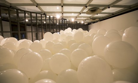
installation filled with nearly seven thousand white balloons in which the
viewer(s) can immerse and loose themselves in childlike joy or claustrophobic terror.
This piece, titled ‘Work No. 200 Half the Air in a Given Space’ represents one
in an ongoing series of numbered works by Creed, the balloons become a visible manifestation of the air around us, whereby the half
the air in the given space is measured and equated into filling the number of balloons
to equal it. Why? Sounds like pretty conceptual stuff, but when asked, Creed
states ‘I don’t believe in conceptual art. I don’t know what it is. I cannot spate
ideas from feelings...Work comes from feelings and goes towards and ends up as
feelings.’ Hmmmm....I ain't buying it, the bullshit alarm has been activated and it’s likely to be the
first of many in this exhibition of the artist’s work from the last twenty years.
This is by no means a criticism as I think the artist is all too aware that his
works which include brick walls, curtains opening and closing, blobs of blu-tack
and prints of broccoli often descend into the pretentious or ‘bullshit’. It is
one view that is perhaps because ‘Creed feels ambiguous and conflicted in
himself and wants to share that with a public who feel the same thing.’ Is it a
questioning of what exactly it means to have your art ‘taken seriously’ and
whether play, observation, wit and, yes, bullshit can be art? What is genuine
and what is taking the piss? Maybe Creed's work is about his feelings, but I am not convinced. Does it matter? Much of these ideas have been touched upon in art before
but what does Creed’s work present for today and a new generation of
artists/art-goers?
I
am probably not alone in never being entirely sure how to ‘take’ Creed’s
comments about his work. The kind-of honesty and simplicity in his responses
can either come across as a dumbing-down, ignorance, ambiguity, pretentiousness
or refreshing almost zen-like, minimalist wisdom and clarity on depending how
you interpret it. Another example, ‘I find it difficult to make judgements, to
decide one thing is more important than the other. So what I try and do is to
choose without having to make decisions. At the same time a non-decision is
still a decision and to choose everything is still to decide.’ What a contradiction,
it’s almost a waste of words but love him of loathe him, he does make a counterpoint
in challenging how we perceive conceptual art and whether he ‘likes’ the label
of being a conceptual artist or not it’s difficult to talk about Creed without
going into the continually shifting realm of ideas, meaning and interpretation
where nothing is tangible and constantly changing.
Feeling uncomfortable? I know beginning to write about Creed
feels as though swimming out to sea without a life raft, pretty quickly I find
myself out of depth. I wonder does the prospect of dealing with paying to see
an exhibition in which some of the work is a scrunched-up ball of paper, an
automated door opening and closing and film of a person vomiting give you cause to sit with head in hands and
despair at what has become of art?! Good, because if so then this is probably
the best thing for you. Those of us who are more familiar with the ‘everything
can be art’ concept, jaded by the legacy of urinals, irons, pickled sharks and
unmade beds walk around Creed’s exhibition probably just a tad too cynical. Although
not cynical enough (yet) to not think it’s worth trying and in fact it
turned-out to be a surprisingly healthy thing to experience (as far as seeing a video of a woman crap on the floor and an erect penis, can be described as a 'healthy thing to experience' then, yes. Ha ha). I don’t think
Creed intentionally tries to make his audience feel uncomfortable, he doesn’t
use a lot of fancy ‘art speak’ or terminology that inflates his work with an
authority or sense of importance. In fact, quite the opposite, it’s more a case
of ‘it is what it is’, almost a one-liner. If you have a problem with seeing a woman crap on the floor then that's normal, that's human. The awkwardness comes more from our own
expectations of what we assume art to be, for example, an artist sees the
piece, ‘Work No.79’ and can see it is a lump of blu-tack pressed on the wall,
but they bring the ‘baggage’ of placing interpretation and an expectation that
it must be more profound, meaningful, ironic and researched than just sticking
a lump of blu-tack to the wall. The context of the work being in a gallery also
throws the reading of the work into having ‘value’, conviction and or merit
that we stereotype with the credibility of the gallery as a brand or
institution of art. The result is that we are kind-of tricked into thinking
perhaps too much when really we don’t need to. Maybe the approach is more
simple, ‘it is a lump of blu-tack on the wall, how funny and should that
sort-of thing be allowed in an art gallery?’ It’s impossible to write about
Creed’s work without writing about rules and whether there are any when it
comes to art, and if not then why aren’t more of us exhibiting our detritus,
play and interventions with our surroundings?
I don’t have the answers to these questions but feel that
we need an artist like Creed to stir things up, to be the one that speaks
plainly, pleads ignorance and does things seemingly for the sheer sake of doing
them. To his credit, he is pretty prolific and explores many mediums from
music, to film, installation, drawing, printing, painting, kinetic works,
sculpture, interaction. Each time seemingly applying a simplistic logic to his
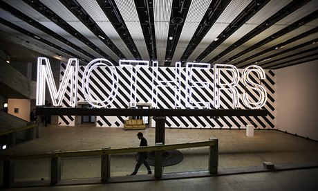
work, in ‘Work No. 1092’ a huge neon sign saying ‘mothers’ (its 12.5 metres
long by 2.5 metres high) spins around above the heads of gallery viewers at
varying speeds, almost threatening to knock your head off, to which the artist claims, ‘when you’re small you’re mother is
always really big, So it seemed like a good reason for this to be big...and
scary.’ Like the title of the exhibition, I am beginning to wonder ‘what is the
point of it all?’ There isn’t one word or place you can pin Creed’s work down
to, it’s not necessarily autobiographical, sociological, psychological,
metaphysical or even really, despite my initial attempt, that
conceptual. The artist doesn’t bring these ideas to the work so much as we read
into them, his ‘Works’ are interventions,
I think, they intervene with how we view art, the world, stuff, things,
materials, people, space, scale, concepts etc. In an exhibition where you move
from one work that is a giant rotating neon sign, to a room filled with
balloons, a light going on and off, a video of a woman vomiting, a
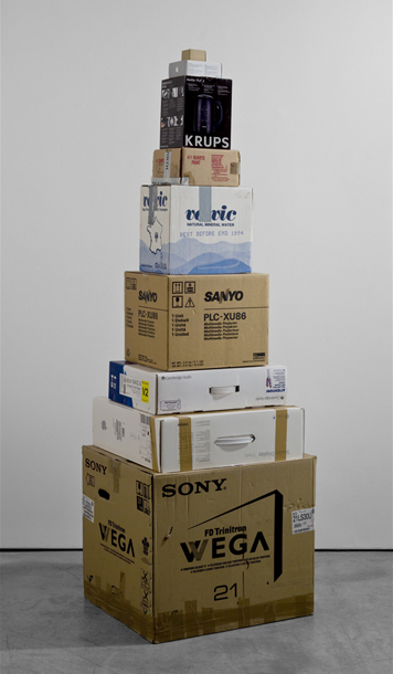
scrunched up ball of paper and boxes arranged in a stack from largest to
smallest how do you begin to equate it all together, make sense of it? It’s all
reactionary and will either provoke, alarm, confront, appal, delight, amuse or
bemuse its audience. It’s dangerous for me to probably have even attempted to
make sense of it, I don’t think I’m supposed to!
Maybe the fine-line between the whimsical and/or intelligence
is all an act? It is likely, as all of Creed’s play, exploration and
interventions must have been met with some determination, business-sense,
networking and authenticity in order to convince the art world that it is worth
acknowledging. The refreshing aspect about Creed is that his work
reflects the insecurities that people have of the art world of being, overtly serious
and inaccessible with meaning (if only accommodating to this audience instead of trying to alter their perceptions). The ‘Work No. 1197’ as part of the Olympics saw
all the bells in the country rung as quickly and as loudly as possible for
three minutes (I remember partaking myself, running into the garden at nine in
the morning with a small hand bell) was a good example of a piece by Creed that
was inclusive, meaningful and accessible without being gimmicky or jokey. To
some, his inability to tackle the true grips of his challenging of how we
make/view art, instead always settling for a flippant answer may be exasperating
and seen as a cop-out; others may see his concern with feeling in the work as an almost romantic gesture that
is about one man’s need to make and express himself. I for one am glad to have
been part of the laughs and think that this retrospective' s greatest legacy will be by having an
artist like Creed recognised in the art world, as a result, we aren’t left with
too many artists like Creed.
Martin Creed ‘What’s the point of it all?’ is on at the
Hayward until May 5th 2014:
Images sourced from:
http://www.theguardian.com/artanddesign/2014/feb/02/martin-creed-whats-the-point-hayward-reviewhttp://www.telegraph.co.uk/culture/culturepicturegalleries/7902671/Martin-Creed-Works.html
http://www.martincreed.com


