Sunday, 21 July 2013

You want proof?

Nice!
 
A brief mention, to celebrate receiving my first ever free requested book proof since I have been a bookseller (six-ish years). Not that proofs are that hard to acquire, in fact quite the opposite, it's just been that working part-time I had never thought/or had much time to email publishers asking before. But when I heard about a new Donna Tartt, I thought I'll make an exception! Thank you Little Brown Publishing for sending it my way, you are AWESOME! Hopefully, Donna Tartt's 'The Goldfinch' will live up to the expectation as her most well-known for novel, 'The Secret History', which is definitely in my personal top ten greatest books of all time. It's a bit of a tome, so not the sort of thing I can carry about on the move, but perhaps the perfect book to read at home over the loooong boring summer.
 
The book's not out until October 22nd, but here's a blurb to get you interested:
 
Aged thirteen, Theo Decker, son of a devoted mother and a reckless, largely absent father, survives an accident that otherwise tears his life apart. Alone and rudderless in New York, he is taken in by the family of a wealthy friend. He is tormented by an unbearable longing for his mother, and down the years clings to one thing that reminds him of her: a small, strangely captivating painting that ultimately draws him into the criminal underworld. As he grows up, Theo learns to glide between the drawing rooms of the rich and the dusty antiques store where he works. He is alienated and in love - and his talisman, the painting, places him at the centre of a narrowing, ever more dangerous circle.
 
The Goldfinch is a haunted odyssey through present-day America and a drama of enthralling power. Combining unforgettably vivid characters and thrilling suspense, it is a beautiful, addictive triumph - a sweeping story of loss and obsession, of survival and self-invention, of the deepest mysteries of love, identity and fate.
 

Once I've read it I'll be reviewing it here on my book blog in October, The Groaning Bookcase, well worth a look:

Monday, 8 July 2013

Contains art is unleashed in Watchet!

On Saturday 6th July at 4pm the Containers at Watchet were officially opened. I popped down on the bus to see the art contained within and of course have a glass of the elderflower champagne I'd heard so much about....
Avast there! The Contains Art flag, proudly aloft in the Watchet breeze.
Quite a crowd of discerning artists and alike turned out for the opening, for which there was booze, bunting, falafel, postcards and sunshine.
For those of you wanting a bit of context to this event then please read the following:

"Contains Art provides flexible, affordable space for artists, designers and makers to develop and showcase their work and to connect with the creative and wider communities of Western Somerset."

Set up in July 2013 by artists and volunteers the containers located on Watchet quay will host studio spaces for several artists and a temporary exhibition space to be hired out.


Does what it says on the tin.
Beautiful boat next to the containers, perfect for some inspiration.

The studio spaces themselves are a good size, they've been finished and built to a really high standard, have more light then I though they would (due to inserted windows/window doors, obviously), electric and smooth white walls to produce/hang work. There is a lack of running water/toilet facilities in the studios themselves, which could be a problem but the containers are located next to public toilets and there is running water taps located on the quay that the artists have liaised to use. Practical stuff aside, the location and community of fellow artists in containers and buzzing arts scene in Watchet and Minehead make up for a few technicalities.  It was a fantastic atmosphere at the Containers on Saturday afternoon with much cause for celebration and many thanks rightly went to those who worked hard to make it happen. A bottle of that very fine elderflower champagne was cracked open against the containers to signify the 'official' launch and long may they reign, in my opinion, it is a truly great idea and use of space.

Another added bonus to the day was being able to see the entries to the postcard competition (of which I mentioned on this blog a couple weeks back http://spannerintheworkz.blogspot.co.uk/2013/06/wish-you-were-here-contains-art.html). Good to see so many entries and even better that quite a few had sold. Whilst viewing work in a container, due to its length and limited viewing distance, took a bit of getting used to, I think for the postcards (which are smaller) actually worked really well. I also think it's it's an interesting opportunity to have a gallery that is a challenging shaped space to work with as it could result in some unusual creative responses. What was also refreshing is that this exhibition was fun, it was great not knowing whose postcard was whose (although I enjoyed trying to guess a few) and there was a real mix of styles and ideas.

Glad to see the art in the containers finally unleashed to the public and I really look forward to seeing what's in store next....

Recognise this postcard? I think it's sold...
A few of my favourite postcards now, it's all anonymous so do let me know if I've picked yours! This one seems apt given the harbour setting, the surface looks like a weathered and worn hull of a ship or indeed a container. 
I'd know that yellow plastic anywhere! It's a SAW sign. Good to see it being recycled! Also like the cows which on first glance look like a fused two-headed beast. Weird-I like it!
This reminds me of a Susan Hiller series of postcards featuring stormy seas. Or a Peter Lanyon. The two aren't necessarily connected its just a few reasons why I was drawn to this postcard.
 This is one of a series of...lino cuts, I presume, from a Cornish artist in St Ives. An additional card with some poignant words and advice was displayed alongside these. It went something like this:
 'Dear Watchet, Advice from one seasoned harbour to another, Your sea may not be as blue, but your strong stone harbour walls are just as strong and beautiful. Your lighthouse is beacon red, mine sea spray white. Don't ever let the seagulls get the upper-hand, your ice cream eating promenaders will never forgive you. Keep your galleries small and ensure your artists stay true--make sure they use the right blue. My sands are white, a colour favoured but your layered red rock holds secrets of old, fine fossils and pink alabaster. The famous have trod and been inspired by your shores and yet your secrets are still hidden, yet to be explored. Not leeched to a cliché. With love from St Ives x'
Superb.

Wish you were here, regards Verity

Ah ha! Finally, its been there for nearly a year this October and last week I have at last been to see Damien Hirst's...erm...'Verity', on the seafront in Ilfracombe, Devon.
 
In honour of this news here are a few facts:
 
It is 66 foot tall
 
 "The statue of Verity pregnant holding a sword aloft and standing on a base of legal books is meant to be a 'modern allegory of truth and justice"
 
"The title 'Verity' is from the Italian word of Truth, while she holds the traditional symbols denoting justice – a sword and scales."
 
"The figure's stance is taken from Edgar Degas' late 19th Century Little Dancer"
 
Interesting...and I guess that middle one explains the Verity naming thing. Still what makes it perhaps more wonderful is its humble setting of Ilfracombe. Whilst I'd describe it as a traditional British seaside place, it wouldn't have exactly been the first place I would have ever predicted a contemporary millionaire artist like Hirst to exhibit in. But why not? There in lies its charm. The artist has apparently a studio near by in Combe Martin and also set up a gallery and café (pictured below) which also sells and displays his work. Love it or hate it, Verity has certainly put Ilfracombe in the public eye and 'on the map' even more so in the way of tourism that Verity attracts. Hirst's work is not shy of controversy, sliced cows/sheep, sharks in formaldehyde, dead butterflies and the lavishly diamond encrusted skull to give a few examples that caused a stir at the time they were first shown. Although, like most controversial artists/works, their infamy soon becomes cliché and eventually even accepted and less shocking than when first revealed. We almost become desensitised to being shocked, the more supposedly 'shocking' things we experience. As a result Hirst has probably now become more Warhol-esque in his fame and can now make pretty much anything and people will buy into it. I'm not sure if Hirst's intention was ever to shock with his early works, but more about creating a reaction, either a sense of wonderment and awe or horror and repulsion. Undoubtedly he'd have been aware that the work may provoke strong reactions either way, maybe it is as meaningless/simple as just sticking a shark in a tank for sheer spectacle alone but then sometimes through spectacle we can learn more about our world and things around us than from the work that is more cryptic in its profundity.
 
I don't personally see the connection (if there is one) between a pregnant woman/cross-section anatomical figure and Ilfracombe as a place. If I was thinking of places for a modern allegory of truth and justice or science and existence then I'm not sure either if Ilfracombe would spring to mind, but again, maybe that is what makes it more appealing. Where war memorials can sometimes get lost and forgotten for fitting-in too much with their context maybe Verity stands out (in more ways than one) for being a kind of odd sight in a relatively small seaside town. And besides, themes of truth, justice, search for meaning, science, biology etc. are fairly universal beliefs and part of being human so in that way Verity has something to communicate to everyone (albeit in a statement/obvious kind of way).
 
 Verity on Ilfracombe Pier -The anatomical side is the best!
 
 Damien Hirst, (1993) 'Where will it end?' Beach wood, glass and fish.


Monday, 1 July 2013

New Year's Resolution Half-way point!

The end of June marks the half-way point of my project to do a drawing a day for a year.
 
See blog post:
 
What began as a new year's resolution is now fast becoming an obsession with increasingly more time each day spent on drawing/thinking of what to draw each day (eventually I plan on creating a separate blog which will show each of the drawings). What is interesting so far is that there have been some improvements in my drawing since I started and I have explored drawing with more texture and being less 'heavy handed'. The style or type of drawing remains pretty tight, illustrative and representational as I made it clear when I started that I wanted this to be an observational drawing project that was about drawing with a degree of intensity, focus and detail. The reason for this being that I feel that when drawing this way it gives you the opportunity to think on other things, focus and be open to new ideas; this wasn't ever intended to be an exercise in ways of drawing but as an exercise to think to and break away from my obsession with drawing just tools! Another unexpected discovery during this activity has been in the selection of what I have chosen to draw, so far the list being:
 

snowman, beer glass, newt, chameleon, bumble bee, frog on nut, Dali clock, dragonfly, portrait of weird looking man, ear, stork scissors, zombie, netsuke, seated Buddha from Gandhara, clay skull, coal tit, telegraph pole, netsuke nut, biro pen, dormouse, ladder, predator, dark bush cricket,  row boat, bowling pin, Mona Lisa on toast, paraffin lantern, wood pigeon, cross-section of chest, typewriter, seahorse, sheep, steak, old telephone, sailing boat hotel Dubai, lobster, ball of string, owl, amber spyglass, platypus, trumpet, pig, converse trainer, silver articulated fish, Inca gold lama, flying bird, walrus, grenade, cross-section of pepper, crab, egg in frying pan, light bulb, Don McCullin’s Nikon camera, tree frog, sundae, strawberry, pumpkin, gas mask, petrol can,   lion, guitar, chicken, film camera, hippo, Native American mask, raven, bucket, moose, peas, key, telephone, Maya Mare God statue, raspberry, revolver, prawn, peg, flame, radiator, pinwheel, hat, lettuce, accordion, fan, Sangrada Familia, Joan Miro sculpture 1, Joan Miro sculpture 2, Cat statue, La Pedera 1, La Pedera 2, anchor, pipe, dart, electric fan, tortoise, high heel shoe, poplar leaf beetle, kestrel, ray gun, vacuum cleaner, ear of wheat, shark, wood plane, hypodermic needle, seagull, unicycle, Roy Lichtenstein Desk Calendar, copper kettle, telephone box, red lipstick, snorkelling gear, pneumatic drill, fish, hour glass, knight chess piece, penny farthing, oil can, natterjack toad, roller skate, chainsaw, ice skate, fire hydrant, zeppelin, spray paint, Van Gogh Skeleton, jelly, tin robot, arrow, cuckoo catfish, iron, budgie, pickaxe, flintlock pistol, rubber duck, JCB, spinning top, lighthouse, puffin, scarecrow, lighthouse lamp, gargoyle, wooden bird, fire extinguisher, padlock, gramophone, fox skull, mushroom, flamingo, hydraulic clamp, sarcophagus, saw, hand whisk, acorn, Georges Melies’ moon,  cassette tape, kangaroo, diamond, T-Rex, squirrel, black spotted woodpecker, wren, penguin, umbrella, wooden chair, folded shirt, Somerfest beast, formula one car, pheasant, electric iron, rhino, hairdryer, fox, bowler hat, pelican, blue whale, leak, ostrich, scorpion, watering can, badger
 
I am sure Freud would have a field day analysing that lot, very disturbing. I'm not going to read too much into what I've chosen to draw in terms of symbolism/metaphor but I am interested in what I have chosen to draw says about the kind of visual aesthetics I'm drawn to. For example there's a lot of hard, robust, man-made, industrial objects there (proving perhaps I cannot ever really get away from tools) but there are also a lot of birds which makes me wonder what it is about the shape/form, pattern/texture of them that captures my interest. Similarly, when there are forms of association from one day to the proceeding, for example a pelican followed by a blue whale. I think I made the connection that the neck/pouch of the pelican is sort-of similar to that of a whale which is what led me to drawing it. Perhaps, more psychoanalysis is in there than I thought! Still, its been a fascinating and challenging discipline so far and one I hope to continue through until the end of the year.

Any suggestions of things you'd like me to draw that obviously aren't on the list above then please let me know!

BV Open Studios - 'I am the walrus'

Crikey! Time is running out! I wanted to write a longer post on visiting BV Open Studios in Bristol which was on Friday 14th June. A bit late now if you were hoping to catch it as its only on for three days, however the gallery space inside BV Studios, Motorcade Flash Parade, has different temporary exhibitions happening on a regular basis.


If you have never been to BV Studios before I thoroughly recommend you visit, its a fantastic collection of over 18 studio spaces that host artists specialising in everything from painting, sculpture, performance, installation to sound and video art. Located in a former printing factory in the Bedminster area of Bristol. I personally enjoy visiting these studios very much as I find the people so friendly and forth-coming with wanting to talk about their work. In fact, I talked so much I forgot to take any photos (!) so this post will concentrate on the equally exciting exhibition I saw in Motorcade Flash Parade.

 The exhibition in question was titled, 'Between two tides' and featured the work of Rosie Snell and Mariele Neudecker.

"In this exhibition, painter Rosie Snell and sculptor Mariele Neudecker combine works made since a trip in May 2012, when they traveled together in the the sublime landscapes of North West Greenland.
The works in ‘Between Two Tides’ are based on the journey’s experiences and sights and look at human interference with the landscapes around Ilulissat, Uummannaq and Disko Island.
The title of the exhibition alludes to the duality of two perceptions, the gap between two realities, the contemporary and traditional, in two subjective ways. A shared experience in the same landscape is fictionalized and re-presented."

Front of BV Studios, Bristol
Rosie Snell (2012) 'Ice Floe' Oil on canvas

Mariele Neudecker 'Cook and Peary' Water, salt, fiberglass, glass
This is the kind of work that I had come to associate Neudecker with. Glass vitrines filled with mini mountainous landscapes/forests shrouded in a mist-like fog. You never forget the first time you come across one. The child in me likens them to a slightly bigger version of a snow-globe, where upon  seeing your first snow-globe one there is a sense of awe and wonder at how a tiny miniature world in this globe can also contain a snow storm. That's a much simplified version of Neudecker's work but the feeling of awe and fascination remain the same. As a result much has been written on the idea of the sublime in her work. For me, I find them enchanting and, like with the snow-globe, love the way something big can be made small but still retain (if not become greater) its power and wonder.  

Rosie Snell (2013) 'Out to dry' Pencil and watercolour on paper
Whilst Snell's work is decidedly more representational than Neudecker's I think the exhibition is richer for having the contrast between the two artists in how they present/communicate their subject. Snell's work almost provides a context and site for the work representing both the bleak emptiness of Greenland but often still sneaking in (as depicted here) traces of the people that work and live in the seemingly hostile-looking environment. In contrast to that I would say Neudecker's works are more about capturing the unseen and more 'felt' atmosphere/sensation of being in that environment.

Mariele Neudecker (2012) '54 Polaroids'
54 Polaroids on a wall shouldn't probably be this interesting, but maybe it was the colour palette that the collection of these photos portrayed or maybe it was the actual stories and narratives within the images themselves that I was engaged enough to want to photograph the photos! Maybe there is also a slight pun in the relation to the polar landscape of Greenland and the decision to use polar-roids!

Rosie Snell (2013) 'Icebound' Oil on canvas
You cannot really tell in this image but the texture and surface in places (such as the snow) in this painting are really thick and almost sculptural. A bit like icing on a cake would be a good analogy. 

Mariele Neudecker (2012/13) 'Odobenbus Rosmarus' single chanel video on monitor (size variable)

Why this is titled the Latin for walrus (I certainly didn't know that it was walrus at the time) I'm not sure I'll ever know. It may not really even matter, I think it was possibly a reference to the walruses seen during the artists' trip to Greenland? However, I'm still not sure how that translates to an image of a rippling pink  image of water on a monitor laid on the floor either, but none of that really bothers me and doesn't stop me from being mesmerised by the moving image on the screen. Are walruses, basking on the shore, in a very abstract way a bit like a mass of rippling pink?  Could it be water, most likely, but  maybe it could also be sky. Why's it pink? Is that its natural colour? I am also curious as to its positioning on the floor and looking down on it holds my attention more than if were on a wall; like some moving abstract painting there was something oddly intriguing about this piece and I am held by its mystery.

 Visit the artists websites for more:

Monday, 24 June 2013

What's cooking in Ilminster?

Last Thursday I visited Mark and Tracy Nesbit's exhibition, 'Physicality and Metaphysical Expressions' at Ilminster Arts Centre featuring mixed media paintings, sculpture and mixed media work from the two Somerset-based artists.
 
The work, isn't intended to necessarily be anything to do with cooking, as my blog post title may suggest; just that I cannot help finding comparisons in the work, its processes and materials, that remind me of some sort of alchemical cooking experiment. Mark in his paintings mixes and layers pigments, metallic elements (perhaps for added mystery?), hair, lime, plaster and more into rich almost 'baked' looking surfaces. They are scraped-back, flattened, cracked, heavy-looking and worn making them look quite industrial or urban (except the few which are portraits) and strongly remind me of Tapies' paintings which I had the pleasure of seeing in Barcelona earlier this year. I'm pretty certain Mark is aware of this analogy and would want him to take it as a compliment as in fact, I enjoy some of his paintings more than Tapies'. Personally, I am a fan of the industrial cogs, wheels and solid, angular lines and mark making in Mark's paintings and the way in which layers are revealed and placed over one another and connected as though stapled together by line. In a way that also makes them quite sculptural paintings. It occurred to me the other day that paintings that look sculptural, a 2D surface that is given treatment as though it were 3D is an interesting concept and illusion that I would like to explore further (but for another day!).
 
Tracy's sculptural works in some cases do actually use food and baking (see bread sculpture below) that she stitches and creates intriguing shapes and forms, no two of which are ever exactly the same. There is a sensitivity to the way she uses materials and how their handling, for me anyway evokes memories and nostalgia of baking and sewing with family members. I wonder if the other pieces containing remnants of scrunched tissues and slate with latex images stitched inside hold similar associations with ideas of loss and memory. At this point, I'm beginning to think I should have paid more heed to the artist statement accompanying the work, but was too curious in looking at the work itself. The work is more conceptual in nature, but I don't think it has to be 'read' in order to have affect or meaning as the work is tactile and visually creative. Materials such as tissues, lead, slate, latex and wood have been used inventively and thoughtfully. It does however raise the question and make me wonder if Tracy thinks through making or makes through thinking i.e.. does the material and process dictate the idea behind the work or is an idea formulated and then a suitable material and process found to fit it? I'd hazard a guess that its the first of those or perhaps a combination of the two.
 
It is really exciting to see such a diverse array of work in this exhibition that showcases Mark and Tracy's skills as makers as well as thinkers. I look forward to seeing what they'll cook up next!
 
(above) Mark Nesbit 'Old Hundreth' Plaster, emulsion, soot, metallic elements and compounds on canvas. [detail]
 
(above) Mark Nesbit 'Anvil' Plaster, lime, ash, metallic elements and compounds on canvas
 
(above) Mark Nesbit 'Human Construction' Plaster, lime, ash, metallic elements, human hair, boot polish and compounds on canvas.
 
(above) Tracy Nesbit 'Freebie' Perspex, lead, compressed tissues
 
(above) Tracy Nesbit's bread sculptures
 
(above) Tracy Nesbit
 
 
Catch Tracy Nesbit and Mark Nesbit's exhibition, 'Physicality and Metaphysical Expressions'
 until 29th June at Ilminster Arts Centre at The Meeting House,  09.30am-04.30pm daily


Monday, 17 June 2013

"The highest I will ever be in Taunton." -Somerfest 2013

Saturday 15th June marked one of the most spectacular and surreal experiences I have ever had; dressed in red, I set out in Taunton town centre to co-ordinate the volunteers taking part in the Somerfest parade. I had hoped that I may also be able to take-part in the parade myself instead of adopting my usual position of viewing and documenting from the side-lines. A vantage point, I'm all too happy to take, not being a performer. Still, I figured I could cope with maybe a little cycling on one of the several cycle powered vehicles taking part in the Somerfest parade. Yeah....how wrong was I! 
 
Those of you not familiar with Somerfest or wondering what I'm talking about, then read the info and view the images below.
 
For the rest of you, as it turns out, I wasn't going to be watching this one from the side-lines. In fact, I wasn't even riding one of the bikes. This time and maybe the only time, I was going to ride the tower! (see fourth image down) "Inconspicuous," thought my sarcastic mind. But also, "Amazing!" And "I don't exactly have a good head for heights!" Initial apprehensions aside, how wonderful it was to be let loose on a massive battery powered tower riding around the streets of Taunton! Finally, I could actually SEE the parade in progress, and not only see it, but BE in it as well!
 
The atmosphere was fab, the music was loud, the performers were entertaining and even the rain could not dampen our spirits. The commitment and enthusiasm from all the artists and volunteers was inspiring to be a part of and got me thinking; one, that we really need to do this every year and two, how similar the 'performing arts', music etc. is really the same as the visual arts or Fine Art. Why do we bother with all the labels, when at the core of what we are all doing is often the same or very similar, albeit to communicate an idea, express oneself, celebrate, challenge or question. A massive thank you needs to go out to all the volunteers, musicians, performers and makers that took part in making this event happen; Tim Hill, Dave Young, Tarn Aitken, Mike Pattison, Fuse, The Big Noise Band, Fork Beard Fantasy, the audience that came to watch and more!
 
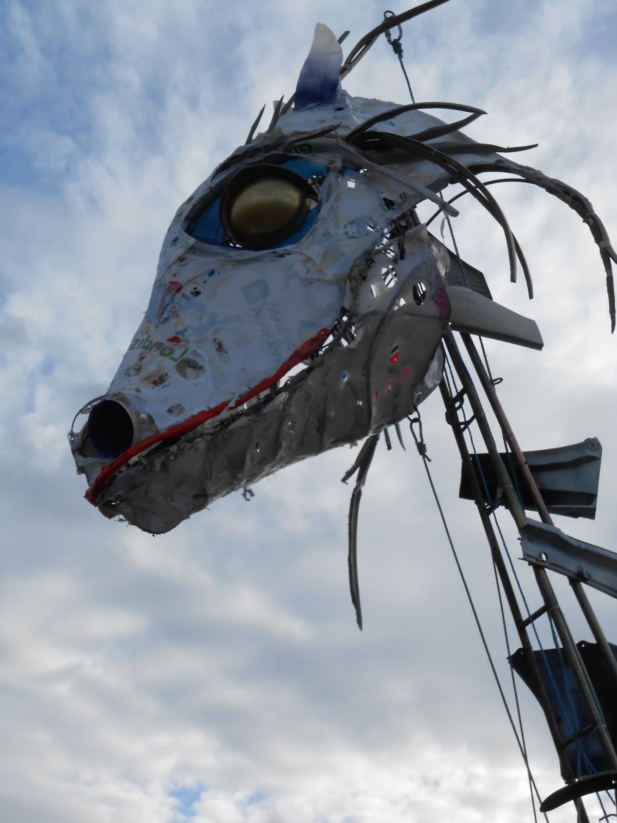
And surely this is the point of parades and festivals, to involve the local community on mass; all ages and backgrounds. Perhaps what's more involving those,  like me, who don't normally do things like this, its slightly out of their comfort zone, but it also gives a sense of empowerment in that kind-of nerdy/fairy-tale-like way, that for one day of the year, even I-a mere bookseller can ride-on-high in a parade through my home town. I may never walk down the town centre and feel the same way ever again. Hopefully our audience will remember when a horse-like dragon came and tried to steal their hat, when a majestic boat and horn came sailing down from the Castle hotel, when the sounding of trombones reverberated off the walls of shops, when giants came and danced amongst jugglers and for me, well maybe when I was the highest I'll ever be in Taunton. And that is the power and perhaps a little magic of the parade!


"Somerfest is a celebration of Taunton, Somerset and green technology that includes an afternoon parade with splendid array of cycle powered vehicles , beasts and machines, banners, street bands and street performers.

The parade included a machine based on the winning design of a design competition together with vehicles seen in last year’s Para-Olympic games and Taunton’s Olympic Torch celebrations. There were also performances from Fuse Performance Company, the Space and Street Linx, The Big Noise Street Band and the Trinity Primary School samba band."

Somerfest and the events supporting it have been made possible by support from Taunton Deane Borough Council, Arts Council England and Somerset County Councils Creative Industries Fund.

The event has been organised by Tim Hill, Tim helped put together the Olympic Torch celebrations and runs street band events, shows and celebrations around the country
Preceding the parade on June 13th will be a conference on parades and processions, featuring presentations from leading makers of parades from England and Ireland including Bridgwater Carnival.

Tarn Aitken and the beast during rehearsals at Taunton's Firepool.

The astronomer's tower that I rode during the parade. Built by Mike Pattison, crashed into The Castle Bow by Natalie Parsley.

Two willing volunteers test out another one of Mike Pattison's creations on The Castle Green.
 
Like what you see? There's more. Check out the link below: 
 
And a history of some of the vehicles present in Somerfest at: