
If there was a message saying, ‘you will write about this exhibition' at 'Barber
Kruger', Modern Art Oxford, then it was subliminal.
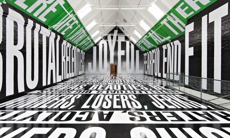
Wandering through one of the
text-filled installations that Barbara Kruger is synonymous for, immersed in the overwhelming scale of the black,
white and green text that ran floor to ceiling in the main room of MAO I felt worryingly desensitised to the whole experience. I say worryingly given the fact that a fellow
visitor, of more elderly years, was so affected by the floor to ceiling
bombardment of text and slogans that he tentatively stumbled, as though unsure
of where the floor had gone, disorientated by the whole experience. For myself,
perhaps being from a generation that has been more subjected to the bombardment of images, words and communication that are also faster and more readily available than ever before, it is harder
for printed text to have impact, a victim of its familiarity. This is not to say that Barbara
Kruger’s work has completely lost its impact, as the current exhibition of the
artist’s work at Modern Art Oxford aims to prove, but it is possibly in danger
in the digital age of news, advertising and social media of becoming more
familiar, less hard hitting than what it once was.

Emerging from America in the early 1960’s Kruger made her
impression on the art world with her adaptation of advertising language and
imagery which she used as a social commentator and political agitator to
provoke questions about assumed viewpoints on capitalism or femininity through graphic media of text and image. From a background in graphic design,
working for a small independent women’s magazine her art work often favoured
the red, white and black (like the tabloids) featuring often classical or
iconic imagery that she juxtaposed with contradictory or perception altering
text. Her wit and edginess ironically perhaps saw her slogans becoming commoditised
into bags (‘I shop therefore I am’) and reproduced as posters turning them into
some of the most recognised images from the pop art era.
Certainly the large installation at MAO is almost too much
to take in making it so that any message, any meaning that the words may have on the
walls/floor are lost in the noise of a hundred other messages all shouting for
your attention at the same time. Perhaps this is the point, that there is a
loss of anything meaningful and words become mere shapes, formal components in
a space when you have too many things competing with each other at once? The
most successful use of text in the main installation, as it has the most
affect, is the word ‘JOYFUL’ in huge letters filling the wall you enter in.
It’s simple and works well in drawing your attention to the height, space and
shape of the room, (which is described as ‘cathedral-like’) but if anything is
more intimidating in its authority in size, that is more bossy than actually
encouraging any genuine feelings of joy. Personally, I think this is quite reflective of
how most advertising works in the sense it presents a good-thing and forces you
to like it clouding your own judgement as to whether you really need it or not.Well
worth watching as well is the impressive and mesmerising feat of how
the work was installed in a short time-lapse film.
For me though, Kruger’s smaller works have more to say and impact than the more superficial room installation. A simple
observation of, bigger is not necessarily better is evident in the example, 'Your Misery Loves Company' where the juxtaposition of a dentist’s drill and wording, ‘Your
Misery Loves Company’ is much more unnerving, hard-hitting and lasts in memory
more than anything in the installation. Some of the messages in these works may have
lost their relevance over time but their ability to have impact has not. Her directness to mass audiences and ability
to provoke/challenge using words and strong graphic imagery has influence that
makes up some of the fundamentals of street art; one example being Shepard
Fairey’s Obey posters and iconic Obama Hope poster. Kruger’s work was one of
the significant players in taking the familiar language/media of advertising
and newsprint and subverting it to create new meaning. More recently artists
such as 2012 Turner Prize winner Elizabeth Price use Kruger influenced text and
image in film montage to great success. The interesting question now, is where
Kruger’s work sits today, with, as I’ve already alluded to, more modern/digital
forms of communication and less use of print?
The answer can be found in Kruger’s most recent pieces where the
artist has used film. They also make up the more relevant and interesting pieces of
the exhibition. ‘Plenty LA’ from 2008 flashes the word ‘enough’ at the viewer
repeatedly amongst still and moving images of sunsets, a handbag, car with a
smashed bonnet and ‘bling’ encrusted mobile phone; a direct Kruger-esque
comment on consumerism, whilst in ‘Twelve’ faces are projected on the walls
argue with one another (about relationships from what I gathered), their real
thoughts read across the bottom of the screen like news coverage. This work is
more topical in its use of modern technology and its use of a reality TV-style
of drama or dialogue that has come full circle from being first intended to
present a view of reality to now in fact being completely unreal in its
superficial-ness. The viewer enters
awkwardly into the middle of these arguments that feel at once staged and fake
but believably real at the same time. It is an observant and is a slightly
troubling comment on our current society that we chose to trust the
authenticity of the news reel text as to the spoken words of the actors, but
this is what Kruger does best. In ‘Twelve’ she takes a familiar mode of presentation
used in the media, the news reel and subverts it into manipulating how, in this
case we respond to what is a very social/domestic situation. It is far more
subtle than her printed work from the sixties and therefore accurately demonstrates
the change in media/advertising to becoming more subliminal.
New and fans to Kruger’s work will get the most out of this
exhibition that for me, acts more as a retrospective than being completely fresh or ‘of the moment’. I don’t think this
is entirely Kruger’s fault, but more that her message that once protruded so
edgily on the walls of modern art galleries or shopping bags now feels too
accepted and familiar to remain that provocative. Your modern-day Kruger is now
more likely to be found tagging a subversive message on the wall of a public building
or generating some of the many political satire games/images that pop-up on
blogs, forums and Facebook pages, they’ll be creating flash mobs, guerrilla
knitting and attempting to go viral with videos and tweets that raise question
to accepted normalities. Such is the plight in the age of uncertainty they
probably won’t even call themselves artists.
Barbara Kruger is on at Modern Art Oxford until August 31st
2014.
Images from: http://www.spruethmagers.com/exhibitions/248@@viewq1
No comments:
Post a Comment