Saturday, 2 May 2015

In the Middle


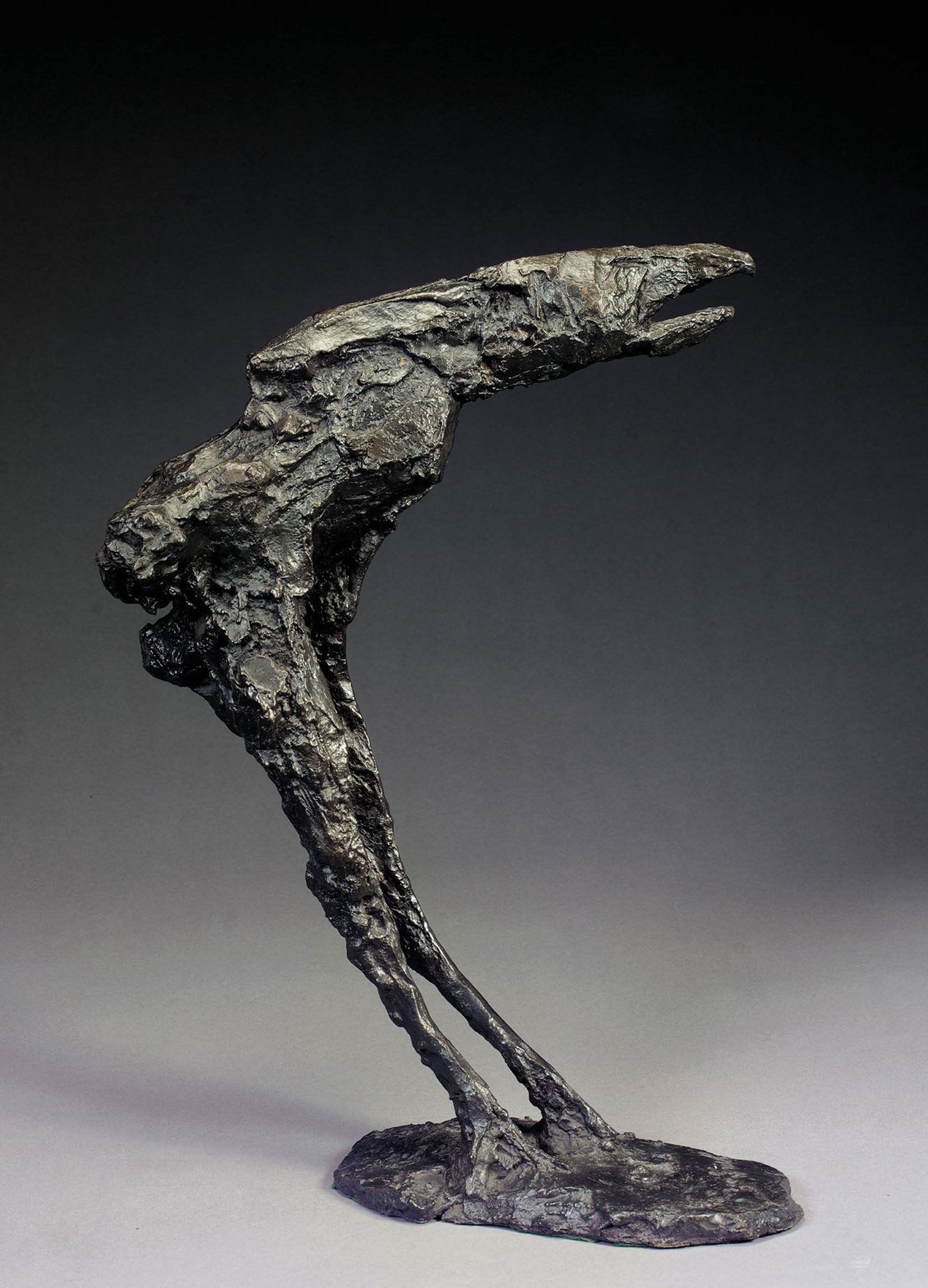
Elisabeth Frink 'Bird' (1958) Bronze.

For its debut exhibition, ‘Leaping the Fence’ at Hestercombe gallery we saw shovels, rafts, a man walking up an escalator, neon signs and Dickensian style pilgrimages from London to Dover. Almost a year on and the private view of the Ingram Collection of Modern British and Contemporary Art currently on show at Taunton’s Hestercombe Gallery was altogether a much more grounded experience. The exhibition titled ‘A Personal Passion’ showcases the ‘artistic passions’ of art collector Chris Ingram and opened to the public on the 25th April. Amongst others it features the works of Kenneth Armitage, Frank Auerbach, John Bellany, Reg Butler, Anthony Caro, Lynn Chadwick, Suki Chan, Aleah Chapin, Ken Currie, Jacob Epstein, Elisabeth Frink, Terry Frost, Peter Howson and RB Kitaj. It is an impressive sounding line-up failing only slightly victim of its own breadth of artists on offer by being at times quite bitty. In the Hestercombe exhibition this is helped by the work being grouped together by connecting themes such as portraiture, religion, place, sea etc. Most of the work is dated somewhere in that ‘middle to modern’ art history dating from roughly the 1860s to the 1970s with the inclusion of several more contemporary pieces by artists such as Aleah Chaplin and Suki Chan.  

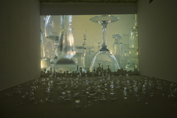
Suki Chan 'Tomorrow is our permanent address' (2008) Video Installation.

Chan’s addition to the Ingram collection is particularly interesting as it provides a contrast in highlighting some of the various practical challenges met in collecting contemporary art. Chan’s work, ‘Tomorrow is our permanent address’ is an installation consisting of a video projection and both stacked and broken ornate drinking glasses. Where once ‘collecting art’ was limited to prints, framed paintings/drawings and bronze sculpture it has since radically evolved in keeping with the progression of art to include work that can be temporary, contextual, ready-made accidental or in a wide range of sizes and mediums than ever before. The storing, preserving and installing of such work posing new tests to both collector and curator. I’m grateful as a member of the public to be able to see these works and that in ‘collecting’ them Chris Ingram is preserving them for future public enjoyment but still at the same time the nature of collecting and commodification of art in this way has always slightly bothered me giving a false sense of ‘importance’ or cultural value to the work that it may not have otherwise. It is one of many contradictions in the art world that doesn’t always sit so comfortably well with the making of it. Conversely the collection does present the pleasures in buying/owning and sharing art in the company of others, I just don’t necessarily think that work has to be ‘rare’ or ‘expensive’ in order to have that affect. I’m interested in the decision making, when buying art shifts from personal interest/meaning to status symbol or investment and am still somewhat diplomatically undecided where the Ingram collection fits. Perhaps if I saw more collectors buying more work at graduate shows outside London then I’d be less sceptical?

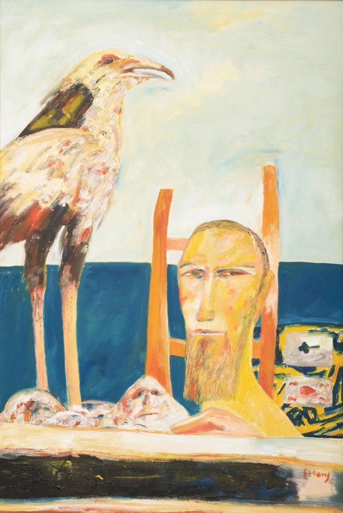
John Bellany 'Aurora' (1980) Oil on canvas.

On the whole, 'A Personal Passion' fell a bit flat for me although it was a real eye-opener of just how my personal taste and understanding of art has evolved into enjoying either contemporary art or the extremely old of the likes of the frescos and Renaissance work I’d experienced for the first time recently. Whilst there is more than I could ever hope to learn, all the stuff in the middle feels more familiar, it was the work that first ignited my interest in art and doesn’t yet quite hold a place in my memory to warrent much nostalgia. By familiar I suppose I mean that even if its work I haven't seen, the intent behind it and place the work sits in art history is more familiar. There are a few exceptions, seeing what I think may have been my first John Bellany painting in the flesh, learning of Irish artist Padraig Macmiadhachain (who moved to Dorset and St Ives who creates very Cornish seascape style paintings) and Frank Auerbach and Jacob Epstein drawings instead of their painting/sculpture retrospectively.  I could also see this exhibition being one of the more popular of recent exhibitions at Hestercombe simply because it is more middle-ground compared its past bolder/challenging exhibitions. Bronze heads wearing sunglasses, depictions of nudes in pencil and oils, seascapes bordering on the abstract, landscapes and plinth-bound bronzes are what I think a general consensus of people would ‘expect’ to see in a modern art exhibition(?). Cynically it also makes me wonder what I’ve seen in my relatively few years to think a giant 8ft head sculpture is middle ground, but then in the bigger picture of art those sort of things have in a way (rightly or wrongly) become familiar. A dangerous game to make such generalizations I know, but ‘A Personal Passion’ meets expectations of what it advertises and in doing so is one of the more easily accessible exhibitions to have yet taken place at Hestercombe. For me, as I said before, that also makes it one of the dullest, but reaffirmed my own understanding of why I preferred exhibitions like Tania Kovats’ ‘Oceans’. If last year we were ‘leaping the fence’, this one sadly opted for sitting on it, but at least it is a break from which we can stop and take some time to admire the view.

‘A Personal Passion’ can be seen at Hestercombe Gallery until the 5th of July 2015:


* Images sourcedfrom:

Tuesday, 14 April 2015

If the room fits?

Light airy two-floored New York style apartment available for immediate viewing in Bristol. ‘348 West 22nd Street’ currently installed in Bristol Museum and Art Gallery offers all the architectural spec of lofty contemporary living in the heart of the city. The room is fully portable, when you decide to move the entire space folds flat in two suitcases. Did we also mention its walls are entirely made of red and green silken, translucent fabric?!
 
The artwork, created by Korean born Do Ho Suh is a scale version of the corridor, ground floor and staircase of the artist’s New York apartment. Everything from the mouldings around the doors, pipes, stair balusters, light switches and wall alarms have been intrinsically recreated so as to produce what the artist describes as the building’s ‘perfect fit’ in which the details and architecture of the interior are as tailored a match to the actual size, scale and shape of the original space as possible, almost like a second skin. Held together and supported by a thin skeletal framework this fabric clone appears more solid like some ghostly tent or architectural human-sized fish tank.  Visitors are invited to experience this work both by walking around it and through it (all the while somehow expected to resist the temptation to attempt to ascend the red cloth stairs or touch the walls, pipes and doors to the watchful eyes of the gallery attendants)!
It was fine, I and the others viewing at the same time managed to behave ourselves and so like those I’d watched before me, I too became part of the work immersing myself into this physical yet imagined environment. The attention to detail and precision in which the space had been recreated was incredibly impressive and highlighted the forms and shapes within the interior that go relatively unnoticed in the familiarity of our everyday lived experiences. When was the last time you noticed the moulding around your doors for example (other than when you’re having to sand or paint them)? All these touches are small but are all there for reasons often either spatial or structural. It was weird how solid, how sharp and crisp it all appeared despite being made of fabric which again, pays testament to the skill involved in literally tailoring the work, Suh undertaking classes in clothing and pattern making whilst studying in America. Occasionally there was the odd slip that gave away the perfected illusion, an end of thread or slightly sagging light switch which are joyful reminders of the delicateness and ‘hand-made’ feel of the structure or sort of alluding to an imagined sense of weight that the real building would have. Initially those aspects of the work reminded me of Claes Oldenburg’s hard and soft sculptures where the artist made toilets and other household objects out of fabric or cardboard. Similarly to Suh they challenged the viewer’s perception to notice the form(s) of these objects in the absence of their functionality.

All the while, I knew the name Do Ho Suh sounded familiar, but I didn’t realise until afterwards that I’d come across one of the artists’ earlier works four years ago, 'Bridging Home’, a Korean Hanok house wedged in the gap between 84 and 86 Duke Street as part of the 2010 Liverpool Biennial. That piece also dealt with the reoccurring theme in Suh’s work of physical and cultural displacement which he himself experienced having grown up in a Joseon Dynasty (1392-1897) style hanok house at a time when Korea was tearing down such buildings. Later Suh moved to the states to study where he experienced a similar feeling of culture shock, separation and ‘entering an entirely different world’. ‘Bridging Home’ in Liverpool was hard to miss and the message of a cultural wedge or displacement was pretty obvious whereas the one currently in Bristol much subtler and worked on the feeling of a more bodily physical displacement than a cultural one in the sense of how we inhabit/interact within space in relation to our body. Making the Bristol piece from cloth and tailoring it to fit the building is derived from the way in which clothing is tailored as a way of both protecting and adornment of the body. Creating a form of clothing for the building this way acts as both protection, trace of the original and generates a metaphorical connection between body and building; perhaps in Suh’s case, how our sense of self and identity are formed by the space we inhabit. The New York apartment is an ethereal new space, but a protected one at the same time as the netted fabric made it feel quite virtual, as though a computer generated diagram made life size, all the time creating a sense of otherness or confinement; terms all of which, I feel,  would find themselves well fitted with ideas of displacement. In this way, by being associated with clothing and the softness and tactility of materials used Suh’s New York apartment feels gentler than that of his contemporary, Rachel Whiteread whose concrete casts of the interiors of entire buildings in the 1990s feel far more imposing, masculine and are literally impregnable. I mention it because it demonstrates how two artists can have similar ideas but using such different materials really adds influence how the work is perceived.
 
There are examples of complete Suh flats which would have been a different interpretation again. Whilst the one in Bristol is just the corridor and stairs, it signifies the important transitionary space between the different rooms of the apartment which makes it again quite relevant to the idea of displacement as it is the one part of any building where one finds themselves in limbo, between the upstairs or downstairs, the entrance or the outside. Its both the nothing space , the uncertain of its purpose space, yet a crucially  vital important one for connecting the living spaces together! For those reasons less may be more in this instance but it is also why its definitely worth a look in.....
 
 
Visitors to Bristol’s Museum and Art Gallery will be able to experience ‘348 West 22nd Street: Corridor/ground floor/plus staircase’ from now until the 27th September 2015.  

Tuesday, 31 March 2015

Whose line is it anyway?

One particularly blustery spring morn a dot went for a walk and consequently found itself on a train to Honiton before arriving  at the Thelma Hulbert Gallery ‘Drop me a Line’ exhibition where it was then joined by lots of other dots that then became a bunch of lines that came from all over Devon, Somerset and beyond...
 
It was too difficult to resist the obligatory Paul Klee reference when beginning to write about the current exhibition of line inspired work at the Thelma Hulbert Gallery created, curated and installed by Somerset-based artists Louise Baker and Michael Fairfax. Klee even more relevant when you take in to consideration just how playful (literally) this particular exhibition is due to its concept of viewer/participant interaction as part of the work which is to be told in two parts (so as to avoid a one liner!) at the gallery throughout 2015.
 
 
Ahem, the current and first, ‘Drop me a Line Part I’ also sees the gallery divided into two halves with Michael Fairfax’s installed piano wires, strung in a series of constellation-like configurations (to be plucked or bowed by the viewer) in the downstairs rooms whilst upstairs Louise Baker’s  lines on paper feature hundreds of mixed-media drawings (in the broadest sense of the word) collected as result of an open call to any ‘line-makers’ out there that sought the opportunity to drop her a line of their own making (interestingly many but not all have been sent by artists). The received lines have then been collated into a huge wall work by Baker where the lines are revealed not just drawn but dribbled, daubed, gilded, stitched, collaged, burnt, printed, written, smudged, stained, sketched, scribbled and torn. There are lines which are solid and fixed others that are more fluid and temporary, varying from the completely abstract to the more representational; each one as different as the handwriting of the individuals who made them (should you feel compelled you can also create your own line to add to the series to be shown later this year). You seldom see such a wide variety of mark-making all in one place and it was both fun and fascinating to try and guess the work/marks of any artists I recognise (with more mysteries than that of being solved!)


I imagined what a delight it must have been receiving these unique drawings individually in the post, each with their own story/ journey they’d undertaken. Therefore in some ways, I felt a little disappointed that the  joy and surprise of each drawing’s uniqueness/subtlety felt as though it got lost in presenting them all together on a wall. The intimacy of each one sometimes a struggle to see in the gallery space and having to contend with the surrounding drawings around it so the sense of an overall journey, chronology or line was a little confused. I speculate that Baker, also a maker of extraordinary hand-made art books, will collate them into a book at some point which I can only imagine would help resolve some of the issues I had with seeing the work presented in this way. Something of a mark-maker myself though I still found much I could relate to and be inspired by, in addition to this work Baker has also displayed a series of threshold lines (pictured above) made from graphite which has been crushed/brushed/stepped on by the feet of visitors as they enter/exit the doorway to her studio space at Hurstone in Somerset. They are a poignant reminder of the beauty in the simplicity to be found in everyday, incidental mark-making and the traces we create unintentionally. More personally too they were reminiscent of my own tribulations with using a hammer and graphite to make drawings during my MA. 
 
 
Contradictory, Fairfax’s work downstairs reveals the other side to installation by which the work has been installed to fit the space so much that the room and gallery walls become part of the work itself. The piano wires connected by tuning pins attached to the walls are composed in response to the architecture of the room and form their own shapes, patterns and lines of varying lengths and degrees. It is a sensorial experience for both sight, sound and touch. With the use of either their hands or bows (provided) viewers are invited to pluck, stroke, strum and listen to these lines whose sounds are reverberated in different walls around the gallery. To aid the hearing process viewers can also pick up, what for lack of knowing its official name, I’m going to somewhat crassly call a ‘piece of wood’ (pictured below) to listen to the walls more intently creating a sharper/deeper sound. Viewers can also record and send their sound interactions which will become the basis for work made in the second ‘Drop me a line’ exhibition later this year. I love the idea of listening to walls and the old saying of ‘if the walls had ears’ as a way of people responding to and interacting with a space in a way they would never normally have the opportunity to; would the walls of an old cob walled cottage sound different to that of its modern brick counterpart? There’s that and the fact, that regardless of one’s personal musical abilities it is fun to be able to touch ‘the art’ as it is fun to make sounds and noise by plucking piano cords. There are even many dualities between this work and the drawings upstairs in the way we talk about rhythm, pace, depth, richness, sharpness and resonance as qualities within the work. It is these variables that will mean that the range of responses generated by these drawings and sound recordings will be vast. My attempts weren’t so much spaghetti western as they were random noise but I enjoyed the experience none-the- less.


One of the most remarkable and special things about art is that sometimes you can make a lot of work out of very little and what ‘Drop me a line’ does is take something very seemingly straight forward and as simple as a line, as its starting point and creates opportunities that invites copious possibilities from its participants which are both fun and revealing at the same time. In all the richness of sound and visual imagery you almost forget it’s the humble line that threads all the work together.
 
 On that note I’ve a few lines of my own.
You will visit ‘Drop me a line’ at the Thelma Hulbert Gallery.
 
You really should.

'Drop Me A Line Part I' is on at the Thelma Hulbert Gallery, Honiton until May16th 2015
More details and opening times at: http://www.thelmahulbert.com/thg.aspx?pageID=2

Thursday, 19 March 2015

“Life is easy to chronicle, but bewildering to practice.”

E M Forster 'A Room with a View'

Renowned redhead seen gazing enigmatically in Florentine art gallery... 


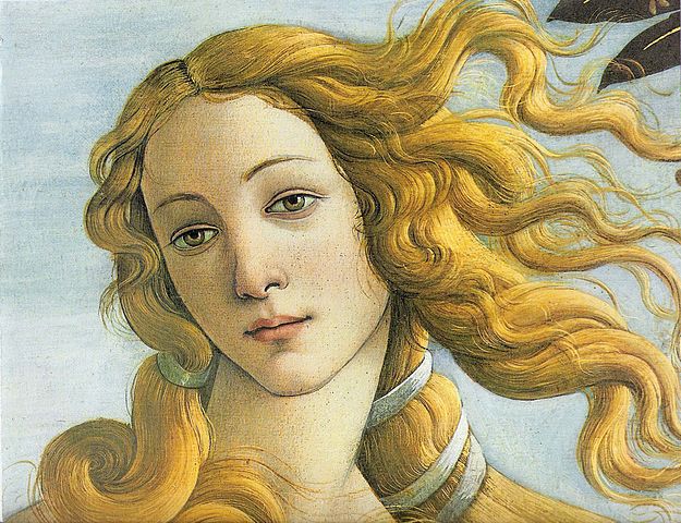
 Erm, well yes, but over the course of four days this March she was not the only redhead to be seen in Florence’s art galleries! Unlike Botticelli’s Venus I arrived (thankfully for all) fully clothed and rather modestly by plane/bus from Pisa on Wednesday 11th before checking in to my dangerously ironic hotel room with a view of Santa Maria Maggiore. Within my first few Florentine minutes I was out heading towards the main cathedral, Duomo Santa Maria del Fiore before being enticed on the way into a local bookshop (how blissfully predictable). 

View of al Duomo from the Campanile a mere 414 steps high!
 
It was a great start though as Florence is particularly known for its abundance in culture in particular its supreme collections of renaissance painting, churches, frescos, marble statues and altarpieces by some the greatest masters of all time. All of which, if I may confess weren’t necessarily things I would have ever expected myself being the slightest bit interested in, despite being aware of their profound importance on the history of art amongst other things. Seeing images of Renaissance paintings in slides and books always tended to bore me; their perceived flatness, dull colours and religious imagery had no comparison with what I considered the excitement of modern and contemporary art with its variety, unpredictability and ‘anything goes’ mentality. A surprising decision then to choose to visit such a place so entrenched with the art history but one I made because I wanted to be proved wrong and see it with my own eyes. I wanted to gain understanding of how this work existed in the context of its own time and yet could still be relevant today. The following is my thoughts, reflections and recommendations of my Florence visit 2015.

Florentine School, Grotesque Decoration (Second Corridor) 1581 -Fresco
 
Starting with the Uffizi, (most notably home to Boticelli’s ‘Birth of Venus’ and ‘Spring’) which hosts the largest collection of Renaissance art in the world including work by Leonardo, Michelangelo, Raphael, Giotto, Piero Della Francesca and many more! Aside from seeing such iconic works of art in person, the lavish, opulence of the interior building of the Uffizi itself and its own history is equally outstanding.  From what info I gleaned it has been open since the 1500’s making it one of the oldest ‘museums’ (in the sense as we know them today) and features grotesque (named after the Roman grottoes in which the style decorations allegedly first appeared) decorations aka Frescos that overlook the vast stretch of corridor. Photographed (badly) above is one example which nearly gave me neck ache (be warned most of your time art viewing in Florence will be looking up) as I got lost in the detail of hundreds of species of birds and flora painted so jewel-like,  delicately yet accurately in a trellis-like wheel. Having recently played what can only be described as too many games of bird bingo with my niece this particular fresco really ‘struck a chord’ and like most paintings in the Uffizi it was genuinely frightening to comprehend just how skilfully it had been executed, with colours that were so bright and clear they were very much the opposite to the lifeless brown faded paintings I’d previously judged based on what I’d seen pictured in art history books. What also surprised me is that when you are faced with so much of this Renaissance work in one place you do also begin to appreciate the differences in style that distinguish a Piero Della Francesca from a Botticelli or a Leonardo; they all have a different way of drawing people, colour palette, composing an image despite working around the same time and with similar subject matter. In fact the Botticelli’s almost begin to look really stylised and incredibly modern when viewed alongside work by other artists of its era. As I left the Uffizi already I was beginning to make connections between the work I’d seen and modern day artists like the Pre-Raphaelites. The links were there if only I began to look...

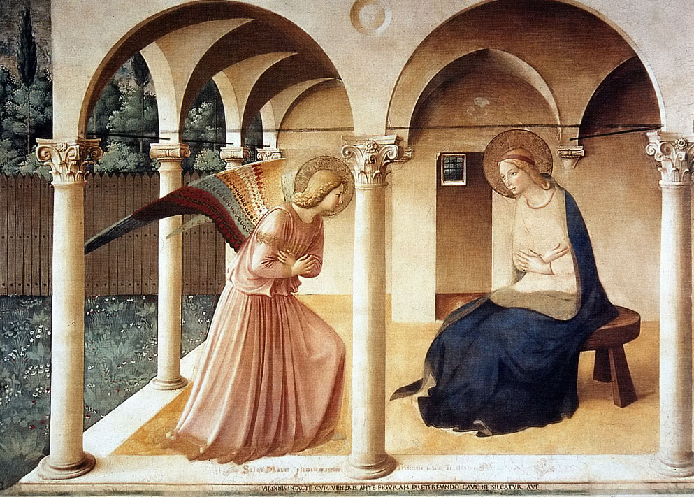
'Annunciation' Beato Angelico 1442ca -Fresco in San Marco

Again, prior to this trip you could fill what I knew about frescos on the back of a very small postcard and whilst I am still a novice when it comes to who painted what, why and when I have certainly seen quite a few now and feel as though I could make some informed observations. Broadly speaking a fresco is traditionally a wall-based image created by painting into wet plaster so that the colours become fixed as the plaster dries. When you see your first fresco in Florence it is a real sense of discovery and awe which doesn’t necessarily have anything to do with the religious imagery it depicts but more a quiet sense of appreciation that comes from the significance of these images to those who painted and viewed them in the time of their original creation in the 13th/14th century. The importance that sharing, telling and depicting stories through art as a means of communication and the search for meaning/spiritual enlightenment  are things which are surely identifiable to all people regardless of faith/religion. The medium and the message of what we are telling may have drastically changed in some ways but the need to be connected to others through shared images/stories and in search of meaning remains the same. It made me wonder if anyone has yet written a book on ‘the evolution of walls as a communication tool from stone age, to frescos, to street art and the now digitised Facebook wall’. Essentially there is a thread that runs through it all, though some historians may be horrified at the thought of likening a fresco to street art and vice versa there are parallels to do with intention behind making the work, i.e why do people feel compelled to paint on walls/in public places, that are similar; it’s just that we have replaced our churches for our urban/natural landscapes, but the basic human-need is still there.

 Going back to Florence however, I have absolutely no knowledge and relatively little interest in the religious scene being depicted in these works but I am interested in how they have a spiritual connection to the need to ‘create images’ and ‘tell stories’. The 15th century convent of San Marco is a particularly good place to start as it features over thirty frescos by Fra Angelico amongst others each in different rooms occupied by the monks within the monastery. It is a fitting example of how the practice of art and image making is so synonymous with a sense of spiritual devotion and awareness that is still as relevant today as the day they were created (or at the very least I don’t think we should forget that it is).

Masaccio 'The Explusion from the Garden of Eden' and Masolino 'The Temptation of Adam and Eve' in the Cappella Brancacci
 
Despite being over 500 years old it is quite uncanny just how fresh and vivid these frescos are upon seeing them in real life. Their soft, warm pastel hues seem to glow against the cold white contrasting surface of the plaster walls. The more I saw, the more I came to appreciate them as paintings both in skill and for their formal qualities. The sense of perspective, architecture and precise, harmonious compositions in which every limb/body gesture, figure, structure is placed in concordance to the overall image is nothing short of mind boggling when one thinks about just how difficult, how skilful an artist would have to be in order to achieve such a feat. They read as paintings compositionally, there is a clarity, a crispness, accuracy and flatness that is highly organised but they are also very painterly; the colours and shapes, illusions of fabric materials, patterns and texture, it’s all there! Somewhat out on its own geographically in the city centre lies the fresco ‘jewel in the crown’, the Cappella Branacci chapel (part of Santa Maria del Carmine). Inside are a series of frescos by Massacio, Masolino and Filippino Lippi depicting the stories of St Peter and are reputed as being on par with Michelangelo’s Sistine Chapel in Rome. High praise indeed, but I think there are aspects to the Massacio frescos particularly that are really quite enjoyably different, for example the figures of Adam and Eve in ‘The Expulsion from the Garden of Eden’ (pictured above) are depicted quite stylised, their faces exaggeratedly drawn, anguished more recently reminiscent in my mind of a Kathy Kollwitz or Francis Bacon. The use of light and dark to create the illusion of shadows and depth was also incredibly sophisticated for its time especially in the way it has been used to create added drama and intensity to the scenes depicted. The more I looked it seemed that so many of the principles that makeup our current visual language were being tested and invented all these years before.  

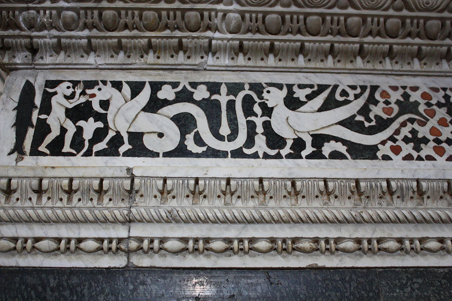
Decorated marble enclosure of the high choir (13th Century) in San Minato al Monte

Inlaid floor Zodiac (13th Century) in San Minato al Monte

Of all the many churches in Florence San Minato al Monte has a lot going for it that sets it apart from the rest. Firstly its views situated atop of Monte alle Croci it is one of the highest vantage points for views out over the city and secondly it has several unique features which are quite quirky and make it so refreshingly unlike the other churches in Florence. With its colourful green and white marble on the outside and painted wooden beams in the interior roof there’s a lot of detail that has gone into this church in particular the marble zodiac floor decoration (pictured above) which is so different to anything I have ever seen in a church, connecting more with the spiritual in the broad sense of the word, astronomy and constellations than necessarily that of ‘religion’. Even more unusual are the strange scenes of creatures or allegorical animals depicted in marble around the choir enclosure (also pictured).  There are also frescos here too of course depicting the life of St Benedict of which almost scene by scene his story unfolds like a film storyboard or comic. There was a LOT to look at here!

'Prisoner (Atlas)' Michelangelo

Without deliberately setting out to state too many of the obvious sights it would be almost impossible to neglect mentioning Michelangelo’s ‘David’ and series of marble sculptures collectively known as ‘The Slaves’ which occupy their own designated wing of the Accademia. As with everything else I had already seen whilst in Florence the reality of seeing the size, scale and amount of craftsmanship involved in producing many of the works couldn’t be more apparent than in this room. Risking possible innuendo, it was all a lot bigger than I had expected and was easier to imagine just how it really did take two previous artists attempts and then Michelangelo two years to complete the marble giant that is ‘David’. Not to be overshadowed though are ‘The Slaves’ a series of unfinished equally sizable marble sculptures whereby the true extent of the process undergone to create finished works like ‘David’ are revealed. You get a much better understanding for the density and solidity of the stone in seeing the variety of marks made from the chisel as it must have meticulously and painstakingly chipped away. Amongst the marks figures start to emerge blurred between resisting the stone that encapsulates them and being trapped within the weight of rock from which they are made. It is a dynamic battle that says a lot more of the process and relationship between material and human hand than the finished marble of ‘David’ which we see as almost this fully-formed vision so perfect in its execution that it is almost impossible to comprehend that it came from such toil from making and natural rawness that is the stone from the earth. The Slaves sort of ground you back to that realisation of the intensity required of creativity and the effort spent working with a very natural material required in order to make these figures surface. All ideas of which are still very relevant today.


...And after all of that if you don’t fancy a little drink of prosecco or two then you’ve not done enough! Head to the Mercato Centrale for the best (and cheapest) bar in town! Ha.

Florence is a serene place. A place of much reflection,  of quietly but magnificent heritage, of dusky yet vivid colours, of hot sun and cold marble; it is both incredibly old but still ringing with the vitality of times past and those who still make the journey to see and engage with it today. I suppose the best way to describe it, for me would be, if there was ever a doubt of where the ‘fine’ in fine art came from then this would probably be it. It has given images I thought I knew well new understanding and ones I thought dull and uninteresting full of life.  


As E M Forster in 'A Room with a view' writes, “One doesn't come to Italy for niceness, one comes for life!” 


Wednesday, 25 February 2015

Here are my Bees,

brazen blurs on paper,
besotted; buzzwords, dancing
their flawless, airy maps.

Bzzzzzzzzzzzzzzzzzzzzzz.......

  
Making tracks: words, footsteps, mark-making, mapping, tracing, beats, rhythm, stitching and time. Somewhere in deepest darkest Devon during the twilight hours in which, I am reliably told, any ideas generally worth having are formed, it was conceived by Frank Edmonds and Stuart Rosamond that twelve artists shall be invited to participate in creating an independently edited, inventive art zine to be published in time with the Spring Equinox, March 20th 2015 at 12.57pm and perhaps more consequently of all, this was remembered the following day from which it was written and said twelve artists were invited to participate in what was to be the inaugural issue of ‘Hive’!

 With the ambition of publishing biannually throughout the year each edition of the ‘Hive’ is guest edited by a different artist who collates the work, binds it and produces the cover plus any supporting content (is that all?!). The editor also sets the theme for each issue of which the first has been chosen by Hive’s co-creator, Stuart Rosamond who has set the seemingly cryptic theme of ‘Track 6’. The brief, that each artist produces a response to the theme, in this case ‘track 6’, on an A3 sheet of paper/surface in any medium of their choosing making either  thirteen copies or originals of their work  and sent to said editor. Each artist as a result receives a completed copy of ‘Hive’ featuring their page and that of the eleven other artists. Consequently by being an independently created form of ‘bedroom lit’ it bypasses the editorial rigmarole and red tape allowing for a more uninhibited set of responses from the artists and the creative freedom such set-ups bring. On an individual level it presents an opportunity to produce new work to the challenge/motivation of a deadline/theme and also a way of both owning and discovering the work of other artists. With plans for the artist contributors to increase each time a new issue is printed and develop a digital archive of ‘Hive’ publications it is something that could hopefully grow wings...

 Those who were ‘deliriously wishing to engage’ in the project replied to an emailed invitation and in doing so the Hive’s first  worker bees (a.k.a artists) are as follows; Nina Gronw-Lewis, Jon England, Anna Newland-Hooper, Malcolm Plastow, Frank Edmonds, Eileen Rosamond, Megan Calver,  Kevin Hawker, Stuart Rosamond, Tim Martin, Ruby Petts and me (Natalie Parsley)!

Personally I have wanted to make a publication of art work or a zine for a long time as it feels a natural progression of combining both my love of books (as a bookseller) and commitment/obsession to continue making art. It also presented an incentive to make work and has already opened up a dialogue with other artists and in turn is beginning to quietly influence the work I make for my ‘drawing a week’ project*. That and it is exciting to work on something that feels collaborative but a surprise at the same time, the reward of course seeing how each of the other artists interpreted the theme.

and honey is art.

At present all the pages have been sent off to be bound and be sent to each artist on March  20th. I’ll keep you posted and reveal exactly how I interpreted the theme of ‘track 6’ (there’s a clue in the picture above) plus an insight into the other artists’ work and any links to an online digitised version of ‘Hive’ here on the blog as it unfolds.  

You have bee-n told!

Buzzing throughout this post in italic are lines from the poem ‘The Bees’ by Carol Ann Duffy
* http://spannerintheworkz.blogspot.co.uk/2015/01/unimportant-somethings-drawing-day-2014.html

Tuesday, 17 February 2015

Site for sore eyes!

Teacups, bronze ingots, a huge boulder and a model fountain don’t at first seem to have a lot in common, nor are they necessarily what you may expect to find in an exhibition responding to the majestic and imposing gardens and landscape of Hestercombe in Somerset, but in that and in many other unexpected ways, ‘Second Site’ at the Hestercombe Gallery promises to be something entirely and refreshingly different. The Arcadian landscaping by Copleston Warre Bampfylde and Edwardian gardens designed by Edwin Lutyens and Gertrude Jekyll at Hestercombe have continued to inspire and delight its owners and public alike since their creation in the 17th century, now visitors have been invited the additional opportunity to experience an alternative perspective in a set of new, surprising and challenging artworks commissioned especially in response to the site and context of Hestercombe House and its gardens....

Jo Lathwood 'Phantoms and Candlesticks' (2015), white cotton and wood

‘Second Site’ opened on the 31st January 2015 in the newly reopened Hestercombe House turned Gallery. With two previous exhibitions under its belt this is the first exhibition to respond directly to the site and context of the house/gardens themselves, curated by Tim Martin and featuring the work of five artists; Patrick Lowry, Megan Calver, Simon Hitchens, Laura Ellen Bacon and Jo Lathwood who between them have diverse practices with experiences of exhibiting nationally/internationally and all being based locally in Somerset or the South West. You'd be forgiven for expecting something slightly spooky based on the shows title and in many ways the house is a bit of a haunting place perhaps as, Jo Lathwood (having spent a residency in Hestercombe House since it re-opened in May 2014) found out as the exhibition inside the house opens with two ghost-like sheets draped over a mock-up of where previously real candlesticks were placed; a physical reminder of a past life of Hestercombe house.Her responses, like that of many of the other invited artists is both a reaction to the inside and history of the house itself as much as the gardens.

 Generally a lot of the work explores bringing the 'outside', inside with current as well as past histories of the house and its uses providing context for the work; in some cases even providing the material from which it has been made. Do expect to be challenged; confused, delighted and exasperated by most of the works in this exhibition, it is not an easy or obvious ride! In fact I read an article ‘Is art best enjoyed in company?’ this morning that commented, “Art is now what religion used to be; an encounter with a mystery, which no one can fully explain and has no purpose beyond itself,” which I think could be said of this and a significant majority of art being made today. If you are open to a little mystery, a little weirdness then you will be rewarded and possibly, like me even learn something you previously didn’t know about Hestercombe in the process.

Megan Calver (from the work) 'Spill' Art Deco cup and saucer, chipped  

On that note, dotted throughout the exhibition on a series of Perspex shelves is a collection of ceramics dating from 1700’s til today. They range everything from a Chinese blue and white tea bowl to a 1970’s squirrel posy vase. There is no comment of ‘high’ or ‘low’ taste/value here with each item displayed on its own Perspex shelf independently with accompanying pamphlet of information on each piece, treated more like artefact than object. Collectively they make up the piece ‘Spill’, by Megan Calver whereby the recorded sound piece of ceramics smashing is played in the stairway/entrance hall to the house. We learn that the sound was recorded in an event which saw the ceramics dropped from the top of the interior stairwell in the Victorian tower of the house by children from Hestercombe’s Centre for Young Musicians. The event prompted by the story and sound of a cedar tree falling in the gardens right next to the house on Valentine’s day last year. The resulting work is both sensitive, with humour and I’m still undecided as to whether it is either blissfully or frustratingly conceptual as is often the case, I find, with Calver’s work in which its strength is in the storytelling and collaborative participation of its audience both in the making and in the interpreting of the work. I like the fact that she is working with old stories of the tree falling and creating new ones at the same time; the children from the music school will hopefully always remember the day they dropped fine china from the top of the stairway at Hestercombe house, it is a fun image and its story will hopefully live on with a time capsule of the broken ceramics planned to be buried in the gardens at the end of the project. In a separate piece Calver has worked again collaboratively with the Taunton Floral Art Club producing wallpaper of a Salvia seed packet, a bedding plant said to be loathed by the garden designer Gertrude Jekyll for its gaudy colour. Yes, you have to really 'work' to unravel this information which is revealed more in the text that accompanies the work than the work itself but when you do its interesting what you learn and in the case of this exhibition generally, it is often the hidden histories, incidental events and slightly subversive stories that the artists choose to bring to our attention. I for one am glad!  

Megan Calver with Taunton Floral Art Club 'Flame' (2015)

Jo Lathwood’s responses begin with the materials and during her time in residence she explored both the inside and outside stripping 15 kilos of copper wire from defunct electrical cable when the house was used by the council/fire brigade and collecting galls from oak trees in the grounds both of which then underwent alchemic transformations resulting in two separate bodies of work. The oak galls were mixed with gum arabic, water and various salts to make a permanent black ink. This ink was then used to create drawings of windows, their view blacked out. Interestingly their creation ties in with the unnerving story that one of the houses previous owners, the Hon Mrs Portman blocked the view from the house to the gardens so her servants could not look out and enjoy the views of the grounds and gardens. In the same room as the drawings the windows too have been blacked out with the same ink, our view of the gardens disrupted in the same way Mrs Portman denied her staff. Subsequently the copper also underwent a similar transformation being combined with tin from donated tankards from Hestercombe staff/volunteers and forged at Lathwood’s forge in Bristol into three bronze ingots inscribed with their maker/date/origin. This is more than just a recycling of materials and becomes symbolically representative of the importance of Hestercombe in all its parts, both its modern and past histories. In the same way that Calver’s ceramics force you to look at the building as you search for them, Lathwood’s work makes you think about the ‘stuff’ it’s made of, the miles of the buildings wire guts and innards made into something compact, something small, precious. The theme of inside/outside, revealed and concealed is present again in the galls from the gardens oak trees brought inside to become ink then brought outside in a representation of a blackened garden view. As Lathwood herself comments, she uses materials and process as ways of luring and engaging with her audience so that the meaning behind the work can in-turn be revealed. Somewhat agreeably I find the products of this labour are more understated in their ability to shout and excite than the often slightly more fascinating methods of their production.

Jo Lathwood 'According to rules and legend' (2015) bronze
Jo Lathwood's oak gall ink studies and experiments in the workspace she used during her residency. 
  
Also in this exhibition, displayed appropriately above the mantel of the fireplace is a painting by C W Bampfylde, ‘An extensive Italian landscape’ created in 1765 its connection to the exhibition otherwise slightly tenuous until you enter the adjacent room. There, visitors discover a life size replica of the Victorian fountain on the terrace of the gardens below, the ‘outside, inside’ again a reoccurring theme (pictured below). The fountain’s top tiered basin becomes a plateau on which a miniaturised model landscape sits complete with cow, people, trees, assorted plants, a turret, water and boats. Typically I unintentionally navigated the exhibition in the ‘wrong’ order (if it is even possible to do such a thing) missing the Bamfylde painting entirely as I passed it via a different doorway so amusingly it took me a while [completely of my own fault] to realise that this scene was in fact a painstaking recreation of Bampfylde’s painting in the other room (eureka)! A delightful moment of realisation later and I take pleasure in comparing and analysing the two. It is a clever way of drawing attention to an otherwise fairly ‘brown’, typical old painting of the likes I’d never really (rightly or wrongly) give much time to and sentimentally reminds me of a ‘transcriptions’ project I did during college where we did a similar thing. Lowry’s version titled ‘Arcadia’ after the Arcadian style landscaping Bampflyde brought to Hestercombe is playful in its own challenge of modelling of Lowry’s landscape where the scale and time are much more under the artists control than that of Bampfylde’s larger feat of landscaping of the grounds themselves. Funnily the two are not that entirely different acts just on different scales and materials. Out of all the works in the exhibition it is probably one of the more joyous and accessible in its conceptuality although I still do not quite understand why it has been presented on its fountain pedestal as to being installed in situ, one of the houses alcoves/windows for example? Lowry is known for life-like interventions which challenge people’s perception in public environments and whilst the fountain in itself is interesting I personally feel it is a little superfluous to the model itself which doesn’t really need or benefit from it other than being a glorified plinth to view it on.

Patrick Lowry 'Arcadia' (2015), mixed media

If you were thinking, what this exhibition is missing so far is a great big lump of rock then Simon Hitchens provides the answer in the form of an impressively excavated 9ft tall chunk of limestone sourced from Westleigh quarry somewhat slightly arrogantly and confrontationally plonked in the middle of the lawn on the approach to the house; one side left natural the other (facing the house) painted white. I get the fact that the stone is the same as used to build the house and that in its raw state stone can be beautiful and sculptural, but with this piece it feels too ceremonially placed to fit-in and yet too natural and unfinished to really stand out. Hitchens does though often work with dualities so that comment may not be as dismissive as it first sounds with the works twin, inside the house in the form of a cast looking back on its originator from the view through the window it faces. Positive and negative are presented, figure and sarcophagus, man-made – natural etc. The affect is ghost-like as the title of the lawn work suggests and does raise interesting doubts on the origins of the boulder, seeing its trace in the cast we start to wonder if the stone on the lawn is in fact a fabrication by man or naturally mined from the earth. The problem for me is that the sculptural works don’t really do a lot for me, as I feel they are dealing with previously explored ideas in a medium that has possibly reached its limits of potential. The more successful work, in my view, is the video piece ‘Genesis’ where the relationship between man/nature, man/material works connects more readily with the viewer. The film depicts a mountainous landscape scene with a large boulder in the foreground which slowly appears as though to inhale and exhale in timing with the sound of the roaring wind. It made me think about how the wind, the rain naturally sculpts stone by slowly eroding it away as well as the bodily connection rocks can  have to human form in scale/mass, their texture and/or porous surface also sharing bodily-like associations. Maybe the piece on the lawn is saying similar things, but for reasons that may be quite subjective to my own opinion it is definitely not as engaging. 

Simon Hitchens 'Genesis' (2014), HD film, 12 minutes looped
 
Lastly, Laura Ellen Bacon presents ‘Occupied’ a willow woven installation of organic arching, curvaceous forms that appear to cocoon, attach and spread themselves along a wall and towards the windows in one of the rooms. It does indeed, ‘occupy’ the space both inviting the viewer to walk around it, in it and explore. There is a great marriage of craft, skill and artistry at work here, but for me it is disappointingly not as immersive given the opportunity of the space, as a previous commission of Bacon’s seen at Barrington Court last year.

 Second site isn’t what you expect it to be and in doing so uses the element of surprise to its advantage showing its audiences contemporary and new perspectives on the house and gardens of which people who live in Taunton like myself, may have previously been all too familiar. The variety and inquisitive rebelliousness of artists exhibiting ensures there is much history and discovery unearthed in its use of wit and processes that range from storytelling to the sculptural. I’d love to have seen some more 'messy' work, by that I mean something more expressive possibly, as at times it runs the danger of being a bit emotionless, or a bit too cerebral; that saying in context to the abundant flamboyance of the gardens themselves maybe it doesn't need to be.


Second Site is on at Hestercombe Gallery until April 12th 2015

Thursday, 5 February 2015

Tool Order/ Occupational Hazard!

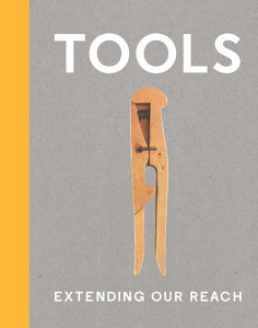
Ah, the unexpected benefits of working in a bookstore! Whilst browsing various arts publishers’ catalogues for new and future releases I discovered a book titled, ‘Tools: Extending our reach’, the accompanying publication for the exhibition of the same name at the Cooper Hewitt Smithsonian Design Museum in New York. A fantastic find, as I have continued to collate various tool related research on the blog since finishing my degree (which, you guessed it, focused on tools as subject matter). Collectively I probably have already amassed quite a broad archive of tool related artists, exhibitions and their cultural, historical associations and am unsure if it has purpose other than as a growing resource for future use or for anyone else researching the same thing. Visually, at least, I do know that it fuels ideas for future drawings/ways of looking at tools themselves (but more on that later). In the unlikely event of being able to afford to go to the states to see the actual exhibition, the catalogue is pretty much the next best thing!  


The Cooper Hewitt is a design museum so as you can expect that there is much emphasis placed on the idea of ‘function informing form’ (and vice versa) with over 175 objects chosen for this exhibition that aims to represent a fraction of creations humans have ‘devised to engage with the world’. However the curators have been quite broad and questioning in their choices of defining ‘what a tool is’ describing them as ‘virtually anything that aids us in accomplishing a task’. This opens the enquiry to everything from the earliest known flint tools, to fishing hooks, spears, maps, telescopes, gloves, needles, clothes pegs, common modern hand tools; to artificial hearts, prosthetics, laptops and robotic bees*! Their modern day counterpoints; technology such as Smartphones contain many of the functions and applications of tools themselves but in a digital format/programme, which in turn is changing how we interact with the world; how we produce food, how we build and create, but also how we interact with each other (in both cases arguably not always to beneficial effect, indeed more technology has often led to creating of new problems that in turn need solving). Although there is an appreciation in this exhibition of looking at the old in order to inform the new, with the seemingly simplicity of a wooden abacus being as valued as its modern evolution of a calculator or a Marshall Islands stick navigation chart being the predecessor of the contour lines and routes of paper mapping. Sometimes the modern design is even trying to replicate the simplicity for purpose found in ancient objects such as a Neolithic hand axe being the inspiration for a similar shaped modern chef knife for chopping.

Hand axe from the Contemporary Flint Tool Design Series by Ami Drach (2011)

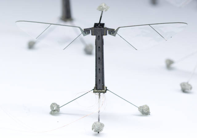
*The Robo Bee (2012); designed to have 'the capacity to artificially pollinate flowering crops, participate in search and rescue missions, act as environmental sensors or conduct covert surveillance.'

As the curators Cara McCarthy and Matilda McQuaid outline in the opening statement introducing this exhibition “[tools] are often equated with technology and engineering, but many acquire meaning through aesthetics, the economy of their design, the cultural significance of their materials...” In an attempt to create awareness of the breadth of how/why tools are made, the curators have divided them into seven categories: work, communicate, survive, measure, make, toolboxes and observe. From what I gather this virtually covers all aspects of life (medicine, food, shelter, clothing, communication, trade etc.) and if you take only one thing away with you from this exhibition it’s the understanding of just how vast the range, creativity and industriousness of tool production has been and continues to grow and evolve at incredible pace. Any ethical, philosophical, psychological or environmental judgements to be made on any of these objects or adversely the effects that they may/may not be having on us and our environment are largely left to the imagination of the viewer in favour for more dialogue on the design, aesthetics, engineering and functionality of the tools presented. This is where having more tool related work by artists as part of this exhibition would have perhaps prompted some of those debates and alternative ways of understanding the cultural, sociological, political and environmental applications of the tools and people who make/weld them. I am being unfairly ambitious in my expectations, but there has yet to be a tool exhibition that covers all aspects of both design, history and their implications on the world. Thankfully the inclusion of the Mexican artist, Damian Ortega’s ‘Controller of the Universe’** a suspended installation of hand tools in the form of an explosion [images found on link below], is at worst within this particular exhibition a dynamic, fun piece of marketing eye-candy but at its best suggests an alternative way of looking at tools, “they extend our body’s ability to do things and at the same time come between us and our direct experience of the action”.


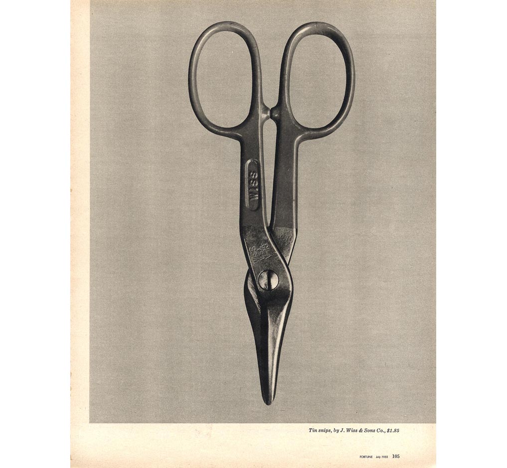
Walker Evans 'Beauties of the Common Tool' 1955 Gelatin silver print 25 x 20.2cm.
"Ultimately, what Evans valued was the design, the construction that resulted from the maker's understanding of function, efficiency of form, and material." 


The highlight of the exhibition catalogue for me was discovering the photographic prints of everyday hand tools by American photographer Walker Evans [1903-1975] who produced the photographic essay 'Beauties of the Common Tool' in the 1955 issue of Fortune magazine. He described hardware stores as "offbeat museum shows" and I couldn't help but notice the connection that these images have to the printmaker Jim Dine's treatment of presenting tools in a state of static isolation (around the same time). The similarity is exciting if a little uncanny. Nonetheless it is very interesting to think that other artists were thinking/noticing and perhaps even responding indirectly to each others work/similar ideas around the same time. Whilst Dine's tools are imbued with an emotional intensity these have an analytical intensity to them in which every detail, their shape, patina and material are really prominent. In a way its as though they are more real than the tools themselves which is a concept worth more attention at another date.
The fact remains that tools are progressive and innovative objects, ‘designed to bring about change’ and as much as they are about creating they can also be about destroying which symbolically for me in my art, they share or act as a metaphor for a lot of the values I associate with art as a subject such as ideas of creativity/destruction, potentiality, alteration and disruption. In the same way tools as well as art have the means to expand our everyday limitations of experience/perception/interaction with the world. I have long speculated why I hold a fascination with drawing tools, but am beginning to think that the intensity invested in drawing these objects has always been an attempt to emphasise the reverence and importance I place not upon the tools but the tools as a symbol for art itself. That still doesn’t account for why I draw certain tools over others, I speculate that maybe I see similar qualities in the hand tools I choose to draw with qualities/traits I see in their owners or perhaps even myself. In that sense maybe they become more like portraits? I’m still undecided, but I'll enjoy finding out.
-Damian Otrega ‘Controller of the Universe’
-For more tool related art, see Mao Tongquiang ‘Tools’


'Tools: Extending our reach' is on at the Cooper Hewitt Museum, New York until May 25th 2015 and if you can't see it then its well worth getting the catalogue!