Showing posts with label Jim Dine. Show all posts

Wednesday, 9 December 2015

"I have gone where my passions have taken me."

Some blog posts are a chore, most a pleasure and then there are some which feel so significant, so important and so personal that writing them becomes a different experience entirely. This post fits into the latter and in its expectation and poignancy in influencing my own art practice has meant that collating my thoughts into writing this has been a slightly daunting process to begin!

I was the first to arrive. (Of course!) I’d booked my ticket in advance and arrived early as I’d never actually previously ever set foot in the Chelsea school of Arts, London. Luckily though through still looking like a student (I’m told) and some misguided snooping-around I had somehow found my way to the Banqueting Suite; a fairly grand wooden panelled room with large windows and ornately carved fireplaces that was originally part of the Royal Army Medical Corps officers’ mess. Now to wait...

I was there to listen to one man, possibly the most influential artist on my practice (and who should need no introduction to those familiar with my work). The date was Wednesday November the 25th 2015. The event, ‘A Conversation with Jim Dine’.   

The Banqueting Suite, Chelsea School of Arts London
Hosted by printmaker and Professor of Fine Art at UCA, Paul Coldwell, the evening was set to be a conversation into Dine’s practice, focusing mostly on his printmaking but also setting the context of the diversity in his practice; from the 60s origins in New York experimenting in performance art alongside Allan Kaprow and Claes Oldenburg to the artist’s recent ongoing print series, a History of Communism. Now turned eighty, Dine’s career as an artist has spanned, drawing, painting, performance, sculpture and printmaking. An artist who defies categorisation but who has and continues to make work that is deeply personal and intense using his own developed set of iconography that includes, tools, heart motifs, bath robes, Pinocchio and birds. In my own work, Dine’s tool drawings and prints have been a significant influence in both the importance and intensity I place upon the process of drawing, the choosing of tools as a subject and how I depict the objects [tools] themselves in the work.

In addition, Dine has always made numerous self-portraits and for those not familiar with these and his appearance, visualise, a more intense-looking version of Terry Pratchett minus the hat! I say this in reverence, for I was sitting as close to the front as I could get, minus the VIP rows (reserved largely, it would seem for the unfashionably late). The anticipation, for me at least, was immense!
  
Walking Dream with Four Foot Clamp (1965) Oil paint, charcoal & steel on canvas. 1524 x 2743 x 29mm


The evening began with a question from Coldwell asking Dine to give a flavour of what life was like during the 60s in New York; the beginnings of Pop Art and ‘Happenings’ performances. Dine replied that New York was without art collectors, dealers and gallerists, it "was a world we made ourselves" and quite literally in some ways with many of the performances including self-made sets and props from cardboard and found objects. He spoke of the ‘need’ to make work with Claes Oldenburg in what was a collegial atmosphere between the artists. It set the tone really for what became and still is the working ethos of Dine’s mentality to making art; prolific, bold and drawing upon the technical knowledge of others. The performance made-way for frenetic, gestural mark-making and has been the visual handwriting of the artist throughout his career. His work is charged with a psychological need, what could be described as a cathartic outpouring in the desire to make work and express oneself. Later in the conversation he stated, “I need to work with my hands...its physical for me”. 

Dine’s answers at this point were relatively short and matter-of-fact as I got the sense that they were questions he’d been asked many times before, but were in-part necessary for setting the scene. Although Dine didn’t continue with performance as an art form after the 60s, the qualities that came from the early happenings never really left Dine’s work, with some of the ideas about using everyday/found objects staying within the work and more significantly the way in which Dine continued to depict tools/inanimate objects as though they were ‘alive’ often positioning them erect as though standing or at other times framing the image as though they were substitutes for actors on the stage. Some of the aspects of 'performance' remained.

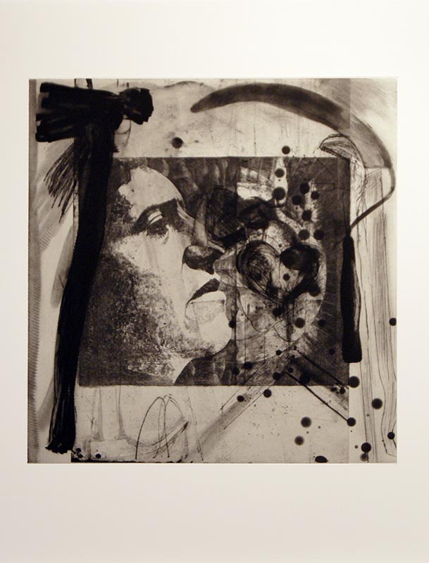
Elyria (2000) Charcoal on etching felt. 104 x 129.5cm.
Dine became more animated when talking about printmaking processes and drawing. Stating how he felt that when he tried silk screen whilst he was living in London, that the mechanical ‘flatness’ took what he called “...the life out of it”. As if to say that etching and lithography offer a much more hand-drawn type of mark. He went on to say that, “Drawing is part of everything for me.” This is evident in his painting and even his sculptures which are as carved, angular and often feature the same type of harsh, hatched mark-making as the prints. From my perspective this was probably one of the most affirming quotes of the talk and echoes a belief I have long had toward my own practice, that nearly all visual thinking and creativity begins with drawing and that the more successful sculptors, films, performances and installation begin with some sort of drawing within their development. And for some the ‘drawing’ even becomes the work itself. Drawing is an embodied process and there is something of working with hands for drawing that is similar to working with the hand tools Dine depicts.

Tool Box 10 (1966) Screenprint on paper 603 x 478mm.
Many times throughout the evening’s talk I had the impression Dine was an artist that was very ‘real’, honest and not a fan toward some of the over-intellectualising of his work. This is refreshing and in-fact most times I have heard any artist talk about their work, they are nearly all often demystified as not being as academic and analytical about their own work as often reading about them alludes to. In part Dine’s compulsion to draw came from he admits his own dyslexia and that drawing was a way of expression without words. He said that it also helped him be able to work backwards, naturally, a skill useful in printmaking.

Dine spent many years growing up and eventually working in his Grandparent’s hardware store, which inspired Dine to use tools in his art. In what John Russell describes of Dine’s work: ‘Daydreaming amongst objects of affection’. Prolific in his depiction of many of the tools found there, the tools became a familiar iconography/trademark of Dine’s work. The tools reoccurring so frequently and with such intensity that Dine himself has stated they became self-portraits. The conversation moved to focusing on Dine’s ‘Winter Tools’ series of hand coloured etchings. Coldwell stating that these works have been said to compare to ‘Degas’ Ballerinas’ in their delicate line work and intent of placement within the ‘frame’ of the page. Described by Coldwell as, “Objects of desire/more alive than human”. They very much have a feeling of movement and life to them despite obviously being inanimate objects. The former statement met by much amusement to Dine, who tended throughout the eve to be very sceptical and apprehensive of interpretations of his work generally. I like his response better, “These tools are dignified...developed by guys who worked with their hands.” In many ways that’s what I’ve always been interested in too; there is a reverence and life of potentiality in tools as objects, their past histories and future possibilities charging these objects with a sense of purpose and in doing so shouldn’t be taken for granted.

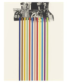
[No title] From 10 Winter Tools series (1973) Lithograph on paper. 707 x 558mm.

Previous to this talk I hadn’t been that aware of some of the techniques and methods Dine uses to create his prints. He treats his plates like drawings, like paper. Speaking of the malleability of print and erasing as a way of drawing with power tools to sand/scrape back through layers in what was explained by Coldwell as, “...tension between classical print making and more urban approach.” Which slightly conflicts with the ‘hand drawn’ nature of some of Dine’s previous comments to which I suppose he still sees using the power tools as a way of making marks on a surface just not with a pencil or charcoal.

Braid (1973) Etching. 85.9 x 40.8cm.
Another aspect of Dine’s practice that I had previously mentioned earlier was that he is dyslexic and early in his education Dine used drawing was a way of communicating without words, a means of expression. This became apparent when the conversation turned to discussing the print ‘Braid’, Coldwell prompting discussion with the question, “Why write what it is?” To which Dine replied, “... it was about not having the confidence of being understood.” And even quite openly commenting in a good humoured, rather than remorseful way that, “It [the text on the print] is kind of dumb...I am in your face.” I definitely don’t think something has to be recognisable in order to be understood, instead this is an insight into some of the insecurity that perhaps Dine and I expect many artists feel in ‘wanting’ to be understood and have ones work understood by others (I've done the same thing myself in the past). Dine has always had links to poetry and words within his work and in nearly all his work there is an importance placed on the ‘recognisability of things’. Hearts, bathrobes, plants, tools are distinctive in his work but often semi-hidden or surrounded by intense, frenetic mark-making. It’s as though he is not content with being purely abstract and needs form to work from. Dine remarking that his ‘heart’ motif in many paintings/prints is simply a means of “something to hang the paint on”. As the viewer I want these hearts, tools etc. to mean more than perhaps Dine lets on, but at the same time I admire his tenacity to not want to over-complicate his work with his own brought meaning. Maybe much of the way these objects are represented owes something to Pop Art (though Dine may be reluctant to admit it) as there is a clarity, almost advertising-like way of presenting these familiar objects. 

A History of Communism (2012) Lithograph.
The evening ended with a discussion on Dine’s on-going series of prints titled, ‘A History of Communism’ made from reworking lithograph stones found in a former Socialist art academy in Berlin. Previous made work by print makers is added, edited and worked over by Dine who stated that he saw these works as, “landscapes” and as Coldwell observed that in these prints the tools really do become animated and like actors on a stage.  Dine references Pinocchio, a character often used in his work for its storytelling quality of what he calls, “a stick coming to life” which is in many ways, as I learnt this evening is a reoccurring idea in all his work. Coldwell notes that in the reworking of these stones that there is a contrast with the new life placed into these works with, “the deadening of the original lithograph”. Is it sacrilegious to appropriate/work into another artists work in this way? We don’t know the reasoning why some of these stones have been abandoned for many years by their owners particularly when it was created under conditions as repressive as those in Berlin before the wall came down (they’re estimated well over 25 years old). If anything the process is almost archaeological and their alteration reinvigorates them with new life and preserves them in a way they had previously gone unnoticed. The addition of tools and other imagery certainly adds a sense of the historical, the political and the confined which is also interesting given the circumstances when which these stones were originally worked into. Many artists may be offended at the idea of reworking someone else’s work but in this instance, I couldn’t think of anything more liberating and more flattering.  

After the talk had finished the audience were invited for drinks in the Green Room next door with the man himself. I’m delighted to say I got to meet him, but less so that after all my hype and anticipation, had absolutely nothing intelligent to ask or say! The evening wasn’t necessarily anything radically new or ground-breaking but reaffirmed many of my thoughts on the importance of drawing as a means of expression, the significance of a sense of life in inanimate objects, Dine’s commitment to his process/learning new techniques and above all his testament to shaping his career by following his passions/interests.

Sunday, 2 August 2015

Tales From The Tool Shed

Is Facebook supposed to be educational? 'Bored Panda' anything other than amusing procrastination?! Imagine my delight logging on to my Facebook account to find amidst the usual shower of cat photos, political garbage and relentless invitations to play candy crush saga (NOTE: I’m still not interested!) something that was actually, amazingly, inspiringly and, somewhat vainly, relevant posted on my wall! THANK YOU!!

 I was so excited to learn about the work of artist, Lee John Phillips and his ‘Tool Shed Project' that I felt compelled to spread-the-word further here on the blog.     

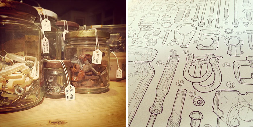
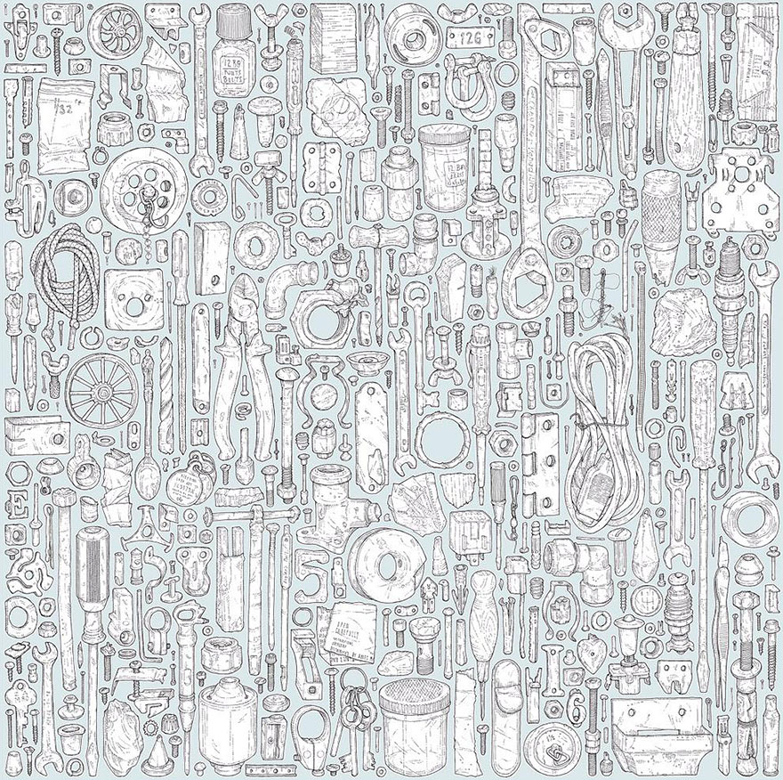
 “Talented artist Lee John Phillips has undertaken a project of epic proportions to celebrate the memory of his late grandfather. Phillips estimates that it will take him about 4-5 years to draw all 100,000+ items left behind in the shed by his grandfather, who passed away roughly 20 years ago. Everything from large tools to jars full of nails, nuts and bolts will be covered!”
Lee John Phillips 'Tool Shed Project' *

Lee John Phillips 'Tool Shed Project' *

Meanwhile, elsewhere, “Not so talented but passionately curious” artist, Natalie Parsley (that’s me) has also been drawing her late Grandfather’s tools estimating it may take between four and five hours to draw the chosen few, picked seemingly at random, but actually via a highly discerning process of aesthetic elimination (in other words I draw what I like the look of)! Saws, hammers, clamps, bill hooks, pliers , keys, spanners and even the occasional nail or bolt. I jest, but on a serious note there is something uncannily brilliant about the discovery of another artist working with drawing tools in a similarly obsessive manner to myself as I have previously done and most recently on the ‘Drawing a Day’ projects from 2013 and 2014.

It is also interesting to analyse what motivates other people to take on these sorts of projects and how there is a reoccurring theme of cataloguing tools of which the aesthetic is of huge appeal to me. I speculate my love/appreciation for order, systems and archiving comes largely influenced from working in a bookshop, but I think that psychologically there is something bordering on compulsive versus the meditative and reflectively endearing about painstakingly ordering, sifting through the items left in Phillip’s Grandfather’s tool shed that is both cathartic and a touching tribute.

“Phillips has been numbering each object in his meticulous project, and has drawn nearly 4,000 at this point. He has spent so much time drawing recently that it has taken a toll on him; “I already have to have physio for the toll it’s taking on my body. About 5% done so far!” he writes on his Instagram."

Experiments with Tool catalogues, labels etc. during my MA.  
Detail from 'Kaye's Tool Kaleidoscope' (2011) Natalie Parsley 

I’m in pretty good health, or at least can honestly say that my art has never physically damaged me (mentally, more likely!) in some way other than fatigue, the odd paper-cut  and I  wouldn’t yet speculate the untold damage years of graphite, turps and varnish inhalation may have caused on my system. Ahem, none-the-less this doesn’t pay dividend to my commitment to drawing and particularly my history of drawing tools. In recent years the tools in my own practice have taken more of a backseat but their influence has been present in other ways either in; drawing similar hard-edged/sculptural objects OR drawing something completely different/opposite to tools i.e. softer/more organic things such as plants, animals, insects. In this way, I had something of a revelation when I realised that my ‘long time art hero’ Jim Dine has explored plants and tools as well as plants with tools in the same image. This is an important distinction as I feel that Dine’s intention in doing this is in order to provide a contrast and a greater understanding of the properties and formal qualities of tools and plants respective. For example, you cannot appreciate, or comprehend the solidness and weightiness of a tool until you know how to capture the lightness and delicateness of a plant. That sounding more Buddhist than it perhaps should, but I am beginning to think that there is possibly, to my mind nothing more enlightening, more revealing than drawing both in terms of perception and personal solace. Recently I have been drawing a lot of plants, but then conversely almost craving to go back to drawing tools with a renewed fascination and attention.

From the 'Drawing a Day Project 2014-2015' Natalie Parsley

From the 'Drawing a Day Project 2014-2015' Natalie Parsley

I will post more of my recent work soon, but want to give it an opportunity to be first seen away from the internet before I reflect and document it on here. Watch this space...! 
Going back to Phillip’s project however, I admire the detail in which he draws each object individually ever perhaps slightly daunted it is part of a much bigger body of work. It has taken me years to appreciate noticing the unique patina each tool bears, the sign or trace of the person who wielded or possessed it. This makes Phillip’s project very much unique, in the same way a portrait is. This project is very much a portrait/tribute to his Grandfather and gives the project more meaning than just becoming pleasing wallpaper. Looking back on my early work, mono prints of tools I missed the opportunity to capture some of that uniqueness that is present in each individual tool. Rather than being an illustration or documentation of tools, I am almost reluctant to admit in the early days my tools had always been more about me, the tools almost a redundant shape on which to hang expressive mark making and intensity. I say 'reluctant' because I do not see myself as an ego driven artist so it feels difficult to contextualise my work within a personal viewpoint. The last few years have been about looking more closely and I’ve grown slightly more patient and with that has come a more conservative and conceptual treatment of tools. There is a slickness and clarity of purposefulness to Phillip's project that I sometimes lack in giving my work a truly professional or contemporary edge. Ultimately my aim is to find a middle ground between the early tool work and my new sense of intention and focus. In recent years my outreach to the art world and public place within it has wavered but my commitment and curiosity have remained.  The fight against the darkness is truly never ending?!

Natalie Parsley (2015) Mono print and ink on paper.

More of Lee John Phillip's Work and further details of the 'Tool Shed Project' can be found at:

Sunday, 12 July 2015

Post Lozano

  If she were alive today would Lee Lozano be a blogger? I’d like to think so, as at the very least I think the medium would have been deeply interesting to her, its occupation with the ‘global audience’, exposure for the written word and debates on censorship and what constitutes public/private in an age when almost every aspect of people’s lives is documented online.  
 
But where are my manners?! Few people I know have ever even heard of the artist, Lee Lozano and to some extent that is exactly  what she wanted, self-creating her own infamy with a body of work titled ‘Dropout piece’ whose primary aim was to reject and create self-anonymity from the art world.
 
“She became competitively uncompetitive, ‘I will not seek fame, publicity or suckcess.’ That single declaration remains the cleanest summation of what Dropout Piece is actually amounted to: a total disengagement from all professional art world ambition.”1
 
In succeeding to do so, but still continuing to work privately and continue her practice (in the form of copious notebooks of thoughts and experimental performance pieces) she inadvertently created a legacy in the art of self-oblivion. Born 1930 in New Jersey she graduated philosophy and natural sciences before marrying and in four years divorcing, architect Adrian Lozano whilst studying towards her Bachelors in Fine Art. In the 60s she moved to New York befriending artists such as Stephen Kaltenbach and Carl Andre in which increasingly, due to the likes of artists such as Michael Heizer and Robert Smithson, the art was beginning to emerge outside the institution of the gallery/exhibition space. This was to be influential in the development of Lozano’s later performance and conceptual pieces.

IMAGE 1. Lee Lozano Installation view of the ‘Wave Series’ (1969) oil on canvas.

  It is a compelling mystery that she is so unheard of given the prolific nature of work she actually produced. Her decision to disappear from the art world was not made out of apathy or an act of attention-seeking but a rebellion, a protest piece against the disillusionment and superficiality of the art world. Additionally it was met with shared adversity amongst many of the artists Lozano associated herself with along with the anti-war protest and feminist movements in America at the time. Prior to ‘Dropout Piece’ Lozano was gaining recognition for her series of large ‘Wave’ paintings that share a similar flat, minimalist sense of abstraction and use of colour to Barnett Newman (IMAGE 1) but becoming increasingly frustrated at the schmooze-filled pomposity of the art scene and after undergoing an extensive period of psychoanalysis she revolted against ‘expectation’ and resorted back to her earlier ‘word’ works; conceptual pieces handwritten in copious notebooks. This almost cataclysmic shift to something different in her practice, I feel has so much in common (but so little written about it) in relation to Philip Guston’s own choosing to retract from his success in the art world as a abstract expressionist painter to pursue his own path, his own re-invention as an artist. A bold thing to do and one that is not without risk nor always successful. Lozano herself very aware of the pressures and expectations put upon artists by both themselves and, more significantly for the motivation for ‘Dropout piece’; the expectation that the art world places upon the artists it is so reliant on. Lozano expresses this quite honestly and refreshingly defiantly at a lecture she gave on creative production,
 
“For example, what is expected of any artist or any creative person, as opposed to what really happens? Everyone knows that an artist’s best work often covers a very short period of time, yet the artist is expected to function on a high, high level of performance at all times. And, if an artist does very good work at one period in life, he or she is always, actually competing with their own great period of work. It’s almost very rare that an artist does high quality work and maintains this great period throughout their career. Yet it’s expected of him.”2
 
Prior to any of this however she had been making drawings, gestural paintings and caricatures of tools, screws, nails, flexi-pipes, sharpeners and mechanical objects which she collected off the streets and her ‘former’ studio floor (IMAGE 2). And for me, personally, it is her tool work made between 1964-67 that is particularly interesting...
 
IMAGE 2. Lee Lozano ‘Untitled’ (1964) Graphite and crayon on paper. 23 x 16”
 
IMAGE 5. Lee Lozano ‘No Title’ (1963-64) graphite and crayon on paper. Dimensions unknown.
 
In her series of tool drawings and large paintings tools are depicted with great intensity, often in extreme close-up with a very physical use of mark-making.
 
“In Lozano’s hands, screws are no longer a neutral means to hang a painting or set a bookshelf but rather explicit euphemisms of sexist logic: anthropomorphized machines aggressively screwing in and out of each other in acts of overdetermined functionality, regardless of pain or pleasure.”3
 
The concept of anthropomorphising tools being one reason I am interested in Lozano’s work,
 
"Given life they automatically become frenzied beings – clamps, pliers, screwdrivers and hammers fondling and struggling with each other in a kind of dangerous courtship."4 (IMAGE 3)
 
IMAGE 3. Lee Lozano ‘No Title’ (1963-64) graphite and crayon on paper. Dimensions unknown.
 
In my own work (IMAGE 4) the tools I depicted were nearly always unconsciously in groups or sets. I like to think this was a compositional decision; that the positive and negative shapes created by layering/overlapping the tools more interesting visually than drawing them statically or in rows. However, the large scale and intensity with which I drew them dictated otherwise, making them often more intimidating or, similarly to Lozano personified in some way. Tools are objects of character, their patina giving them unique surfaces and whilst I did not directly respond to imbuing them with the courtship and coupling in Lozano’s drawings I accept that other people could read into them in this way. If anything it makes me want to make new work that specifically explores these ideas. 'Tools and their relationships'! Ha!

IMAGE 4. Natalie Parsley. Tools 2. 2008. Oil and gloss mono print on paper. 250 x 220cm.

 Lozano’s tool works aren’t exactly comfortable viewing aside from the fact they aren’t always particularly accurately drawn, their composition of being squashed and almost perverse intimate close-ups of these familiar objects that creates feeling of claustrophobia or threat; met with the large scale of some of the paintings,
 
“The huge formats of many of the Tool Paintings give these dynamic images an overpowering forcefulness.”5
 
These are paintings that intend to intimidate and are as aggressive as they are sexually direct and full of double entendre and masculinity (IMAGE 5). In their exaggerated extremity they also have many parallels with comic books that both influenced Lozano and whose word-play inspired her written pieces. But the fact Lozano is a woman depicting these heavily masculinised objects with equally masculine connotations gives them a sort of anarchic sense of taking claim or ownership of them.
 
"Lozano’s early work was irreverent and unabashed, propelled by an overt and oversexed drive to misbehave as much as possible for a woman in the early 60s."6
 
As a woman myself, conveniently, who has depicted tools in her art for many years now it is incredibly liberating to discover Lozano’s tool work as it openly challenges stereotypes and throws an interesting perspective on my own relationship with tools that had previously, relatively gone unconsidered.  Perhaps being in a more liberal age of equality than America in the 60s I don’t see gender-equality as much of an issue regarding my own work in the sense it isn’t driven out of a desire to protest or misbehave but none-the-less after spending the majority of my tool-based art career looking at the prints of Jim Dine it is refreshing to counterbalance this perspective with a female artist. Dine and Lozano’s drawings have a similarity in their intensity of looking and use of drawing as a means of expression and almost cathartic ‘drawing-out’ which I too have frequently referred to in my own practice. This and the fact that each of them underwent bouts of psychoanalysis is evidence that there is more that unites the likes of Lozano and Dine other than just in their representation of tools.

Lee Lozano ‘No Title’ (1964) oil on canvas (two parts) 275.2 x 168.5 x 5.2cm.

  Where Lozano differs, is that Dine’s tools are relatively more static but ‘sexually’ charged by the mark-making that surround them (IMAGE 6); Lozano’s tools are cropped so that the moving-parts of the tool, the parts with teeth, which cut, which flatten and squeeze are amplified so have this feeling of being  more menacing, at times perverse and certainly more physical. In a precursor to Sol Lewitt, Lozano wrote her own list of verbs and used these ‘doing’ words as titles for her tool paintings, further underpinning associations with action/use.  
 
In my own practice an ongoing thread has been the idea that the function of objects is to be ‘put to use or be possessed’ and my MA explored someway into unravelling what it means to ‘use’ a tool and/or ‘possess’ one. Specifically I was interested if drawing could be a form of use and possession largely fuelled by a quote by Jim Dine who of his tool prints stated, "I wanted to possess them and what better way to possess them than to draw them"7. Whether Lozano was trying to possess them or not she was encapsulated in a form of ’Tool Mania’ and possessive lifestyle mixed with periods of casual and heavy drug-taking. It was as though she was seeking of ways in which to escape reality and thinking through frantically making work,
 
"...concerns shaping her practice, involving intimacy and exposure, the incommunicatability of living in your head and the psychological state of possession, whether taking possession or being possessed."8
 
IMAGE 6. Jim Dine ‘Untitled (C Clamp)’ from Untitled Tool Series (1973).
 
The idea of ‘incommunicatability of living in your head’ struck me as yet another example of the similarities that Lozano’s tool drawings have to Guston’s later works (IMAGE 7). They share the similarity of being inwardly bodily; ‘living in your head’ which Lozano conveyed with her treatment to thickly apply paint like a skin and make marks with a frenzied intensity, expression and physicality that are comparable to Guston’s fleshy, skin-crawlingly pink, eyeball filled figures. A depiction of what it feels like on a very sensorial level, to be inside a head. As cartoonist, Chris Ware writes of Guston’s work so succinctly,
 
"...these paintings are not what it looks like to see a human being, but what it feels like to inhabit one. Philip Guston is the first painter, ever, to truly paint a portrait from the inside out."9
 
There is, I feel without doubt a rawness of emotion in both Lozano's and Guston's drawings aside from their subject matter that warrants further research than I have gone into here. I see this post as the beginning of an on-going enquiry into Lozano's work.

IMAGE 7. Philip Guston ‘Rug’ (1980) Lithograph on paper, 495 x 736 mm.

Lee Lozano ‘Untitled (Be this occasionally)’ (1964) Graphite and crayon on paper. 13 x 18.5”
 
Lozano’s tool drawings and paintings only made for a short span of her artistic career which evolved from the early tool works to minimalist paintings and later written conceptual pieces performed often in private. Despite the diversity and shifts within her practice her reasoning and resistance to any sense of categorisation within the art system and nonconformity prevailed seeking recognition and appraisal amongst her peers rather than public.
 
Her work highlighted the dangers of expectation and assumption and demonstrated that artists are able to reinvent themselves and take on many evolutions within their practice, but most of all being admirable for not being afraid to stick two fingers up at the symbiotic, superficial relationship between artist and the art world, in fact making it into the catalyst for creating work. This path consequently led her down an incredibly self-destructive path and at times reliant on the support of friends and family which she continued to rely on up until her being diagnosed for cervical cancer which she died from in 1999 (she was 69).  Yet despite her elusiveness and relatively premature death her work went on to influence a generation of conceptual and performance artists working in America and thanks to the preservation of many of her works, countless since. I have known of her work since 2011, first discovering her in a book on drawing –since then I have felt obliged to unveil some of the mystery and have continued to seek her work out in exhibitions and in books. I still want to find out more, captivated by both the shifts within her practice, her mystery and determination met with anarchy against the establishment.
 
 That and the tools, of course!  
 

1 LEHRER-GRAIWER, S (2014) Lee Lozano ‘Dropout Piece’ Afterall Books: London p57
2 IBID p59/60
3 FOLIE, S (2011) ‘Lozano Tools’, An Art Service Publications; Minneapolis
4 IBID
5 IBID
6 LEHRER-GRAIWER, S (2014) Lee Lozano ‘Dropout Piece’ Afterall Books: London p28
7 DINE, J (2005) Jim Dine: Tools and Plants Alan Cristea Gallery: London p5.
8 OpCit p18


Thursday, 5 February 2015

Tool Order/ Occupational Hazard!

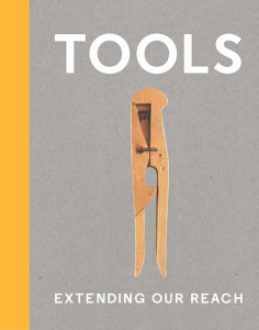
Ah, the unexpected benefits of working in a bookstore! Whilst browsing various arts publishers’ catalogues for new and future releases I discovered a book titled, ‘Tools: Extending our reach’, the accompanying publication for the exhibition of the same name at the Cooper Hewitt Smithsonian Design Museum in New York. A fantastic find, as I have continued to collate various tool related research on the blog since finishing my degree (which, you guessed it, focused on tools as subject matter). Collectively I probably have already amassed quite a broad archive of tool related artists, exhibitions and their cultural, historical associations and am unsure if it has purpose other than as a growing resource for future use or for anyone else researching the same thing. Visually, at least, I do know that it fuels ideas for future drawings/ways of looking at tools themselves (but more on that later). In the unlikely event of being able to afford to go to the states to see the actual exhibition, the catalogue is pretty much the next best thing!  


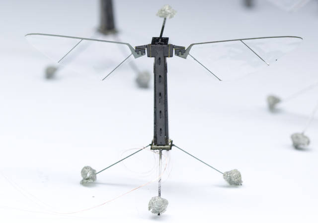
The Cooper Hewitt is a design museum so as you can expect that there is much emphasis placed on the idea of ‘function informing form’ (and vice versa) with over 175 objects chosen for this exhibition that aims to represent a fraction of creations humans have ‘devised to engage with the world’. However the curators have been quite broad and questioning in their choices of defining ‘what a tool is’ describing them as ‘virtually anything that aids us in accomplishing a task’. This opens the enquiry to everything from the earliest known flint tools, to fishing hooks, spears, maps, telescopes, gloves, needles, clothes pegs, common modern hand tools; to artificial hearts, prosthetics, laptops and robotic bees*! Their modern day counterpoints; technology such as Smartphones contain many of the functions and applications of tools themselves but in a digital format/programme, which in turn is changing how we interact with the world; how we produce food, how we build and create, but also how we interact with each other (in both cases arguably not always to beneficial effect, indeed more technology has often led to creating of new problems that in turn need solving). Although there is an appreciation in this exhibition of looking at the old in order to inform the new, with the seemingly simplicity of a wooden abacus being as valued as its modern evolution of a calculator or a Marshall Islands stick navigation chart being the predecessor of the contour lines and routes of paper mapping. Sometimes the modern design is even trying to replicate the simplicity for purpose found in ancient objects such as a Neolithic hand axe being the inspiration for a similar shaped modern chef knife for chopping.

Hand axe from the Contemporary Flint Tool Design Series by Ami Drach (2011)

*The Robo Bee (2012); designed to have 'the capacity to artificially pollinate flowering crops, participate in search and rescue missions, act as environmental sensors or conduct covert surveillance.'

As the curators Cara McCarthy and Matilda McQuaid outline in the opening statement introducing this exhibition “[tools] are often equated with technology and engineering, but many acquire meaning through aesthetics, the economy of their design, the cultural significance of their materials...” In an attempt to create awareness of the breadth of how/why tools are made, the curators have divided them into seven categories: work, communicate, survive, measure, make, toolboxes and observe. From what I gather this virtually covers all aspects of life (medicine, food, shelter, clothing, communication, trade etc.) and if you take only one thing away with you from this exhibition it’s the understanding of just how vast the range, creativity and industriousness of tool production has been and continues to grow and evolve at incredible pace. Any ethical, philosophical, psychological or environmental judgements to be made on any of these objects or adversely the effects that they may/may not be having on us and our environment are largely left to the imagination of the viewer in favour for more dialogue on the design, aesthetics, engineering and functionality of the tools presented. This is where having more tool related work by artists as part of this exhibition would have perhaps prompted some of those debates and alternative ways of understanding the cultural, sociological, political and environmental applications of the tools and people who make/weld them. I am being unfairly ambitious in my expectations, but there has yet to be a tool exhibition that covers all aspects of both design, history and their implications on the world. Thankfully the inclusion of the Mexican artist, Damian Ortega’s ‘Controller of the Universe’** a suspended installation of hand tools in the form of an explosion [images found on link below], is at worst within this particular exhibition a dynamic, fun piece of marketing eye-candy but at its best suggests an alternative way of looking at tools, “they extend our body’s ability to do things and at the same time come between us and our direct experience of the action”.


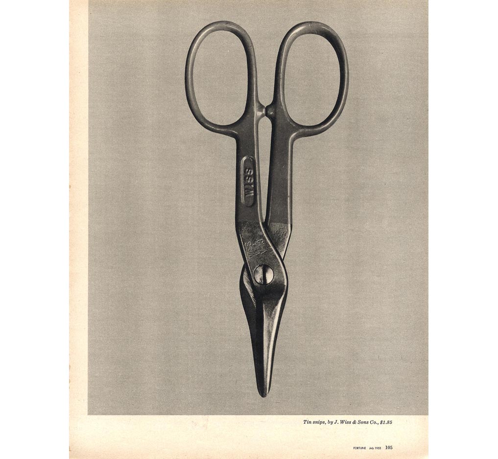
Walker Evans 'Beauties of the Common Tool' 1955 Gelatin silver print 25 x 20.2cm.
"Ultimately, what Evans valued was the design, the construction that resulted from the maker's understanding of function, efficiency of form, and material." 


The highlight of the exhibition catalogue for me was discovering the photographic prints of everyday hand tools by American photographer Walker Evans [1903-1975] who produced the photographic essay 'Beauties of the Common Tool' in the 1955 issue of Fortune magazine. He described hardware stores as "offbeat museum shows" and I couldn't help but notice the connection that these images have to the printmaker Jim Dine's treatment of presenting tools in a state of static isolation (around the same time). The similarity is exciting if a little uncanny. Nonetheless it is very interesting to think that other artists were thinking/noticing and perhaps even responding indirectly to each others work/similar ideas around the same time. Whilst Dine's tools are imbued with an emotional intensity these have an analytical intensity to them in which every detail, their shape, patina and material are really prominent. In a way its as though they are more real than the tools themselves which is a concept worth more attention at another date.
The fact remains that tools are progressive and innovative objects, ‘designed to bring about change’ and as much as they are about creating they can also be about destroying which symbolically for me in my art, they share or act as a metaphor for a lot of the values I associate with art as a subject such as ideas of creativity/destruction, potentiality, alteration and disruption. In the same way tools as well as art have the means to expand our everyday limitations of experience/perception/interaction with the world. I have long speculated why I hold a fascination with drawing tools, but am beginning to think that the intensity invested in drawing these objects has always been an attempt to emphasise the reverence and importance I place not upon the tools but the tools as a symbol for art itself. That still doesn’t account for why I draw certain tools over others, I speculate that maybe I see similar qualities in the hand tools I choose to draw with qualities/traits I see in their owners or perhaps even myself. In that sense maybe they become more like portraits? I’m still undecided, but I'll enjoy finding out.
-Damian Otrega ‘Controller of the Universe’
-For more tool related art, see Mao Tongquiang ‘Tools’


'Tools: Extending our reach' is on at the Cooper Hewitt Museum, New York until May 25th 2015 and if you can't see it then its well worth getting the catalogue!


Sunday, 3 March 2013

Stop the presses!

Tales from the print room....
 
After two weeks of quite political posts this weeks’ takes on a more reflective tone, looking at my brief stint of ‘running’ the print room at Somerset College. (Those of a nervous disposition read no further!) I exaggerate, there isn’t really much to tell nor indeed was it particularly eventful, but the very fact that I was left responsible to look-after it for two weeks is in itself pretty news worthy. It’s not in my nature to take things lightly, perhaps once, when Starbursts were called Opal Fruits, ‘Fun House’ was still on TV and when ‘walking the dog’ meant doing a trick with a yoyo; I was a bit more carefree and a lot less ‘serious’ than I am now then the prospect of being left alone in a print room would be pretty damn cool.  It still is, but then, you probably wouldn’t have wanted the younger-me to run such a place, it could only have ended in a messy, squashed-fingered and chaotic sort of way. So, there I was, the ‘serious’ adult me, the prestigious print room key in my possession. How exactly did I succumb to this opportunity you ask? I’ve been teaching upstairs in Fine Art, only for a few days, and due to a staff sickness in the print room I was asked to cover it. I’d studied at SCAT so I was familiar with the print room and specialised in mono printing for my own practice so I was fairly confident I could keep it running safely and tidily, covering the most basic of print techniques. My own experiences of printmaking had been based from taking lessons from a now retired (I think it’s safe to say) eccentric (and I use the term widely), wild bearded but incredibly knowledgeable technician who was pretty protective of his print room. Whilst I felt I learnt how to actually make prints, I never really got to learn the practical things like mixing ink with extender (perhaps obvious, but who knew if it was always done for us). So there’s a few holes in my knowledge, nothing that I couldn’t handle and wasn’t willing to learn quickly.
 
As I was saying, so I had the key (pardon the megalomania) and dozens of new opportunities at my fingertips from drypoint, etching, lino, wood, lithography, collagraph, monotype, aquatint, silk screen and more...It was also half term, so it was relatively quiet in terms of students so between bouts of cleaning/organising and finding where everything was stored I took the opportunity to try a quick drypoint and mono type, examples of which can be seen here. Although, I can appreciate the quality of printmaking and take great pleasure in seeing other people’s prints, one of my favourite artists of all time, Jim Dine is a printmaker, not to mention that as an avid bookworm I am indebted to printmaking, for if it not for print then there’d be no books. Books aside, whilst I have always felt drawn to prints by artists like Dine and others, I’ve tried emulating certain qualities from their work (be it formal or subject matter) in other ways than print taking more delight in trying to replicate their processes/surfaces/affects in drawing or paint. I take more joy in the amateur techniques, the amateur, the ’do it yourself’ kind-of mentality that makes for a more immediate spontaneity, whilst you can still achieve this in printmaking, I still think it’s more controlled.

 
I was hoping to maybe ignite my love of print, but soon after soaking the paper ready for drypoint I already found myself remembering why I disliked the process-led nature of print making, its preparation time frustrates me and as an impatient artist I prefer immediacy of drawing, painting and mono type. Although, even those processes in each of their own way has elements of preparation to them (be in stretching a canvas, or organising drawing materials, rolling out ink) so maybe it is the formal-ness of the print room that I dislike, preferring the privacy and freedom of the studio. It does, however also highlight something interesting about creativity and how it works. For example, it feels a bit silly that we create rooms like print rooms, studios etc that we make ourselves be ‘creative’ in but these sorts of spaces facilitate and nurture creativity rather than instigate it in the first instance (?).  Personally, I feel less creative when there is an expectation to be creative because I’m in the studio or print room. Hence, one of the good things of using my room as a ‘studio’ as it is multi-functional which some people could see as a distraction, but for me become more of a stimulus and inspiration to make work. However, most of my own creative thinking probably happens when I’m not ‘trying’ to be creative at all, often I get most ideas when out walking or walking home to/from work, having a shower, cleaning, reading, watching a film, in conversation over a drink, travelling on the train, food shopping etc etc. Does anyone ever really have all their creative ideas in a studio?


So, I’ve ascertained that printmaking (except for mono printing) might not be for me and that if anything I’m probably more interested in the room and its contents. The presses, inks, letter blocks, cutting tools and print paraphernalia. Like when Alain de Botton was ‘writer in residence’ at Heathrow Airport and made a book of observations, ‘A Week at the Airport’; I could easily find myself enthused over describing the splatters of ink in the sink, stained psychedelic rags used for cleaning, coppers, glass, Perspex, wood, the sounds of the press as it rolls and squeezes, the crisp/sticky sound of ink being rolled out, the creaking of the ‘used’ rags basket as it slowly rots and splits open and clang and clashing of the drying wrack....The smells alone could be a whole separate post, turps, oil paint, floor stripper and swarfega as could a description into the state of the skin on my hands after only spending 7 days in there! It made me realise how difficult and complex a place it is to run.
 
 
It’s easy to romanticise looking back on these experiences and when you don’t work in there every day. One could probably paint quite a romantic picture in words about working in a bookshop (as I do), until you’re faced with the reality of what it’s really like to work in these kinds of places, when you seldom have the time or luxury to reflect, appreciate or notice it. Hence my decision to reflect on it here, albeit brief, certainly given me a lot more respect for print as a process and those who choose to use it whilst my time in the print room was short-lived it certainly made an impression.