Showing posts with label Claes Oldenburg. Show all posts

Wednesday, 9 December 2015

"I have gone where my passions have taken me."

Some blog posts are a chore, most a pleasure and then there are some which feel so significant, so important and so personal that writing them becomes a different experience entirely. This post fits into the latter and in its expectation and poignancy in influencing my own art practice has meant that collating my thoughts into writing this has been a slightly daunting process to begin!

I was the first to arrive. (Of course!) I’d booked my ticket in advance and arrived early as I’d never actually previously ever set foot in the Chelsea school of Arts, London. Luckily though through still looking like a student (I’m told) and some misguided snooping-around I had somehow found my way to the Banqueting Suite; a fairly grand wooden panelled room with large windows and ornately carved fireplaces that was originally part of the Royal Army Medical Corps officers’ mess. Now to wait...

I was there to listen to one man, possibly the most influential artist on my practice (and who should need no introduction to those familiar with my work). The date was Wednesday November the 25th 2015. The event, ‘A Conversation with Jim Dine’.   

The Banqueting Suite, Chelsea School of Arts London
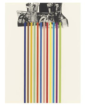
Hosted by printmaker and Professor of Fine Art at UCA, Paul Coldwell, the evening was set to be a conversation into Dine’s practice, focusing mostly on his printmaking but also setting the context of the diversity in his practice; from the 60s origins in New York experimenting in performance art alongside Allan Kaprow and Claes Oldenburg to the artist’s recent ongoing print series, a History of Communism. Now turned eighty, Dine’s career as an artist has spanned, drawing, painting, performance, sculpture and printmaking. An artist who defies categorisation but who has and continues to make work that is deeply personal and intense using his own developed set of iconography that includes, tools, heart motifs, bath robes, Pinocchio and birds. In my own work, Dine’s tool drawings and prints have been a significant influence in both the importance and intensity I place upon the process of drawing, the choosing of tools as a subject and how I depict the objects [tools] themselves in the work.

In addition, Dine has always made numerous self-portraits and for those not familiar with these and his appearance, visualise, a more intense-looking version of Terry Pratchett minus the hat! I say this in reverence, for I was sitting as close to the front as I could get, minus the VIP rows (reserved largely, it would seem for the unfashionably late). The anticipation, for me at least, was immense!
  
Walking Dream with Four Foot Clamp (1965) Oil paint, charcoal & steel on canvas. 1524 x 2743 x 29mm


The evening began with a question from Coldwell asking Dine to give a flavour of what life was like during the 60s in New York; the beginnings of Pop Art and ‘Happenings’ performances. Dine replied that New York was without art collectors, dealers and gallerists, it "was a world we made ourselves" and quite literally in some ways with many of the performances including self-made sets and props from cardboard and found objects. He spoke of the ‘need’ to make work with Claes Oldenburg in what was a collegial atmosphere between the artists. It set the tone really for what became and still is the working ethos of Dine’s mentality to making art; prolific, bold and drawing upon the technical knowledge of others. The performance made-way for frenetic, gestural mark-making and has been the visual handwriting of the artist throughout his career. His work is charged with a psychological need, what could be described as a cathartic outpouring in the desire to make work and express oneself. Later in the conversation he stated, “I need to work with my hands...its physical for me”. 

Dine’s answers at this point were relatively short and matter-of-fact as I got the sense that they were questions he’d been asked many times before, but were in-part necessary for setting the scene. Although Dine didn’t continue with performance as an art form after the 60s, the qualities that came from the early happenings never really left Dine’s work, with some of the ideas about using everyday/found objects staying within the work and more significantly the way in which Dine continued to depict tools/inanimate objects as though they were ‘alive’ often positioning them erect as though standing or at other times framing the image as though they were substitutes for actors on the stage. Some of the aspects of 'performance' remained.

Elyria (2000) Charcoal on etching felt. 104 x 129.5cm.
Dine became more animated when talking about printmaking processes and drawing. Stating how he felt that when he tried silk screen whilst he was living in London, that the mechanical ‘flatness’ took what he called “...the life out of it”. As if to say that etching and lithography offer a much more hand-drawn type of mark. He went on to say that, “Drawing is part of everything for me.” This is evident in his painting and even his sculptures which are as carved, angular and often feature the same type of harsh, hatched mark-making as the prints. From my perspective this was probably one of the most affirming quotes of the talk and echoes a belief I have long had toward my own practice, that nearly all visual thinking and creativity begins with drawing and that the more successful sculptors, films, performances and installation begin with some sort of drawing within their development. And for some the ‘drawing’ even becomes the work itself. Drawing is an embodied process and there is something of working with hands for drawing that is similar to working with the hand tools Dine depicts.

Tool Box 10 (1966) Screenprint on paper 603 x 478mm.
Many times throughout the evening’s talk I had the impression Dine was an artist that was very ‘real’, honest and not a fan toward some of the over-intellectualising of his work. This is refreshing and in-fact most times I have heard any artist talk about their work, they are nearly all often demystified as not being as academic and analytical about their own work as often reading about them alludes to. In part Dine’s compulsion to draw came from he admits his own dyslexia and that drawing was a way of expression without words. He said that it also helped him be able to work backwards, naturally, a skill useful in printmaking.

Dine spent many years growing up and eventually working in his Grandparent’s hardware store, which inspired Dine to use tools in his art. In what John Russell describes of Dine’s work: ‘Daydreaming amongst objects of affection’. Prolific in his depiction of many of the tools found there, the tools became a familiar iconography/trademark of Dine’s work. The tools reoccurring so frequently and with such intensity that Dine himself has stated they became self-portraits. The conversation moved to focusing on Dine’s ‘Winter Tools’ series of hand coloured etchings. Coldwell stating that these works have been said to compare to ‘Degas’ Ballerinas’ in their delicate line work and intent of placement within the ‘frame’ of the page. Described by Coldwell as, “Objects of desire/more alive than human”. They very much have a feeling of movement and life to them despite obviously being inanimate objects. The former statement met by much amusement to Dine, who tended throughout the eve to be very sceptical and apprehensive of interpretations of his work generally. I like his response better, “These tools are dignified...developed by guys who worked with their hands.” In many ways that’s what I’ve always been interested in too; there is a reverence and life of potentiality in tools as objects, their past histories and future possibilities charging these objects with a sense of purpose and in doing so shouldn’t be taken for granted.

[No title] From 10 Winter Tools series (1973) Lithograph on paper. 707 x 558mm.

Previous to this talk I hadn’t been that aware of some of the techniques and methods Dine uses to create his prints. He treats his plates like drawings, like paper. Speaking of the malleability of print and erasing as a way of drawing with power tools to sand/scrape back through layers in what was explained by Coldwell as, “...tension between classical print making and more urban approach.” Which slightly conflicts with the ‘hand drawn’ nature of some of Dine’s previous comments to which I suppose he still sees using the power tools as a way of making marks on a surface just not with a pencil or charcoal.

Braid (1973) Etching. 85.9 x 40.8cm.
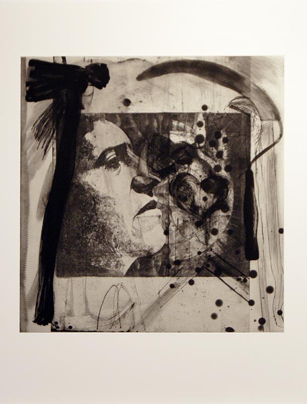
Another aspect of Dine’s practice that I had previously mentioned earlier was that he is dyslexic and early in his education Dine used drawing was a way of communicating without words, a means of expression. This became apparent when the conversation turned to discussing the print ‘Braid’, Coldwell prompting discussion with the question, “Why write what it is?” To which Dine replied, “... it was about not having the confidence of being understood.” And even quite openly commenting in a good humoured, rather than remorseful way that, “It [the text on the print] is kind of dumb...I am in your face.” I definitely don’t think something has to be recognisable in order to be understood, instead this is an insight into some of the insecurity that perhaps Dine and I expect many artists feel in ‘wanting’ to be understood and have ones work understood by others (I've done the same thing myself in the past). Dine has always had links to poetry and words within his work and in nearly all his work there is an importance placed on the ‘recognisability of things’. Hearts, bathrobes, plants, tools are distinctive in his work but often semi-hidden or surrounded by intense, frenetic mark-making. It’s as though he is not content with being purely abstract and needs form to work from. Dine remarking that his ‘heart’ motif in many paintings/prints is simply a means of “something to hang the paint on”. As the viewer I want these hearts, tools etc. to mean more than perhaps Dine lets on, but at the same time I admire his tenacity to not want to over-complicate his work with his own brought meaning. Maybe much of the way these objects are represented owes something to Pop Art (though Dine may be reluctant to admit it) as there is a clarity, almost advertising-like way of presenting these familiar objects. 

A History of Communism (2012) Lithograph.
The evening ended with a discussion on Dine’s on-going series of prints titled, ‘A History of Communism’ made from reworking lithograph stones found in a former Socialist art academy in Berlin. Previous made work by print makers is added, edited and worked over by Dine who stated that he saw these works as, “landscapes” and as Coldwell observed that in these prints the tools really do become animated and like actors on a stage.  Dine references Pinocchio, a character often used in his work for its storytelling quality of what he calls, “a stick coming to life” which is in many ways, as I learnt this evening is a reoccurring idea in all his work. Coldwell notes that in the reworking of these stones that there is a contrast with the new life placed into these works with, “the deadening of the original lithograph”. Is it sacrilegious to appropriate/work into another artists work in this way? We don’t know the reasoning why some of these stones have been abandoned for many years by their owners particularly when it was created under conditions as repressive as those in Berlin before the wall came down (they’re estimated well over 25 years old). If anything the process is almost archaeological and their alteration reinvigorates them with new life and preserves them in a way they had previously gone unnoticed. The addition of tools and other imagery certainly adds a sense of the historical, the political and the confined which is also interesting given the circumstances when which these stones were originally worked into. Many artists may be offended at the idea of reworking someone else’s work but in this instance, I couldn’t think of anything more liberating and more flattering.  

After the talk had finished the audience were invited for drinks in the Green Room next door with the man himself. I’m delighted to say I got to meet him, but less so that after all my hype and anticipation, had absolutely nothing intelligent to ask or say! The evening wasn’t necessarily anything radically new or ground-breaking but reaffirmed many of my thoughts on the importance of drawing as a means of expression, the significance of a sense of life in inanimate objects, Dine’s commitment to his process/learning new techniques and above all his testament to shaping his career by following his passions/interests.

Friday, 11 April 2014

Dam! Top Ten

Being a creature of habit, upon returning from my holiday in Amsterdam I felt compelled to comprise the usual top ten format of personal highlights from this year's trip.
 
Enjoy! (who knows if you're possibly planning a trip there yourself, it may even prove to be useful!)
 
1.) Suspension Bridge/Road
I'm not really for the opinion that some people will 'get' this and others just won't preferring to think that its all a matter of perspective (in more cases than one), but I found this road surface to be rather stunningly, albeit incidentally, beautiful. True, it is just a road, as normal or unique as any road anywhere (and I wouldn't have noticed it had it not been raised to allow a boat to pass through) but seeing it vertical  made it appear as though it were a painting, a Tapies, Robert Motherwell or more neutral Barnett Newman. It was really quite exciting. The surface of the road itself met with the horizontals of the crossing barrier and diagonals of the tram line cut by the flat blueness of the sky makes for a fairly dynamic composition visually (the photo hopefully goes some way to picture what I am explaining). Like most of my holidays I had come to Amsterdam to see art and as is often the case end up seeing as much in the gallery as out and about exploring. I don't intentionally look for these things and see their spontaneity as part of the appeal.    
 
2.) Bridges
 If bridges are your thing then Amsterdam is the place for you (or Venice). Not much to say really other than many of the bridges in Amsterdam are swing bridges which are particularly sculptural and interesting to look-at. A good idea to travel both over and under them in a boat and preferably on a bike (in keeping with the Amsterdam theme).
 
3.) Rembrandt Etchings
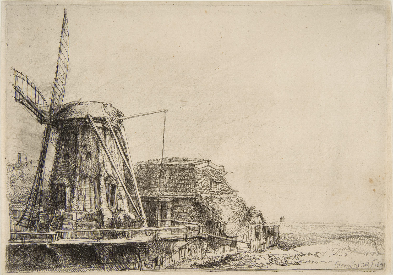
The second pleasant surprise about Amsterdam for me, was Rembrandt's etchings in Rembrandt House. It is almost impossible to go the city, where the Dutch born etcher and painter lived/worked, without hearing him mentioned or seeing his portrait festooned on postcards, t-shirts and various tourist tat everywhere you go. And, yes, for tourists like me, walking through Rembrandt Square or seeing 'The Nightwatch' in the Rijksmuseum are all essential parts of the overall experience. Whilst I had planned to visit Rembrandt House I wasn't expecting to be particularly overwhelmed or impressed by his work any more than I am of any other artists from the 1600's. It is sometimes good to be wrong! His etchings (pictured above) are exquisite. The attention to detail, variety of mark making, tonal qualities and drawing ability in general are amazing. Needless to say I was impressed, but inspired too and I only realised in the few days since I've been back home just how much looking at these etchings influenced my own drawing style. There has been a notable and I believe, significant shift, in my drawing style in the last few days that has definitely improved my mark-making and intensity to my drawings. I definitely put this change down to spending a great deal of time looking at Rembrandt's etchings and more excitingly, for me, this is the first instance in a long time, that I have been genuinely inspired by looking at another artist's work where it has had a knock-on affect to my own. Watch this space for future posts on how the 'drawing-a-day' project 2014 is progressing. 

4.) 'Charlene' -Robert Rauschenberg
In the Stedelijk Museum (imagine the Dutch version of our Tate Modern) lies this fantastic combine painting by American artist, Robert Rauschenberg. At 89 x 112 inches big its hard to miss! Apart from being among the very first of his combine paintings (paintings that literally combine collage, objects, paint, lights and variety of surfaces) it is also one of my personal favourites, largely this is due to the inclusion of (one of my all time favourite objects of obsession to paint/draw) an umbrella in the top right corner. Perhaps in the same way that the different sections of the road, lights, cables came together in the image of the road in figure 1, this painting achieves, in its divided boxed sections of collage, painting, a mirror, a light, a folded shirt, a similar affect.

5.) Tuschinski Theatre
Definitely one, if not the most exciting cinema of all time, the Tuschinski Theatre. Whilst I would strongly recommend seeing a film here (most of them are in English with Dutch subtitles) it is worth visiting even to see the front of the building and inside foyer (pictured). Described more accurately by friends, as 'an Art Deco space ship' the architecture and lighting of the Tuschinski is a theatrical marvel and should be experienced in person. I absolutely love film and cinema and the Tuschinski is how cinema's should be, something special, something theatrical, an experience and not (like so many chain cinemas in this country have become) just a big TV in a darkened room.
 
6.) Arman
Ok, so it's not technically an Arman, or a work by the French-born, American artist, Arman (who is nest known for his accumulations of objects in boxes/vitrines), but it is pretty much, intentionally or accidentally like his work (who knows maybe he lived here?). As with the Rauschenberg and the road surface there is something aesthetically appealing about compartmentalised sections of stuff whereby each section has a mass of different forms/surfaces/colours/groupings/textures. Wonderful stuff!
 

7.) Rijksmuseum Library
Tucked away in the  recently renovated Rijksmuseum is this fantastic 19th century-style reading room, library. Apparently, and I quote, "The Rijksmuseum Research Library is one of the main art libraries in the world. Catalogues of auctions and exhibitions, trade and collection catalogues, as well as books, periodicals and annual reports relating to the museum collections have been collected without interruption since 1885." I wasn't expecting to see this (and probably you're average viewer to the Rijksmuseum is in the same position) and although I didn't look at any of the books on this occasion (where would I start?) I found it to be an incredible looking place.

8.) 'The Milkmaid' -Vermeer
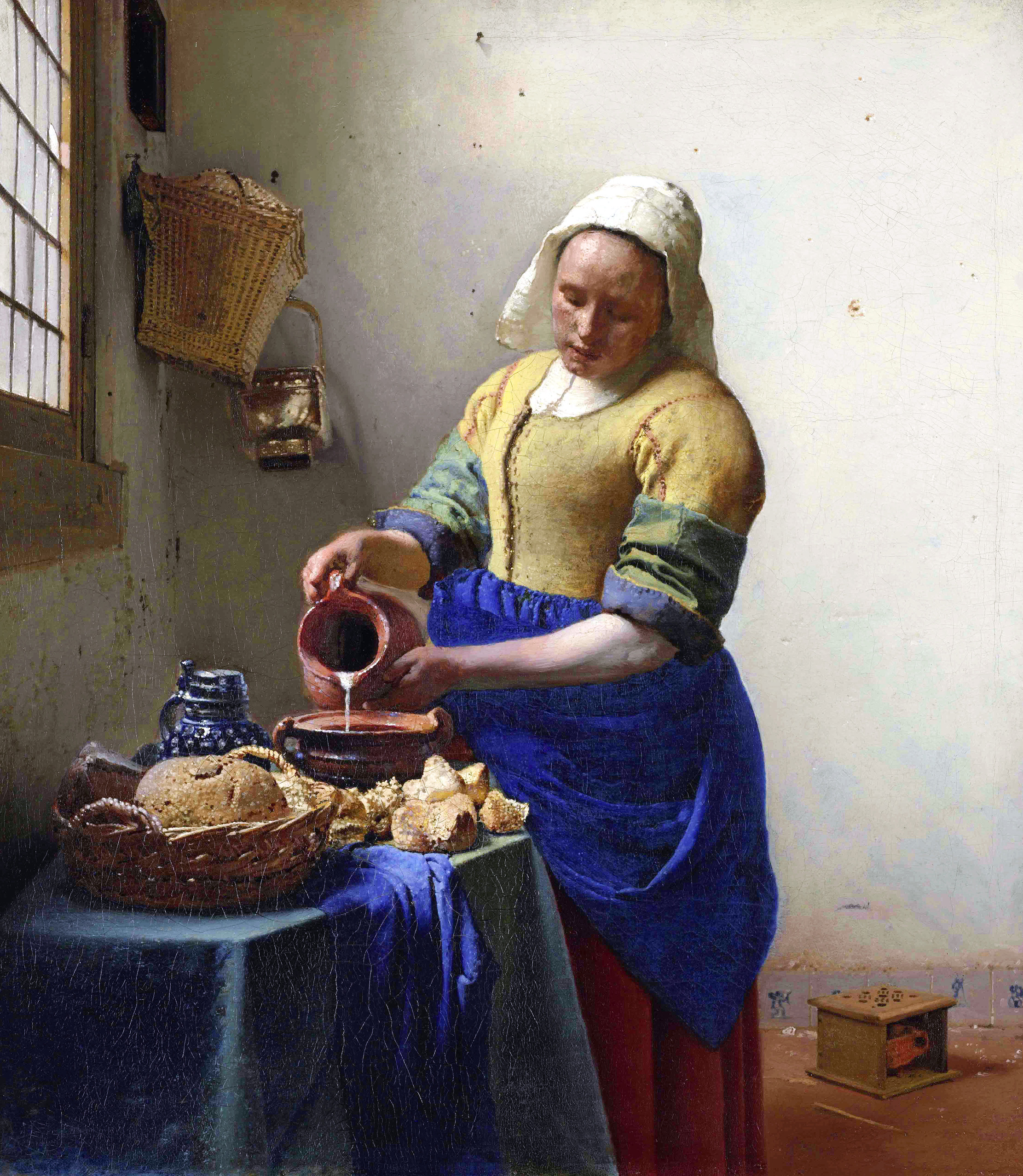
At last! After seeing more parodies of this painting (there was a Delia Smith version...if I recall...)than even reproductions, it was good to finally see the real thing! In some ways this painting by Vermeer is like the Dutch Mona Lisa, its fame known so widely  that when you're actually met with the real thing in person, it doesn't feel quite real at all. It is also smaller (like the Mona Lisa) than what I imagined it to be. Which begs the question, does fame, reproductions of images and photos have a way of making things, people, places physically seem bigger than they are? That could be quite interesting. Although back to the point, 'The Milkmaid' I think can only be most accurately described as jewel-like, its small and precious, bright and glistening (the highlights where the light hits in the painting/the sharpness of the central figure against the background/the whiteness of the milk being poured) . And again, like a rare jewel, it is perfectly formed with care and attention to detail that appears quite natural and effortless when in reality it is a great deal of process is involved. Ironic too, when you consider the connotations of my analogy to jewels when the scene it is depicting the opposite to wealth in the statutory or money sense of the word which is all the more poignant that it is painted with such reverence. The vibrancy of the colour in this painting being particularly eye-opening to what I had previously pictured. Seeing this work along with a selection of Vermeer's in the Rijksmuseum was really significant in changing my preconceptions of his work. 

9.) Flower Market
Where Munt-plein meets Vijzelstr you'll find Singel street, home to one of Amsterdam's many flower markets. Apart from selling tulips, tulips and more tulips it also sells a variety of dried flowers (pictured above), plants, cheeses and assorted touristy goods.

10.) 'Hard Saw II' -Claes Oldenburg
You are reading, 'A Spanner in the Workz' and yes that is a giant saw! All manner of things tool-related just won't go-away anytime soon (and I wouldn't want it to) so how could I fail to be excited by the presence of seeing Oldenburg's giant saw in person at the Stedlijk. I actually never knew Oldenburg made a giant saw being familiar with just about every other giant, hard and soft objects the artist made throughout his career (i.e. toilets, blenders, hamburgers, spoons) and now wishing I had known about this piece whilst doing my degree! In true American Pop-Art style, its big and bold and almost a one-liner if you don't start going into detail of how turning a saw into a giant sculptural work questions the boundaries between a saw as an art object or a functional object (or indeed what does 'functional' mean in relation to use), but then that was always why I was interested in Oldenburg. His work is fun and seemingly straight-forward, allowing the viewer to decide whether to leave it at face-value or whether to pursue interpreting it further. I'll probably find myself somewhere in between the two!


Images sourced from: