Wednesday, 23 April 2014

Happy World Book Night 2014!

Is it unusual to travel for two hours on a train just to visit a library? Perhaps, if it was an ordinary library but then Birmingham Central Library is anything but ordinary.


Like a giant box of Ferrero Rocher, Christmas present or Islamic garden trellis the ornate aluminium facade of Birmingham Library is impressive and certainly eye-catching, if not also accused of being a little gaudy. Never being one to shy away from matters of taste (in probably not having any myself) and whilst recovering in the lull of post Amsterdam festivities it seemed the right time to pay a visit and reach my own conclusion. Even more appropriate timing too if you consider that it was designed by a Dutch architect, Francine Houben.
 Libraries are fantastic places, period. Whether they’re old or new, rundown, in a village, town, city or touring in the back of a bus they're still full of wonder, potential, magic and the source of much delight and contemplation. This is largely due to them being full of books, acting as temples for books, palaces for books. Rarely is it the actual building itself that inspires but more the sheer accumulation of books, the knowledge, histories and stories they hold all in one place.  It is the idea of the library, a wealth of collective and shared knowledge that is debatably, in many ways as uplifting as a place of worship (or it can be). Equally, I’d agree that books really do furnish a room and unless you’re incredibly wealthy where else are you going to see thousands of books, that you have the freedom to access, all in one place other than a public library? Is it therefore the books that make the library or can the library itself as a building, a construct, a symbol for knowledge, learning, discovery, discussion, debate etc. be as important (if not more so) than the books themselves? More on that later....
 Being in the business of supposedly selling as many books as possible it may seem counterproductive, to those not within the world of bookselling, to speak so highly or fondly of libraries as though we should regard them as the enemy. I’m pretty confident that this is not the attitude of most booksellers and I speak for myself in saying that it is impossible not to have a respect for libraries and what they offer, not to mention unsustainable when anything that encourages and promotes reading can only be considered as a good thing for both parties (economically and ethically). Most libraries I’ve ever had the pleasure of visiting have been old (in one sense or another), New York Central Library, the British Library, the Bodleian (Oxford), the Rijksmuseum Library, Bristol library and even Taunton library, which whilst obviously is no way near as old or grand as the Bodleian is still fairly old (despite renovations it’s still the same building)... well in fact, what was the Old Library is now a pub, but that’s a whole other story.
  Birmingham library is on the other hand, very shiny and new, opened in September 2013 and costing an estimated 188.8 million! All that money didn’t just go on a lavish exterior, the innards are not only as impressive architecturally, but are where the real workings of the building happen and substance lies. Point already made, libraries are awesome places so imagine (what is claimed to be) the biggest library in Britain and one of the biggest in the world, ten floors including archives, collections a gallery and more. It doesn’t yet live up to the dusty, established neglect that, sort-of lovingly stereotypes many of the aforementioned older libraries, but this is not a criticism.
In fact, with the history of ‘the book’ as a piece of technology having until recently remained relatively unchanged for hundreds of years, now being under more threat/pressure to change with the arrival of digital or e-books, there is never a better time to re-kindle (pardon the pun) our investment into books, how we store them share them, access them. What do libraries of the future look like? Do they contain physical books? Do they become data storage banks? And how do any of those changes affect how we interact with those books and/or that information? The building of Birmingham library has almost coincided at the beginning of this unfolding debate and how people choose to use it will influence, in some way, what future role libraries will have.

At some point in the design process for Birmingham library someone must have had the idea that what current libraries are missing are curves, we spent so long trying to create storage solutions suited for housing books that most libraries since the Bodleian onwards has became very square and boxy. The building itself on the outside is very square and made of different levels with outside seating/gardens on three different floors. If not for the overlapping circular motif cladding the building it would be a tiered box. Besides, looking around the rest of Birmingham’s architecture it seems to be in-keeping with a theme of curves throughout from the spotted rotund Selfridges building to the renowned Floozy in the Jacuzzi (don’t take my word for it!).  


On a practical level, squares are fine, they’re very utilitarian, but there’s nothing like the sweeping round atrium space inside the library filled with shelves and more shelves of books to break convention and draw one’s attention. Naturally too, many of us didn’t even know what an atrium was until after the millennium when suddenly every corporate building, institute and public space decided that what they lacked in business acumen and reputation could be made up for with an impressive, costly and oversized hole in the middle of their existing building (not mentioning anywhere I may have been in particular...). The bigger the hole it seemed, the more productive and industrious the business...but...uh, back to the library. Thankfully the atrium here works well at opening up the space without being too daunting as it is broken up by levels of escalators that beckon you to explore and see where they lead. It’s like being inside a spaceship...or an airport, depending on your age and imagination. However the promise of being transported both literally by the escalator and in the literary sense by the books themselves is a clever effect.

On each level and away from the traffic central atrium is what you’d come to expect from a library, quiet, rows of shelves, seating areas (really comfy might I add), natural lighting (each floor is surrounded by windows), information terminals and tables but with the added thoughtfulness of having these tables positioned facing windows all around the edges of each floor so people sat can look-out/view over the city acts as an important reminder to the context of the library, the city in which it resides and its people. The outside-in is exploited again with an outside garden/seating area on two different levels with views overlooking the city making the library not only a place of study but a social one.
Whilst books may still be my main reason for going to a library what makes Birmingham Library so special and different is the building itself. It does everything a library should do, whilst being an exciting, modern and intriguing place to visit, to socialise in its own right. Without knowing too much about it, I think that good architectural design should make you want to explore the building and it should inspire without being inaccessible. For these reasons Birmingham Library feels like an inclusive, active, motivational place to be as in different ways so do many other libraries. When a library is designed with this in mind, it enhances the books but also invites an audience of people to use the library’s other resources such as film, music, archives, internet, gallery, cafe etc.  What Birmingham library signifies is the last recent significant investment into a public cultural place and if it is successful (as it appears to be so far) then it is an example of what good design and investment can do to encourage and raise the use of all libraries. 

In the run-up to and after the opening of Birmingham Library in 2013 there were many closures of local public libraries throughout the country with many still under continued threat of closure since. This isn't new news or even a call to arms, just a thought that perhaps we all need to do more to show the Government and our Local Authorities that our libraries are not merely storage facilities for books but are unique in being one of the only places where anyone can go and choose to be in solitude and study or meet and connect with other people regardless of their age, wealth, religion, race etc. For this reason alone and many more too numerous to mention they should be protected, looked-after and cherished. I sincerely hope Birmingham Library acts as a positive example of what good investment can do and encourage investment in developing future/existing libraries and or cultural spaces. The timing of its build when so many smaller libraries were closed isn't ideal circumstances but its legacy could yet prove beneficial to the future of other libraries. 


Going back to my earlier point, if books do become completely digitised in the next hundred years then we shouldn’t be overly concerned, as long as there are people who want to read them and there are people writing then that is a good thing. To read is to be empowered, to be enlightened, to be informed, so it doesn’t matter so much the format that reading takes as to where we access it being the thing of crucial importance. How authors, publishers and booksellers within this industry adapt to promote digital books and make profit from them is the debate that is ongoing. Going back to libraries it is a question of what is the role of a library without books and if those books are digital how do you engage with people and make them aware of what they can access and how? It is difficult to browse a digital database so often things that are often the most useful can be left unseen. I find it reassuring that there is a lot needs to change and improve with how we manage and access digital books before this will/if ever happen.
Until then, there’s the library.

Happy World Book night!

Monday, 14 April 2014

I've got cabin fever


Where’s the work?...You’ll have to literally hunt for it as part of the ‘Palaces and Cabins’ exhibition at Salisbury Arts Centre between now and May 18th. Initiated by OSR Projects* collaborative group, the exhibition sees a site specific intervention around Salisbury and a series of miniature clay buildings (made by the artists) hidden around the arts centre exhibition space, bar and theatre. Visitors have the option of using a map to find the models and even then it’s still entertainingly tricky to find all thirty (disclaimer –no prizes will be awarded other than the satisfaction of finding them). The models, created from submitted ideas of people’s ‘palaces or cabins’ range from quirky-looking houses, to sheds, citadels, imagined structures and palace-like buildings are but one aspect of what is largely a fun and thoughtful exhibition.

“Palaces & Cabins explores the intersection of public and private space in Salisbury, revealing aspects of the City that are hidden in plain sight. The exhibition acts as an artists' guide to the City, encouraging viewers to revisit the spaces they inhabit from a different perspective.”

As part of the exhibition visitors are also invited to create their own digital palace or cabin on the OSR Projects Minecraft realm situated next to the Arts Centre bar (an irrelevant detail, but sort-of an oddly amusing place to have a videogame). You can pick up a ‘Palaces and Cabins’ map at the Arts Centre for an alternative look at places that are considered important by the creative team and on Sunday 27th April join, artist, Meg Calver as she performs live interventions in the various map-marked locations throughout the city (between 11am-3pm). This day also sees the unveiling of the ‘Palaces and Cabins’ board game, which if you are unfortunate to see at any other time, is displayed in the exhibition, out of touch, its pieces in bags and rules pinned on the wall. Aspects like this make what is a very playful exhibition at times appear a little bit pretentious and you can be left feeling distanced from the work which is equally the case with the series of models that look as though they were more fun to make than what they are to look at. As the exhibition blurb dictates, the work is an exploration into ‘public and private space’, so context in favour of content is possibly to be expected.  And it is fairly minimal, work wise, with Salisbury and Salisbury Arts Centre very much the stars of the show. Rightly so, the arts centre, former church, is a unique and fantastic space that retains its outside appearance of being a church but with a massive modern theatre space and lighting inside. An installed smoke machine within the exhibition picks out shafts of light coming through the building’s original church windows and draws attention to/emphasises the space. Similarly, an iron clock face (again from the church before it was converted) is installed as a work of art on the floor. These are thoughtful observations that reaffirm the importance of Salisbury Arts Centre as the context and catalyst for making some of the work.


If you are from or familiar with Salisbury then this exhibition goes someway to providing an alternative, enlightening perspective on its places and spaces. If, on the other hand, you are just visiting having never been before you may be left thinking it’s all a bit unnecessary and that Salisbury Arts Centre is still an impressive space that you’re going to notice regardless of what’s shown in it. Still, admittedly, I wouldn’t have been there if not for the exhibition... I just feel that the concept of palaces and cabins may have been explored a bit too literally, focusing more on types of structures/places looking to slightly blur their definitions when often it is less clear what defines these places i.e. the activity that goes on within the place, the people, the location etc that isn’t always as easily signified by a particular boundary of ‘the walls of my shed’ or ‘perimeter of the castle grounds’ (‘the woods are my palace’ being another example outside of the box). That idea is briefly alluded to as is the overriding message that a man’s cabin is his palace or that one man’s cabin is another man’s palace etc. However there is potential to explore some of the themes it raised in more depth which is why I suppose this felt more like a starter rather than a fully realised main course. Despite my criticisms, its strengths are that the concept is a thoughtful one and as usual with OSR Projects it has been put-together very elegantly and professionally, albeit minimally, in its presentation. I think the harshness of my review comes from the contrast of the publicity images/poster looking really intriguing and exciting but not, in my opinion, really lived up to in the work (that’s the power of good graphic design/photography for you?). It highlights a significant point on how we review/reflect on an exhibition based on our expectation of it. Whether we leave pleasantly surprised, inspired, underwhelmed or disappointed is often down to whether it was better or worse than what we had imagined from the poster/website/blurb. The more I think on it, the more tricky it must be to find an image that sells the exhibition without giving a false impression of the work/what to expect but is still intriguing enough. Does having an image give too much information, is it better to just have text, or is that not enough information? If you take a photo of the work that presents the work in a new way, i.e. creatively lit sculpture/close-up, does the photo then become the work/should be presented as the work?  I'm not presenting any answers to these questions, but it is food for thought.

Overall if you are in Salisbury on the 27th May and have children, take them with you and I’m convinced you’ll find enough to have a great time. I’d loved to have played the board game and wandered the streets which I’m sure would have given me a different impression of the whole thing. For now it’s back to Parsley Towers, until next time.   

  
Exhibition open Friday 11 April – Sunday 18 May
Salisbury Arts Centre is open Tuesday – Sunday, 10am – 3pm
Special Event Sunday 27 April  Including a live performance by Megan Calver,
the unveiling of Palaces & Cabins ‘the Game’, and a chance to build your own digital Palace or Cabin on the OSR Projects Minecraft realm.
Keep an eye on http://osrprojects.net for times and information about additional events.


Images sourced from:

 *Who’s that? OSR Projects (Old School Room) is an evolving curatorial project that creates a platform for engagement with the world through artist–led activity. The OSR Project Space, located in rural Somerset, is a place for incubation, exhibition and engagement, delivering artist-led projects that place people at the centre of artistic activity. Established in 2011 by artist Simon Lee Dicker & graphic designer Chantelle Henocq the aim of the OSR Project Space is to enrich the local cultural landscape, engage new audiences and provide opportunities for creative practitioners.

Friday, 11 April 2014

Dam! Top Ten

Being a creature of habit, upon returning from my holiday in Amsterdam I felt compelled to comprise the usual top ten format of personal highlights from this year's trip.
 
Enjoy! (who knows if you're possibly planning a trip there yourself, it may even prove to be useful!)
 
1.) Suspension Bridge/Road
I'm not really for the opinion that some people will 'get' this and others just won't preferring to think that its all a matter of perspective (in more cases than one), but I found this road surface to be rather stunningly, albeit incidentally, beautiful. True, it is just a road, as normal or unique as any road anywhere (and I wouldn't have noticed it had it not been raised to allow a boat to pass through) but seeing it vertical  made it appear as though it were a painting, a Tapies, Robert Motherwell or more neutral Barnett Newman. It was really quite exciting. The surface of the road itself met with the horizontals of the crossing barrier and diagonals of the tram line cut by the flat blueness of the sky makes for a fairly dynamic composition visually (the photo hopefully goes some way to picture what I am explaining). Like most of my holidays I had come to Amsterdam to see art and as is often the case end up seeing as much in the gallery as out and about exploring. I don't intentionally look for these things and see their spontaneity as part of the appeal.    
 
2.) Bridges
 If bridges are your thing then Amsterdam is the place for you (or Venice). Not much to say really other than many of the bridges in Amsterdam are swing bridges which are particularly sculptural and interesting to look-at. A good idea to travel both over and under them in a boat and preferably on a bike (in keeping with the Amsterdam theme).
 
3.) Rembrandt Etchings
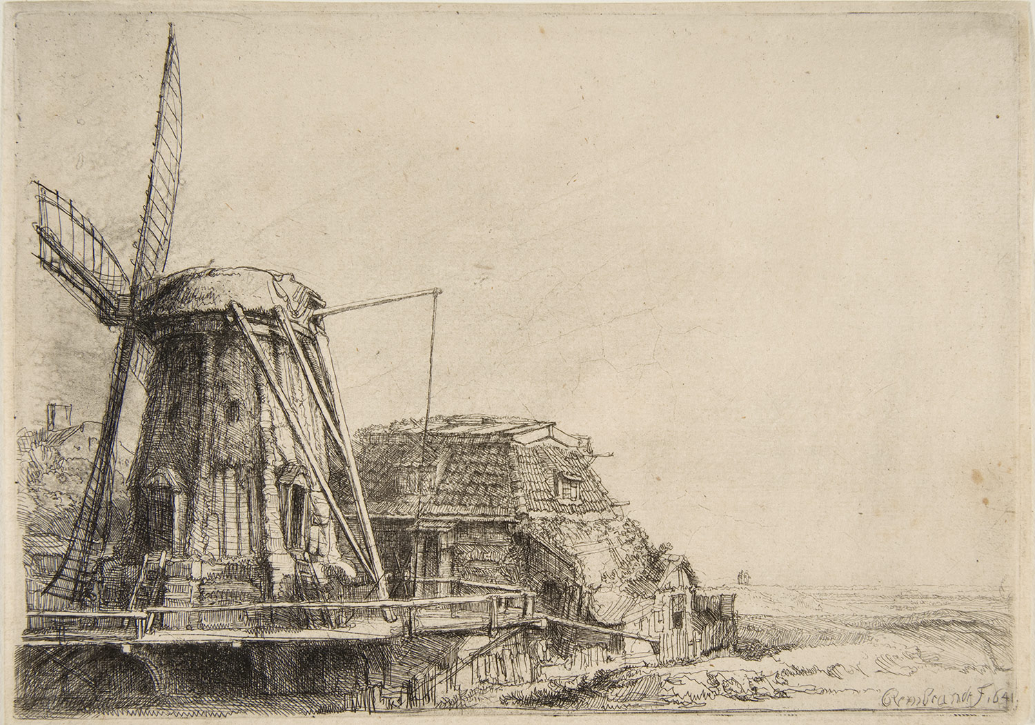
The second pleasant surprise about Amsterdam for me, was Rembrandt's etchings in Rembrandt House. It is almost impossible to go the city, where the Dutch born etcher and painter lived/worked, without hearing him mentioned or seeing his portrait festooned on postcards, t-shirts and various tourist tat everywhere you go. And, yes, for tourists like me, walking through Rembrandt Square or seeing 'The Nightwatch' in the Rijksmuseum are all essential parts of the overall experience. Whilst I had planned to visit Rembrandt House I wasn't expecting to be particularly overwhelmed or impressed by his work any more than I am of any other artists from the 1600's. It is sometimes good to be wrong! His etchings (pictured above) are exquisite. The attention to detail, variety of mark making, tonal qualities and drawing ability in general are amazing. Needless to say I was impressed, but inspired too and I only realised in the few days since I've been back home just how much looking at these etchings influenced my own drawing style. There has been a notable and I believe, significant shift, in my drawing style in the last few days that has definitely improved my mark-making and intensity to my drawings. I definitely put this change down to spending a great deal of time looking at Rembrandt's etchings and more excitingly, for me, this is the first instance in a long time, that I have been genuinely inspired by looking at another artist's work where it has had a knock-on affect to my own. Watch this space for future posts on how the 'drawing-a-day' project 2014 is progressing. 

4.) 'Charlene' -Robert Rauschenberg
In the Stedelijk Museum (imagine the Dutch version of our Tate Modern) lies this fantastic combine painting by American artist, Robert Rauschenberg. At 89 x 112 inches big its hard to miss! Apart from being among the very first of his combine paintings (paintings that literally combine collage, objects, paint, lights and variety of surfaces) it is also one of my personal favourites, largely this is due to the inclusion of (one of my all time favourite objects of obsession to paint/draw) an umbrella in the top right corner. Perhaps in the same way that the different sections of the road, lights, cables came together in the image of the road in figure 1, this painting achieves, in its divided boxed sections of collage, painting, a mirror, a light, a folded shirt, a similar affect.

5.) Tuschinski Theatre
Definitely one, if not the most exciting cinema of all time, the Tuschinski Theatre. Whilst I would strongly recommend seeing a film here (most of them are in English with Dutch subtitles) it is worth visiting even to see the front of the building and inside foyer (pictured). Described more accurately by friends, as 'an Art Deco space ship' the architecture and lighting of the Tuschinski is a theatrical marvel and should be experienced in person. I absolutely love film and cinema and the Tuschinski is how cinema's should be, something special, something theatrical, an experience and not (like so many chain cinemas in this country have become) just a big TV in a darkened room.
 
6.) Arman
Ok, so it's not technically an Arman, or a work by the French-born, American artist, Arman (who is nest known for his accumulations of objects in boxes/vitrines), but it is pretty much, intentionally or accidentally like his work (who knows maybe he lived here?). As with the Rauschenberg and the road surface there is something aesthetically appealing about compartmentalised sections of stuff whereby each section has a mass of different forms/surfaces/colours/groupings/textures. Wonderful stuff!
 

7.) Rijksmuseum Library
Tucked away in the  recently renovated Rijksmuseum is this fantastic 19th century-style reading room, library. Apparently, and I quote, "The Rijksmuseum Research Library is one of the main art libraries in the world. Catalogues of auctions and exhibitions, trade and collection catalogues, as well as books, periodicals and annual reports relating to the museum collections have been collected without interruption since 1885." I wasn't expecting to see this (and probably you're average viewer to the Rijksmuseum is in the same position) and although I didn't look at any of the books on this occasion (where would I start?) I found it to be an incredible looking place.

8.) 'The Milkmaid' -Vermeer
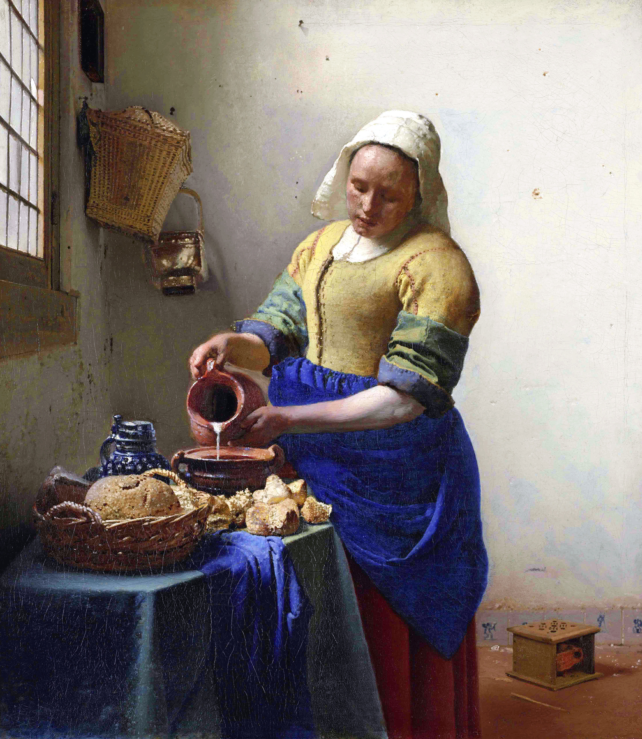
At last! After seeing more parodies of this painting (there was a Delia Smith version...if I recall...)than even reproductions, it was good to finally see the real thing! In some ways this painting by Vermeer is like the Dutch Mona Lisa, its fame known so widely  that when you're actually met with the real thing in person, it doesn't feel quite real at all. It is also smaller (like the Mona Lisa) than what I imagined it to be. Which begs the question, does fame, reproductions of images and photos have a way of making things, people, places physically seem bigger than they are? That could be quite interesting. Although back to the point, 'The Milkmaid' I think can only be most accurately described as jewel-like, its small and precious, bright and glistening (the highlights where the light hits in the painting/the sharpness of the central figure against the background/the whiteness of the milk being poured) . And again, like a rare jewel, it is perfectly formed with care and attention to detail that appears quite natural and effortless when in reality it is a great deal of process is involved. Ironic too, when you consider the connotations of my analogy to jewels when the scene it is depicting the opposite to wealth in the statutory or money sense of the word which is all the more poignant that it is painted with such reverence. The vibrancy of the colour in this painting being particularly eye-opening to what I had previously pictured. Seeing this work along with a selection of Vermeer's in the Rijksmuseum was really significant in changing my preconceptions of his work. 

9.) Flower Market
Where Munt-plein meets Vijzelstr you'll find Singel street, home to one of Amsterdam's many flower markets. Apart from selling tulips, tulips and more tulips it also sells a variety of dried flowers (pictured above), plants, cheeses and assorted touristy goods.

10.) 'Hard Saw II' -Claes Oldenburg
You are reading, 'A Spanner in the Workz' and yes that is a giant saw! All manner of things tool-related just won't go-away anytime soon (and I wouldn't want it to) so how could I fail to be excited by the presence of seeing Oldenburg's giant saw in person at the Stedlijk. I actually never knew Oldenburg made a giant saw being familiar with just about every other giant, hard and soft objects the artist made throughout his career (i.e. toilets, blenders, hamburgers, spoons) and now wishing I had known about this piece whilst doing my degree! In true American Pop-Art style, its big and bold and almost a one-liner if you don't start going into detail of how turning a saw into a giant sculptural work questions the boundaries between a saw as an art object or a functional object (or indeed what does 'functional' mean in relation to use), but then that was always why I was interested in Oldenburg. His work is fun and seemingly straight-forward, allowing the viewer to decide whether to leave it at face-value or whether to pursue interpreting it further. I'll probably find myself somewhere in between the two!


Images sourced from:

Sunday, 6 April 2014

Piggybacking Art on the Block 2014

Back in January I wrote a post about a block of wood I received in the post
http://spannerintheworkz.blogspot.co.uk/2014/01/writers-block.html. The 'block of wood' was actually a blank canvas on which to create something that could be auctioned for 'Art for Life' at Musgrove Park Hospital, Taunton. Despite my creative speculation as to alternative uses for said block of wood, I opted for the safer option to use it as intended and commenced by drawing my then recent obsession, a chameleon. Those of you reading this who may be more familiar with my previous work may remember my drawing-a-day project from 2013 that I've since continued this year, anyway, during that time I drew many different things and particularly enjoyed drawing lizards, reptiles and things with textured/interesting skins/surfaces/shapes. Loosely, that's one theory behind my decision to draw a chameleon...or at least I think so. They're pretty cool and this one's called 'Herman' so what's not to like?   


In addition to 'Herman' the chameleon, you could also place a bid on 'Pigsaw' (pictured below) my transformed Orchard Shopping Centre pig seat which is also being auctioned for 'Art for Life'. The former wooden pig seats that resided in Taunton's Orchard Shopping Centre had long been left to rot in storage before the two remaining survivors were given to myself and Michael Fairfax to transform and revitalise (and believe me, they needed it!). Back in 2013 the idea was to auction the pigs after they had gone on tour of Taunton to raise money for The Brewhouse Theatre. The sad twist in the tale, was that the theatre went in to administration during the pig's tour and both 'Pigsaw' and 'The Polden Pig' were rescued but sadly it was too late for the theatre and due to its closure they went back into storage. In search for a happy ending to their tale and to ensure that they fulfilled their purpose to raise money for a local charitable arts cause it was agreed by the artists that the pigs be auctioned for 'Art for Life'.


There you have it. A pig and a chameleon both in need of good homes. Admittedly, it is amongst my most eclectic of work I have ever made, but hopefully that adds to the appeal. We are very grateful to be allowed the opportunity to 'piggyback' on to the existing 'Art on the Block' event and I'd like to emphasise that there are many more works for auction by over 80 different local artists all in support of what is a very good cause.

If you are interested in bidding then please follow the info below which will direct you to the official Art for Life site:

The auction will take place on Tuesday 20th May 2014 at 6pm - 8pm in the Beacon Centre at Musgrove Park Hospital.

Visit the online gallery and make pre-bids on your favourite blocks (bidding closes on Tuesday 6th May 2014) or come along to the auction.  Tickets are £8, on sale now from the Art for Life office (artforlife@tst.nhs.uk or tel: 01823 342488), and include wine and canapes.


http://www.artforlife.nhs.uk/art-on-the-block-2014/
 

Thursday, 27 March 2014

I like balloons, a lot

Creed-ites or art boffins among you may recognise the deliberate pun in the title of this week’s blog post as a reference to Turner Prize winning, Scottish born artist, Martin Creed’s song ‘I like things’. That’s your first clue, the second being that the artist’s retrospective, ‘What’s the point of it?’ at the Hayward Gallery is most memorable (if the catalogue image/poster and my friends photos online are anything to go by) for a room installation filled with nearly seven thousand white balloons in which the viewer(s) can immerse and loose themselves in childlike joy or claustrophobic terror. This piece, titled ‘Work No. 200 Half the Air in a Given Space’ represents one in an ongoing series of numbered works by Creed, the balloons become a visible manifestation of the air around us, whereby the half the air in the given space is measured and equated into filling the number of balloons to equal it. Why? Sounds like pretty conceptual stuff, but when asked, Creed states ‘I don’t believe in conceptual art. I don’t know what it is. I cannot spate ideas from feelings...Work comes from feelings and goes towards and ends up as feelings.’ Hmmmm....I ain't buying it, the bullshit alarm has been activated and it’s likely to be the first of many in this exhibition of the artist’s work from the last twenty years. This is by no means a criticism as I think the artist is all too aware that his works which include brick walls, curtains opening and closing, blobs of blu-tack and prints of broccoli often descend into the pretentious or ‘bullshit’. It is one view that is perhaps because ‘Creed feels ambiguous and conflicted in himself and wants to share that with a public who feel the same thing.’ Is it a questioning of what exactly it means to have your art ‘taken seriously’ and whether play, observation, wit and, yes, bullshit can be art? What is genuine and what is taking the piss? Maybe Creed's work is about his feelings, but I am not convinced. Does it matter? Much of these ideas have been touched upon in art before but what does Creed’s work present for today and a new generation of artists/art-goers?


I am probably not alone in never being entirely sure how to ‘take’ Creed’s comments about his work. The kind-of honesty and simplicity in his responses can either come across as a dumbing-down, ignorance, ambiguity, pretentiousness or refreshing almost zen-like, minimalist wisdom and clarity on depending how you interpret it. Another example, ‘I find it difficult to make judgements, to decide one thing is more important than the other. So what I try and do is to choose without having to make decisions. At the same time a non-decision is still a decision and to choose everything is still to decide.’ What a contradiction, it’s almost a waste of words but love him of loathe him, he does make a counterpoint in challenging how we perceive conceptual art and whether he ‘likes’ the label of being a conceptual artist or not it’s difficult to talk about Creed without going into the continually shifting realm of ideas, meaning and interpretation where nothing is tangible and constantly changing.
 
Feeling uncomfortable? I know beginning to write about Creed feels as though swimming out to sea without a life raft, pretty quickly I find myself out of depth. I wonder does the prospect of dealing with paying to see an exhibition in which some of the work is a scrunched-up ball of paper, an automated door opening and closing and film of a person vomiting  give you cause to sit with head in hands and despair at what has become of art?! Good, because if so then this is probably the best thing for you. Those of us who are more familiar with the ‘everything can be art’ concept, jaded by the legacy of urinals, irons, pickled sharks and unmade beds walk around Creed’s exhibition probably just a tad too cynical. Although not cynical enough (yet) to not think it’s worth trying and in fact it turned-out to be a surprisingly healthy thing to experience (as far as seeing a video of a woman crap on the floor and an erect penis, can be described as a 'healthy thing to experience' then, yes. Ha ha). I don’t think Creed intentionally tries to make his audience feel uncomfortable, he doesn’t use a lot of fancy ‘art speak’ or terminology that inflates his work with an authority or sense of importance. In fact, quite the opposite, it’s more a case of ‘it is what it is’, almost a one-liner. If you have a problem with seeing a woman crap on the floor then that's normal, that's human. The awkwardness comes more from our own expectations of what we assume art to be, for example, an artist sees the piece, ‘Work No.79’ and can see it is a lump of blu-tack pressed on the wall, but they bring the ‘baggage’ of placing interpretation and an expectation that it must be more profound, meaningful, ironic and researched than just sticking a lump of blu-tack to the wall. The context of the work being in a gallery also throws the reading of the work into having ‘value’, conviction and or merit that we stereotype with the credibility of the gallery as a brand or institution of art. The result is that we are kind-of tricked into thinking perhaps too much when really we don’t need to. Maybe the approach is more simple, ‘it is a lump of blu-tack on the wall, how funny and should that sort-of thing be allowed in an art gallery?’ It’s impossible to write about Creed’s work without writing about rules and whether there are any when it comes to art, and if not then why aren’t more of us exhibiting our detritus, play and interventions with our surroundings?


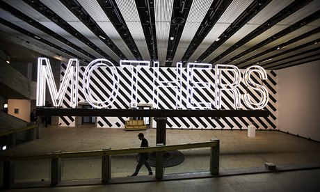
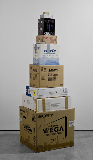
I don’t have the answers to these questions but feel that we need an artist like Creed to stir things up, to be the one that speaks plainly, pleads ignorance and does things seemingly for the sheer sake of doing them. To his credit, he is pretty prolific and explores many mediums from music, to film, installation, drawing, printing, painting, kinetic works, sculpture, interaction. Each time seemingly applying a simplistic logic to his work, in ‘Work No. 1092’ a huge neon sign saying ‘mothers’ (its 12.5 metres long by 2.5 metres high) spins around above the heads of gallery viewers at varying speeds, almost threatening to knock your head off, to which the artist claims, ‘when you’re small you’re mother is always really big, So it seemed like a good reason for this to be big...and scary.’ Like the title of the exhibition, I am beginning to wonder ‘what is the point of it all?’ There isn’t one word or place you can pin Creed’s work down to, it’s not necessarily autobiographical, sociological, psychological, metaphysical or even really, despite my initial attempt, that conceptual. The artist doesn’t bring these ideas to the work so much as we read into them,  his ‘Works’ are interventions, I think, they intervene with how we view art, the world, stuff, things, materials, people, space, scale, concepts etc. In an exhibition where you move from one work that is a giant rotating neon sign, to a room filled with balloons, a light going on and off, a video of a woman vomiting, a scrunched up ball of paper and boxes arranged in a stack from largest to smallest how do you begin to equate it all together, make sense of it? It’s all reactionary and will either provoke, alarm, confront, appal, delight, amuse or bemuse its audience. It’s dangerous for me to probably have even attempted to make sense of it, I don’t think I’m supposed to!


Maybe the fine-line between the whimsical and/or intelligence is all an act? It is likely, as all of Creed’s play, exploration and interventions must have been met with some determination, business-sense, networking and authenticity in order to convince the art world that it is worth acknowledging. The refreshing aspect about Creed is that his work reflects the insecurities that people have of the art world of being, overtly serious and inaccessible with meaning (if only accommodating to this audience instead of trying to alter their perceptions). The ‘Work No. 1197’ as part of the Olympics saw all the bells in the country rung as quickly and as loudly as possible for three minutes (I remember partaking myself, running into the garden at nine in the morning with a small hand bell) was a good example of a piece by Creed that was inclusive, meaningful and accessible without being gimmicky or jokey. To some, his inability to tackle the true grips of his challenging of how we make/view art, instead always settling for a flippant answer may be exasperating and seen as a cop-out; others may see his concern with feeling  in the work as an almost romantic gesture that is about one man’s need to make and express himself. I for one am glad to have been part of the laughs and think that this retrospective' s greatest legacy will be by having an artist like Creed recognised in the art world, as a result, we aren’t left with too many artists like Creed.

 
Martin Creed ‘What’s the point of it all?’ is on at the Hayward until May 5th 2014:

Images sourced from:
http://www.theguardian.com/artanddesign/2014/feb/02/martin-creed-whats-the-point-hayward-review
http://www.telegraph.co.uk/culture/culturepicturegalleries/7902671/Martin-Creed-Works.html
http://www.martincreed.com

Monday, 10 March 2014

May contain spoilers!

So I made the fatal mistake of reading a review of the Richard Hamilton retrospective at Tate Modern prior to seeing it. ‘No big deal’, you say but in the age of twitter and instant access news it’s difficult to read any book,  walk into any film or exhibition without some preconception of what to expect. We’ve lost the element of surprise. You’ve seen most of the film in the trailer, read the book, downloaded the soundtrack often before you’ve even sat down in the theatre. And of course, whilst a certain amount of ‘knowing what you’re in for’ is important in giving you a reason to be there, it’s also kind-of sad that there is less surprise, shock or mystery to so many of these experiences. In terms of art, a little ignorance goes a long way (albeit if it’s met equally with the desire to learn). Anyway, what I’m getting at is the difficulty of forming an individual opinion, thoughts and ideas on an exhibition or to experience it open-mindedly if you’ve already read too much about it elsewhere. And does popularity in the form of reviews lead to a consensus that something is ‘good’? Appropriately for a retrospective centred on a Pop Artist it becomes a debate on quality in relation to popularity. Do our parameters of judgement change if we know the thing we are critiquing is deemed popular?

'Just what is it about today's homes that makes them so  different, so appealing?' -1956 Collage

This of course just my opinion, perhaps I’m too easily influenced by what I read instead of using it as a counterpoint to make my own conclusions but I still cannot help but enjoy seeing an exhibition that I’ve only  been drawn to by the title, knowing nothing of what artists/works to expect. The flip-side to all this, is how the internet, reviews, sharing and ironically, even blogging, opens art up to an even bigger audience that includes people who go to exhibitions all the time and those who may be considering to go perhaps for the first time. Wonderful, and how else are you going to hear about an exhibition other than a review, mailing list or advert/poster that could well be online or on someone’s Facebook page? Still, I’d say every once and a while read a book, see a film, visit an exhibition on as little information you can, find out the bare minimum of something that pries your interest and go for it blindly. It’s really hard to do.

If you’ve read this far already then maybe you’re interested in hearing a bit more about the Hamilton retrospective at the Tate, but I’d suggest that if you’re planning on going to see it anytime soon, then read no further! Those of you who’ve already been or perhaps not interested in going at all (why wouldn’t you be?) then allow me to continue...
'Transition IIII' -1954 Oil on panel.

As I said, I read the review so I already knew that Laura Cumming from the Observer thinks that this retrospective has too much in it and should have been edited down more. Reluctantly, for reasons mentioned above, I am inclined to agree and ponder; does a retrospective have to include absolutely everything to be a retrospective? Should the Tate ever decide to honour my passing with a retrospective of my own work, I’d be horrified to think they’d put everything I’d ever made in, thinking of the hand drawings I did at A-level for example. Not that they were particularly bad or good, but more that they wouldn’t be relevant, I never came back to hands since and it had no influence stylistically on my later work...or so I’d say...The same goes for Hamilton, did I really need to see half a gallery dedicated to his turd drawings against a sunset, when one would have been enough to get the point across? The amount of work shown was incredibly comprehensive, Hamilton was a prolific maker and evidently, from what I just mentioned, with an excellent sense of humour. That humour now comes across as more subtle than I assume the reaction it would have had in the 60’s when some of the more political pieces were more prevalent. From the collage and precursor to Brit Pop, ‘Just what is it that makes today’s homes so different, so appealing’ (pictured) to the reconstructed Duchamp’s Large glass and photorealist styles of ‘The citizen/the subject/the state’, Hamilton’s work spanned several decades of vast changes in technology and the rise of mass-market consumerism which he explored and utilized in his work. In fact, Hamilton’s art career could best be described like a collage, he explored and collected a variety of different components, images, fragments, techniques that all seem slightly different but come together as often reassembled re-edited and reconfigured works commenting with wit and humour on elements of consumerism, politics, fame, design and advertising. Instead of focusing on the breadth of his entire career this post will focus on the particular work that resonated with me and present some usual commentary as to why that is.

'Towards a definitive statement on the coming trends in menswear and accessories (a) "Together let us explore the stars" -1962 Oil and collage on panel.

For me, the stars of the show are the Pop paintings from 1957-1963 where combined images of cars, machines, appliances and people are composed with abstract mark making, signs and symbols. The canvases are left fairly neutral and almost minimal in their whiteness and use of space. Onto these surfaces cars, radios are half-painted/half-sketched so only an outline or trace of the object can be seen. What is revealed is small, stylistically detailed and rendered sections that hint the edge of a car’s bumper, a tap, a shoulder, before disappearing. They’re paintings that explore the way we read representational images in art by offering a ‘dot to dot’ of an object instead of presenting the whole package. This also makes them quite painterly as elements of realism sit alongside gesture, surface and form. Although their flatness remains and ties them into the realms of graphics/advertising, again in-keeping with the era they were created. Interestingly, for me, they all have a limited colour palette, fairly neutral in tone and on a personal level I am curious as to why I am drawn to this in both my own and other’s work (think Jim Dine’s prints for example)? Is it because the beige/off-white background is reminiscent of paper or vellum, which has an association of drawing and primed-ness/workings-out to it that appeals to my love of drawing? It’s interesting and something I need to give further thought to.

'Reaper' - 1949 Drypoint

In one of the opening rooms to Hamilton’s retrospective a series of prints are shown from his days as a student at the Slade, 1949-1951, they’re semi-abstract etchings of reapers and ploughs, titled ‘Variations on the theme of reaper’. Aside from my obvious delight at seeing a tool-related theme, these etchings were an interesting insight into the aforementioned Pop paintings due to their approach of deconstruction and reconstruction. It was apparent in these early prints that Hamilton was interested in figuring-out how things worked and reimagining them particularly within design and form. This same deconstructing can be seen in Hamilton’s obsession with Duchamp, Dada and reconstructing ‘The Bride Stripped Bare by her Bachelors, Even’ but also in the Pop paintings under discussion here where aspects of the form/design of the car as object is played upon against the natural curves and design of people’s bodies or faces. In fact in some cases the two almost appear to fuse together perhaps also alluding to or signifying the growing ‘need’ and relationship that was prevalent at the time between people and the objects they possess that ‘become’ and/or form their identity.

'Hommage a Chrysler Corp' -1957 Oil, metal foil and collage on panel.

As a student I longed to see these paintings in real life, having spent many an evening squinting over often small or low resolution images in books as I made desperate attempts to replicate and understand them. Hamilton was a great maker of images, the flat and 2-Dimensional, the static, the one-liner, they are qualities I have been able to relate to in my own working methods. What a delight it was to finally see these paintings in-the-flesh, reaffirming the things that I enjoyed about them whilst showing me a closer view at their surfaces and colours that I was previously unable to see. The rewarding thing about this retrospective as a whole was making connections through seeing how his early work influenced the latter. Its also in some ways quite reassuring as it means I may never escape from tools or A-level hands for that matter as my concerns with those things will develop and lead to the themes of future work. I may be reluctant or unaware to notice it at the time but retrospectively it’s all connected.

Wednesday, 19 February 2014

The things we do


Spent a fantastic evening in the company of some spectacularly talented, kind people and then of course there was the fellow who drew this cartoon. Ho ho. No prizes for guessing which is me and coincidentally after what was a formidable battle I went on to loose at moustache top trumps. Cartoon created by Philip Kingslan John, moustache top trumps, fine dining, table, wine, ambiance and hosting extraordinaire supplied by Siobhan. Cake pops by Rosie.

You can check out more awesome artwork and all manner of macabre puppetry and performance on Philip's company, 'Four of Swords' website. 
http://four-of-swords.com/
And watch this space for future details of their forth coming production of Macbeth coming to Beer Quarry Caves this May