Tuesday, 27 May 2014

Look if you like, but you will have to leap

Creativity requires a leap of faith that is not limited necessarily to the making of art, but also in how we approach it or attempt to engage with it. The sentiment comes from the title of this week’s blog post, a line from the Auden poem of the same name, ‘Leap before you look’. As I understood it, the poem, (in the context of first coming across it during my art degree) is about taking risks, having the courage to move forward, indeed even leap into the unknown. For all this 'leaping' we may be rewarded with progress, innovation, revelation or new understanding.

 
Therefore appropriately titled, ‘Leaping the Fence’ the first exhibition in the newly reopened Hestercombe House acknowledges this same conviction of pushing of boundaries and pioneering exploration undergone in the practices of sixteen selected contemporary artists who have contributed to British art over the past thirty years. Although it is also asking its audiences to do the same in challenging their perceptions of what contemporary art is within the context of Hestercombe House and what are already well-established Georgian and Edwardian gardens that would have been groundbreaking in their own way upon their creation.

On Monday 26th May, I went to have a look at ‘Leaping the fence’ (never really being one to sit comfortably on it).


(pictured left to right) David Batchelor 'Colour Chart Painting 33 (green)', Steve Johnson 'Binoculars (charm no 9), Adam Chodzco 'Untitled stile (teenage version)'
 
It should come as no surprise to find that there are a significant number of works in the exhibition which are distinctly garden and/or landscape themed. Perhaps the title of the exhibition inspired from Adam Chodzko’s turquoise glossed stile (pictured) that stands proudly, mixture between kitsch piece of aerobics equipment and ‘pimped-up’ take on the familiar countryside hurdle. It is a fence of sorts but sadly, despite the temptation, not for leaping over, at least not literally. The theme continues in what, joy for me, is Gavin Turk’s ‘Desert Island Scenario’ (pictured) a mahogany carved spade. Likened to Duchamp’s similarly conceptual ‘In advance of the broken arm’ whereby the authorship of the object is questioned, Turk takes the debate one step further by crafting his ‘ready-made’.

Gavin Turk 'Desert Island Scenario' (2003) Mahogany, 8 x 103 x 19.5cm.

Another tool-based piece in the exhibition that appealed to me (in the sense that it is probably the one I would most like to draw-and probably will) is Mark Hosking’s ‘Untitled (Lowland Rice) two steel sculptures that appear to be utilitarian pieces of farm machinery in bright red (pictured) and sage green. They appear at first like two abstract Anthony Caro works, their forms reminiscent in my view, of the late artists balancing/minimalist sculptures. In this sense the work operates on two planes, being sculptural for their form, colour and context but in also having a functionality that the artist has created from a United Nations pamphlet on sustainable development and survivalist technology. I’m not entirely sure what these contraptions are actually for, some sort of digging/sowing, I assume but am more interested in their ambiguity. In past discussions about tools and their uses, I’ve often found that the more interesting tools both visually and conceptually are the ones which cannot be easily defined in their use and/or being classified as a tool. The ambiguity of the objects imbues them with more potential than if their exact purpose is known. In Hosking’s work does this duality as art object and functional one help us, as stated by the catalogue, ‘question the clash between contemporary art and reality of life for large parts of the world’s population’?  Perhaps, it goes someway to doing so, but I find it harder to escape its reality as an art object more than its connotation to the wider world of farming/survival. Man’s relationship with the earth is explored deeper (literally) in Tania Kovats sculpture ‘Sunk’ and in Janice Kerbell’s social/scientific digital drawings garden design is determined by the climatic, architectural and functional conditions of a range of indoor environments. In an adjacent room, Marc Quinn presents a series of prints of frozen gardens of plants which would never grow together naturally. 


Mark Hosking 'Untitiled (Lowland Rice)' (1998) Steel and paint, variable.

The exhibition also features painting by Clare Woods, sound installation by Susan Philipsz and film from Spartacus Chetwynd and Mark Wallinger (the Chetwynd film being the stronger of the two for me). Did I mention Tracy Emin is in this show too? Well, her work’s here and maybe lends a certain amount of popularity and recognisability along with the shows’ other five Turner Prize nominated/winning artists, but other than that her neon poems/phrases, like the one featured in this show don’t do a lot for me personally (I think I find them too obvious) however I do not doubt will appeal to some. No stranger to this blog we also see a painting by David Batchelor whose green gloss blob has seemingly inspired a similar green arc filling the top floor of the gallery windows. It’s an impressive sight when you come down the stairs or driveway to the front of the house (pictured) that reaffirms that something new, lively and fun inhabits within. Largely, the exhibition is well placed with the different rooms each giving their own atmosphere/context to the work. It particularly works well in the case of Bill Woodrow’s ‘Clockswarm’, a cast bronze in the shape of a mantel piece clock of a swarm of bees which sits as though it were built for the space on the fireplace opposite Ruth Claxton’s sculpture featuring, possibly what could be a bee-eating bird. Mark Nelson’s installation ‘Taylor’ (pictured) also works well in the building completely filling the room on the ground-floor. A raft of barrels tied (expertly!) together with rope supports a small tent and supplies for a journey. Where is it going? I’m drawing up my own recollections of the recent floods on the levels...Nelson is best known for his labyrinthine installations, ‘Coral Reef’ shown at the Tate in 2000 being among one of the most ambitious, disorientating and filmic pieces I have seen. ‘Taylor’ similarly has filmic connotations referencing the character, George Taylor from ‘Planet of the Apes’ who tries to escape upon a raft in vain. This work was site specific to Liverpool as one of the last centres for the British slave trade and references the political plight of refugees from Haiti and Cuba.

Mike Nelson 'Taylor' (1994) Metal, canvas, wood and mixed media, 250 x 336 x 456cm.

To ‘art tarts’ (so I’ve been told!) like me, then this exhibition will come as a shining example at a time of great losses in contemporary arts in Taunton and is therefore a glimmer of hope for the future. It deserves every success and is a delight to be able to enjoy and see these works on my doorstep. To the unconverted, undoubtedly there will be those who come to Hestercombe with more traditional expectations of painted landscapes, flowers and botany. To those ends you are probably best suited to looking at the gardens, but if are willing to not just look, but to leap into embracing or attempting to understand something new, something challenging, something difficult then you will be rewarded with an experience that is every bit as colourful but in many ways more, joyous and contemplative as the gardens themselves.

It is also a refreshing reminder that regarding creativity, sitting on the fence is a good vantage point but it also stops us from moving forward. This proves that it sometimes pays to do away with the fence altogether and venture into the unknown. Let's hope art at Hestercombe continues to do so. 
 
'Leaping the Fence' is on at Hestercombe Gallery until 14th September 2014.

Tuesday, 20 May 2014

Livin' for the Weekend


Sunday 4th May, whilst it seemed the entire population of Bristol was on Park Street attempting to catch a glimpse of the waterslide (myself included), I wondered how many also knew that this was just one event during the first Bristol Art Weekender. Spike Island Open Studios, Arnolifini, Bristol Museum and the Royal West of England Academy being among the few big venues to host events and exhibitions over the three day bank holiday weekend. I navigated my way through the crowds on Park Street to venture what was happening....
This is a post in three parts so you can choose which you’d like to read individually or sit and read them all. You decide... 

The slide's there somewhere, as is Wally


Karin Krommes 'Sway' (2012) Acrylic on Panel 60 x 40cm.

1.) Before I arrived in the melee I wandered Bristol harbour side to Purifier House where the nomadic art gallery, Antlers hosts the exhibition ‘Exploration’ featuring the work of three contemporary artists. If you haven’t come across Antlers before they’re worth keeping an eye on, based in Bristol they use different venues for each exhibition and represent emerging artists. ‘Exploration’ for want of a better word, explores the idea of technology and/or architecture being used as a means of exploring our environment in pursuit of discovery. In Krommes’ paintings, ‘Romantic’ landscapes featuring snow-filled and haunted looking pine forests become invaded by satellites and swarms of passenger-less drones. Similarly in George Diego Litherland’s paintings Eden-like utopias complete with their own self-contained weather system are trapped within octagonal frames or windows suspended within a  fantasy or science fiction-like world. Completing the line-up is Jemma Appleby who combines landscape and architecture into precise charcoal drawings based on Frank Lloyd Wright’s Usonian houses. Are they utopias or dystopias?  Devoid of humans it is hard to tell if we are seeing the technology or architecture left behind some terrible event or from the future. The buildings, the drones have are the unnerving presence in these works. Together the work is deliberately quite cold, artificial, isolating and slick. This is echoed in their presentation, as they are highly skilled works that are astonishingly done by hand but at first appear with the precision of a machine. It is also a poignant reminder of our reliance on technology in our day-to-day lives often determining how we navigate, interact and explore our environment.
'Exploration' is on until 8th June 2014 at Purifier House


Jeremy Deller 'A Good Day For Cyclists' (2013) Commissioned for the British Pavilion at the Venice Biennale, painted by Sarah Tynan 

2.) I eventually make my way to Bristol Museum and Art Gallery where Jeremy Deller’s Venice Biennale exhibition, ‘English Magic’ is currently on display. For the first time in the Biennale’s history the exhibition from the British Pavilion is touring the UK. I’d previously seen the work in Venice so it was interesting to see how it varied in a different context and I think the British Pavilion should tour the country every year; it’s a great way for the public to engage more with the Bienniale (we’ll have to see when Sarah Lucas exhibits in 2015). ‘English Magic’ gets its name from the ‘good’ and ‘bad’, trickery and concealment practised by politicians. It reflects the diverse nature of British society, its culture, its economics and its politics whereby Deller interprets particular events by working collaboratively with the public often with humour and wit. All is not what it seems however, icons of British culture and heritage are mixed, reinterpreted and/or respond to current events. Still I think this shows that we can be proud that Deller represented Britain at the Venice Biennale he showcases many of the ‘great’ things about Britain but does so by showing that we also have a sense of humour! The work isn’t a collection of one-liners, the humour more subtle, wry and satirical. Social upheaval and the economic depression are presented alongside Bowie’s tour between 1972-73, William Morris is painted on a wall as a giant lifting Roman Abramovich’s yacht from the waters of the Giardini in Venice (in 2011 he moored his 377-foot yacht blocking the quay for tourists visiting the Biennale), a hen harrier is grasping a range rover in its talons, Neolithic hand axes adorn the walls becoming arrows and way markers, there are drawings of politicians connected to the conflicts in Iraq and David Kelly incident by prisoners in the UK and seemingly colourful/abstract banners depict tax avoidance schemes used by international companies.

The themes in these works are presented in the opening film to the exhibition, ‘Ooh-oo-hoo ah-ha ha yeah’ where at first slow-motion shots of birds of prey are shown swooping in, talons and wings splayed in captivating detail; we are then transported to a scrap heap where giant mechanical claws are lifting and prising up cars at this point the link between the two becoming more obvious. Another shift sees a bouncy castle Stonehenge and its excited participants, young and old bouncing on it. The film finishes with a scene involving the Melodians Steel Orchestra playing Bowie’s ‘The man who sold the world’ (It’s a really wonderful version). The film is fun to watch and captivating, there is something uplifting about the sense of community involvement in the work and it highlights the wonderful aspects of Britain, its birdlife, history, people etc. but with a quiet, underlying subversive sense of unease; the Stonehenge isn’t real being commoditised to a thing of play, the natural beauty of a bird of prey grasping its prey is compared to the not so obviously/debatably beautiful mechanised version of the car disposal industry , the steel band performing a rendition of the ‘man who stole the world’ marking a change in what is traditionally played on steel drums as well as being a politically-charged song. I do feel the exhibition worked better in its own compact pavilion in Venice where the work could be read as a whole, the linking and referencing between ideas in the different pieces of work was more clear. Th enjoyment of the work however is not lost in Bristol  and still has thought provoking impact with the most notable significant difference being that in the Venice show part of the exhibition was to have a complimentary cup of English tea. Magic!      
Jeremy Deller, 'English Magic' is on at Bristol Museum and Art Gallery until 21st September 2014

Gail Harvey 'Light and Movement on the Sea' (2013) Oil on Canvas, 142 x 163cm.

3.) Final destination of the day was ‘The Power of the Sea’ at the Royal West of England Academy (and also the first time I’d ever been there). In an exhibition that is co-curated by painter, Janette Kerr (pictured) it is not surprising to find it mostly contains paintings! We leave behind the directly conceptual ponderings of Deller’s work and delve into the briny depths of surfaces, texture and the stuff of paint. Personally, I love the fact there are so many painters in this show. It’s really refreshing for me to be reminded of the joys of making marks and wielding a brush. There are so many big paintings, expressive paintings, abstract paintings where the vibrancy, energy, intensity and often ferociousness of the sea are portrayed in frenetic mark making, gesture, splashes and pouring. Maybe it is because paint is a liquid medium it lends itself so well to communicating the fluidity of water and can capture a moment in time/an action drying to leave a trace, mark or stain?
It is not all painting however there are also sculptures, etchings, photography and film-based works where the serenity, vastness, sustaining and navigational nature of the sea are also explored. Featuring sea inspired/ themed work from British artists from 1790 til present day curating this exhibition must have been no easy task with artists who are essential in telling the story of British artists relationship with the sea such as Turner, Constable, John Miller Marshal, John Piper and Peter Lanyon to others who were certainly less well known to me, such as George Morland and Charles Napier Hemy. The pre 21st century artists are well placed in this exhibition being worth seeing in their own right and for providing a history of the evolution and context for the contemporary artists’ work in the second half of the gallery.

Janette Kerr 'Holding my Breath II' (2013) Oil on Canvas 180 x 210cm.

The contemporary responses to the sea are, for me, where things start to get a lot more interesting. There are a lot of paintings, I may have mentioned, some depicting the sea, others using water from the sea and in the case of Peter Matthews’ ‘Atlantic Drift’ and Susan Derges in ‘Shoreline 5 October’ the sea itself becomes part-creator in the work. In Matthews’ a primed board is attached to a rope and buoy before being tossed out to sea and in Derges the tide sweeps over photographic paper creating exposures of the waves. These works highlight one of the most important challenges of capturing the sea in art, movement. The sea is rarely, if ever, still. Even on the calmest of says the reflected light on water from the sun moves and shimmers. Along with their own concerns that each artist brings to their work the one thing most of them also have to contend with is how suspend that moment in time, an impression of the movement of the sea and or as well as addressing the ‘movements’ of change, tensions with our relationship to both use, navigate and save it. Anne Lydiat has a refreshing approach making a series of spider-like drawings marking the lived experience of bobbing about in a boat at sea. In ‘Currents’ Annie Cattrell has literally frozen the rippling or effect of light on water in what at first appears as the seemingly impossible, a cast taken off the surface of the ocean (the work is actually created using data scanning techniques to recreate a 3D vacuum formed  acrylic model of the surface). Pausing for thought looking at the variety of works in this show I begin to wonder how they begin to alter our impression of, relationship with and how we ‘see’ the sea. A bit like looking at the actual sea itself, it is all very contemplative and we seem to find some sort of solace or meditation in looking into the surfaces, the depths of these representations. It warrants more thought than I have time or words to explore now.     
There are two interesting films in this exhibition as well, Rona Lee’s ‘Ama’ is a moving film about the limits of observation shown through deep sea investigation and narrative of Amant Marine: De Friedrich Nietzsche read in Braille by a blind performer and Joanna Millett’s ‘Overflow’ (pictured) a video/sound recording of the ebb and flow of the sea that is projected on the wall and floor of the gallery space creating a disorientating and immersive experience for the viewer.


Joanna Millett 'Overflow' (2004) HD Video and Sound loops
This is an interesting exhibition and the relationships the artists have to researching, living and experiencing their subject matter is reflected in the work. A lot of it might be ‘Romantic’ in the sense that many of the artists have affinities with the sea, embracing themes such as light, colour, weather, mythology and history in the work, but there is increasingly a more scientific, more questioning  approach used by artists to understanding and representing these ideas which makes for an altogether more engaging show.

'The Power of the Sea' can be seen at The Royal West of England Academy until 6th July 2014

Tuesday, 6 May 2014

Nosing around in Newlyn and Penzance

Tiny wooden tools suspended in salt water inside a bottle! What's not to love or at the very least find incredibly curious about these unusual man-made relics by Cornish sailors. A ship in a bottle, seen plenty, but tools in a bottle?  That's certainly new to me. Their display in the Exchange, Penzance doesn't offer up any additional information either, being deliberately ambiguous and provocative. Alongside this, similarly unique artefacts, on loan from Helston Museum, are on display as part of an exhibition that I'd been intrigued to see for a very long time...


‘Curiosity: Art and the Pleasures of Knowing’ is a touring Hayward exhibition inspired by cabinets of curiosities and draws on ideas in contemporary artists’ practices that explore the perils and joys of research, fascination and enquiry within their work. The nature of wonder, knowledge, curiosity and the dark side of secrets is explored in new, sometimes surprising or unsuspecting ways by the featured artists and, as I found out, has both the power to bemuse, delight and inform its audiences.

‘Curiosity confuses attention and distraction, novelty and repetition, interest and boredom, seriousness and triviality.’

As I briefly mentioned, I managed to catch this exhibition whilst it was on at Newlyn Art Gallery and The Exchange, Penzance back in April. It’s now currently on its last stage of its tour at the excellent (take it from me I’ve been there) Appel Gallery in Amsterdam. However, I had heard of the exhibition long before I saw it, coming across a copy of the exhibition catalogue and after seeing the works it presented I really did want to find out more.


How things work, mechanics and the tools that fix them, mechanical diagrams, Da Vinci’s drawings, Fernand Leger’s mechanical inspired compositions, the Futurists, the deconstruction of the everyday presented in Cubism; are some of the many things that have influenced and inspired my own practice (or at least in the early stages, initially more aesthetically than symbolically). Collections also often appear in my work particularly in my depictions of tools, although I never really came to a resolution as to whether this was because I liked the shapes layered clusters of tools created or whether there was something underlying more psychological or obsessive about the collection/need to draw them all. Either way, the decision to create sets of tools often drew parallels to museum modes of identification, artefacts and cabinets of curiosities. In turn this led to looking in more depth at interpretation, how/what criteria we use to define what a tool is etc. ‘Curiosity’ appeals to that reasoning and is really an exploration into how we interpret things. There isn’t a huge amount of pinpointing to exactly what anything in the exhibition means or often even is which only heightens the sense of intrigue and curiosity. For this reason, and unlike some conceptual art the work operates on two levels;

-“I’m interesting and intriguing enough to look at, experience on my own.”
-“If you read what I’m about you’ll find a different/additional way into understanding the work.”   

‘Curiosity’ brings together the work of 21 artists, that include Susan Hiller and Richard Wentworth alongside specific artefacts based on whatever location it’s currently on display in. It’s a concept that has been explored before in ‘Mythologies’ at Haunch of Venison, 2009 and ‘The Martian Museum of Terrestrial Art’ at the Barbican in 2008 both of which also featured a mix of contemporary art works alongside everyday or museum-based artefacts. The exhibited works have been selected well ranging across a wide variety of media and approaches from taxidermy to photography, film, glass and printmaking. Some of the processes are natural such as a collection of agates, alabaster, jasper and quartz stones belonging to writer Roger Caillois’ who reminds us of the tradition of artists and writers ‘seeing things’ in stones whereas others are more playful such as Nina Katchadourian who creates images or recreates Flemish style portraits from in-flight magazines, food, napkins on long haul flights .There is something to satisfy everyone’s level of curiosity, with works that are scientific studies, such as Leopold and Rudolf Blaschka’s  glass anemones and jellyfish (pictured) to Thomas Grunfeld’s taxidermy hybrids (a peacock fused to a penguin) which is more direct in alluding to the Victorian Cabinets of Curiosities/Freak shows that often featured taxidermy hybrids. What these works also demonstrate is the idea of 'making' as a way of understanding. In the same way that drawing allows us to notice the thing we are drawing more closely making or drawing also reveal an understanding of how something is formed/how it works that cannot perhaps be so easily obtained through other means of gaining knowledge.

Aura Satz 'Skyquakes in Ear Trumpets' 2013

The artist Aura Satz attempts to create visual representations of sound using archaic technologies, whereby hearing trumpets emerge from a phonograph horn capture the sounds emitting from the phonograph inwardly mimicking the functioning of the human ear....or something like that...it sounded very unusual.

Leopold and Rudolf Blaschka 'Actinia and Sargartia' 1890


'The Centre for Landuse Interpretation' Los Alamos National Laboratory Rolodexes 1965-78

Apparently when it comes to landuse there's a vast archive of material collected by the CLUI in Los Alamos, a research and education organisation whose aim is to 'understand the nature and extent of human interaction with the earth's surface'. What exactly that incudes or rules out is anyone's guess, it could include absolutely everything.The business cards displayed here are from organisations and suppliers of the sort that a national nuclear weapons factory might need to call upon (and there's a lot of them!) Collected at the height of the Cold War arms race they are representative of the sheer numbers and volume of companies involved. Fascinating in its weirdly specific nature but also politically charged in its decision making.

Matt Mullican 'Untitled (New Edinburgh Encyclopaedia Project) 1991

Highlights for me included Matt Mullican’s ‘Untitled (New Edinburgh Encyclopaedia Project)’ (pictured) comprising of hundreds of oilstick rubbings, some hung on the wall others in a large plan chest and are from what I assume were printing plates for an encyclopaedia.  Naturally the information presented alongside doesn’t specify and is fairly vague saying that they are the artists’ ‘signs’ and he sees them as ‘symbols and pictographs that make up an eccentric cosmography that might expand forever’. All I know is that to me this work deals with how things are signified, how we represent knowledge and meaning pictorially which touches upon what I mentioned earlier in being interested in interpretation.

Katie Paterson’s ‘History of Darkness’ is essentially a box of slides containing photographic images of the night sky collected from researchers around the world. Visitors are invited to view the slides and hold them to the light. Each one is dated with its time and location and you are quickly aware that each one appears exactly the same. The interpretation? Darkness is never ending or I prefer to think it’s an enquiry to find when the darkness does end or a kind-of reassuring take on the idea that despite coming out of the age of enlightenment, the age of illumination and so forth that we are still in the dark, in the sense that there is still much we do not know/understand.
All very reassuring in what was a very enjoyable and fascinating exhibition. In some aspects the process of 'finding out', exploration and investigation is what artists already do and have always done; whether it is a 'finding out' that is personal, expressive or a 'finding out' in which to communicate an idea, event, phenomena, persons or place. In stating that, this exhibition doesn't present anything wildly revolutionary but does reaffirm that art is always about enquiry in some form or another which this exhibition successfully shows alongside the work of scientists demonstrating the often tangible links between the two.  Art tends to make the science more accessible and science informs and gives a rationale to the art. It is an exhibition I will continue to talk and think about long after having seen it. 

Wednesday, 23 April 2014

Happy World Book Night 2014!

Is it unusual to travel for two hours on a train just to visit a library? Perhaps, if it was an ordinary library but then Birmingham Central Library is anything but ordinary.


Like a giant box of Ferrero Rocher, Christmas present or Islamic garden trellis the ornate aluminium facade of Birmingham Library is impressive and certainly eye-catching, if not also accused of being a little gaudy. Never being one to shy away from matters of taste (in probably not having any myself) and whilst recovering in the lull of post Amsterdam festivities it seemed the right time to pay a visit and reach my own conclusion. Even more appropriate timing too if you consider that it was designed by a Dutch architect, Francine Houben.
 Libraries are fantastic places, period. Whether they’re old or new, rundown, in a village, town, city or touring in the back of a bus they're still full of wonder, potential, magic and the source of much delight and contemplation. This is largely due to them being full of books, acting as temples for books, palaces for books. Rarely is it the actual building itself that inspires but more the sheer accumulation of books, the knowledge, histories and stories they hold all in one place.  It is the idea of the library, a wealth of collective and shared knowledge that is debatably, in many ways as uplifting as a place of worship (or it can be). Equally, I’d agree that books really do furnish a room and unless you’re incredibly wealthy where else are you going to see thousands of books, that you have the freedom to access, all in one place other than a public library? Is it therefore the books that make the library or can the library itself as a building, a construct, a symbol for knowledge, learning, discovery, discussion, debate etc. be as important (if not more so) than the books themselves? More on that later....
 Being in the business of supposedly selling as many books as possible it may seem counterproductive, to those not within the world of bookselling, to speak so highly or fondly of libraries as though we should regard them as the enemy. I’m pretty confident that this is not the attitude of most booksellers and I speak for myself in saying that it is impossible not to have a respect for libraries and what they offer, not to mention unsustainable when anything that encourages and promotes reading can only be considered as a good thing for both parties (economically and ethically). Most libraries I’ve ever had the pleasure of visiting have been old (in one sense or another), New York Central Library, the British Library, the Bodleian (Oxford), the Rijksmuseum Library, Bristol library and even Taunton library, which whilst obviously is no way near as old or grand as the Bodleian is still fairly old (despite renovations it’s still the same building)... well in fact, what was the Old Library is now a pub, but that’s a whole other story.
  Birmingham library is on the other hand, very shiny and new, opened in September 2013 and costing an estimated 188.8 million! All that money didn’t just go on a lavish exterior, the innards are not only as impressive architecturally, but are where the real workings of the building happen and substance lies. Point already made, libraries are awesome places so imagine (what is claimed to be) the biggest library in Britain and one of the biggest in the world, ten floors including archives, collections a gallery and more. It doesn’t yet live up to the dusty, established neglect that, sort-of lovingly stereotypes many of the aforementioned older libraries, but this is not a criticism.
In fact, with the history of ‘the book’ as a piece of technology having until recently remained relatively unchanged for hundreds of years, now being under more threat/pressure to change with the arrival of digital or e-books, there is never a better time to re-kindle (pardon the pun) our investment into books, how we store them share them, access them. What do libraries of the future look like? Do they contain physical books? Do they become data storage banks? And how do any of those changes affect how we interact with those books and/or that information? The building of Birmingham library has almost coincided at the beginning of this unfolding debate and how people choose to use it will influence, in some way, what future role libraries will have.

At some point in the design process for Birmingham library someone must have had the idea that what current libraries are missing are curves, we spent so long trying to create storage solutions suited for housing books that most libraries since the Bodleian onwards has became very square and boxy. The building itself on the outside is very square and made of different levels with outside seating/gardens on three different floors. If not for the overlapping circular motif cladding the building it would be a tiered box. Besides, looking around the rest of Birmingham’s architecture it seems to be in-keeping with a theme of curves throughout from the spotted rotund Selfridges building to the renowned Floozy in the Jacuzzi (don’t take my word for it!).  


On a practical level, squares are fine, they’re very utilitarian, but there’s nothing like the sweeping round atrium space inside the library filled with shelves and more shelves of books to break convention and draw one’s attention. Naturally too, many of us didn’t even know what an atrium was until after the millennium when suddenly every corporate building, institute and public space decided that what they lacked in business acumen and reputation could be made up for with an impressive, costly and oversized hole in the middle of their existing building (not mentioning anywhere I may have been in particular...). The bigger the hole it seemed, the more productive and industrious the business...but...uh, back to the library. Thankfully the atrium here works well at opening up the space without being too daunting as it is broken up by levels of escalators that beckon you to explore and see where they lead. It’s like being inside a spaceship...or an airport, depending on your age and imagination. However the promise of being transported both literally by the escalator and in the literary sense by the books themselves is a clever effect.

On each level and away from the traffic central atrium is what you’d come to expect from a library, quiet, rows of shelves, seating areas (really comfy might I add), natural lighting (each floor is surrounded by windows), information terminals and tables but with the added thoughtfulness of having these tables positioned facing windows all around the edges of each floor so people sat can look-out/view over the city acts as an important reminder to the context of the library, the city in which it resides and its people. The outside-in is exploited again with an outside garden/seating area on two different levels with views overlooking the city making the library not only a place of study but a social one.
Whilst books may still be my main reason for going to a library what makes Birmingham Library so special and different is the building itself. It does everything a library should do, whilst being an exciting, modern and intriguing place to visit, to socialise in its own right. Without knowing too much about it, I think that good architectural design should make you want to explore the building and it should inspire without being inaccessible. For these reasons Birmingham Library feels like an inclusive, active, motivational place to be as in different ways so do many other libraries. When a library is designed with this in mind, it enhances the books but also invites an audience of people to use the library’s other resources such as film, music, archives, internet, gallery, cafe etc.  What Birmingham library signifies is the last recent significant investment into a public cultural place and if it is successful (as it appears to be so far) then it is an example of what good design and investment can do to encourage and raise the use of all libraries. 

In the run-up to and after the opening of Birmingham Library in 2013 there were many closures of local public libraries throughout the country with many still under continued threat of closure since. This isn't new news or even a call to arms, just a thought that perhaps we all need to do more to show the Government and our Local Authorities that our libraries are not merely storage facilities for books but are unique in being one of the only places where anyone can go and choose to be in solitude and study or meet and connect with other people regardless of their age, wealth, religion, race etc. For this reason alone and many more too numerous to mention they should be protected, looked-after and cherished. I sincerely hope Birmingham Library acts as a positive example of what good investment can do and encourage investment in developing future/existing libraries and or cultural spaces. The timing of its build when so many smaller libraries were closed isn't ideal circumstances but its legacy could yet prove beneficial to the future of other libraries. 


Going back to my earlier point, if books do become completely digitised in the next hundred years then we shouldn’t be overly concerned, as long as there are people who want to read them and there are people writing then that is a good thing. To read is to be empowered, to be enlightened, to be informed, so it doesn’t matter so much the format that reading takes as to where we access it being the thing of crucial importance. How authors, publishers and booksellers within this industry adapt to promote digital books and make profit from them is the debate that is ongoing. Going back to libraries it is a question of what is the role of a library without books and if those books are digital how do you engage with people and make them aware of what they can access and how? It is difficult to browse a digital database so often things that are often the most useful can be left unseen. I find it reassuring that there is a lot needs to change and improve with how we manage and access digital books before this will/if ever happen.
Until then, there’s the library.

Happy World Book night!

Monday, 14 April 2014

I've got cabin fever


Where’s the work?...You’ll have to literally hunt for it as part of the ‘Palaces and Cabins’ exhibition at Salisbury Arts Centre between now and May 18th. Initiated by OSR Projects* collaborative group, the exhibition sees a site specific intervention around Salisbury and a series of miniature clay buildings (made by the artists) hidden around the arts centre exhibition space, bar and theatre. Visitors have the option of using a map to find the models and even then it’s still entertainingly tricky to find all thirty (disclaimer –no prizes will be awarded other than the satisfaction of finding them). The models, created from submitted ideas of people’s ‘palaces or cabins’ range from quirky-looking houses, to sheds, citadels, imagined structures and palace-like buildings are but one aspect of what is largely a fun and thoughtful exhibition.

“Palaces & Cabins explores the intersection of public and private space in Salisbury, revealing aspects of the City that are hidden in plain sight. The exhibition acts as an artists' guide to the City, encouraging viewers to revisit the spaces they inhabit from a different perspective.”

As part of the exhibition visitors are also invited to create their own digital palace or cabin on the OSR Projects Minecraft realm situated next to the Arts Centre bar (an irrelevant detail, but sort-of an oddly amusing place to have a videogame). You can pick up a ‘Palaces and Cabins’ map at the Arts Centre for an alternative look at places that are considered important by the creative team and on Sunday 27th April join, artist, Meg Calver as she performs live interventions in the various map-marked locations throughout the city (between 11am-3pm). This day also sees the unveiling of the ‘Palaces and Cabins’ board game, which if you are unfortunate to see at any other time, is displayed in the exhibition, out of touch, its pieces in bags and rules pinned on the wall. Aspects like this make what is a very playful exhibition at times appear a little bit pretentious and you can be left feeling distanced from the work which is equally the case with the series of models that look as though they were more fun to make than what they are to look at. As the exhibition blurb dictates, the work is an exploration into ‘public and private space’, so context in favour of content is possibly to be expected.  And it is fairly minimal, work wise, with Salisbury and Salisbury Arts Centre very much the stars of the show. Rightly so, the arts centre, former church, is a unique and fantastic space that retains its outside appearance of being a church but with a massive modern theatre space and lighting inside. An installed smoke machine within the exhibition picks out shafts of light coming through the building’s original church windows and draws attention to/emphasises the space. Similarly, an iron clock face (again from the church before it was converted) is installed as a work of art on the floor. These are thoughtful observations that reaffirm the importance of Salisbury Arts Centre as the context and catalyst for making some of the work.


If you are from or familiar with Salisbury then this exhibition goes someway to providing an alternative, enlightening perspective on its places and spaces. If, on the other hand, you are just visiting having never been before you may be left thinking it’s all a bit unnecessary and that Salisbury Arts Centre is still an impressive space that you’re going to notice regardless of what’s shown in it. Still, admittedly, I wouldn’t have been there if not for the exhibition... I just feel that the concept of palaces and cabins may have been explored a bit too literally, focusing more on types of structures/places looking to slightly blur their definitions when often it is less clear what defines these places i.e. the activity that goes on within the place, the people, the location etc that isn’t always as easily signified by a particular boundary of ‘the walls of my shed’ or ‘perimeter of the castle grounds’ (‘the woods are my palace’ being another example outside of the box). That idea is briefly alluded to as is the overriding message that a man’s cabin is his palace or that one man’s cabin is another man’s palace etc. However there is potential to explore some of the themes it raised in more depth which is why I suppose this felt more like a starter rather than a fully realised main course. Despite my criticisms, its strengths are that the concept is a thoughtful one and as usual with OSR Projects it has been put-together very elegantly and professionally, albeit minimally, in its presentation. I think the harshness of my review comes from the contrast of the publicity images/poster looking really intriguing and exciting but not, in my opinion, really lived up to in the work (that’s the power of good graphic design/photography for you?). It highlights a significant point on how we review/reflect on an exhibition based on our expectation of it. Whether we leave pleasantly surprised, inspired, underwhelmed or disappointed is often down to whether it was better or worse than what we had imagined from the poster/website/blurb. The more I think on it, the more tricky it must be to find an image that sells the exhibition without giving a false impression of the work/what to expect but is still intriguing enough. Does having an image give too much information, is it better to just have text, or is that not enough information? If you take a photo of the work that presents the work in a new way, i.e. creatively lit sculpture/close-up, does the photo then become the work/should be presented as the work?  I'm not presenting any answers to these questions, but it is food for thought.

Overall if you are in Salisbury on the 27th May and have children, take them with you and I’m convinced you’ll find enough to have a great time. I’d loved to have played the board game and wandered the streets which I’m sure would have given me a different impression of the whole thing. For now it’s back to Parsley Towers, until next time.   

  
Exhibition open Friday 11 April – Sunday 18 May
Salisbury Arts Centre is open Tuesday – Sunday, 10am – 3pm
Special Event Sunday 27 April  Including a live performance by Megan Calver,
the unveiling of Palaces & Cabins ‘the Game’, and a chance to build your own digital Palace or Cabin on the OSR Projects Minecraft realm.
Keep an eye on http://osrprojects.net for times and information about additional events.


Images sourced from:

 *Who’s that? OSR Projects (Old School Room) is an evolving curatorial project that creates a platform for engagement with the world through artist–led activity. The OSR Project Space, located in rural Somerset, is a place for incubation, exhibition and engagement, delivering artist-led projects that place people at the centre of artistic activity. Established in 2011 by artist Simon Lee Dicker & graphic designer Chantelle Henocq the aim of the OSR Project Space is to enrich the local cultural landscape, engage new audiences and provide opportunities for creative practitioners.

Friday, 11 April 2014

Dam! Top Ten

Being a creature of habit, upon returning from my holiday in Amsterdam I felt compelled to comprise the usual top ten format of personal highlights from this year's trip.
 
Enjoy! (who knows if you're possibly planning a trip there yourself, it may even prove to be useful!)
 
1.) Suspension Bridge/Road
I'm not really for the opinion that some people will 'get' this and others just won't preferring to think that its all a matter of perspective (in more cases than one), but I found this road surface to be rather stunningly, albeit incidentally, beautiful. True, it is just a road, as normal or unique as any road anywhere (and I wouldn't have noticed it had it not been raised to allow a boat to pass through) but seeing it vertical  made it appear as though it were a painting, a Tapies, Robert Motherwell or more neutral Barnett Newman. It was really quite exciting. The surface of the road itself met with the horizontals of the crossing barrier and diagonals of the tram line cut by the flat blueness of the sky makes for a fairly dynamic composition visually (the photo hopefully goes some way to picture what I am explaining). Like most of my holidays I had come to Amsterdam to see art and as is often the case end up seeing as much in the gallery as out and about exploring. I don't intentionally look for these things and see their spontaneity as part of the appeal.    
 
2.) Bridges
 If bridges are your thing then Amsterdam is the place for you (or Venice). Not much to say really other than many of the bridges in Amsterdam are swing bridges which are particularly sculptural and interesting to look-at. A good idea to travel both over and under them in a boat and preferably on a bike (in keeping with the Amsterdam theme).
 
3.) Rembrandt Etchings
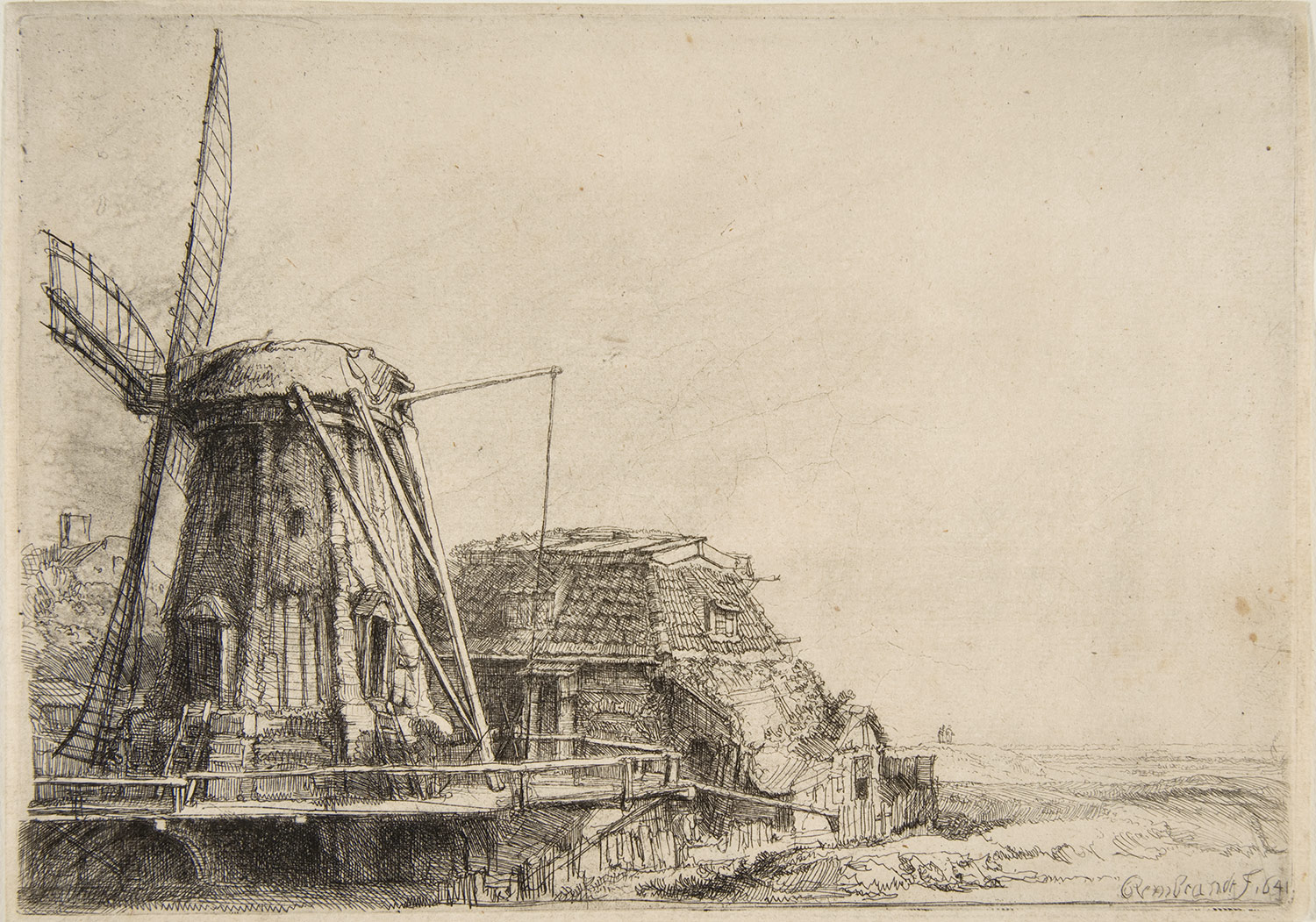
The second pleasant surprise about Amsterdam for me, was Rembrandt's etchings in Rembrandt House. It is almost impossible to go the city, where the Dutch born etcher and painter lived/worked, without hearing him mentioned or seeing his portrait festooned on postcards, t-shirts and various tourist tat everywhere you go. And, yes, for tourists like me, walking through Rembrandt Square or seeing 'The Nightwatch' in the Rijksmuseum are all essential parts of the overall experience. Whilst I had planned to visit Rembrandt House I wasn't expecting to be particularly overwhelmed or impressed by his work any more than I am of any other artists from the 1600's. It is sometimes good to be wrong! His etchings (pictured above) are exquisite. The attention to detail, variety of mark making, tonal qualities and drawing ability in general are amazing. Needless to say I was impressed, but inspired too and I only realised in the few days since I've been back home just how much looking at these etchings influenced my own drawing style. There has been a notable and I believe, significant shift, in my drawing style in the last few days that has definitely improved my mark-making and intensity to my drawings. I definitely put this change down to spending a great deal of time looking at Rembrandt's etchings and more excitingly, for me, this is the first instance in a long time, that I have been genuinely inspired by looking at another artist's work where it has had a knock-on affect to my own. Watch this space for future posts on how the 'drawing-a-day' project 2014 is progressing. 

4.) 'Charlene' -Robert Rauschenberg
In the Stedelijk Museum (imagine the Dutch version of our Tate Modern) lies this fantastic combine painting by American artist, Robert Rauschenberg. At 89 x 112 inches big its hard to miss! Apart from being among the very first of his combine paintings (paintings that literally combine collage, objects, paint, lights and variety of surfaces) it is also one of my personal favourites, largely this is due to the inclusion of (one of my all time favourite objects of obsession to paint/draw) an umbrella in the top right corner. Perhaps in the same way that the different sections of the road, lights, cables came together in the image of the road in figure 1, this painting achieves, in its divided boxed sections of collage, painting, a mirror, a light, a folded shirt, a similar affect.

5.) Tuschinski Theatre
Definitely one, if not the most exciting cinema of all time, the Tuschinski Theatre. Whilst I would strongly recommend seeing a film here (most of them are in English with Dutch subtitles) it is worth visiting even to see the front of the building and inside foyer (pictured). Described more accurately by friends, as 'an Art Deco space ship' the architecture and lighting of the Tuschinski is a theatrical marvel and should be experienced in person. I absolutely love film and cinema and the Tuschinski is how cinema's should be, something special, something theatrical, an experience and not (like so many chain cinemas in this country have become) just a big TV in a darkened room.
 
6.) Arman
Ok, so it's not technically an Arman, or a work by the French-born, American artist, Arman (who is nest known for his accumulations of objects in boxes/vitrines), but it is pretty much, intentionally or accidentally like his work (who knows maybe he lived here?). As with the Rauschenberg and the road surface there is something aesthetically appealing about compartmentalised sections of stuff whereby each section has a mass of different forms/surfaces/colours/groupings/textures. Wonderful stuff!
 

7.) Rijksmuseum Library
Tucked away in the  recently renovated Rijksmuseum is this fantastic 19th century-style reading room, library. Apparently, and I quote, "The Rijksmuseum Research Library is one of the main art libraries in the world. Catalogues of auctions and exhibitions, trade and collection catalogues, as well as books, periodicals and annual reports relating to the museum collections have been collected without interruption since 1885." I wasn't expecting to see this (and probably you're average viewer to the Rijksmuseum is in the same position) and although I didn't look at any of the books on this occasion (where would I start?) I found it to be an incredible looking place.

8.) 'The Milkmaid' -Vermeer
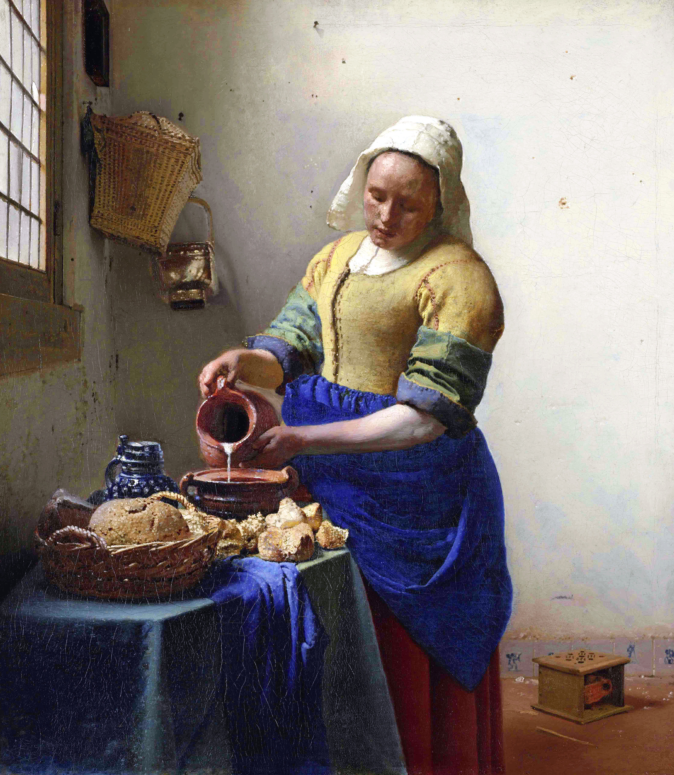
At last! After seeing more parodies of this painting (there was a Delia Smith version...if I recall...)than even reproductions, it was good to finally see the real thing! In some ways this painting by Vermeer is like the Dutch Mona Lisa, its fame known so widely  that when you're actually met with the real thing in person, it doesn't feel quite real at all. It is also smaller (like the Mona Lisa) than what I imagined it to be. Which begs the question, does fame, reproductions of images and photos have a way of making things, people, places physically seem bigger than they are? That could be quite interesting. Although back to the point, 'The Milkmaid' I think can only be most accurately described as jewel-like, its small and precious, bright and glistening (the highlights where the light hits in the painting/the sharpness of the central figure against the background/the whiteness of the milk being poured) . And again, like a rare jewel, it is perfectly formed with care and attention to detail that appears quite natural and effortless when in reality it is a great deal of process is involved. Ironic too, when you consider the connotations of my analogy to jewels when the scene it is depicting the opposite to wealth in the statutory or money sense of the word which is all the more poignant that it is painted with such reverence. The vibrancy of the colour in this painting being particularly eye-opening to what I had previously pictured. Seeing this work along with a selection of Vermeer's in the Rijksmuseum was really significant in changing my preconceptions of his work. 

9.) Flower Market
Where Munt-plein meets Vijzelstr you'll find Singel street, home to one of Amsterdam's many flower markets. Apart from selling tulips, tulips and more tulips it also sells a variety of dried flowers (pictured above), plants, cheeses and assorted touristy goods.

10.) 'Hard Saw II' -Claes Oldenburg
You are reading, 'A Spanner in the Workz' and yes that is a giant saw! All manner of things tool-related just won't go-away anytime soon (and I wouldn't want it to) so how could I fail to be excited by the presence of seeing Oldenburg's giant saw in person at the Stedlijk. I actually never knew Oldenburg made a giant saw being familiar with just about every other giant, hard and soft objects the artist made throughout his career (i.e. toilets, blenders, hamburgers, spoons) and now wishing I had known about this piece whilst doing my degree! In true American Pop-Art style, its big and bold and almost a one-liner if you don't start going into detail of how turning a saw into a giant sculptural work questions the boundaries between a saw as an art object or a functional object (or indeed what does 'functional' mean in relation to use), but then that was always why I was interested in Oldenburg. His work is fun and seemingly straight-forward, allowing the viewer to decide whether to leave it at face-value or whether to pursue interpreting it further. I'll probably find myself somewhere in between the two!


Images sourced from: