Friday 29 May 2015

Jurassic World!

Old fossils spotted down on Watchet’s quayside!

‘Jurassic: Triassic: a Geological Journey’ currently on at ‘Contains Art’ in Watchet is an exhibition of drawings, paintings, felt and mixed media work ‘inspired by the strata, rock formations and landscapes of the coastline from Doniford to Blue Anchor’. Featuring work by six local artists (four of whom also have container-based studios on site alongside this exhibition) Mel Degan, Lucy Lean, Angie Wood, Leo Davey, Sue Lowe and Alison Jacobs.

Speaking of ancient history, it has been almost two years since I last visited Watchet when I attended the ‘Contains Art’ grand opening on the sixth of July 2013*! What kept me away for so long?! For those not in the know, ‘Contains Art’ is located on Watchet’s quayside in the form of three large beautiful blue shipping containers that have been transformed into studio spaces and an exhibition space for artists. A visit to these unique and imaginative studios and exhibition space was clearly long overdue and so on May’s last bank holiday Monday I paid them a visit.
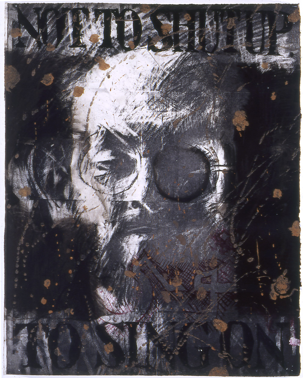
Leo Davey

The practicalities of an artist working and exhibiting in a shipping container is no mean feat, the spaces are long and relatively narrow (and probably quite cold in the winter months), but as ‘Contains Art’ continues to prove the resilience of artists is such that we are prepared to make it just about anywhere. Printmaking, sculpture and painting all happen on site in these seemingly impractical containers in a real working example of the innovativeness of creative practitioners. It is quite inspiring and has already become a successful addition to the contemporary arts landscape in Somerset with ambitions for future expansion in the pipeline.

Sue Lowe 'Helwell Layers I'
 The small but geologically formed exhibition currently on until Sunday 31st May is an example of some of the local talent on offer and brings together some varied and imaginative approaches to the theme of the local Jurassic/Triassic coastline. As you may expect to find in an exhibition about geology there is a lot of layering going on in the work! Printmaker, Sue Lowe produces collagraphs layered with chine collĂ© in totem-like columns. The colours and layering Lowe uses create a sense of the maritime, salt/minerals through their depth, texture and wear. Minehead based artist, Leo Davey provides a series of watercolour/ink based drawings depicting the strata and layering of the coastal rock formations. The longer you spend looking at stone the more you notice the amount of colours and tones that seem to change in different light and weather conditions. Davey’s drawings seem to pick up on this being extremely colourful becoming stylised and almost pattern-like in their appearance. Elsewhere Lucy Lean felts undyed natural fleece into tightly packed, dense forms mimicking the shapes and layering of fossils or rock. It is an interesting choice of material [fleece] as it’s soft, more malleable properties have parallels to geological processes of squashing and compressing of layers of rock and sediment.


Lucy Lean
Angie Wood and Alison Jacobs both create their own interpretations in paint inspired by the cliffs and coastal landscape; Wood through stained/layered acrylic paintings which seem to celebrate the roughness and texture of the canvas surface they’re painted on creating earthy, moody and contemplative scenes inspired by the local cliffs but could also connect to a broader reaching sense of our relationship to space, the ground and terra firma. Jacobs, another accomplished painter depicts coastal landscapes with vivid, expressive colours and energy, some of which have been created on an iPad in a sort of David Hockney style experimental playfulness. They are slightly detracted from, however, in my opinion by another of her works (coincidently my favourite overall in this exhibition) made entirely from used artist’s paint brushes. Titled ‘Fossil’ (pictured) as the name would suggest, the brushes are arranged together in rows taking the curved form of an ammonite fossil, or as I saw it mimicking stratum layers. It is possibly the most conceptual piece in the show, but is very cleverly affective and brilliantly observed at communicating the same subject matter in the paintings but in an altogether wittier way.   

Angie Wood

Alison Jacobs 'Fossil'

In true cabinet of curiosities style ‘Contains Art’ is full of many wonders and diehard fossil hunters fear not, for there are also a few actual fossils in this exhibition as well as alabaster and various stones!   ‘Jurassic: Triassic: a Geological Journey’ is a vibrant exhibition that is only limited by its deserving to expand into a bigger container!

 ‘Jurassic: Triassic: a Geological Journey’ is on at Contains Art, Watchet until the 31st May! Get a move on!


Tuesday 19 May 2015

Drawn together

 ‘Writing is like drawing in that it focuses the mind wonderfully’.  –Michael Craig-Martin*
 
I write these posts in order to understand what I’ve seen or experienced, better. It is a way of processing, analysing those thoughts for as much my own record as it may (hopefully) be as of interest to anyone else that chooses to read it. The same can be said of drawing and my relationship with it as a means of focusing the mind allowing the opportunity for new thoughts, or indeed the almost meditative expulsion of having no thoughts at all (both as equally valuable).  Having a passion for both, with that in mind, I began writing this post about ‘Great British Drawings’ exhibition of over 100 drawings by artists such as, Gainsborough, Turner, Rossetti, Millais, Holman Hunt, David Hockney, Gwen John, Walter Sickert, Ravilious, Edward Lear, William Blake, Samuel Palmer and Tom Phillips at the Ashmolean in Oxford.
Tom Phillips 'Salman Rushdie' (probably 1993) Charcoal, red and black body colours,
 brown mud bound in liquitex mat medium on white paper.
 
Most exhibitions I visit are intentional, in the sense that I plan to go see them. Visiting ‘Great British Drawings’ was more fortuitous in that I went to see it simply because I had some time to spare!  In that respect it was a pleasant surprise with equally a few seldom-seen gems amongst the collection on display. These include a Tom Phillips charcoal, mud and liquitex drawing of Salman Rushdie, (pictured above) which was uncannily Jim Dine like in its drawing style through heavy use of black and intense mark-making. Elsewhere it was refreshing to see a pen and ink drawing by Edward Coley Burne-Jones (of Pre-Raphaelite fame) that was in its small, more intimate scale more engaging and visually interesting in tone/marks than any of his paintings in my opinion. A few more of the Pre-Raphaelite ‘gang’ had work displayed in this exhibition and whilst I wouldn’t say I’m a fan of work from that period the difference in a perceived sense of warmth between their drawings and their paintings was quite striking. It reaffirmed that the pre-emptive nature of drawing, in the way it was used often before or as a way of composing a painting is so much more revealing of the artists hand and first impression of what they are looking at often than the painting. The painting is more measured in that it has been considered, edited and planned to convey what the artist ‘wants you to see’ whereas a drawing can be as considered but is often more ‘of the moment’ and sort-of as consequence, I feel, slightly more real (‘real’ in the integrity sense of the word rather than necessarily ‘realistic’) Turner is however a good exception to this theory whose drawings are also in this exhibition, he paints very much how he draws and the drawings inform the painting as much as the drawing is informed by the materials he is using.  Again, it was great to see these smaller on paper watercolours which if anything felt slightly fresher and less laboured than some of his paintings.
 
Samuel Palmer 'The valley with a bright cloud' (1825) Pen and dark brown ink with
sepia mixed with gum Arabic, varnished.
 
Edward Lear 'Contstantinople from Eyoub' (1848) Pen and brown ink
with watercolour over graphite on wove paper.
 
Flavour of the month, Eric Ravilious also had a drawing present in this exhibition along with Samuel Palmer (pictured above) who feels vaguely similar in that both were attempting to depict the romanticism of the English landscape, the undulating hills, cloudy skies, ploughed furrows in fields, rows of corn, hidden pathways, stone walls and all the variety in textures of trees, leaves, hedges and fauna. I also admired the draughtsmanship of artists such as Edward Lear whose illustrations I was familiar with but until now had never seen these more technical drawings (pictured above) which although preparatory for something finished are still quite elegantly sensitive and informative in their own right.  There was also work that reminded me of the importance of drawing as capturing an impression of something and the immediacy and observational sketchiness of John Sell Cotman’s ‘A Ruined House’ (pictured below) being one example and also a more unusual contrast to the familiar subject matter predominantly limited to classical architecture or castles (though many of these perhaps also united to this drawing in being ruins but of a slightly different nature).
 
John Sell Cotman 'A Runined House' (1807) Watercolour over graphite on paper.
 
This was a quietly contemplative exhibition, with lots of looking and noticing attention to detail of the kind which drawing tends to invite more gently than painting so whilst the Ashmolean probably possess infinitely more work they could have possibly shown in the space it still felt as though there was a lot to see. Certainly a lot to think about.
 
‘Great British Drawings’ is on at the Ashmolean, Oxford until August 31st.
 
*Taken from  CRAIG-MARTIN, M; ‘On being an artist’ (2015) Art Books Publishing: London. p8. 

Saturday 2 May 2015

In the Middle


Elisabeth Frink 'Bird' (1958) Bronze.

For its debut exhibition, ‘Leaping the Fence’ at Hestercombe gallery we saw shovels, rafts, a man walking up an escalator, neon signs and Dickensian style pilgrimages from London to Dover. Almost a year on and the private view of the Ingram Collection of Modern British and Contemporary Art currently on show at Taunton’s Hestercombe Gallery was altogether a much more grounded experience. The exhibition titled ‘A Personal Passion’ showcases the ‘artistic passions’ of art collector Chris Ingram and opened to the public on the 25th April. Amongst others it features the works of Kenneth Armitage, Frank Auerbach, John Bellany, Reg Butler, Anthony Caro, Lynn Chadwick, Suki Chan, Aleah Chapin, Ken Currie, Jacob Epstein, Elisabeth Frink, Terry Frost, Peter Howson and RB Kitaj. It is an impressive sounding line-up failing only slightly victim of its own breadth of artists on offer by being at times quite bitty. In the Hestercombe exhibition this is helped by the work being grouped together by connecting themes such as portraiture, religion, place, sea etc. Most of the work is dated somewhere in that ‘middle to modern’ art history dating from roughly the 1860s to the 1970s with the inclusion of several more contemporary pieces by artists such as Aleah Chaplin and Suki Chan.  

Suki Chan 'Tomorrow is our permanent address' (2008) Video Installation.

Chan’s addition to the Ingram collection is particularly interesting as it provides a contrast in highlighting some of the various practical challenges met in collecting contemporary art. Chan’s work, ‘Tomorrow is our permanent address’ is an installation consisting of a video projection and both stacked and broken ornate drinking glasses. Where once ‘collecting art’ was limited to prints, framed paintings/drawings and bronze sculpture it has since radically evolved in keeping with the progression of art to include work that can be temporary, contextual, ready-made accidental or in a wide range of sizes and mediums than ever before. The storing, preserving and installing of such work posing new tests to both collector and curator. I’m grateful as a member of the public to be able to see these works and that in ‘collecting’ them Chris Ingram is preserving them for future public enjoyment but still at the same time the nature of collecting and commodification of art in this way has always slightly bothered me giving a false sense of ‘importance’ or cultural value to the work that it may not have otherwise. It is one of many contradictions in the art world that doesn’t always sit so comfortably well with the making of it. Conversely the collection does present the pleasures in buying/owning and sharing art in the company of others, I just don’t necessarily think that work has to be ‘rare’ or ‘expensive’ in order to have that affect. I’m interested in the decision making, when buying art shifts from personal interest/meaning to status symbol or investment and am still somewhat diplomatically undecided where the Ingram collection fits. Perhaps if I saw more collectors buying more work at graduate shows outside London then I’d be less sceptical?

John Bellany 'Aurora' (1980) Oil on canvas.

On the whole, 'A Personal Passion' fell a bit flat for me although it was a real eye-opener of just how my personal taste and understanding of art has evolved into enjoying either contemporary art or the extremely old of the likes of the frescos and Renaissance work I’d experienced for the first time recently. Whilst there is more than I could ever hope to learn, all the stuff in the middle feels more familiar, it was the work that first ignited my interest in art and doesn’t yet quite hold a place in my memory to warrent much nostalgia. By familiar I suppose I mean that even if its work I haven't seen, the intent behind it and place the work sits in art history is more familiar. There are a few exceptions, seeing what I think may have been my first John Bellany painting in the flesh, learning of Irish artist Padraig Macmiadhachain (who moved to Dorset and St Ives who creates very Cornish seascape style paintings) and Frank Auerbach and Jacob Epstein drawings instead of their painting/sculpture retrospectively.  I could also see this exhibition being one of the more popular of recent exhibitions at Hestercombe simply because it is more middle-ground compared its past bolder/challenging exhibitions. Bronze heads wearing sunglasses, depictions of nudes in pencil and oils, seascapes bordering on the abstract, landscapes and plinth-bound bronzes are what I think a general consensus of people would ‘expect’ to see in a modern art exhibition(?). Cynically it also makes me wonder what I’ve seen in my relatively few years to think a giant 8ft head sculpture is middle ground, but then in the bigger picture of art those sort of things have in a way (rightly or wrongly) become familiar. A dangerous game to make such generalizations I know, but ‘A Personal Passion’ meets expectations of what it advertises and in doing so is one of the more easily accessible exhibitions to have yet taken place at Hestercombe. For me, as I said before, that also makes it one of the dullest, but reaffirmed my own understanding of why I preferred exhibitions like Tania Kovats’ ‘Oceans’. If last year we were ‘leaping the fence’, this one sadly opted for sitting on it, but at least it is a break from which we can stop and take some time to admire the view.

‘A Personal Passion’ can be seen at Hestercombe Gallery until the 5th of July 2015:


* Images sourcedfrom: