Showing posts with label exhibition. Show all posts

Thursday, 8 June 2017

Tasteless

Buffet d’art at Hestercombe gallery is a smorgasbord of buffet-sized sculpture, live art, film, sound, light and painting from 45 different artists, all of whom have been invited to bring work that can be ‘perused on a plinth’.
 
“The show is a meleè of mismatched yet aspiring works, some with delusions of grandeur, others grubby with spillage and monotonous repetition, set to a medley of smooth and relaxing music, designed to whet the senses and heighten your experience of these buffet-inspired memories.”
An unusual exhibition warrants an unusual response so I am writing mine in the form of a buffet table conversation between three people with very opposing views as they attempt to digest what lies before them.
Person X: What ill conceived manner of cacophonous, inane, conceited  tat is all this?! Something that can only best resemble a turd, a giant band aid, a woman urinating, a load of old cigarettes... A blue stick! A cupcake, that as far as I can see is unedible!
Person Y: It is safe to assume that you liked it then?
Person X: Liked it! If I wanted to see a load of something of nothing, I’d have gone to [disclaimer we could not include the name of the gallery here, but you know the one]!
Person Y: I think any reaction is a good one, besides its playful, an example of bringing together these disparate, strange and creative elements. Their variety and unexpected nature of viewing works on and under a giant table is visually a lot to look at in a small curated space.
Georgina Starr
Person Z: I don’t get it.
Person X: It’s taking the p**s is what it is. A cheap way for artists to boost their CVs and for galleries to they’ve exhibited work by a wide array of artists.
Person Y: Cynically, perhaps yes. But where else do you get the opportunity to see work like this, by artists whose big works you may be familiar with, it offers a glimpse into the playful and other creative outputs within their practice.
Person X: I wouldn’t want to see any more of some of it!
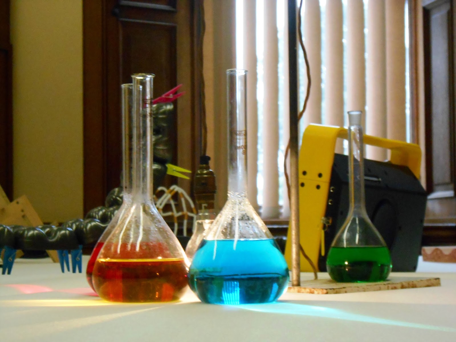
Person Y: It is all here, lights, coloured liquids, music, strange undefinable forms, waves, a diorama of a swimming pool, a revolving pot, recycled entities, felt, paper, foam. A village of tiny people, projection, a yellow baseball cap!
Person Y: Maybe you are taking it too seriously. Think of Dada, Surrealism, artist’s studios and the ‘real, lived process’ of what it means to be an artist and make art. Is it not at times inquisitive, spontaneous, rebellious in its non-conformity? See this as a buffet, a taste of lots of variables out of many. So many that we may not have time to savour and understand each one individually for long before moving onto the next thrill, the next surprise, the next thing that may upset, delight or confuse us. Some are intentionally small things, but with grand ambitions that the status of the plinth provides. You could see it as ironic or tongue-in-cheek.
Reith Bowler
Person Z: I don’t get it.

Person Y: What would you expect or want to see in Somerset?
Person X: .....I suppose, ...variety. Something contemporary.
Person Y: Exactly!
Person X: But I am not sure I get the ‘joke’ here, if that was what was intended. I am not sure if pointlessness for the sake of pointlessness either does anything to help raise the bar or what is it challenging or prove?
Person Z: ...I really do not get it.
Person X: The only people this will appeal to are those hipster, do-gooder, lefty, decaffeinated-skim-latte drinking mediocrities blinded to the facts that what this truly is, a waste of space! 
Peggy Atherton
Person Z: “Interpretation is the revenge of the intellectual upon art.” Susan Sontag
Person X: Even if this is art, which isn’t quite the same as what we are arguing here, what this is, is still not good art. This is a bunch of stuff masquerading as being important because it is made by an entitled, insider bunch of artists.
Person Y: Isn’t that what all art is. Who decides what is good or bad, it’s all subjective. What is the inside? These are old issues. It is all too easy to grow cynical of these things; I think that the connection it creates between artists, curators and gallery spaces is a good one. I read recently that, “Reviewers like to feel they are above a work of art. If it puzzles them or if they are intimidated they are more than likely to trash it.” Could not the same be said of art audiences?
Person X: ....
Person Y: Though I do often wonder if it is an apathy towards our failings to engage and discuss this sort of art with other people or ourselves and honestly, that causes these strong opinions. How often is it that we merely tolerate a lot of art that we feel is bad because criticism is difficult to express as it can be to ingest. This isn’t good for either party. Audiences are always being forced to be open-minded and try new things but do they have the same power of influence on the curators who's shows they visit and consume?
David Cotterrell
Person Z: I suppose by that comment you are referring to me. I do not understand it but that does not come out of apathy or lack of desire to understand. I am content with just experiencing and viewing it for what it is.

Person X: Well, certainly no apathy here!
Person Y: Maybe it is all a conversation. The pieces brought together from individual artists, arranged in a way so that they ‘talk’ to one another. See it as a series of rhythms and forms, colours and textures that change. Or maybe the point is that it generates us to have the kinds of conversations we are having now.
Person X: Not big enough or isolated enough to be satisfying.
Person Y: I found a couple of things that really stood out for me. I like R J Hinrichson’s pamphlet on creating your own ‘Semi Formal Discussion Networks’. Though as a whole it looked a bit goofy and forced together and I couldn’t appreciate how the different objects related to one another in terms of their space on the ‘table’.
Person Z: I liked Ben Joiner’s piece. It sort-of looked like it was crawling onto the table like a giant fried egg.
Person X: Hmmm, ... I still do not see quite why someone would be willing to waste their time looking at this as they would want to read about it.
Person Y: On that we can agree.
 
 
You too can gorge yourself silly or go on an art detox at Hestercombe Gallery's Buffet d'art, open Sun, 21st May at 11:00 am to Sun, 18th Jun at 5:00 pm http://www.hestercombe.com/event/buffet-dart/

Monday, 16 January 2017

Fantastic Artists and Where to Find Them

Upstairs Gallery -'Animality' at Marian Goodman Galley
As one steps inside the familiar white-walled terrain of the contemporary art gallery one is greeted by the shrieking caw of ‘GilbertandGeorge!’ 'CyTwombly!' 'CarlAndre!' and names of other artists in a sound piece titled ‘Birdcalls’ by Louise Lawler [1972]. Above me there is a stuffed magpie, to the right a giant photo of an elephant and ahead a portrait of a tiger looks straight at me between an oversized stuffed squirrel, rows of glass vitrines, plinths and free standing sculptures. These are animals but not as we are accustomed to; myths and conventions around how we perceive animals are challenged in fun and unexpected ways across two floors in a menagerie of film, photography, sculpture and illustration.
 
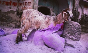
Gabriel Orozco 'Goat in Purple Bag' 1996
"Animality quietly crept up on me and completely took me by surprise. It was without doubt one of the most exciting exhibitions I saw during 2016, on for just over four weeks in November-December at the London Marian Goodman Gallery in Soho."
 
Imagine the best of the science and unusual curiosities of a Wellcome Collection exhibition mixed with works by modern and contemporary artists and you’ll have a good idea of what made this exhibition so special. ‘Animality’ featured the work of over seventy ‘creatures’ comprising of artists, philosophers, writers, scientists and illustrators throughout history (Darwin, Heidegger, Foucault are here and more) seeking to understand the complex relationship humans have with animals; what it means to be human, what it means to be an animal and how the division between the two is sometimes not as distant (if at all) as we thought. What works so well within this exhibition (and other exhibitions I have seen of this type) is this fusion between science, history and philosophy either integrated with art works or presented in context alongside them. This is science and history at its most engaging, its most visual and, I think, is significantly longer lasting in memory for it.
 
Albrecht Durer 'The Rhinoceros' 1515
 From the graphic illustrations of Charley Harper to the observed biological illustrations of Earnst Haeckel and woodcut of an armour plated Rhinoceros by Albrecht Durer (pic), ‘Animality’ covers a breadth of ways in which humans have not only sought to represent animals in art but in doing so were also attempting to understand and educate themselves and others in outcomes that are in some cases playful and in others personal or documentarian. They each offer insight into either our fear or love of beasts, bugs and creatures of all shapes and sizes; those that can eat us, others be eaten. There is a whole Zoo here, tigers, elephants, cats, slugs, horses, magpies, goats and camels including mythical creatures and hybrids throughout history. Despite being a mixed 'museum meets art' exhibition there is no hierarchy of one depiction of ‘animality’ being more significant than any other which is what makes it particularly rewarding, both the scientific and historical are presented alongside the whimsical and fun, grouped together into themes of origins, markings, crossings, variations, trace and extinction.
 
Roni Horn 'Untitled no. 4' 1998
Roni Horn’s photos featuring the backs of bird’s heads (pic) are surprisingly confrontational and unfamiliar, unsurprising  as it is an angle we are not accustomed to seeing birds being taken at. Similarly unsettling is Sarah Jones’s ‘Black Horse’ is striking not only in its scale but in its black on black image of a horse that almost disappears and reappears so we are forced to look at the catches of light on the muscles that define the form of the body. Elsewhere another horse piece by Steve McQueen, ‘Running Thunder’ depicts a horse that at first appears to be asleep in a grassy meadow, the scene a relatively still one until we see a fly pitch around its eyes and we make the startling discovery that this horse is in-fact dead. It is more a comment on our relationship with how we perceive and ‘expect’ to see animals in art; here the expectation of the horse as heroic or symbol of wealth as familiar in paintings by George Stubbs is given a dark twist. A goat stands inside a purple bag (pic) in one of a series of photos by Gabriel Orozco but is more photography than it is fitting in ‘nature photography’ as they do not attempt to present an ideal as much as a reality. Danh Vo reminds us of history in presenting a photo of a pekingese on a throne, the dog once belonging to Queen Victoria plundered from Beijing by British troops during the second opium war.
 
Carsten Holler 'Octopus' 2014 
Amidst this Noah’s Ark-like procession of animals Carsten Holler’s pink octopus (pic) creeps along the gallery floor adding an element of unexpected fun to the proceedings, making us aware of the space in which we inhabit together; like many of the works in this exhibition on its own it doesn’t have a huge amount to say but as part of the whole they form a welcome visual rest bite. Over by the stairs Fischli and Weiss’s projection of a cat lapping up cream plays on continuous loop which is fun if nothing for its almost banal familiarity. There is an almost absurd amount of work to process which only compounds why animals as a subject matter in art is so diverse and why even early George Shira photography first published in National Geographic in 1906 being shown alongside contemporary art works does prove that photography and art are still relevant in aiding education, research and conservation. Seeing Pavia and Gusmao’s slow-motion film of a peacock strutting should be a relatively familiar sight to anyone who’s ever been to a zoo or heritage garden but this film acts as a reminder, as though you were seeing them for the first time, to just how strange, marvellous and remarkable a bird they really are. Or if anything the works in this exhibition only highlight that the real mystery and most complex creature of all is in-fact the artist. Intellectually challenged I proceeded to scramble on two legs out the gallery door and into the jungle outside....
 
Roni Horn and Gabriel Orozco images Sourced from:  http://www.tate.org.uk; https://www.theguardian.com

Wednesday, 27 January 2016

From The Archives

In 2011 I researched agricultural farming tools with Somerset Heritage Centre in Taunton as part of Somerset Art Weeks. What transpired was a most wonderful, resourceful experience as I had the opportunity to see ‘behind the scenes’ of the Heritage Centre’s storage facility and access some of the artefacts kept there from public sight. Warehouse rooms filled with wall-lined tools, boxes of treasures, taxidermy, clothing, a carriage and bull’s head all amongst the things to discover and be inspired by in addition to the knowledge and story-telling from the generously knowledgeable local curators of the collection.

Tools at The Somerset Heritage Centre (2011)
The work I made as a result was much more concerned with the museum itself, and museum modes of presentation & archiving than that of the actual objects themselves. I still speculate whether this was a missed opportunity on my part (not to have focused on the objects). However there was something fascinating about the processes and decisions used in order to protect, restore and catalogue these items which felt a more intriguing line of enquiry to pursue at the time.

 As you might imagine therefore I had a particularly vested interest in seeing the new exhibition of local artist’s responses to this same collection currently on show at the Museum of Somerset...

Natalie Parsley (Detail) Kaye's Tool Kaleidoscope, 2011
Featuring the work of Jenny Graham (who also brought the exhibiting artists together), Richard Tomlinson, Chris Dunseath, Jacy Wall, Laura Aish and Ralph Hoyte; the exhibition is pleasingly curated so as to look and utilise the experience of ‘the storage’ facility of Somerset Heritage. From the coded letters to signify different storage rooms on the walls, metal shelving and racking to place artefacts on, brown storage cardboard boxes; to clip-boarded ‘title’ lists printed on graph paper. There is a lot of ‘stuff’ in this exhibition and it is fortunate enough to have many of the artefacts the artists ‘used’ or took inspiration from on display alongside the work. The overall ‘feel’ of the exhibition is a good one, busy but not cluttered and does well at recreating that sense of discovery, wonder and unashamed nosiness that I certainly took away from my time at Somerset Heritage.
Richard Tomlinson’s work particularly does this brilliantly; to the right of the room stacked cardboard boxes with viewing holes which reveal hidden photographic anaglyphs inside. The images taken from safe’s, cogs and gears from mechanised objects found in storage. Peaking-in on them in this way recreates that same sense of curiosity and child-like delight from opening presents. Similarly Chris Dunseath’s vessels made from bronze and papier-mâché have hidden constellations and universes inside their shadowy interiors, again work that beckons one to look closer and discover more. These objects also directly relate to Bronze Age axe heads and more of Chris’ sculptures found in the cabinet behind. The objects patina mimicking the corroded ancient greens found on bronze/copper artefacts. Chris is one of the few artists who blurs the line between the museum piece and the art object so that sometimes one isn’t quite sure which is which.
Richard Tomlinson in 'New Dimensions'

A revolving postcard display unit featuring hundreds of curated postcards from Somerset and ‘days of old’ make some entertaining reading and act as inspiration for a sound piece featuring the poems by declamatory poet Ralph Hoyte. It’s good to see a more word-based practice in the show and makes great, often amusing discussion points for many conversations and questions into the origins and people behind the postcards.  

The flaw in this exhibition is that the museum objects tend to outshine most of the artwork. There is an amazing case of butterflies, pressed flowers, a safe, a film camera, tins, old sowing paraphernalia and a split Ash tree as part of some ancient cure for a hernia...! Very often the artefacts are almost intimidating in their effortless intrigue and charm that it feels somewhat futile as an artist to even contemplate competing with it! This is certainly how I felt and perhaps now think I was fortunate not to have the artefacts displayed alongside the work –it then became purely about my interpretation of them. I appreciate how challenging it is to both; select an object, from a source of thousands of things and then find a concept or response to that object which is both relevant and communicates with its source without being too close to it! I also criticise my own work of having conveyed some of the pleasures of depicting and ‘capturing the artefacts I selected but not really having as much dialogue into their unique histories and factors that made them individual.
Chris Dunseath (foreground) in 'New Dimensions'
Hence with the New Dimensions exhibition, there are a few similar opportunities where the work feels unresolved or unimaginative. Jacy Wall’s touchy feely cases of material and hands holding ribbons and thread feel a little lost and contrived compared to her skilfully executed prints (I think they're about challenging the inability of touching the artefacts in museums, but it still feels a little unresolved or too obvious) and Jenny Graham’s commercial butterfly prints similarly leave little to the imagination. Jenny's Victorian style Wunderkammers are better and feature well collated and wonderful objects, but being a big fan of Cabinets of Curiosities I have to be honest and say I've seen other artists (Duncan Cameron) do, in my opinion, better versions that also offer something 'new' rather than just being a collection of objects. I think my expectations were high but the work could have said more or something different in my view.

What is important overall from this exhibition is the commitment to what is hopefully an ongoing dialogue between the Museum of Somerset and artists. New Dimensions has achieved in revealing new aspects of the Heritage Centre’s collection that go relatively unseen and presented them in a visual way rather than purely historical or ‘museum’ way. I believe this opens up the collection and allows for new discovery that curators within Museums should note; sometimes a well chronicled, researched and informed museum exhibition doesn’t appeal to all audiences in the same way as the excitement of a bustling, disorganised antiques or flea market (I honestly think I have learnt more about history from these types of places). The latter is more visual and more inquisitive, promoting independent dialogue based on a genuine curiosity and interaction with objects that I think traditional museum curatorial practices should experiment more with. The testament from this exhibition is a simple but highly important one; let more artists work with museum collections!  

The Exhibition is FREE and I urge you all to go see it whilst you can. It is on until April 16th 2016.
All text and photos copyright Natalie Parsley

Friday, 29 May 2015

Jurassic World!

Old fossils spotted down on Watchet’s quayside!

‘Jurassic: Triassic: a Geological Journey’ currently on at ‘Contains Art’ in Watchet is an exhibition of drawings, paintings, felt and mixed media work ‘inspired by the strata, rock formations and landscapes of the coastline from Doniford to Blue Anchor’. Featuring work by six local artists (four of whom also have container-based studios on site alongside this exhibition) Mel Degan, Lucy Lean, Angie Wood, Leo Davey, Sue Lowe and Alison Jacobs.

Speaking of ancient history, it has been almost two years since I last visited Watchet when I attended the ‘Contains Art’ grand opening on the sixth of July 2013*! What kept me away for so long?! For those not in the know, ‘Contains Art’ is located on Watchet’s quayside in the form of three large beautiful blue shipping containers that have been transformed into studio spaces and an exhibition space for artists. A visit to these unique and imaginative studios and exhibition space was clearly long overdue and so on May’s last bank holiday Monday I paid them a visit.

Leo Davey

The practicalities of an artist working and exhibiting in a shipping container is no mean feat, the spaces are long and relatively narrow (and probably quite cold in the winter months), but as ‘Contains Art’ continues to prove the resilience of artists is such that we are prepared to make it just about anywhere. Printmaking, sculpture and painting all happen on site in these seemingly impractical containers in a real working example of the innovativeness of creative practitioners. It is quite inspiring and has already become a successful addition to the contemporary arts landscape in Somerset with ambitions for future expansion in the pipeline.

Sue Lowe 'Helwell Layers I'
 The small but geologically formed exhibition currently on until Sunday 31st May is an example of some of the local talent on offer and brings together some varied and imaginative approaches to the theme of the local Jurassic/Triassic coastline. As you may expect to find in an exhibition about geology there is a lot of layering going on in the work! Printmaker, Sue Lowe produces collagraphs layered with chine collé in totem-like columns. The colours and layering Lowe uses create a sense of the maritime, salt/minerals through their depth, texture and wear. Minehead based artist, Leo Davey provides a series of watercolour/ink based drawings depicting the strata and layering of the coastal rock formations. The longer you spend looking at stone the more you notice the amount of colours and tones that seem to change in different light and weather conditions. Davey’s drawings seem to pick up on this being extremely colourful becoming stylised and almost pattern-like in their appearance. Elsewhere Lucy Lean felts undyed natural fleece into tightly packed, dense forms mimicking the shapes and layering of fossils or rock. It is an interesting choice of material [fleece] as it’s soft, more malleable properties have parallels to geological processes of squashing and compressing of layers of rock and sediment.


Lucy Lean
Angie Wood and Alison Jacobs both create their own interpretations in paint inspired by the cliffs and coastal landscape; Wood through stained/layered acrylic paintings which seem to celebrate the roughness and texture of the canvas surface they’re painted on creating earthy, moody and contemplative scenes inspired by the local cliffs but could also connect to a broader reaching sense of our relationship to space, the ground and terra firma. Jacobs, another accomplished painter depicts coastal landscapes with vivid, expressive colours and energy, some of which have been created on an iPad in a sort of David Hockney style experimental playfulness. They are slightly detracted from, however, in my opinion by another of her works (coincidently my favourite overall in this exhibition) made entirely from used artist’s paint brushes. Titled ‘Fossil’ (pictured) as the name would suggest, the brushes are arranged together in rows taking the curved form of an ammonite fossil, or as I saw it mimicking stratum layers. It is possibly the most conceptual piece in the show, but is very cleverly affective and brilliantly observed at communicating the same subject matter in the paintings but in an altogether wittier way.   

Angie Wood

Alison Jacobs 'Fossil'

In true cabinet of curiosities style ‘Contains Art’ is full of many wonders and diehard fossil hunters fear not, for there are also a few actual fossils in this exhibition as well as alabaster and various stones!   ‘Jurassic: Triassic: a Geological Journey’ is a vibrant exhibition that is only limited by its deserving to expand into a bigger container!

 ‘Jurassic: Triassic: a Geological Journey’ is on at Contains Art, Watchet until the 31st May! Get a move on!


Wednesday, 23 July 2014

What's the word?

If there was a message saying, ‘you will write about this exhibition' at 'Barber Kruger', Modern Art Oxford, then it was subliminal.  
 
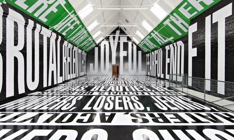
 Wandering through one of the text-filled installations that Barbara Kruger is synonymous for, immersed in the overwhelming scale of the black, white and green text that ran floor to ceiling in the main room of MAO I felt worryingly desensitised to the whole experience.  I say worryingly given the fact that a fellow visitor, of more elderly years, was so affected by the floor to ceiling bombardment of text and slogans that he tentatively stumbled, as though unsure of where the floor had gone, disorientated by the whole experience. For myself, perhaps being from a generation that has been more subjected to the bombardment of images, words and communication that are also faster and more readily available than ever before, it is harder for printed text to have impact, a victim of its familiarity. This is not to say that Barbara Kruger’s work has completely lost its impact, as the current exhibition of the artist’s work at Modern Art Oxford aims to prove, but it is possibly in danger in the digital age of news, advertising and social media of becoming more familiar, less hard hitting than what it once was.

 
Emerging from America in the early 1960’s Kruger made her impression on the art world with her adaptation of advertising language and imagery which she used as a social commentator and political agitator to provoke questions about assumed viewpoints on capitalism or femininity through graphic media of text and image. From a background in graphic design, working for a small independent women’s magazine her art work often favoured the red, white and black (like the tabloids) featuring often classical or iconic imagery that she juxtaposed with contradictory or perception altering text. Her wit and edginess ironically perhaps saw her slogans becoming commoditised into bags (‘I shop therefore I am’) and reproduced as posters turning them into some of the most recognised images from the pop art era.
 
Certainly the large installation at MAO is almost too much to take in making it so that any message, any meaning that the words may have on the walls/floor are lost in the noise of a hundred other messages all shouting for your attention at the same time. Perhaps this is the point, that there is a loss of anything meaningful and words become mere shapes, formal components in a space when you have too many things competing with each other at once? The most successful use of text in the main installation, as it has the most affect, is the word ‘JOYFUL’ in huge letters filling the wall you enter in. It’s simple and works well in drawing your attention to the height, space and shape of the room, (which is described as ‘cathedral-like’) but if anything is more intimidating in its authority in size, that is more bossy than actually encouraging any genuine feelings of joy. Personally, I think this is quite reflective of how most advertising works in the sense it presents a good-thing and forces you to like it clouding your own judgement as to whether you really need it or not.Well worth watching as well is the impressive and mesmerising feat of how the work was installed in a short time-lapse film.    


For me though, Kruger’s smaller works have more to say and impact than the more superficial room installation. A simple observation of, bigger is not necessarily better is evident in the example, 'Your Misery Loves Company' where the juxtaposition of a dentist’s drill and wording, ‘Your Misery Loves Company’ is much more unnerving, hard-hitting and lasts in memory more than anything in the installation. Some of the messages in these works may have lost their relevance over time but their ability to have impact has not.  Her directness to mass audiences and ability to provoke/challenge using words and strong graphic imagery has influence that makes up some of the fundamentals of street art; one example being Shepard Fairey’s Obey posters and iconic Obama Hope poster. Kruger’s work was one of the significant players in taking the familiar language/media of advertising and newsprint and subverting it to create new meaning. More recently artists such as 2012 Turner Prize winner Elizabeth Price use Kruger influenced text and image in film montage to great success. The interesting question now, is where Kruger’s work sits today, with, as I’ve already alluded to, more modern/digital forms of communication and less use of print?
The answer can be found in Kruger’s most recent pieces where the artist has used film. They also make up the more relevant and interesting pieces of the exhibition. ‘Plenty LA’ from 2008 flashes the word ‘enough’ at the viewer repeatedly amongst still and moving images of sunsets, a handbag, car with a smashed bonnet and ‘bling’ encrusted mobile phone; a direct Kruger-esque comment on consumerism, whilst in ‘Twelve’ faces are projected on the walls argue with one another (about relationships from what I gathered), their real thoughts read across the bottom of the screen like news coverage. This work is more topical in its use of modern technology and its use of a reality TV-style of drama or dialogue that has come full circle from being first intended to present a view of reality to now in fact being completely unreal in its superficial-ness.  The viewer enters awkwardly into the middle of these arguments that feel at once staged and fake but believably real at the same time. It is an observant and is a slightly troubling comment on our current society that we chose to trust the authenticity of the news reel text as to the spoken words of the actors, but this is what Kruger does best. In ‘Twelve’ she takes a familiar mode of presentation used in the media, the news reel and subverts it into manipulating how, in this case we respond to what is a very social/domestic situation. It is far more subtle than her printed work from the sixties and therefore accurately demonstrates the change in media/advertising to becoming more subliminal.
 
New and fans to Kruger’s work will get the most out of this exhibition that for me, acts more as a retrospective than being completely  fresh or ‘of the moment’. I don’t think this is entirely Kruger’s fault, but more that her message that once protruded so edgily on the walls of modern art galleries or shopping bags now feels too accepted and familiar to remain that provocative. Your modern-day Kruger is now more likely to be found tagging a subversive message on the wall of a public building or generating some of the many political satire games/images that pop-up on blogs, forums and Facebook pages, they’ll be creating flash mobs, guerrilla knitting and attempting to go viral with videos and tweets that raise question to accepted normalities. Such is the plight in the age of uncertainty they probably won’t even call themselves artists.
 
Barbara Kruger is on at Modern Art Oxford until August 31st 2014.


Monday, 24 June 2013

What's cooking in Ilminster?

Last Thursday I visited Mark and Tracy Nesbit's exhibition, 'Physicality and Metaphysical Expressions' at Ilminster Arts Centre featuring mixed media paintings, sculpture and mixed media work from the two Somerset-based artists.
 
The work, isn't intended to necessarily be anything to do with cooking, as my blog post title may suggest; just that I cannot help finding comparisons in the work, its processes and materials, that remind me of some sort of alchemical cooking experiment. Mark in his paintings mixes and layers pigments, metallic elements (perhaps for added mystery?), hair, lime, plaster and more into rich almost 'baked' looking surfaces. They are scraped-back, flattened, cracked, heavy-looking and worn making them look quite industrial or urban (except the few which are portraits) and strongly remind me of Tapies' paintings which I had the pleasure of seeing in Barcelona earlier this year. I'm pretty certain Mark is aware of this analogy and would want him to take it as a compliment as in fact, I enjoy some of his paintings more than Tapies'. Personally, I am a fan of the industrial cogs, wheels and solid, angular lines and mark making in Mark's paintings and the way in which layers are revealed and placed over one another and connected as though stapled together by line. In a way that also makes them quite sculptural paintings. It occurred to me the other day that paintings that look sculptural, a 2D surface that is given treatment as though it were 3D is an interesting concept and illusion that I would like to explore further (but for another day!).
 
Tracy's sculptural works in some cases do actually use food and baking (see bread sculpture below) that she stitches and creates intriguing shapes and forms, no two of which are ever exactly the same. There is a sensitivity to the way she uses materials and how their handling, for me anyway evokes memories and nostalgia of baking and sewing with family members. I wonder if the other pieces containing remnants of scrunched tissues and slate with latex images stitched inside hold similar associations with ideas of loss and memory. At this point, I'm beginning to think I should have paid more heed to the artist statement accompanying the work, but was too curious in looking at the work itself. The work is more conceptual in nature, but I don't think it has to be 'read' in order to have affect or meaning as the work is tactile and visually creative. Materials such as tissues, lead, slate, latex and wood have been used inventively and thoughtfully. It does however raise the question and make me wonder if Tracy thinks through making or makes through thinking i.e.. does the material and process dictate the idea behind the work or is an idea formulated and then a suitable material and process found to fit it? I'd hazard a guess that its the first of those or perhaps a combination of the two.
 
It is really exciting to see such a diverse array of work in this exhibition that showcases Mark and Tracy's skills as makers as well as thinkers. I look forward to seeing what they'll cook up next!
 
(above) Mark Nesbit 'Old Hundreth' Plaster, emulsion, soot, metallic elements and compounds on canvas. [detail]
 
(above) Mark Nesbit 'Anvil' Plaster, lime, ash, metallic elements and compounds on canvas
 
(above) Mark Nesbit 'Human Construction' Plaster, lime, ash, metallic elements, human hair, boot polish and compounds on canvas.
 
(above) Tracy Nesbit 'Freebie' Perspex, lead, compressed tissues
 
(above) Tracy Nesbit's bread sculptures
 
(above) Tracy Nesbit
 
 
Catch Tracy Nesbit and Mark Nesbit's exhibition, 'Physicality and Metaphysical Expressions'
 until 29th June at Ilminster Arts Centre at The Meeting House,  09.30am-04.30pm daily


Sunday, 28 April 2013

Kurt Schwitters - What a load of rubbish!

A couple of weeks ago I visited the exhibition, ‘Schwitters in Britain’ at the Tate Britain [catch it if you can, it’s on until the 12th of May]. Previously I’ve been lucky enough to view one or two of Schwitters’ collages and mixed-media works in collections in modern art galleries throughout Europe; every time seeing one of his ‘jewel-like’, multi-layered, aged, delicate and weathered creations and thinking, ‘I’d love to see a collection of his work someday.’   Then on Tuesday 9th April, that day finally came!
 
Here are a few of my thoughts...
 
 Initially I was surprised by the scale of most of his work, a lot smaller than I had thought, but soon got distracted into the intensity of colours, painterly compositions and shapes, structures and forms. After keeping my ‘drawing a day’ diary for four months now, I am beginning to realise just what sort of things, specifically, that I find aesthetically appealing. Objects with a strong sense of form, shape, design particularly being favoured over those with more ephemeral, less tangible outlines and structure. For example, I think if I was asked to draw ‘light’ I would want to depict it as quite solid shafts and lines as to depicting its softness or affects of light hitting the edges/surfaces of other objects. I digress from Schwitters, but the point here being, that the structure and content of his work is what appeals to me most; the shapes created from his overlapping scrapes of paper as to the actual colour and textures of the paper itself. Schwitters described the use of objects/found-materials in his work as, ‘having equal rights with paint’, which I think echoes a little bit of what I said previously that the structure and content of the work is made from the objects within it acting in a similar way to how paint is normally used to create structure and content.
 
 ‘Anything with a stone’ - This reminds me of Kandinsky’s painting ‘Red, yellow, blue’.
 
It would be easy to make comparisons of Schwitters’ work to Picasso’s early collages so I’m simply going to mention it and then move swiftly on because it is the influence that Schwitters had on his predecessors that is actually a lot more interesting. With Schwitters’ deployment of the theory of Merz as, ‘essentially the combination of all conceivable materials for artistic purposes’ in his art; another crucial stepping stone was laid on the path towards ‘the everyday’ in an ‘as’ art. Influences of which can be seen in Pop Art particularly Richard Hamilton, Rauschenberg and Daniel Spoerri. Consequently, the more I think work I see by artists who were part of Dada (Schwitters, Duchamp, Man Ray etc) the more clearly I can see how much of what they did fed into what later became Pop Art. Pop Art being the more commercial, glossy mass produced younger sibling of Dada but still with its same values of the everyday, play and experimentation with ‘what is art?’ at its core.
 
 There’s a feeling of nostalgia with Schwitters’ work, apart from literally looking worn, stained and aged the colours, textures and patterns in the work feel old-fashioned. They remind me of wooden toys, fairground games or pub signs whose paint is beginning to chip, fade and peel off. The piece titled, ‘Merz Picture 46 A. The Skittle Picture’ does actually comprise itself of wooden playing pieces in a box frame composition and look like the leftovers from some battered old pub game. Play, of course being a factor in the making of Schwitters’ work as, to some extent, must have been an element of chance; after all most of the materials used in his collages were scrapes and throw-away objects. Part of me wonders if this is simply because the content within the collages is itself now old (sweet wrappers, bus tickets, newspapers, metal, feathers etc) and I wonder if they felt as ‘aged’ at the time they were created? A modern-day Schwitters collage would be drastically more intense in its colour palette, textures and surfaces due to the wide selection of materials, glossy papers and printing inks that are commonplace today. Or, perhaps more than likely, he wouldn’t be doing collage from paper scrapes but taking on digital mediums and left overs/waste? Collage from the content not of our bins but our computers recycle bins?! Modern-day Merz.
 

There were elements to this exhibition that felt a little bit empty, that it was all a little bit ‘nice’ and I wanted to be challenged a bit more, made to think, which the installation of the ‘Merz Barn’ (large scale plaster sculptural works comprising of found objects that filled rooms and created immersive environments for the viewer) did go some way in challenging my expectations as did a surreal performance piece called ‘Ursonate’ but perhaps I was looking for something more, but not really knowing what that was. Neither was I particularly a fond of his free standing sculptures made from stone, wood or bone and plaster. That’s of course completely subjective and it is good to see the other sides to Schwitters’ practice, but they only acted as additions to the painted and collage work which were really the stars of the show and completely captivated my attention. 
 
'En Morn'
 
Equally I was so busy looking at work didn’t pay too much heed to context that the work was made in, for example Schwitters’ time during the war exiled from Germany to be interned on the Isle of Man to his involvement in London art scene and influences that the Lake District had on his work up until his death in 1948. It seems that despite the amount of art I subject myself to seeing that I never really take as much attention and enthusiasm to understanding the context surrounding the work. Retrospectively, I did find something interesting in the way in which Schwitters’ collages made during his time living in the Lake District used more organic and natural found materials in his collages than when he was living in London where the work took on a more urban feel, but I think maybe I would have noticed these differences eventually anyway without having known when/where they were made. I feel the same way about music and that really I am only interested greatly in the music itself and very rarely if at all know anything about the band/artist that produce it. Does it change how I feel about the music if I know the lead singer’s favourite colour is blue? Or that they used to be a furniture maker?  Would Schwitters’ have minded if I sort-of ignorantly, if unintentionally, paid no attention to his life and situation he found himself in during his time in Britain? Or maybe that would have been just what he intended, he himself stating, ‘The picture is a self-sufficient work of art. It is not connected to anything outside.’ With that in mind I’ll leave it for you to decide whether I made the right decision upon seeing, ‘Schwitters in Britain’ in noticing less of the ‘Britain’ part and instead  focusing more on the ‘Schwitters’.

Images from:
http://www.tate.org.uk
http://www.southwillard.com/
http://www.guardian.co.uk/