Showing posts with label review. Show all posts

Wednesday, 23 July 2014

What's the word?

If there was a message saying, ‘you will write about this exhibition' at 'Barber Kruger', Modern Art Oxford, then it was subliminal.  
 
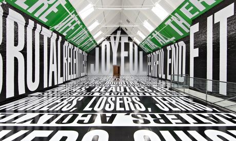
 Wandering through one of the text-filled installations that Barbara Kruger is synonymous for, immersed in the overwhelming scale of the black, white and green text that ran floor to ceiling in the main room of MAO I felt worryingly desensitised to the whole experience.  I say worryingly given the fact that a fellow visitor, of more elderly years, was so affected by the floor to ceiling bombardment of text and slogans that he tentatively stumbled, as though unsure of where the floor had gone, disorientated by the whole experience. For myself, perhaps being from a generation that has been more subjected to the bombardment of images, words and communication that are also faster and more readily available than ever before, it is harder for printed text to have impact, a victim of its familiarity. This is not to say that Barbara Kruger’s work has completely lost its impact, as the current exhibition of the artist’s work at Modern Art Oxford aims to prove, but it is possibly in danger in the digital age of news, advertising and social media of becoming more familiar, less hard hitting than what it once was.

 
Emerging from America in the early 1960’s Kruger made her impression on the art world with her adaptation of advertising language and imagery which she used as a social commentator and political agitator to provoke questions about assumed viewpoints on capitalism or femininity through graphic media of text and image. From a background in graphic design, working for a small independent women’s magazine her art work often favoured the red, white and black (like the tabloids) featuring often classical or iconic imagery that she juxtaposed with contradictory or perception altering text. Her wit and edginess ironically perhaps saw her slogans becoming commoditised into bags (‘I shop therefore I am’) and reproduced as posters turning them into some of the most recognised images from the pop art era.
 
Certainly the large installation at MAO is almost too much to take in making it so that any message, any meaning that the words may have on the walls/floor are lost in the noise of a hundred other messages all shouting for your attention at the same time. Perhaps this is the point, that there is a loss of anything meaningful and words become mere shapes, formal components in a space when you have too many things competing with each other at once? The most successful use of text in the main installation, as it has the most affect, is the word ‘JOYFUL’ in huge letters filling the wall you enter in. It’s simple and works well in drawing your attention to the height, space and shape of the room, (which is described as ‘cathedral-like’) but if anything is more intimidating in its authority in size, that is more bossy than actually encouraging any genuine feelings of joy. Personally, I think this is quite reflective of how most advertising works in the sense it presents a good-thing and forces you to like it clouding your own judgement as to whether you really need it or not.Well worth watching as well is the impressive and mesmerising feat of how the work was installed in a short time-lapse film.    


For me though, Kruger’s smaller works have more to say and impact than the more superficial room installation. A simple observation of, bigger is not necessarily better is evident in the example, 'Your Misery Loves Company' where the juxtaposition of a dentist’s drill and wording, ‘Your Misery Loves Company’ is much more unnerving, hard-hitting and lasts in memory more than anything in the installation. Some of the messages in these works may have lost their relevance over time but their ability to have impact has not.  Her directness to mass audiences and ability to provoke/challenge using words and strong graphic imagery has influence that makes up some of the fundamentals of street art; one example being Shepard Fairey’s Obey posters and iconic Obama Hope poster. Kruger’s work was one of the significant players in taking the familiar language/media of advertising and newsprint and subverting it to create new meaning. More recently artists such as 2012 Turner Prize winner Elizabeth Price use Kruger influenced text and image in film montage to great success. The interesting question now, is where Kruger’s work sits today, with, as I’ve already alluded to, more modern/digital forms of communication and less use of print?
The answer can be found in Kruger’s most recent pieces where the artist has used film. They also make up the more relevant and interesting pieces of the exhibition. ‘Plenty LA’ from 2008 flashes the word ‘enough’ at the viewer repeatedly amongst still and moving images of sunsets, a handbag, car with a smashed bonnet and ‘bling’ encrusted mobile phone; a direct Kruger-esque comment on consumerism, whilst in ‘Twelve’ faces are projected on the walls argue with one another (about relationships from what I gathered), their real thoughts read across the bottom of the screen like news coverage. This work is more topical in its use of modern technology and its use of a reality TV-style of drama or dialogue that has come full circle from being first intended to present a view of reality to now in fact being completely unreal in its superficial-ness.  The viewer enters awkwardly into the middle of these arguments that feel at once staged and fake but believably real at the same time. It is an observant and is a slightly troubling comment on our current society that we chose to trust the authenticity of the news reel text as to the spoken words of the actors, but this is what Kruger does best. In ‘Twelve’ she takes a familiar mode of presentation used in the media, the news reel and subverts it into manipulating how, in this case we respond to what is a very social/domestic situation. It is far more subtle than her printed work from the sixties and therefore accurately demonstrates the change in media/advertising to becoming more subliminal.
 
New and fans to Kruger’s work will get the most out of this exhibition that for me, acts more as a retrospective than being completely  fresh or ‘of the moment’. I don’t think this is entirely Kruger’s fault, but more that her message that once protruded so edgily on the walls of modern art galleries or shopping bags now feels too accepted and familiar to remain that provocative. Your modern-day Kruger is now more likely to be found tagging a subversive message on the wall of a public building or generating some of the many political satire games/images that pop-up on blogs, forums and Facebook pages, they’ll be creating flash mobs, guerrilla knitting and attempting to go viral with videos and tweets that raise question to accepted normalities. Such is the plight in the age of uncertainty they probably won’t even call themselves artists.
 
Barbara Kruger is on at Modern Art Oxford until August 31st 2014.


Monday, 10 March 2014

May contain spoilers!

So I made the fatal mistake of reading a review of the Richard Hamilton retrospective at Tate Modern prior to seeing it. ‘No big deal’, you say but in the age of twitter and instant access news it’s difficult to read any book,  walk into any film or exhibition without some preconception of what to expect. We’ve lost the element of surprise. You’ve seen most of the film in the trailer, read the book, downloaded the soundtrack often before you’ve even sat down in the theatre. And of course, whilst a certain amount of ‘knowing what you’re in for’ is important in giving you a reason to be there, it’s also kind-of sad that there is less surprise, shock or mystery to so many of these experiences. In terms of art, a little ignorance goes a long way (albeit if it’s met equally with the desire to learn). Anyway, what I’m getting at is the difficulty of forming an individual opinion, thoughts and ideas on an exhibition or to experience it open-mindedly if you’ve already read too much about it elsewhere. And does popularity in the form of reviews lead to a consensus that something is ‘good’? Appropriately for a retrospective centred on a Pop Artist it becomes a debate on quality in relation to popularity. Do our parameters of judgement change if we know the thing we are critiquing is deemed popular?

'Just what is it about today's homes that makes them so  different, so appealing?' -1956 Collage

This of course just my opinion, perhaps I’m too easily influenced by what I read instead of using it as a counterpoint to make my own conclusions but I still cannot help but enjoy seeing an exhibition that I’ve only  been drawn to by the title, knowing nothing of what artists/works to expect. The flip-side to all this, is how the internet, reviews, sharing and ironically, even blogging, opens art up to an even bigger audience that includes people who go to exhibitions all the time and those who may be considering to go perhaps for the first time. Wonderful, and how else are you going to hear about an exhibition other than a review, mailing list or advert/poster that could well be online or on someone’s Facebook page? Still, I’d say every once and a while read a book, see a film, visit an exhibition on as little information you can, find out the bare minimum of something that pries your interest and go for it blindly. It’s really hard to do.

If you’ve read this far already then maybe you’re interested in hearing a bit more about the Hamilton retrospective at the Tate, but I’d suggest that if you’re planning on going to see it anytime soon, then read no further! Those of you who’ve already been or perhaps not interested in going at all (why wouldn’t you be?) then allow me to continue...
'Transition IIII' -1954 Oil on panel.

As I said, I read the review so I already knew that Laura Cumming from the Observer thinks that this retrospective has too much in it and should have been edited down more. Reluctantly, for reasons mentioned above, I am inclined to agree and ponder; does a retrospective have to include absolutely everything to be a retrospective? Should the Tate ever decide to honour my passing with a retrospective of my own work, I’d be horrified to think they’d put everything I’d ever made in, thinking of the hand drawings I did at A-level for example. Not that they were particularly bad or good, but more that they wouldn’t be relevant, I never came back to hands since and it had no influence stylistically on my later work...or so I’d say...The same goes for Hamilton, did I really need to see half a gallery dedicated to his turd drawings against a sunset, when one would have been enough to get the point across? The amount of work shown was incredibly comprehensive, Hamilton was a prolific maker and evidently, from what I just mentioned, with an excellent sense of humour. That humour now comes across as more subtle than I assume the reaction it would have had in the 60’s when some of the more political pieces were more prevalent. From the collage and precursor to Brit Pop, ‘Just what is it that makes today’s homes so different, so appealing’ (pictured) to the reconstructed Duchamp’s Large glass and photorealist styles of ‘The citizen/the subject/the state’, Hamilton’s work spanned several decades of vast changes in technology and the rise of mass-market consumerism which he explored and utilized in his work. In fact, Hamilton’s art career could best be described like a collage, he explored and collected a variety of different components, images, fragments, techniques that all seem slightly different but come together as often reassembled re-edited and reconfigured works commenting with wit and humour on elements of consumerism, politics, fame, design and advertising. Instead of focusing on the breadth of his entire career this post will focus on the particular work that resonated with me and present some usual commentary as to why that is.

'Towards a definitive statement on the coming trends in menswear and accessories (a) "Together let us explore the stars" -1962 Oil and collage on panel.

For me, the stars of the show are the Pop paintings from 1957-1963 where combined images of cars, machines, appliances and people are composed with abstract mark making, signs and symbols. The canvases are left fairly neutral and almost minimal in their whiteness and use of space. Onto these surfaces cars, radios are half-painted/half-sketched so only an outline or trace of the object can be seen. What is revealed is small, stylistically detailed and rendered sections that hint the edge of a car’s bumper, a tap, a shoulder, before disappearing. They’re paintings that explore the way we read representational images in art by offering a ‘dot to dot’ of an object instead of presenting the whole package. This also makes them quite painterly as elements of realism sit alongside gesture, surface and form. Although their flatness remains and ties them into the realms of graphics/advertising, again in-keeping with the era they were created. Interestingly, for me, they all have a limited colour palette, fairly neutral in tone and on a personal level I am curious as to why I am drawn to this in both my own and other’s work (think Jim Dine’s prints for example)? Is it because the beige/off-white background is reminiscent of paper or vellum, which has an association of drawing and primed-ness/workings-out to it that appeals to my love of drawing? It’s interesting and something I need to give further thought to.

'Reaper' - 1949 Drypoint

In one of the opening rooms to Hamilton’s retrospective a series of prints are shown from his days as a student at the Slade, 1949-1951, they’re semi-abstract etchings of reapers and ploughs, titled ‘Variations on the theme of reaper’. Aside from my obvious delight at seeing a tool-related theme, these etchings were an interesting insight into the aforementioned Pop paintings due to their approach of deconstruction and reconstruction. It was apparent in these early prints that Hamilton was interested in figuring-out how things worked and reimagining them particularly within design and form. This same deconstructing can be seen in Hamilton’s obsession with Duchamp, Dada and reconstructing ‘The Bride Stripped Bare by her Bachelors, Even’ but also in the Pop paintings under discussion here where aspects of the form/design of the car as object is played upon against the natural curves and design of people’s bodies or faces. In fact in some cases the two almost appear to fuse together perhaps also alluding to or signifying the growing ‘need’ and relationship that was prevalent at the time between people and the objects they possess that ‘become’ and/or form their identity.

'Hommage a Chrysler Corp' -1957 Oil, metal foil and collage on panel.

As a student I longed to see these paintings in real life, having spent many an evening squinting over often small or low resolution images in books as I made desperate attempts to replicate and understand them. Hamilton was a great maker of images, the flat and 2-Dimensional, the static, the one-liner, they are qualities I have been able to relate to in my own working methods. What a delight it was to finally see these paintings in-the-flesh, reaffirming the things that I enjoyed about them whilst showing me a closer view at their surfaces and colours that I was previously unable to see. The rewarding thing about this retrospective as a whole was making connections through seeing how his early work influenced the latter. Its also in some ways quite reassuring as it means I may never escape from tools or A-level hands for that matter as my concerns with those things will develop and lead to the themes of future work. I may be reluctant or unaware to notice it at the time but retrospectively it’s all connected.

Sunday, 28 April 2013

Kurt Schwitters - What a load of rubbish!

A couple of weeks ago I visited the exhibition, ‘Schwitters in Britain’ at the Tate Britain [catch it if you can, it’s on until the 12th of May]. Previously I’ve been lucky enough to view one or two of Schwitters’ collages and mixed-media works in collections in modern art galleries throughout Europe; every time seeing one of his ‘jewel-like’, multi-layered, aged, delicate and weathered creations and thinking, ‘I’d love to see a collection of his work someday.’   Then on Tuesday 9th April, that day finally came!
 
Here are a few of my thoughts...
 
 Initially I was surprised by the scale of most of his work, a lot smaller than I had thought, but soon got distracted into the intensity of colours, painterly compositions and shapes, structures and forms. After keeping my ‘drawing a day’ diary for four months now, I am beginning to realise just what sort of things, specifically, that I find aesthetically appealing. Objects with a strong sense of form, shape, design particularly being favoured over those with more ephemeral, less tangible outlines and structure. For example, I think if I was asked to draw ‘light’ I would want to depict it as quite solid shafts and lines as to depicting its softness or affects of light hitting the edges/surfaces of other objects. I digress from Schwitters, but the point here being, that the structure and content of his work is what appeals to me most; the shapes created from his overlapping scrapes of paper as to the actual colour and textures of the paper itself. Schwitters described the use of objects/found-materials in his work as, ‘having equal rights with paint’, which I think echoes a little bit of what I said previously that the structure and content of the work is made from the objects within it acting in a similar way to how paint is normally used to create structure and content.
 
 ‘Anything with a stone’ - This reminds me of Kandinsky’s painting ‘Red, yellow, blue’.
 
It would be easy to make comparisons of Schwitters’ work to Picasso’s early collages so I’m simply going to mention it and then move swiftly on because it is the influence that Schwitters had on his predecessors that is actually a lot more interesting. With Schwitters’ deployment of the theory of Merz as, ‘essentially the combination of all conceivable materials for artistic purposes’ in his art; another crucial stepping stone was laid on the path towards ‘the everyday’ in an ‘as’ art. Influences of which can be seen in Pop Art particularly Richard Hamilton, Rauschenberg and Daniel Spoerri. Consequently, the more I think work I see by artists who were part of Dada (Schwitters, Duchamp, Man Ray etc) the more clearly I can see how much of what they did fed into what later became Pop Art. Pop Art being the more commercial, glossy mass produced younger sibling of Dada but still with its same values of the everyday, play and experimentation with ‘what is art?’ at its core.
 
 There’s a feeling of nostalgia with Schwitters’ work, apart from literally looking worn, stained and aged the colours, textures and patterns in the work feel old-fashioned. They remind me of wooden toys, fairground games or pub signs whose paint is beginning to chip, fade and peel off. The piece titled, ‘Merz Picture 46 A. The Skittle Picture’ does actually comprise itself of wooden playing pieces in a box frame composition and look like the leftovers from some battered old pub game. Play, of course being a factor in the making of Schwitters’ work as, to some extent, must have been an element of chance; after all most of the materials used in his collages were scrapes and throw-away objects. Part of me wonders if this is simply because the content within the collages is itself now old (sweet wrappers, bus tickets, newspapers, metal, feathers etc) and I wonder if they felt as ‘aged’ at the time they were created? A modern-day Schwitters collage would be drastically more intense in its colour palette, textures and surfaces due to the wide selection of materials, glossy papers and printing inks that are commonplace today. Or, perhaps more than likely, he wouldn’t be doing collage from paper scrapes but taking on digital mediums and left overs/waste? Collage from the content not of our bins but our computers recycle bins?! Modern-day Merz.
 

There were elements to this exhibition that felt a little bit empty, that it was all a little bit ‘nice’ and I wanted to be challenged a bit more, made to think, which the installation of the ‘Merz Barn’ (large scale plaster sculptural works comprising of found objects that filled rooms and created immersive environments for the viewer) did go some way in challenging my expectations as did a surreal performance piece called ‘Ursonate’ but perhaps I was looking for something more, but not really knowing what that was. Neither was I particularly a fond of his free standing sculptures made from stone, wood or bone and plaster. That’s of course completely subjective and it is good to see the other sides to Schwitters’ practice, but they only acted as additions to the painted and collage work which were really the stars of the show and completely captivated my attention. 
 
'En Morn'
 
Equally I was so busy looking at work didn’t pay too much heed to context that the work was made in, for example Schwitters’ time during the war exiled from Germany to be interned on the Isle of Man to his involvement in London art scene and influences that the Lake District had on his work up until his death in 1948. It seems that despite the amount of art I subject myself to seeing that I never really take as much attention and enthusiasm to understanding the context surrounding the work. Retrospectively, I did find something interesting in the way in which Schwitters’ collages made during his time living in the Lake District used more organic and natural found materials in his collages than when he was living in London where the work took on a more urban feel, but I think maybe I would have noticed these differences eventually anyway without having known when/where they were made. I feel the same way about music and that really I am only interested greatly in the music itself and very rarely if at all know anything about the band/artist that produce it. Does it change how I feel about the music if I know the lead singer’s favourite colour is blue? Or that they used to be a furniture maker?  Would Schwitters’ have minded if I sort-of ignorantly, if unintentionally, paid no attention to his life and situation he found himself in during his time in Britain? Or maybe that would have been just what he intended, he himself stating, ‘The picture is a self-sufficient work of art. It is not connected to anything outside.’ With that in mind I’ll leave it for you to decide whether I made the right decision upon seeing, ‘Schwitters in Britain’ in noticing less of the ‘Britain’ part and instead  focusing more on the ‘Schwitters’.

Images from:
http://www.tate.org.uk
http://www.southwillard.com/
http://www.guardian.co.uk/