Wednesday 17 December 2014

We are very disappointed, but does it matter?

Who is this for?  The words ‘We’re all very disappointed’ blazing through my mind as the result of Alice Hartley’s gigantic printed wall montage in bold black text amid the spattering painted mark making on the gallery walls of the Institute of Contemporary Art in London.   

Alice Hartley 'We're all very disappointed' (2013)
 
Even if it is intended to be a political reproach it is nonetheless a brave, confrontational statement to make in what is a selected group show of recent art school graduates work. It sets a certain expectation and one that isn't particularly optimistic. Perhaps that is what the selectors intended as like an itch I couldn’t scratch its rebuke somewhat haunted me as I contemplated both the validity of this year’s Bloomberg New Contemporaries as a whole and my place as ‘the audience’ within it. Was I really disappointed? In some ways, yes. Did it matter if I was? Does art exist merely for some sort of approval or recognition? Without response does it cease to exist as art? And just how reflective of current art education was all of this? These were arguably all very valid questions that I loftily tried to ignore in an attempt to engage with the work, but often found myself wondering back to because on the whole these thoughts were only remotely more interesting than that of than much of the work on show.

Now in its 65th year the Bloomberg New Contemporaries is the UK’s annual ’barometer of contemporary art practice’ and offers a teaser into the work of emerging artists from art school graduates of the past year. Therein already lies a potential flaw in not being able to see a body of work or practice of the chosen artists instead being shown a selected few works and expected to understand the whole. Still, there are as always, glimmerings of potential to be excited about of which I will go on to mention and as an introduction to contemporary art it is healthy to see there is still such variety in discipline from painting, drawing, mixed media, sculpture and of course film (even if it is largely dominated by film this year). Despite my criticism the prestige and selection of this year’s 55 chosen artists from 1,400 entries should not to be downplayed and both adds to expectation of how the work is received but is also commendable in highlighting emerging artists work and creating that debate/platform in which to generate more exposure of fresh talent.
Emily Motto 'A bodily capacity (the endeavour of stuff on a frame) Steel mesh, copper, foam floats, yarn, rope, wool, homemade playdough (2012)
 
It is interesting to try and spot the themes between this year’s chosen artists as it reveals an insight into what some of the concerns and interests of our time are. Worryingly for this year's generation, it's all a bit too serious, too cynical. Where themes do occur, they range from the directly political such as Henry Hussey’s tabloid-like Marxist mixed-media wall tapestries and Maco Godoy’s ‘Claiming  the Echo’film piece which documents a choir singing the protests made at  public demonstrations since the recent financial collapse to slightly broader themes of consumerism, the food industry and affects of gluttony on the human form found in works such as Emily Motto’s ‘A bodily capacity’ (pictured above) which is like an Arte Povera self oozing, self expanding and changing sculpture which appears to be bursting out of its wire mesh container and the more literal depictions of the human form as a result of over consumption and elsewhere in Adam Wallace’s collage and oil paint creations  fleshy man/woman machine hybrids are painted directly onto the on cardboard synonymous of a throw-away society. In two more film based works, MKLK’s ‘Man Eater’ as the title suggests sees its female protagonist performing a ceremonial-like dance, revealing and concealing under a gown of what appears to be VHS tape that is either swamping or perhaps protecting its wearer (a comment on the commodification of the human form?) and Lucy Beech’s ‘Cannibals’ follows a gathering of a group of women where it is uncertain if they are meeting for some weird version of a Tupperware party or something more sinister.

Miroslav Pomichal 'Mismatched Couple' Oil on canvas, carved wood, paint (2013)
 
Yussef Hu’s ‘Resting on a sharp point’ for me was one of the most engaging film works, possibly because it was one of the most shocking as it also deals with a similar theme of consumption in a performance piece by the artist who spears hung sacks of balloons containing mustard, mayonnaise, ketchup and brown sauce their poured contents being collected into plastic buckets eventually consumed by the artist in their mixed state, much to the horror of the onlookers in the film (the artist himself fighting back physically retching). I have to admit I thought it was paint for the majority of the film thinking the piece shared similarities with action painting. And it was incredibly gruelling but oddly compelling to watch in an almost statistically fascinating and repulsive way. After being sufficiently underwhelmed it was good to 'feel' something.

There were some remarkable surfaces to be found too in Yi Dai’s ‘Nocturne’ series where hair and tights are stretched over a mirror and acrylic painted panel creating an optical illusion-type of effect whilst in Athena Papadopoulos’s (see below) mixed media work all manner of assorted stains and fragmented layers made up a rich and intriguing surfaces that reminded me of a softer version of a Tapies painting and in Deborah Westmancoat’s ‘Mountain’ (see below) found rusted surfaces are responded to with mark making combined with dynamic found shapes that draw your attention to notice the subtle details and patina in the work. It is even more positive and important to note that she is the first from the college I studied at to be represented in this prize, along with three (I think I counted correctly) other artists from art schools in the South West which regardless of my personal opinion of their work is a good start for more representation of artists in our region.
 
Deborah Westmancoat 'Mountain' Metal plate, rivets, charcoal, pencil on found surface (2012)
 
The Bloomberg New Contemporaries at the ICA London. (from left to right) Adam Wallace 'Transfat' (2013) and 'Skin-Flick (2014), Ian Tricker 'Gravity II' (2013), Xiao-Yang Li 'Woman and Beast' (2013)

Athena Papadopoulos 'Acting Single, Drinking Doubles (Belladonna Muse)' Pepto-Bismol, Berocca, shoe polish, oil stick, charcoal, pencil crayon, French's mustard, rust, image transfers, thread, glue, napkins, pillowcase, jersey cotton on canvas. (2014) 
 
Painting on the whole as with sculpture wasn’t particularly exciting for me this year, with Miroslav’s ‘Mismatched Couple’ (pictured above) being pretty punchy and bold but in doing so not having much else to say. Another painter, Edward Hill with a portrait of a bee keeper, ‘Bee Night’ is quite elegantly and subtly painted and a little reminiscent of a Peter Doig or Marlene Dumas and is probably my favourite painting of the show, but unlike their work and out of context of the rest of Hill's work it was  hard to grasp if it was anything other than 'something of nothing'. Similarly sculptures made from sand and ones that mimicked a replica between an ancient and modern hybrid were good but didn't leave a lot to the imagination. I think it points to the fact of my real frustration or disappointment from this year's BNC came from the lack of anything of real resonance, or  qualities that will make the work more memorable. Yes there was a good variety of work, but none of it felt particularly 'heart-felt', not the best choice of words but I couldn't think of a better way of saying that a lot of the work felt very self conscious.
Personally I’m always under the impression that if you really want a taste of ‘current contemporary emerging  arts  practice’ then the best place to find it has always been in art school’s at private views, exhibitions and open days. The majority often being radically under publicised and consequently under-attended for what they deserve, as it is here where you discover the truly wacky, sometimes unpolished potential and innovativeness amidst the good, the bad and the ugly. Art School exhibitions have an unbiased integrity to them that lets the viewer decide what is ‘good’ or ‘bad’ art rather than being presented a selected sample of what a chosen few think and in the case of this year’s BNC, the biasness of the selection panel, I feel leaves it a little flat in terms of innovation, difference and joyousness. If I hadn’t seen any previous BNC then I don’t think I would be quite so discerning but perhaps every graduating generation of artists remembers their generation of BNC as being the best or the most enjoyable. I first came across the prize in 2006 at the Liverpool Biennial, at the start of my degree and subsequently followed its progress ever since. That was a fantastic year, a staircase carved into a birthday candle, massive woodcuts, kinetic sculptures, vandalised bins, plaster covered newspapers, miniature sculptures inside matchboxes, satirical yellow pages. 2010 also stands out as a particularly good exhibition with artists such as Greta Alfaro, Darren Harvey-Regan and Sam Knowles being three favourites from that year. Without sounding terribly older than I may already be, those years felt so much more ambitious and not trying to be what I’d call ‘too clever’. On the whole the work felt it much less self-aware and more concerned with its own existence as a piece of art made by someone trying to figure something out. I have the impression that more and more work produced by art school students is stifled by an awareness of the viewer, the audience, the gallery and context of the art world which is great on many levels as it shows how well we prepare young artists to place their work in context of the wider world, but it has also meant that the audience sometimes feels like they are having to second-guess the real intention behind the work and that it operates more like advertising whereby the audience is being knowingly manipulated to a ‘preferred reading’. I still sort of feel art is better when it has open or multiple meanings. 
It is good to see the Bloomberg New Contemporaries still running and whilst I may have been a little disappointed, it’s not to assume that we all would be and therein is worthy of an amount of anyone’s time and attention.

 
Bloomberg New Contemporaries 2014 can be seen at the Institute of Contemporary Art, London until the 25th January 2015.

Saturday 29 November 2014

Playing videogames...

 
If M C Escher could have made a video game app it might have looked something like this...
 
 
It seems reasonable to assume that if weathered painted wooden doors, rusty tins and all manner of broken detritus can be art; (as well as films, music and certain branches of cookery, gardening and sport which can also be seen as art forms) then surely some aspects of videogames should also be recognised as such? And does it really matter if they are/aren’t? I’m not going any further to attempt tackling the age old debate of what ‘is’ and ‘isn’t’ art, numerous philosophers, writers and thinkers have attempted to do so infinitely better than me with the only certainty is that we’re still not quite sure and that it is ever changing.  It is ‘an excessively broad church’ I was once told.  Hence, given the amount of production, imagination, people and time invested in developing games, fuelled by the money the industry generates in Britain alone each year (in excess of 3.5 billion!) it is slightly surprising that videogames are met with a degree of resistance and snobbery in being perceived, critiqued or categorised under the ‘art umbrella’.
 
I’m all for a bit of inclusivity having played video games as I have watched movies, listened to music and dabbled in art (in the conventional sense) for years. When I completely per chance came across an online downloadable app called ‘Monument Valley’, a game that looked and played like being in an M C Escher painting I thought it was long overdue that I hit the keys and articulated my thoughts here on the blog.  [That and to prove that there is more to videogames as art than the likes of David Hockney drawing a few digital paintings on an ipad.]
 
In ‘Monument Valley’ the concept is a simple one; move the protagonist ‘girl in a pointy hat’ from A to point B via navigating your way through the ‘impossible’ architecture of a topsy-turvey citadel of er...monuments. Combining puzzle solving with narrative the player embarks on a series of challenges in which they control parts of the structures to create new routes and walkways that once didn’t exist in order to progress through the game. The illusionary perspective, that only really makes sense if/when you play the game arguably borrows its sense of impossible realism from the likes of the Surrealists and artists like M C Escher (see images below). I don’t want to intentionally make it sound 'dry' by over analysing it, as ultimately it is a really fun, elegant and beautifully simple looking game, but one in which (as in many games) has had a great deal of design, craft and creativity put into it. Surely worth some appreciation at least? 
 
The games creator Ken Wong claimed the design was inspired by Japanese prints and minimalist sculpture. The crisp, cell-shaded design with very sparse, flat and often mist shrouded backgrounds does have a very Japanese quality to it. Equally the music and sound effects in 'Monument Valley' have a Arabic, Eastern sound which alters based on the movements of the buildings when you touch the screen. The overall affect is very thoughtful and well put together gentle and calming game. In terms of where it sits in the bigger gaming community it reminds me of a growing trend for architecture design and utopias in games like Minecraft where vast, intricate and idealised visions of the metropolis or imagined structures can be created. In these virtual world's things can be created that exceed the limitations of reality and could and should be used as start points and spring boards for creativity and design. Who wouldn't want to live in a house like this?   
 
 
M C Escher 'Ascending and Descending' (1960) Lithographic print

If you’re in need of further convincing then look no further than the De Chirico influenced art style from the 2001 Playstation Game, 'Ico' (see image below) .

(Left) 'Mystery and Melancholy of a Street' (1914) Giorgio de Chirico -- (Right) 'Ico' (2001) Playstation 2

Videogames operate on a similar conceptual basis of puzzle solving, communication and engagement that can be not too dissimilar to the process of viewing art. Similarly they are interactive and immersive, games and I quote ‘speak to people’ and communicate in a medium that is debatably more of ‘our time’ than traditional methods of painting, printmaking. Without going into it now, I speculate that the most innovative artists are the ones utilising new technologies such as 3D printing, laser cutting etc. to make work.
 
 In the same way every scene from certain films can be perceived as an individual framed work of art so can shots or scenes from videogames be perceived as such. Increasingly as well videogames are becoming more cinematic in their story telling and realism ('Heavy Rain' from 2010 being one example).  Unlike a lot of art however videogames offer the ‘liberation of shared authorship’ as one Oxford professor** on a lecture on videogames as art described the process of interacting with games having one author who programmes/creates the constraints, rules and possibilities but multiple authors in those who interact with it and in the case of games like, ‘Minecraft’ or ‘Second Life’ contribute creating and altering elements within that digital universe. I struggled to think of any artists whose work operated in this way, other than that of participatory art and some environmental art projects. To be continued....
 
 
In 2012 the MOMA held an exhibition of iconic videogames (such as PACMAN and Pong) alongside its collection of Modern art works. Unsurprisingly it was met with some controversy and sparked much debate as to whether something which originated as a means of entertainment, play and fun could really be considered as art with one critic making a case for games not being an art form with the analogy of likening it to chess, 
 
“Chess is a great game, but even the finest chess player in the world isn't an artist. She is a chess player. Artistry may have gone into the design if the chess pieces. But the game of chess itself is not art nor does it generate art – it is just a game.”
 
Still if that is the case then we are ignoring the fact that ‘everyone’s favourite’ art protagonist, Marcel Duchamp had not only opened the doors to allowing ‘anything’ to be considered as art he specifically recognised along with Manray that chess too could be art and shared many of its traits with the process of making it,
 
‘...they saw qualities in it that they thought essential to their art –opportunities for improvisiation and play based upon skill, not chance; ritualised forms and iconography that embodied the violence and eroticism of the world around them; a new type of artist-viewer relationship; a unique sense of spatial organisation; and a set of contradictions that could be transposed to aesthetic or anti-aesthetic ends.*
 
 
The danger of inclusivity or ‘if everything can be art’ can mean that you dilute the distinction of what ‘Fine Art’ may be, but it’s not to say that all video games are art or in the same way that all videogames aren’t necessarily ‘good’ art. Although with more and more time people are spending online, in virtual worlds and the accessibility online generally it is a debate that is going to become increasingly hard for its critics to ignore. Videogames continue to develop that exceed their original origins of being merely things of 'play' and indeed on the other hand are one of the few mediums which truly value the role of play as a means of discovery and learning.
 
With a Minecraft exhibition featuring 3D reproductions of famous Modernist paintings currently on show at the Tate it seems that computing technology and in particular videogames are in fact being used as a means of appealing to a younger generation. I'd argue that it is more than a gimmicky passing fad and like it or loathe it, it seems they are around to stay. Popularity isn’t necessarily a conclusive bench mark for whether something can be considered as art or not, but the increased popularity of gaming and game production is worthy of our attention. Only time will tell.
 
 
Similar links and references:
*LIST, L. (2008) Chess as Art, In: MUNDY, J. (2008) Duchamp, Manray, Picabia, London: Tate Publishing . pp. 133-143


Tuesday 18 November 2014

Must try harder!

There was a fair amount of online chatter last week regarding a comment made by the newly appointed Education Secretary Nicky Morgan, who at a campaign to promote science, technology, engineering and maths warned young people that choosing to study arts subjects at school could “hold them back for the rest of their lives”.

Pretty dramatic stuff!

‘Morgan said the idea that choosing arts or humanities subjects can keep pupils’ career choices open “couldn’t be further from the truth”.

To those who know me and to readers of this blog it will come as no surprise to learn where my own personal stance on this is, which to briefly outline encase you didn’t already guess, is that I completely, unequivocally disagree with what Mrs Morgan has to say as I aim to prove (amongst other things) in this post. However the starting catalyst for my post this week was not triggered from Nicky Morgan’s ill-founded comments but more from how we (as artists) respond to opinions such as hers and how we talk about the value/benefits of an art education in general.

Leonardo Da Vinci's sketchbooks 'Muscles of the Shoulder' (1509-1510)

I heard the news of this story, like perhaps many people, through social media in the form of a blogger’s response to the story online. I was hoping to be in agreement with the blogger who expressed an incredibly well written opinion drawn from their personal experiences of both undertaking a business course which she consequently left in favour of an archaeology and poetry/arts administration career. In truth, however, I found myself disheartened by the quality of the argument for the arts in this and other posts I read online in which the defence for ‘why the arts/humanities are as important as the sciences’ were spoken about in such lofty, sentimental terms with the over-riding tone being that art ‘gave something to live for’ and offered a ‘wealth’ in the wellbeing sense of the word. None of which really spoke of how art made manifest in the real world. Forgive me for my own grandiose, 'loftiness' but I actually think art, ‘the arts’ are MUCH more important than ‘something to live for’. What could be more important than living you ask? They have practical, functional, monetary, real-life, earthly uses nor should they be lumped into a governed thinking that art is some form of secondary response to a real piece of research that exists independently; when in fact, art is the research, the product, the subject all at once or in no particular order.

 I’m not saying an emotive opinion in defence of the arts is incorrect, when the time calls I am the first to make an impassioned plea, gushing sentiment or dramatic speech for how important the arts are in the holistic, soul searching and life enhancing sense. My criticism is that when ‘preaching to the converted’ so to speak, that kind of tone makes sense. Consequently I think that when trying to convince a member of Government, who has just been incredibly negative and rather ignorant regarding the value and use of the arts, a ‘heart’ over ‘head’ approach isn’t the most perception altering way to do it. Rather it reaffirms her argument that implies the arts are not as deep-thinking as the sciences and therefore offer a limited career skill set. Categorically this is not the case, but it is possible that we, the art community, need to get better at how we talk about the arts to those who maybe don’t understand it, find it difficult, pretentious, a waste of time or valueless. That is probably quite harsh of me, but raises a point that, broadly speaking, we often choose to ignore the talking/writing about art, the critical aspect and although the arts are visual, kinetic and audio forms of communication; creative people/those who work within the arts shouldn’t have to be good with words, but increasingly have had to become so in order to survive in the real world. What's wrong with words anyway? Equally I feel slightly that audiences are partly to blame for encouraging an attitude of  general passivity in online reading, where text is skimmed and not often understood, "this person is ‘for’ art so their opinion must be a correct one" without necessarily considering what is actually being said and whether it really is helpful or not. This is why I think that the better defence for the arts in this instance is an informed one rather than an emotive one.

And so, with slight trepidation so as to dampen any heightened expectation I may have already generated, I am going to attempt to write my own response to this argument here...

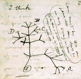
Page from Charles Darwin's notebooks depicting the  'Tree of life' (1837) 

There is a sort of myth, a mystique that often surrounds the role of the artist which can hinder more than it helps. I put Nicky Morgan’s recent comments down to a lack of understanding on her part, as to what art and art education actually is. Although instead of blaming her I wonder if more could be done by the arts community to demystify the misconceptions of art and artists (although the challenge would be to do so without stifling creativity). The light-hearted, romantic or idealised view of producing art; of pondering, talking walks, leisurely painting and drawing in sketchbooks especially now that many artists create a whole career without almost ever touching a pencil (not for me, but each to their own!) is no longer a given stereotype. In reality, the artists I know don't lead a particularly leisurely existence and seem to spend most of their time writing applications for funding, filing tax returns and updating their web presence online. All of that in addition to actually having to make work and find somewhere to exhibit it! Perhaps what Mrs Morgan fails to realise is that most successful artists are also successfully business minded. If you are someone from outside the art world or even someone beginning to embark in arts education there is much curiosity, doubt and uncertainty, I believe, to the perception vs. the reality of what it means to be an artist in the 21st Century. Yet, thankfully it seems many are still willing to try. Therefore I speculate that if we are uncertain what the role or use of an artist is then equally we can expect that will be uncertainty on how the education system promotes and nourishes art subjects. 

From my own experience of studying art, during my MA one of the most deep-seated things I learnt was that art does have a ‘use’ outside being merely a thing for ‘looking at’, or that the process of looking is also a valid ‘use’ in itself. This seems awfully silly to admit that it took me my whole art education from when I first laid crayon to paper to primary school, GCSE, A-level and even throughout my BA degree to reach this, fairly basic realisation, that ‘art is useful’. Maybe, it is something lots of people struggle with and if it took me that long to learn that art can be equal to that of science in terms of the skill-set it teaches maybe it would take others that long? If so, could we then be doing more to promote .....? True I wouldn’t want an artist to perform brain surgery on me, but brain surgery wouldn’t be where it is today without the inquisitive mind’s of looking, investigation, diligence and patience that share its stem with that of art skills. Engineers may require an understanding of maths more than their drawing ability but needs both, along with a problem-solving, creative, questioning mind that is obtained from arts education, in order to apply them into a working design. If that is the case then maybe my experience is shared with what many people struggle to understand; how the arts are relevant and have a value in being aesthetic objects as much as being research, experiential, interactive or social pieces.

Audubon's Arctic Tern (1827-1839) 

When I made the commitment to studying the arts full-time I was aware that the job prospects after weren’t necessarily going to be plentiful or great, which being brought-up in an education system that is designed to teach you that your career matters as though it is the principal thing that defines your whole being, which sort of hung over me like a black cloud throughout the entirety of my studies and some days still does. For reasons that I hold the arts in such high esteem, I've stuck with them and whilst it in some ways they haven't perhaps yet defined my career in an obvious or particular profitable way, it has most definitely defined who I am, what motivates me and how I respond to the world. And yes, I am a bookseller with a masters degree in Fine Art chipping away at the marble monolith that is the art world one blog post at a time. Some of my peers have already and continue to forge their own careers within the arts which is again one of the benefits of an art education it teaches you resilience. Of which I am still inspired by a quote I found in a book about creativity I read years ago which talks about graduates from the New Orleans Centre of Creative Arts;

‘Most NOCCA graduates won’t become professional artists. Nevertheless, these students will still leave the school with an essential talent, which is the ability to develop his or her own talent. Because they spend five hours a day working on their own creations, they learn what it takes to get good at something, to struggle and fail and try again. They figure out how to dissect difficult problems and cope with criticism. The students will learn how to manage their own time and persevere in the face of difficulty.’


I think the problem with how art is perceived as a subject in education is that it has been attempted to be compartmentalised into a system that operates on regulation and attainment. I’m not even sure that this is even a good way to teach maths or science? This is all purely my opinion but in essence I think there are many aspects of art which are not too dissimilar to that of science/maths, and educators, when looking at skill-sets and opportunities subjects offer, should be looking for the connections between the humanities and sciences rather than the distinctions between them. Skills such as, knowledge building, inquiry, logic, critical thinking, discovery, independence, application and realisation along with the numerous theoretical overlaps with philosophy, psychology, feminism, linguistics etc.

Sue Austin http://www.trishwheatley.co.uk/suehome.html

When I dusted off some old notes from my MA days, in an attempt to find something to support my own opinion, I came across my notes on Pragmatism. I remembered in particular that a lot of what John Dewey has to say in 'Art as Experience' makes so much sense in relation to some aspects of education/learning, 

‘In insisting that hard thought was as important to art as to science.....Indeed he was eager to underline the deep similarities of art and science as forms of ordering and coping with experience, noting that they are hardly distinguished in ancient and primitive cultures.’

If separating the distinctions between the arts/humanities and sciences are too prescriptive then you are limiting what both subjects have the potential to be. In college I can remember being really surprised when I saw my dentist on an evening sculpting course (Until then I actually thought he went into a cupboard at the surgery and switched off at the end of the day) but when I thought about it it made sense that someone who was interested in a career that involved drilling holes and filling them may also be interested in the malleable, form shaping properties of sculpting?! When I began looking there were countless examples in science and art where there where the boundaries became blurred, Charles Darwin’s drawings/diagrams in his notebooks, the work of Leonardo Da Vinci, Joseph Beuys’s ’social sculpture’, numerous environmental artists, artists who contributed to social change amongst others whose work connects/tells is more about our psychological, expressive or spiritual needs to contemporary practitioners such as Sue Austin’s free-wheeling under- water wheelchair, Peter Butcher’s embroidered surgical implants, Rosemarie Trockel and the Wellcome Collection who have long supported collaborations between artists and scientists.

Embroidered Surgical Implant -Peter Butcher (2005)

In referring to Charles Darwin as a scientist we may be limited to a set of defining criteria of ‘what a scientist is’ and similarly could categorise what an artist is in the same way. When in fact what the scientist, what the artist is actually doing, what they are concerned with, what they are trying to find out, might be exactly the same thing! In this, “classification sets limits to perception” and so with the definitions more permeable in reality education should mirror this to be more open-minded, more cross-disciplinary with more validation to different approaches of research. I think this could be achieved without either subject losing its uniqueness or special characteristics, which are still important it just seems that at the moment the balance is more in favour of the divisions rather than similarities.

I’m not saying this is a universal guideline of how it should be all of the time, if you’re training to be a doctor, clearly there are many practical things and knowledge you need to acquire which you’re not going to get from just making drawings from the human form (arguably) but there needs to be more understanding from those in government about the potential benefits from all subjects, equally and not this current hierarchal system. Promoting science, technology and engineering is great but it should be done so in the recognition that the arts are equally entrepreneurial, enterprising and society contributing as hopefully some of my earlier examples demonstrated. I can list more if need be! 

Going back to Nicky Morgan’s implication that arts humanities subjects potentially close career prospects, somewhat reluctantly, she is possibly right but that isn’t so much a failing of the way in which arts or humanities are taught or what they teach, but I hypothesize due to a failing of how they are invested in by education authorities that promotes a lack of confidence and uncertainty of what arts/humanities graduates can offer from employers. That and the fact that there aren't many arts jobs going due to cuts made....but that's probably best left till another day.

And what would I know; I am but a humble bookseller. ;)

Friday 7 November 2014

Turner Prize in your eyes!

There is a lot of carpet flooring in this year’s Turner Prize which could also be something to do with three of the four selected artists being film based [carpet, of course dampening the distracting sound of footsteps]. It took me longer than I’d probably like to admit to arrive at that conclusion spending my first Turner Prize 2014 moments adjusting to the dark, sound proofed interior of the exhibition space at Tate Britain. The 2014 prize marking my third overall Turner Prize viewed, the first artist/work of which I’m confronted by in the year's show was James Richards's film, ‘Rosebud’ displayed on what is possibly the biggest free standing television monitor I’ve ever seen! I sit down next to my fellow Turner Prize goers, a middle-aged woman (or so I assume!) and a young mum and toddler, wondering if they are full of the same heightened sense of expectation and intrigue as me. A minute later and the middle-aged woman begins administering herself eye-drops, much to my bemusement, a darkened art gallery being a fairly impractical place to start dispensing eye-care, surely? But needs must and I speculated if maybe there was something in her eye medicine that made her see everything a little differently or maybe she was preparing or purifying her eyes in anticipation for what she was about to see...? Perhaps I should have asked to borrow some? Should eye-baths be dispensed at the beginning of all art exhibitions? Sadly, though I did not know it at the time, this amusing encounter was to be one of the few lasting images I took away from this year’s prize. 

Sigh.
 
Now in its 31st year the 2014 Turner Prize features the work of four artists, ‘under the age of fifty, born, living or working in Britain, for an outstanding exhibition or other presentation of their work in the twelve months before April 2014’.  This year’s nominees include; Duncan Campbell, Ciara Phillips, James Richards and Tris Vonna-Michell. On Monday 1st December one of these four artists will be chosen to win the £25,000 prize by a ‘jury’ of art curators from this country and abroad. Locals may note one of them being the Director of Bristol’s ‘Spike Island’, Helen Legg.

Rather depressingly this year’s Turner Prize is dominated by film. And ironically, after an earlier post about my inhibitions to watching film in art galleries generally*, I now found myself in a situation where I have to watch three all at once! Debatably previous Turner Prize’s may have been too accommodating, or trying to be inclusive for short-listing artists across different mediums each year (painting, sculpture, film and in more recent years performance art being represented) but I find it somewhat sad that there isn’t at least one painter, sculptor amongst the group and don’t feel the decision of so many film artists nominated this year is reflective of a decline in the quality or abundance of artists who categorise themselves as painters, sculptors etc. In fact, the Turner Prize felt like something of an anticlimax after having to navigate one’s way through the breathtaking scale of the Phyllida Barlow's installation of ‘stuff’ in the Duveen Galleries. Surely she deserves to be nominated one year?

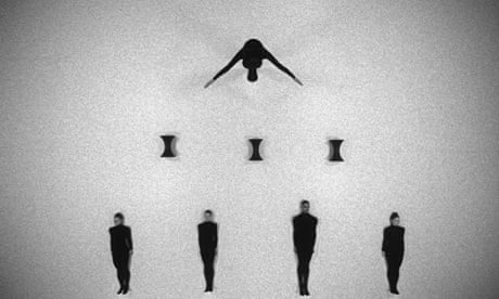
Still, the Turner Prize has always been renowned for its notoriety, its controversy and its general challenging, at times awkward relationship with both the public, the media and the art world alike. In defence of this year’s chosen four, when you go into the work in more detail, one begins to realise it is perhaps the labelling of ‘film art’ that becomes irrelevant and blurred as each artist uses the medium differently. Stills from Duncan Campbell’s ‘It for Others’, in the form of a choreography of dancers dressed in black, becomes sculptural, James Richards produces accompanying tapestries to his film and Triz Vonna-Michell’s work feels more like a museum/performance poetry than to be labelled just as ‘film’. Most frustratingly of all however, despite their differences, it is still really hard to pick a winner amongst the four. I don’t personally feel one artist stands out much above the rest, making the question surrounding the Turner Prize this year not really a matter of who will win but should we really bothered?

James Richards 'Rosebud' (2013)

Before I was easily distracted by eye-drops, I was watching James Richards’s film ‘Rosebud’, a fragmented collage of personal archive footage or as Richards explains, ‘a restricted set of image sensations’ that flicks between grainy images of roadside shrubbery, pornographic  images from a Japanes art library which have been censored by the scratching/sandpapering away of the genitalia and close-up marco shots of President Hamilton’s eye on a ten dollar bill, its surface looking more like tattooed skin than paper. It moves (or is edited), with what’s been described as a ‘claustrophobic intensity’ whereby the ‘bigger picture’ is never shown; the viewer subjected to incredibly close-up shots, glimpses in a sort-of post-modern peep show. The soundtrack, coming from Richards’s background in experimental sound production is a series of amplifies noises of scratches and high pitched whistles and at this point I stopped trying to make sense of what I was seeing, what it all may mean and/or how it related to one another and instead focused on what it made me feel, which I guess was slightly unnerved. The whole thing was oddly tactile, in parts violent in others sensual; the textures and sounds present making it a ‘felt’ experience’ as to just being something you saw with your eyes. A quote I read from Richards goes some wayto articulating my own experience, ‘the screen is less a window into another world...but rather a surface upon which sensorial information can pass.’

Ciara Phillips 'Things Shared' (2014)
 
 Another collagist of sorts and who is the only artist not to use film is also this year’s only female artist; Ciara Phillips, creates silkscreen prints from imagery started from accidental ink splotches which have then been enlarged, cropped and repeated into a bigger ‘collage’ come installation. In the Turner Prize show ‘Things shared’ these prints have been pasted directly onto the gallery walls, the letters, K, N and O singled out and presented in the work in seemingly random intervals, of which Phillips implies, ‘I prefer letters to words –words can be a limit on meaning, but letters give their voice to other languages present in the work.’ In another aspect to this space a sound piece in a booth plays conversations recorded with the practitioners she collaborated with to make the prints as they share their experiences of process/making.  I think the work presented by Phillips in the Turner Prize highlights the danger of seeing just one body of work from these artists, usually out of context from the larger body of work within which it sits. I struggled to get much from this work seeing it alone, but having read more on the artist since, I think some of her concepts on printmaking as a process to ‘im-press’ and the double meaning surrounding the word are actually quite interesting. It is a shame I didn’t get it from the piece exhibited at the Tate.
 
Tris Vonna-Michell 'Postscript II (Berlin)' (2013)

Tris Vonna-Michell may at first appear to be as I so rudely put it, ‘another film maker’ however he is also a historian of memory and uses his own personal life history and relics from his past to self-destruct, interpret, copy and create new stories/identities. Using slides, photocopies, found images and historical references Vonna-Michell creates new narratives and storylines based on the opposing images projected. In addition to the images Vonna-Michell records or performs a live monologue influenced by the sound poetry of Henri Chopin (whom he sites in a specific piece of work, ‘Finding Chopin: Dans l’Essex’) scrambling through his memories, repeating words and phrases. Dotted between these works are the paraphernalia of his source material, photographs, slide projector boxes, shredded paper, designer chairs becoming an archive in addition to the story. The viewer unwittingly also becomes part of unravelling the mystery and trying to make sense of it all, so much so you are left wondering how much is real and how much has been fabricated, how much is a copy. This layering and uncertainty, borrowing and altering, though fabricated is, I found, a more accurate representation of ‘a life’, ‘an identity’ than that of trying to tell or document it accurately. What Vonna-Michell’s work shows is that identity and personal narrative is made from multiple encounters, sources; meetings with other people and their life stories, fragments from the self we project and show to others and the self we perhaps are in private –the whole thing is very layered and is not a linear form of storytelling. Out of all this year’s nominated artists I personally found his work the most engaging in the sense it was made from lots of different components which forced you to participate and think about your own narrative/storytelling.
 
Duncan Campbell 'It for Others' (2013)

The last artist in this year’s prize is Duncan Campbell, already tipped by critics as the favourite to win, he presents two films ‘Stills from Sigmar’ a digital/stop-motion animation hybrid and ‘It for Others’, another hybrid that blurs the lines between documentary film-making, re-enactment and disjointed fictional/non-fictional narratives. ‘It for Others’ is a response to Chris Marker and Alain Resnais's 1953 film ‘Statues Also Die’ a film that explored the commercialisation of African Art. It argues that African Art out of context loses its original function and ‘degenerates to commercialised decoration’. A point that becomes increasingly awkward and provocative when in relation to African art in museums and art galleries (the piece narrated over images of African masks and objects). In another part of the same film a dancers appear to trace words/symbols from Karl Marx’s ‘Capital Volume I’. Sadly, I don't think these ideas being communicated through choreography are any more accessible than they are being read. Through several different visual displays Campbell weaves together a thought-provoking comment on commercialisation although arguably it represents rather than contributes much, if anything new to the debate that hasn't already been done. And by this point, as the last artist in my Turner Prize journey, unfortunately for Campbell, I was beginning to lose energy. Campbell is probably the most accomplished 'film maker' of the three, his editing, storytelling and shots being the most cinematic but I am unconvinced that that is enough to win.
 
This year’s Turner Prize was difficult! The work demanded a lot of time in order to be understood and out of context from the artists other work I felt there was much I was missing or failing to grasp. Was it worth the effort? I don’t honestly feel it was. There have been many, many more artists who’ve been interesting this year outside the realms of the Turner Prize, Phyllida Barlow, Tania Kovats, David Batchelor to name a few. If I had to pick a winner, Tris Vonna-Michell would be my bet simply because his work best emulated the thing I found most interesting in this year’s Prize, which wasn’t the work, but the lady putting in her eyedrops.  The mundane honesty of, ‘So what if I’m in an art gallery, my eyes are killing me. Time for some eye drops!’ was more amusing, more lasting and more realistic than anything much I saw in the Prize itself. Whether Vonna-Michell’s narratives are ‘real’ or not I guess it felt the most human of all the work presented this year and for that relatable quality his work provides where the others tend to alienate, he deserves to win.
 
  You decide? -The Turner Prize 2014 can be seen at Tate Britain until 4th January 2015

 Winner announced on Channel Four, Monday 1st December, time TBC.


Images from:


Sunday 26 October 2014

"Pass me my oil pastels!"

'By words visual imagery is given a second vividness. And writers recast it into a descriptiveness that's infinitely portable.' Ross Feldt

 How does one begin to write about a painter, sculptor such as Anselm Kiefer?! A painter whose work is huge, 'heavy', both in materials and content, multifaceted in its layers and rich surfaces, symbolic, breathtakingly immersive, powerful and to reiterate ,really anything but portable!! To quantify the sheer scale of his works alone in a blog post, had you not ever seen any of them in person is to attempt to imagine an oversized Van Gogh painting on steroids! The physicality in weight, amount of layering, carving and sculpting of materials and paint involved in a Kiefer painting is phenomenal. They almost swallow you up these paintings such is their enormity in size, depth of surface and symbolic content. Hence he's not the sort of artist who is easily done justice in words or photos, in fact, until I saw his work in person (seeing my first Kiefer in 2008) I struggled to see what all the fuss was about. I strongly encourage you to read no  further and go and visit the Anselm Kiefer exhibition at the Royal Academy, London for yourselves.


For those of you unable to get there at present or in need of further convincing then please read on...

The opening quote, perhaps over ambitiously summarises my aspiration for this post (oo-er). It is an ambitious statement indeed and not meant to sound  as pretentious as it first may seem, but is intended a way of justifying the case of 'why bother attempting to write about an artist like Kiefer at all?' [The quote] Taken from a book I recently read called, 'Guston in time' documents the letters between writer, Ross Feld and painter Philip Guston. It is an excellent example of the dialogue between artist and writer, sharing an almost symbiotic relationship as they fuelled and bouncing ideas off the other.I have already alluded to the fact that words cannot really do justice to seeing Kiefer's work in the flesh and more generally I am curious to understand the relationship writing has to visual art, whether it helps or hinders our understanding/enjoyment of the work and is it really possible to make Kiefer's work 'infinitely more portable' through words? Is it foolish even to try?

'Velimir Khlebnikov: Fates of Nations: The New Theory of War. Time, Dimension of the World, Battles at Sea Occur Every 317 Years or Multiples Thereof, Namely 317 x 1, 2, 3, 4, 5, 6 . . . . . . . .' (2011-14)

In this retrospective of the German born artists' work the viewer is taken on a chronological tour from Kiefer's early watercolours and 'Attic' paintings (from the Venice Biennial in 1971) to his present day paintings and installations. Its a wonder how the curators physically fitted it all in! When I mentioned earlier that Kiefer's work is 'heavy' I meant it in both senses of the word. Born in the Black Forest region of Germany in 1945 at the end of the Second World War Kiefer often explores the weight of human history, particularly of Germany's involvement in World War II. Not the lightest of subjects to make work from and is arguably why critics often refer to Kiefer's work dealing with the 'burden of history'; it would have been easy for Kiefer to give in to the darkness and anxiety of such a task, but taught by the mystical and shamanistic teachings of Joseph Beuys, Kiefer's work draws on mythology and symbolism as his starting point, making the work referential to the war but not enclosed by it. His work often symbolically challenging (sometimes confrontationally so), attempts to rewrite the collective memory of the atrocities of war whilst paying homage to it through images of ploughed fields, decaying neo-classical ruins designed by the Nazis) to books and submarines out of materials that also hold symbolic properties such as ash, clay, sunflowers, earth, lead, diamonds (yes you read correctly -take that, Damien Hirst!) and straw. This idea of redemption and remembrance through creating what are thick, obliterated surfaces is, you could argue, both metaphorically a 'covering-over' and 'wiping-out' of history whilst also being a turning-over and creating of something new; it refers to a cyclical movement of time -birth, death and rebirth. The ploughed fields in paintings like 'Nigredo' represent both the end of one thing but the beginning of another. And in other works, sunflowers emerge from ashy dystopian ruins offering a sign of hope and life from despair and destruction.

'Nigredo' (1984)

Viewer stands next to 'Ash Flower' (1983-97) *

The 'passage of life' and link between the celestial/the spiritual and the earthly is a reoccurring theme in Kiefer's work and whilst the human form is often absent his use of perspective and scale draw the viewer into inhabiting and pondering these charred, haunting, desolate spaces. Spaces in which pyramids become mediators between heaven and earth, ruins crumble (are they failed utopias or future dystopias?) and diamonds twinkle off the surface of canvases like constellations whilst also reminding us that they come from the blackest soil found at the base of volcanos; near/far, sky/earth, known/unknown, repulsion/attraction, darkness and light. These are some of the binary opposites which Kiefer uses to represent large concepts or ideas in the same way, I understand, that myth, allegory or metaphor have been used as accessible ways of understanding/contemplating some of life's largest, most intangible questions.  

In Kiefer's paintings the sumptuous surfaces of paint, plaster, concrete, metal, rust, earth and ash cause you to linger, to inspect so that eventually you are engaged in the work long enough to start to wonder what it all means. Both the material and how it has been manipulated hold meaning; the properties of materials like lead holding alchemic associations with transformation as well as compositionally adding to tones of grey within various works. This duality, in the sense that everything is there for a reason gives his work a depth that exceeds from creating a purely a visual experience. Whilst you're walking around the Royal Academy show you can almost here quiet gasps of awe and intake of breath as people fall spell to the lure and vastness of these works that are both beautiful and chilling at the same time. This is one reason why Kiefer is often compared to Romantic painters such as Casper David Friedrich as being inspirational. Equally it is difficult not to get overly poetic in your use of language describing Kiefer's work or loose site of the fact that some of the subjects he is dealing with are very emotive. [He often references the poet, Paul Celan (himself sent to a labour camp during the war) in many of his works.]

 If the spaces and landscapes Kiefer paints are apocalyptical then the only things that remain relatively unscathed are the books which remain a crucial motif in his practice. Once quoted as saying, 'art is an attempt to get at the very centre of truth' Kiefer's use of lead books, physically attached to and mounted on his paintings; is perhaps symbolic of the legacy of books as vessels for human thought, knowledge and culture. It reminds me of a quote I heard or remember from somewhere about when civilisations fail all that remains of them is through their art and culture (forgive me for not being able to find the exact reference). The books in Kiefer's work act as the preservers of history, the remains of human voice in the absence of any human life. Books however, do not necessarily point to a universal sense of 'truth' but do, like art and music document man's search for it. The piece 'The Language of the Birds' placed theatrically at the top of the stairs as you approach the Royal Academy exhibition encapsulates this idea well, marrying the escapism, lofty-ness of books by giving them wings whilst at the same time weighing them down by making them out of lead as though weighted by the knowledge contained in their pages. Perhaps more disturbingly too the spread wings are also reminiscent of the eagle motif used by the Nazis, whilst in its Kiefer-esque duality could also refer to angel wings. By not being too polished and remaining decidedly earthy in its materials it doesn't somehow fall victim into becoming too gimmicky or clichéd.

'The Language of the Birds' (2013)

How does one man deal with the darkness of  the Second World War and remain tireless in pursuit, inexhaustible in a quest for meaning? Somehow Kiefer remains prolific as the sculpture 'Ages of the World' (2014) in the RA exhibition attempts to emphasise. Hundreds of canvases are seemingly precariously stacked into a mountain, pyramid-like pyre with sunflowers sticking out between the sandwiched layers of canvases. It is as though we are seeing the hundreds of works which have been sifted through, created and then discarded in an artistic process/frenzy. Incidentally, it is probably my least favourite works in this exhibition as I think it fails where other paintings and sculptures have tackled a similar idea of presenting 'mass' and cataloguing but have done it better. This piece feels more like a by-product of trying to work something out or search for answers but unlike Kiefer's sketchbooks (which do a similar task) it is more clunky and feels more 'throw-away' or less considered than the sketchbooks. Maybe that is what it is meant to be? In a room adjacent to where 'Ages of the World' is positioned are a couple of paintings depicting the ancient civilisation of Mesopotamia, their surfaces ashen, dusty and worn as though well travelled across a dusty barren landscape prior to being archaeologically revived in the gallery (or so they seem, it is a myth all too befitting of an artist such as Kiefer). They depict the pyramid structures of Mesopotamia that are, I speculate a curatorial decision to be echoed in the 'Ages of the World' sculpture. If anything it feels as though in this preservation of history and predicting of future it is time itself that drives Kiefer to make work so voraciously, by making work that is about past and future before it is too late or before it is forgotten.  

'Morgenthau Plan' (2014) **

The danger with Kiefer is the more you read about his work the more it runs the risk of becoming a bit pretentious, especially if, like me, you aren't at times all too familiar with a wide knowledge of mysticism and mythological references. However I'd argue that his work doesn't need to be over-thought in order to resonate and still communicates at a level of engagement and human consciousness that is accessible to anyone willing to spend time in the presence of these works. This is partly because the symbolism he uses is archetypal but also because it is presented with, for want of a better word 'guts', there's nothing half-hearted about Kiefer, it is big, it is expressive, it is challenging, beautiful and haunting and that gives his work an authority, a presence that can't really fail to prompt a reaction. For me personally, the barometer of whether I enjoyed an exhibition or not usually hinges on two things, whether I feel like I want to write about the exhibition and whether I feel inspired to draw/make studies of work in the exhibition. On this occasion I felt like doing both, hence the blog post and in addition felt compelled to dig out the oil pastels and draw. As for whether it is possible to encapsulate the lived-experience of seeing Kiefer's paintings into words I'll leave that for you to decide. 

Anselm Kiefer is on at the Royal Academy until the 14th of December 2014. Catch it whilst you can!