Showing posts with label drawing. Show all posts

Tuesday, 18 April 2017

Samples

Just a short post to mention an exciting book that arrived today; in 2013 during my first visit to the Venice Biennale I discovered the work of Columbian born artist, José Antonio Suárez Londoño. The work consisted of hundreds of tiny drawings/paintings on paper laid out in glass cases in the centre of the ‘Encyclopaedic Palace’. I fell in love with these quiet, captivating and imaginative drawings admiring their sometimes referential and other times surreal-looking or ‘automatic’ subconsciously derived imagery. They were an inspiration for my own drawing-a-day’ projects and continue to be motivational for my sketchbooks which I still produce but seldom show. I have often written about the 'need' to draw and mind-set induced by the commitment to drawing regularly. They are personal items of use, obsession and need so I have never felt that they need to be subject to the self-conscious inducing scrutiny or rationale of an audience or gallery, however I have shown some and subsequently am grateful that Londoño’s work has been shown in the public domain and embraces an outsider art sense of integrity, to be just what they are (but by all means makes them no less brilliant), drawings in notebooks.


“José Antonio Suárez Londoño revives the profession of artist as a reflection of his time, his surroundings, his personal experience and that of the moment in which he lives.”   

I have been in search of a book of his work for the last four years (they are as hard to come by as it is to repeatedly have to type his name into search engines) and the more I learn about him the more interesting he becomes [For example, I have just discovered he illustrated a book of poetry by Patti Smith]. The book is a retrospective catalogue of his works that were shown in 2015 in Spain Columbia and France. Once I have read the book I will perhaps post more info on here but for now wanted to introduce to more people the work of this exciting artist.    
"Since the 1970s José Antonio Suárez Londoño has expressed himself through drawing, in the form of his prints, his numerous notebooks and rubber stamps. The intense focus and emphasis on a single medium has allowed the artist to create a coherent body of work, which has become an undoubted reference point for the new generations of artists now championing drawing as an essential tool within their artistic activities. Suárez Londoño’s constant, daily endeavours are revealed through an oeuvre that represents a type of inventory of the world, a diary that almost obsessively describes his situation and concerns...an artist for whom drawing is a way to present the viewer with new micro-universes, encouraging us to construct our own narrative."

To View an Online Book of Suárez Londoño’s Works Click Here

Images and Text Sourced from: José Antonio Suárez Londoño: Samples, (2015) This Side Up, Madrid.

Thursday, 7 April 2016

Drawing a Week 2015-2016

Back once again! What began with the 'Drawing a Day' project in 2013* continued in a moment of madness for a second time in 2014** and in 2015 evolved into the more manageable, 'Drawing a Week' 2015-2016!
 
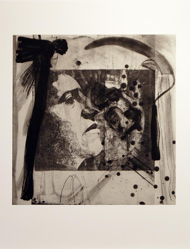
February 27th 2015, Mono print and ink on paper.
Despite having finished it in December last year I have been uncharacteristically slow in getting this sketchbook scanned and uploaded online, this is largely due to the fact that I don't feel that everything I produce needs to be made public. Sketchbooks, to most artists are generally quite personal or private things and feature often the most honest and rawest work; some of which is ugly or badly drawn and other works experimental and full of an integrity of purpose. 
 
Against that better judgement perhaps, I've eventually decided to present this project here. Though genuinely still a bit reluctant to do so, I value the opportunity to reflect on them through writing this post and comments from the public and peers more than my insecurities of sharing them to a wider audience.
 
What a year 2015 was! I'd made the decision to do at least one drawing a week, in my A5 Sea White of Brighton, sketchbook -this was as consequence from wanting to allow more time to produce and experiment with the work as well as be able to produce more work outside the sketchbook. In fact images that began life as tests or drawings in these books have grown and continue to be starting points or references to new work I'm creating at present. In variation to last year 2015's offerings were in a much wider range of media, from pencil, to ink, mono printing, silverpoint and watercolour (though often a combination of a few). This was in my view the most successful aspect of the 2015 drawings and the re-introduction of mono print significantly gave a rekindled sense of life, expression and depth to my work. Nothing still quite matches mono printing, for quality of line, chance and sensitivity in my opinion. 
 
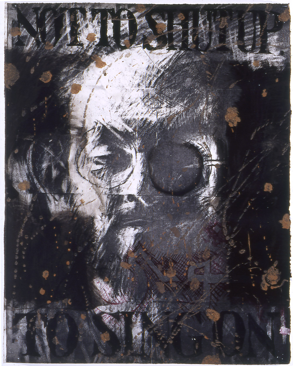
March 5th 2015, Mono print and ink on paper.
Other changes to the 2015 drawings were that they were considerably more open to chance in how I experimented with media, allowing the medium to dictate the drawing rather than the other way around.
 
 The subject matter for the drawings followed tangents of thought that were parallel to work I was creating outside the sketchbooks, so for the first time last year work I was making outside the sketchbook was fed by work I'd previously done and vice versa [probably most evident in the mono print works/tools]. They had a bit of a dialogue which I'd like to develop further this year.
 
 The mark-making and type of line was expanded upon from the previous 'drawing a day' projects which was mostly due to the introduction of silverpoint which forced a broader depth of layering/mark-making to happen and has impacted on being more experimental with marks during mono printing i.e. applying different pressures of line to create different thicknesses.   
 
Working bigger has also significantly changed the intensity and surface of the drawings from previous years allowing for more surface/texture/background and detail.
 
Whilst I feel marginally my drawing continues to improve there are still many aspects I aim to develop which include; 
 
Working more/if not entirely from life: In many ways the better drawings have still been those drawn from life (i.e. real objects, things). There is a 'flatness' that comes from drawing objects, animals, things from photographs or off a screen. Similarly a sense of movement or resonance from drawing actual objects may bring a new challenge or perspective to the work -sense of immediacy or 'lived' moment that could invigorate my drawing. Its a challenge that slightly daunts me, but would be an opportunity to really demonstrate my passion for the 'remarkable everyday'.
 
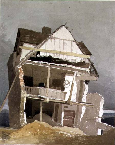
May 28th 2015, Acrylic ink/pencil on paper.
 
Cylinders: Just a small observation, but an important one. I seem to struggle with cylinders! The bases of paint cans, cups, bases of round or curved objects etc. They never look quite right, even when I think they do -I don't notice it until looking back on it much later. I'd like to improve drawing this form as well as perspective and 3D forms generally.
 
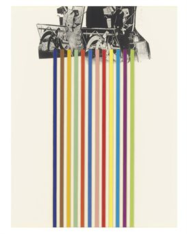
More experimental: So far I have been almost solely representational in my consideration of 'what a drawing is' but conversely one of the more interesting drawings from 2015 was the below image; a completely playful experiment made by rolling a ball covered in ink inside a tube. I'd like to try more non-outcome based or preconceived ways of drawing and instead play with ways of making marks. This wouldn't be to abandon the representational stuff but I think it would open and loosen-up my way of drawing that may worth trying. 
 
Work bigger/different paper/outside of sketchbook: I think working outside of sketchbooks is a lot more liberating in terms of having a freedom to make more marks, stain, pour, paint etc. I also prefer the tautness of paper outside a sketchbook to print onto. So more experiments outside the sketchbook and on different papers.
 
Develop threads of thought: It has to be said that all previous drawing projects seem erratic in their subject matter and tone; going from the political to caricatures or illustrations. In many ways as touched upon earlier, not many are directly observations. Whilst this form of spontaneity has been very  cathartic I am conscious that it leaves many ideas or ways of working undeveloped. My suggestion is to take a starting point and work from it continuously evaluating and learning as I go in order to refine or explore ideas/mediums/subjects in greater depth rather than treating imagery to the equivalent of fast-food!

January 21st 2015, ink on paper. 
 
Overall however, I have already been actively making work during 2016. None of which as yet is sketchbook-based, interestingly, so I am keen to reinvigorate this thread to my practice but want to approach it with the new suggestions mentioned above and see where the work takes me. The dark sincerity remains for me that drawing is still a pleasure and a mystery that is very integral to my practice and my overall sense of being/purpose. 
 
Therefore I am once again pleased to present the 'Drawing a Week 2015-2016' project below where you can put to test all my above observations and hopefully draw your own conclusions...
 
Enjoy!


Created with flickr slideshow.


(Note - you can either watch the flickr slideshow here or if it doesn't work on your phone/tablet then please click on the link below)
 
Watch the slideshow and/or click on the link here: https://www.flickr.com/photos/113459200@N03/
 

Sunday, 24 January 2016

Silver Linings Sketchbook

October 2015 was a busy month for seeing art and I didn’t mention it much at the time but the ‘Drawing in Silver and Gold’ exhibition I saw at The British Museum had probably one of the biggest effects on my artwork in a long while.

Generally speaking, I think there has been a shift in my 'taste in art', (if you can call it that) as I’ve gotten older; where I was once excited by Modernism (Futurism, Cubism, Dada and Surrealism etc.) I now find myself either drawn to the incredibly new or polar opposite, incredibly old. Rembrandt’s etchings which I saw for the first time in Amsterdam two years ago and since, Frescos in Florence have been amongst the art which has genuinely sparked excitement or the desire to create my own work. Their influence not necessarily manifest in style or much in the way of technique in my own work but have maintained a sense of wonder and kept cynicism at bay. And there has of course been much new contemporary art that’s been exciting but does not very often generate the same sense of awe and lastingness as much pre-20th century art.
 
Perhaps in the same way that the Rembrandt etchings were exquisitely drawn; their appeal for me being their mark making and intensity of light/dark contrast (Rembrandt also worked in silverpoint); I was also interested in the variety of marks and precision involved in metalpoint in the drawings in the British Museum exhibition....
 
Metalpoint is a process of drawing with a metal point (initially lead or tin but during Renaissance silver or gold began to be used) onto a subtly abrasive prepared ground so that traces of the metal are left on the surface creating the image. Originating in the late 14th Century it was used by artists such as van Eyck, Durer, da Vinci, Raphael and so on. As part of the process glue hide was mixed with fine bone ash to make the surface to coat the paper, this labour intense process was one of the reasons its use declined along with the introduction of more gestural materials like graphite which were more forgiving to erasing/correcting.      I thoroughly recommend viewing some early metalpoint drawings in person; they are amongst the finest methods of drawing I have ever seen. By fine, I literally mean a delicate fine and worked array of marks built-up and crossed to suggest tone. They achieve what, I think, is one of the most difficult things in drawing; to create tone as well as a sense of texture at the same time. Skin looks smooth as well as having the lights and darks of tone; a plume of feathers looks light and textured as well as adhering to darks/lights. The fact they are made of silver or gold also subconsciously adds to a sense of permanence and preciousness that cannot be overlooked in reading meaning into this drawing method. This discovery wasn’t, I’ll admit completely ‘new’, I had previously learnt about silverpoint’s existence from an artist working locally in Somerset. Like most things, regrettably, I became more interested in the process when just about everyone else did!
 
On first attempts at silverpoint I didn’t, like many, have the luxury of bone ash and glue based primer to work with so I experimented with the cheapest gesso I could find (as it needed a paint with a slight ‘tooth’ to it in order to work) and a silver earring (the hook of which I bent straight to create a point) taped to a chopstick. This will do. The type of line created is very light, very delicate and as mentioned before does not allow for mistakes but can be built upon in layers of fine lines/mark-making. I like the way it forces you to build areas up in line rather than flat shading. For my drawing style it allows for the intensity and closeness of looking which I'm interested in and have significantly and want to continue to improve upon since I started drawing regularly in 2013. My experience of etching is limited, but I feel that silverpoint is akin to the scratching and delicateness of producing marks that are created on an etching plate –fundamentally one of the differences being that you can see the line in silverpoint but not in etching obviously until you add the ink. I think the two relate to each other which is probably why artists like Rembrandt used both.
 
For me, however it is a satisfying process and one that I’ve only really begun to discover. I have since invested in a more manageable silverpoint tool to draw with (pictured above) that always alarmingly reminds me of some sort of dentist drill or implement, matched to the forensic-like precision spent scratching away. Creepy! To start with I’ve been interested in drawing things with lots of texture; hair/fur, scales, feathers etc (as pictured) without really questioning why/or what I’ve chosen to draw.  Due to the faintness and sheen of silverpoint it doesn’t reproduce well in any of my photos/scans but hopefully you get the idea. I think next maybe I start looking at drawing things that either relate to the medium (silver) or respond to some idea in some way (like the dentist thing, maybe I draw some dentures!? Or something mundane, silverpoint socks, maybe?).
For the time being at least silverpoint remains my most exciting art medium of choice since I discovered acrylic artist ink in 2014!
 
 Surely the next step is to try a combination of the two?!
 
 More information on ‘Drawing in Silver and Gold’ sourced from here:
 All text and images copyright of Natalie Parsley©
 

Wednesday, 9 December 2015

"I have gone where my passions have taken me."

Some blog posts are a chore, most a pleasure and then there are some which feel so significant, so important and so personal that writing them becomes a different experience entirely. This post fits into the latter and in its expectation and poignancy in influencing my own art practice has meant that collating my thoughts into writing this has been a slightly daunting process to begin!

I was the first to arrive. (Of course!) I’d booked my ticket in advance and arrived early as I’d never actually previously ever set foot in the Chelsea school of Arts, London. Luckily though through still looking like a student (I’m told) and some misguided snooping-around I had somehow found my way to the Banqueting Suite; a fairly grand wooden panelled room with large windows and ornately carved fireplaces that was originally part of the Royal Army Medical Corps officers’ mess. Now to wait...

I was there to listen to one man, possibly the most influential artist on my practice (and who should need no introduction to those familiar with my work). The date was Wednesday November the 25th 2015. The event, ‘A Conversation with Jim Dine’.   

The Banqueting Suite, Chelsea School of Arts London
Hosted by printmaker and Professor of Fine Art at UCA, Paul Coldwell, the evening was set to be a conversation into Dine’s practice, focusing mostly on his printmaking but also setting the context of the diversity in his practice; from the 60s origins in New York experimenting in performance art alongside Allan Kaprow and Claes Oldenburg to the artist’s recent ongoing print series, a History of Communism. Now turned eighty, Dine’s career as an artist has spanned, drawing, painting, performance, sculpture and printmaking. An artist who defies categorisation but who has and continues to make work that is deeply personal and intense using his own developed set of iconography that includes, tools, heart motifs, bath robes, Pinocchio and birds. In my own work, Dine’s tool drawings and prints have been a significant influence in both the importance and intensity I place upon the process of drawing, the choosing of tools as a subject and how I depict the objects [tools] themselves in the work.

In addition, Dine has always made numerous self-portraits and for those not familiar with these and his appearance, visualise, a more intense-looking version of Terry Pratchett minus the hat! I say this in reverence, for I was sitting as close to the front as I could get, minus the VIP rows (reserved largely, it would seem for the unfashionably late). The anticipation, for me at least, was immense!
  
Walking Dream with Four Foot Clamp (1965) Oil paint, charcoal & steel on canvas. 1524 x 2743 x 29mm


The evening began with a question from Coldwell asking Dine to give a flavour of what life was like during the 60s in New York; the beginnings of Pop Art and ‘Happenings’ performances. Dine replied that New York was without art collectors, dealers and gallerists, it "was a world we made ourselves" and quite literally in some ways with many of the performances including self-made sets and props from cardboard and found objects. He spoke of the ‘need’ to make work with Claes Oldenburg in what was a collegial atmosphere between the artists. It set the tone really for what became and still is the working ethos of Dine’s mentality to making art; prolific, bold and drawing upon the technical knowledge of others. The performance made-way for frenetic, gestural mark-making and has been the visual handwriting of the artist throughout his career. His work is charged with a psychological need, what could be described as a cathartic outpouring in the desire to make work and express oneself. Later in the conversation he stated, “I need to work with my hands...its physical for me”. 

Dine’s answers at this point were relatively short and matter-of-fact as I got the sense that they were questions he’d been asked many times before, but were in-part necessary for setting the scene. Although Dine didn’t continue with performance as an art form after the 60s, the qualities that came from the early happenings never really left Dine’s work, with some of the ideas about using everyday/found objects staying within the work and more significantly the way in which Dine continued to depict tools/inanimate objects as though they were ‘alive’ often positioning them erect as though standing or at other times framing the image as though they were substitutes for actors on the stage. Some of the aspects of 'performance' remained.

Elyria (2000) Charcoal on etching felt. 104 x 129.5cm.
Dine became more animated when talking about printmaking processes and drawing. Stating how he felt that when he tried silk screen whilst he was living in London, that the mechanical ‘flatness’ took what he called “...the life out of it”. As if to say that etching and lithography offer a much more hand-drawn type of mark. He went on to say that, Drawing is part of everything for me.” This is evident in his painting and even his sculptures which are as carved, angular and often feature the same type of harsh, hatched mark-making as the prints. From my perspective this was probably one of the most affirming quotes of the talk and echoes a belief I have long had toward my own practice, that nearly all visual thinking and creativity begins with drawing and that the more successful sculptors, films, performances and installation begin with some sort of drawing within their development. And for some the ‘drawing’ even becomes the work itself. Drawing is an embodied process and there is something of working with hands for drawing that is similar to working with the hand tools Dine depicts.

Tool Box 10 (1966) Screenprint on paper 603 x 478mm.
Many times throughout the evening’s talk I had the impression Dine was an artist that was very ‘real’, honest and not a fan toward some of the over-intellectualising of his work. This is refreshing and in-fact most times I have heard any artist talk about their work, they are nearly all often demystified as not being as academic and analytical about their own work as often reading about them alludes to. In part Dine’s compulsion to draw came from he admits his own dyslexia and that drawing was a way of expression without words. He said that it also helped him be able to work backwards, naturally, a skill useful in printmaking.

Dine spent many years growing up and eventually working in his Grandparent’s hardware store, which inspired Dine to use tools in his art. In what John Russell describes of Dine’s work: ‘Daydreaming amongst objects of affection’. Prolific in his depiction of many of the tools found there, the tools became a familiar iconography/trademark of Dine’s work. The tools reoccurring so frequently and with such intensity that Dine himself has stated they became self-portraits. The conversation moved to focusing on Dine’s ‘Winter Tools’ series of hand coloured etchings. Coldwell stating that these works have been said to compare to ‘Degas’ Ballerinas’ in their delicate line work and intent of placement within the ‘frame’ of the page. Described by Coldwell as, “Objects of desire/more alive than human”. They very much have a feeling of movement and life to them despite obviously being inanimate objects. The former statement met by much amusement to Dine, who tended throughout the eve to be very sceptical and apprehensive of interpretations of his work generally. I like his response better, “These tools are dignified...developed by guys who worked with their hands.” In many ways that’s what I’ve always been interested in too; there is a reverence and life of potentiality in tools as objects, their past histories and future possibilities charging these objects with a sense of purpose and in doing so shouldn’t be taken for granted.

[No title] From 10 Winter Tools series (1973) Lithograph on paper. 707 x 558mm.

Previous to this talk I hadn’t been that aware of some of the techniques and methods Dine uses to create his prints. He treats his plates like drawings, like paper. Speaking of the malleability of print and erasing as a way of drawing with power tools to sand/scrape back through layers in what was explained by Coldwell as, “...tension between classical print making and more urban approach.” Which slightly conflicts with the ‘hand drawn’ nature of some of Dine’s previous comments to which I suppose he still sees using the power tools as a way of making marks on a surface just not with a pencil or charcoal.

Braid (1973) Etching. 85.9 x 40.8cm.
Another aspect of Dine’s practice that I had previously mentioned earlier was that he is dyslexic and early in his education Dine used drawing was a way of communicating without words, a means of expression. This became apparent when the conversation turned to discussing the print ‘Braid’, Coldwell prompting discussion with the question, “Why write what it is?” To which Dine replied, “... it was about not having the confidence of being understood.” And even quite openly commenting in a good humoured, rather than remorseful way that, It [the text on the print] is kind of dumb...I am in your face. I definitely don’t think something has to be recognisable in order to be understood, instead this is an insight into some of the insecurity that perhaps Dine and I expect many artists feel in ‘wanting’ to be understood and have ones work understood by others (I've done the same thing myself in the past). Dine has always had links to poetry and words within his work and in nearly all his work there is an importance placed on the ‘recognisability of things’. Hearts, bathrobes, plants, tools are distinctive in his work but often semi-hidden or surrounded by intense, frenetic mark-making. It’s as though he is not content with being purely abstract and needs form to work from. Dine remarking that his ‘heart’ motif in many paintings/prints is simply a means of “something to hang the paint on”. As the viewer I want these hearts, tools etc. to mean more than perhaps Dine lets on, but at the same time I admire his tenacity to not want to over-complicate his work with his own brought meaning. Maybe much of the way these objects are represented owes something to Pop Art (though Dine may be reluctant to admit it) as there is a clarity, almost advertising-like way of presenting these familiar objects. 

A History of Communism (2012) Lithograph.
The evening ended with a discussion on Dine’s on-going series of prints titled, ‘A History of Communism’ made from reworking lithograph stones found in a former Socialist art academy in Berlin. Previous made work by print makers is added, edited and worked over by Dine who stated that he saw these works as, “landscapes” and as Coldwell observed that in these prints the tools really do become animated and like actors on a stage.  Dine references Pinocchio, a character often used in his work for its storytelling quality of what he calls, “a stick coming to life” which is in many ways, as I learnt this evening is a reoccurring idea in all his work. Coldwell notes that in the reworking of these stones that there is a contrast with the new life placed into these works with, “the deadening of the original lithograph”. Is it sacrilegious to appropriate/work into another artists work in this way? We don’t know the reasoning why some of these stones have been abandoned for many years by their owners particularly when it was created under conditions as repressive as those in Berlin before the wall came down (they’re estimated well over 25 years old). If anything the process is almost archaeological and their alteration reinvigorates them with new life and preserves them in a way they had previously gone unnoticed. The addition of tools and other imagery certainly adds a sense of the historical, the political and the confined which is also interesting given the circumstances when which these stones were originally worked into. Many artists may be offended at the idea of reworking someone else’s work but in this instance, I couldn’t think of anything more liberating and more flattering.  

After the talk had finished the audience were invited for drinks in the Green Room next door with the man himself. I’m delighted to say I got to meet him, but less so that after all my hype and anticipation, had absolutely nothing intelligent to ask or say! The evening wasn’t necessarily anything radically new or ground-breaking but reaffirmed many of my thoughts on the importance of drawing as a means of expression, the significance of a sense of life in inanimate objects, Dine’s commitment to his process/learning new techniques and above all his testament to shaping his career by following his passions/interests.

Friday, 29 May 2015

Jurassic World!

Old fossils spotted down on Watchet’s quayside!

‘Jurassic: Triassic: a Geological Journey’ currently on at ‘Contains Art’ in Watchet is an exhibition of drawings, paintings, felt and mixed media work ‘inspired by the strata, rock formations and landscapes of the coastline from Doniford to Blue Anchor’. Featuring work by six local artists (four of whom also have container-based studios on site alongside this exhibition) Mel Degan, Lucy Lean, Angie Wood, Leo Davey, Sue Lowe and Alison Jacobs.

Speaking of ancient history, it has been almost two years since I last visited Watchet when I attended the ‘Contains Art’ grand opening on the sixth of July 2013*! What kept me away for so long?! For those not in the know, ‘Contains Art’ is located on Watchet’s quayside in the form of three large beautiful blue shipping containers that have been transformed into studio spaces and an exhibition space for artists. A visit to these unique and imaginative studios and exhibition space was clearly long overdue and so on May’s last bank holiday Monday I paid them a visit.

Leo Davey

The practicalities of an artist working and exhibiting in a shipping container is no mean feat, the spaces are long and relatively narrow (and probably quite cold in the winter months), but as ‘Contains Art’ continues to prove the resilience of artists is such that we are prepared to make it just about anywhere. Printmaking, sculpture and painting all happen on site in these seemingly impractical containers in a real working example of the innovativeness of creative practitioners. It is quite inspiring and has already become a successful addition to the contemporary arts landscape in Somerset with ambitions for future expansion in the pipeline.

Sue Lowe 'Helwell Layers I'
 The small but geologically formed exhibition currently on until Sunday 31st May is an example of some of the local talent on offer and brings together some varied and imaginative approaches to the theme of the local Jurassic/Triassic coastline. As you may expect to find in an exhibition about geology there is a lot of layering going on in the work! Printmaker, Sue Lowe produces collagraphs layered with chine collé in totem-like columns. The colours and layering Lowe uses create a sense of the maritime, salt/minerals through their depth, texture and wear. Minehead based artist, Leo Davey provides a series of watercolour/ink based drawings depicting the strata and layering of the coastal rock formations. The longer you spend looking at stone the more you notice the amount of colours and tones that seem to change in different light and weather conditions. Davey’s drawings seem to pick up on this being extremely colourful becoming stylised and almost pattern-like in their appearance. Elsewhere Lucy Lean felts undyed natural fleece into tightly packed, dense forms mimicking the shapes and layering of fossils or rock. It is an interesting choice of material [fleece] as it’s soft, more malleable properties have parallels to geological processes of squashing and compressing of layers of rock and sediment.


Lucy Lean
Angie Wood and Alison Jacobs both create their own interpretations in paint inspired by the cliffs and coastal landscape; Wood through stained/layered acrylic paintings which seem to celebrate the roughness and texture of the canvas surface they’re painted on creating earthy, moody and contemplative scenes inspired by the local cliffs but could also connect to a broader reaching sense of our relationship to space, the ground and terra firma. Jacobs, another accomplished painter depicts coastal landscapes with vivid, expressive colours and energy, some of which have been created on an iPad in a sort of David Hockney style experimental playfulness. They are slightly detracted from, however, in my opinion by another of her works (coincidently my favourite overall in this exhibition) made entirely from used artist’s paint brushes. Titled ‘Fossil’ (pictured) as the name would suggest, the brushes are arranged together in rows taking the curved form of an ammonite fossil, or as I saw it mimicking stratum layers. It is possibly the most conceptual piece in the show, but is very cleverly affective and brilliantly observed at communicating the same subject matter in the paintings but in an altogether wittier way.   

Angie Wood

Alison Jacobs 'Fossil'

In true cabinet of curiosities style ‘Contains Art’ is full of many wonders and diehard fossil hunters fear not, for there are also a few actual fossils in this exhibition as well as alabaster and various stones!   ‘Jurassic: Triassic: a Geological Journey’ is a vibrant exhibition that is only limited by its deserving to expand into a bigger container!

 ‘Jurassic: Triassic: a Geological Journey’ is on at Contains Art, Watchet until the 31st May! Get a move on!


Tuesday, 19 May 2015

Drawn together

 ‘Writing is like drawing in that it focuses the mind wonderfully’.  –Michael Craig-Martin*
 
I write these posts in order to understand what I’ve seen or experienced, better. It is a way of processing, analysing those thoughts for as much my own record as it may (hopefully) be as of interest to anyone else that chooses to read it. The same can be said of drawing and my relationship with it as a means of focusing the mind allowing the opportunity for new thoughts, or indeed the almost meditative expulsion of having no thoughts at all (both as equally valuable).  Having a passion for both, with that in mind, I began writing this post about ‘Great British Drawings’ exhibition of over 100 drawings by artists such as, Gainsborough, Turner, Rossetti, Millais, Holman Hunt, David Hockney, Gwen John, Walter Sickert, Ravilious, Edward Lear, William Blake, Samuel Palmer and Tom Phillips at the Ashmolean in Oxford.
Tom Phillips 'Salman Rushdie' (probably 1993) Charcoal, red and black body colours,
 brown mud bound in liquitex mat medium on white paper.
 
Most exhibitions I visit are intentional, in the sense that I plan to go see them. Visiting ‘Great British Drawings’ was more fortuitous in that I went to see it simply because I had some time to spare!  In that respect it was a pleasant surprise with equally a few seldom-seen gems amongst the collection on display. These include a Tom Phillips charcoal, mud and liquitex drawing of Salman Rushdie, (pictured above) which was uncannily Jim Dine like in its drawing style through heavy use of black and intense mark-making. Elsewhere it was refreshing to see a pen and ink drawing by Edward Coley Burne-Jones (of Pre-Raphaelite fame) that was in its small, more intimate scale more engaging and visually interesting in tone/marks than any of his paintings in my opinion. A few more of the Pre-Raphaelite ‘gang’ had work displayed in this exhibition and whilst I wouldn’t say I’m a fan of work from that period the difference in a perceived sense of warmth between their drawings and their paintings was quite striking. It reaffirmed that the pre-emptive nature of drawing, in the way it was used often before or as a way of composing a painting is so much more revealing of the artists hand and first impression of what they are looking at often than the painting. The painting is more measured in that it has been considered, edited and planned to convey what the artist ‘wants you to see’ whereas a drawing can be as considered but is often more ‘of the moment’ and sort-of as consequence, I feel, slightly more real (‘real’ in the integrity sense of the word rather than necessarily ‘realistic’) Turner is however a good exception to this theory whose drawings are also in this exhibition, he paints very much how he draws and the drawings inform the painting as much as the drawing is informed by the materials he is using.  Again, it was great to see these smaller on paper watercolours which if anything felt slightly fresher and less laboured than some of his paintings.
 
Samuel Palmer 'The valley with a bright cloud' (1825) Pen and dark brown ink with
sepia mixed with gum Arabic, varnished.
 
Edward Lear 'Contstantinople from Eyoub' (1848) Pen and brown ink
with watercolour over graphite on wove paper.
 
Flavour of the month, Eric Ravilious also had a drawing present in this exhibition along with Samuel Palmer (pictured above) who feels vaguely similar in that both were attempting to depict the romanticism of the English landscape, the undulating hills, cloudy skies, ploughed furrows in fields, rows of corn, hidden pathways, stone walls and all the variety in textures of trees, leaves, hedges and fauna. I also admired the draughtsmanship of artists such as Edward Lear whose illustrations I was familiar with but until now had never seen these more technical drawings (pictured above) which although preparatory for something finished are still quite elegantly sensitive and informative in their own right.  There was also work that reminded me of the importance of drawing as capturing an impression of something and the immediacy and observational sketchiness of John Sell Cotman’s ‘A Ruined House’ (pictured below) being one example and also a more unusual contrast to the familiar subject matter predominantly limited to classical architecture or castles (though many of these perhaps also united to this drawing in being ruins but of a slightly different nature).
 
John Sell Cotman 'A Runined House' (1807) Watercolour over graphite on paper.
 
This was a quietly contemplative exhibition, with lots of looking and noticing attention to detail of the kind which drawing tends to invite more gently than painting so whilst the Ashmolean probably possess infinitely more work they could have possibly shown in the space it still felt as though there was a lot to see. Certainly a lot to think about.
 
‘Great British Drawings’ is on at the Ashmolean, Oxford until August 31st.
 
*Taken from  CRAIG-MARTIN, M; ‘On being an artist’ (2015) Art Books Publishing: London. p8. 

Tuesday, 31 March 2015

Whose line is it anyway?

One particularly blustery spring morn a dot went for a walk and consequently found itself on a train to Honiton before arriving  at the Thelma Hulbert Gallery ‘Drop me a Line’ exhibition where it was then joined by lots of other dots that then became a bunch of lines that came from all over Devon, Somerset and beyond...
 
It was too difficult to resist the obligatory Paul Klee reference when beginning to write about the current exhibition of line inspired work at the Thelma Hulbert Gallery created, curated and installed by Somerset-based artists Louise Baker and Michael Fairfax. Klee even more relevant when you take in to consideration just how playful (literally) this particular exhibition is due to its concept of viewer/participant interaction as part of the work which is to be told in two parts (so as to avoid a one liner!) at the gallery throughout 2015.
 
 
Ahem, the current and first, ‘Drop me a Line Part I’ also sees the gallery divided into two halves with Michael Fairfax’s installed piano wires, strung in a series of constellation-like configurations (to be plucked or bowed by the viewer) in the downstairs rooms whilst upstairs Louise Baker’s  lines on paper feature hundreds of mixed-media drawings (in the broadest sense of the word) collected as result of an open call to any ‘line-makers’ out there that sought the opportunity to drop her a line of their own making (interestingly many but not all have been sent by artists). The received lines have then been collated into a huge wall work by Baker where the lines are revealed not just drawn but dribbled, daubed, gilded, stitched, collaged, burnt, printed, written, smudged, stained, sketched, scribbled and torn. There are lines which are solid and fixed others that are more fluid and temporary, varying from the completely abstract to the more representational; each one as different as the handwriting of the individuals who made them (should you feel compelled you can also create your own line to add to the series to be shown later this year). You seldom see such a wide variety of mark-making all in one place and it was both fun and fascinating to try and guess the work/marks of any artists I recognise (with more mysteries than that of being solved!)


I imagined what a delight it must have been receiving these unique drawings individually in the post, each with their own story/ journey they’d undertaken. Therefore in some ways, I felt a little disappointed that the  joy and surprise of each drawing’s uniqueness/subtlety felt as though it got lost in presenting them all together on a wall. The intimacy of each one sometimes a struggle to see in the gallery space and having to contend with the surrounding drawings around it so the sense of an overall journey, chronology or line was a little confused. I speculate that Baker, also a maker of extraordinary hand-made art books, will collate them into a book at some point which I can only imagine would help resolve some of the issues I had with seeing the work presented in this way. Something of a mark-maker myself though I still found much I could relate to and be inspired by, in addition to this work Baker has also displayed a series of threshold lines (pictured above) made from graphite which has been crushed/brushed/stepped on by the feet of visitors as they enter/exit the doorway to her studio space at Hurstone in Somerset. They are a poignant reminder of the beauty in the simplicity to be found in everyday, incidental mark-making and the traces we create unintentionally. More personally too they were reminiscent of my own tribulations with using a hammer and graphite to make drawings during my MA. 
 
 
Contradictory, Fairfax’s work downstairs reveals the other side to installation by which the work has been installed to fit the space so much that the room and gallery walls become part of the work itself. The piano wires connected by tuning pins attached to the walls are composed in response to the architecture of the room and form their own shapes, patterns and lines of varying lengths and degrees. It is a sensorial experience for both sight, sound and touch. With the use of either their hands or bows (provided) viewers are invited to pluck, stroke, strum and listen to these lines whose sounds are reverberated in different walls around the gallery. To aid the hearing process viewers can also pick up, what for lack of knowing its official name, I’m going to somewhat crassly call a ‘piece of wood’ (pictured below) to listen to the walls more intently creating a sharper/deeper sound. Viewers can also record and send their sound interactions which will become the basis for work made in the second ‘Drop me a line’ exhibition later this year. I love the idea of listening to walls and the old saying of ‘if the walls had ears’ as a way of people responding to and interacting with a space in a way they would never normally have the opportunity to; would the walls of an old cob walled cottage sound different to that of its modern brick counterpart? There’s that and the fact, that regardless of one’s personal musical abilities it is fun to be able to touch ‘the art’ as it is fun to make sounds and noise by plucking piano cords. There are even many dualities between this work and the drawings upstairs in the way we talk about rhythm, pace, depth, richness, sharpness and resonance as qualities within the work. It is these variables that will mean that the range of responses generated by these drawings and sound recordings will be vast. My attempts weren’t so much spaghetti western as they were random noise but I enjoyed the experience none-the- less.


One of the most remarkable and special things about art is that sometimes you can make a lot of work out of very little and what ‘Drop me a line’ does is take something very seemingly straight forward and as simple as a line, as its starting point and creates opportunities that invites copious possibilities from its participants which are both fun and revealing at the same time. In all the richness of sound and visual imagery you almost forget it’s the humble line that threads all the work together.
 
 On that note I’ve a few lines of my own.
You will visit ‘Drop me a line’ at the Thelma Hulbert Gallery.
 
You really should.

'Drop Me A Line Part I' is on at the Thelma Hulbert Gallery, Honiton until May16th 2015
More details and opening times at: http://www.thelmahulbert.com/thg.aspx?pageID=2

Saturday, 10 January 2015

Unimportant somethings - A Drawing a Day 2014-2015

Happy 2015! You didn't think that I wouldn't complete my 'drawing a day' challenge for 2014 did you? I have to admit the challenge of working bigger and in colour for what was going to be my second year of completing 365 drawings, left me unsure if I was going to actually find enough time and have the discipline that was needed to complete such a task. What was I going to draw for each of those days?!
 
From whatever depths of madness, obsession and passion for drawing that drove me I managed to complete the year. Self congratulations aside it is useful for me to take this opportunity to reflect and evaluate on the experience. Similar to the year before I formed a love but also hesitant relationship with the daily commitment to drawing. Unlike no other medium I've found in art, I actually feel the 'need' to draw and if I haven't drawn something for a number of days I start to feel like something's amiss. Like an itch that needs scratching, perhaps it is the closest thing to some mild form of addiction. Yet despite this, I found it interesting how making time to do a drawing everyday; on your good days, bad days, holidays, when you're feeling unwell, days when you're just so busy; really offers a rare moments pause and reflection where the only thing that matters is your attention to the thing you're looking at/'what's on the page'. Days when you really feel too tired, stressed or just too busy to draw are the most challenging yet once you lose yourself into the process of looking I felt reminded of why I enjoy the concentration, focus and escapism it offers. In part a lot of this has something to do with the 'type' of drawing I do everyday which borders on something closer to illustration than the eye-opening skill-set of drawing/looking I explored during Fine Art. To confess I think I have always wandered the periphery of being more representational dare I say 'a closet illustrator' a 'repressed doodler or cartoonist'. This 'tight' way of drawing often, arguably not leaving much to the imagination; other than appearing as a purely self indulgent exercise has, I think testament in the choice of 'what' is drawn and intensity placed upon 'how' it is drawn. In this way, conceptually at least, it shares some threads within Fine Art practice. The purpose and where this project 'sits' within my practice bothers me slightly as it is less defined and I am less clear in its motives other than it 'was something I wanted and felt a compulsive need to do'. It is a question I will have to consider later in more detail. 
 
The drawings themselves should reflect some of these observations more accurately. It is an honest account of my drawing ability, some of which has improved  whilst other aspects, as you will see, still remain a challenge (wheels for example!).There are many bad drawings as there are many successful ones (and that's not necessarily about being subjective, some drawings are just bad drawings!), but all of them of course a learning experience. Some days are quite lazy others clearly have had more effort put into them, it would have been impossible to be in the same state of concentration everyday for a year. Life, events and your emotions won't allow for consistency. And that's not to say the days with a bad drawing were a 'bad' day and vice versa, I think it's probably a lot more subconscious than that and never at the front of my mind when I draw. I just draw. What I will say is that they definitely improve throughout the year as my confidence with using colour and experimenting with pencil instead of pen begin to creep in. I acknowledge that, but it isn't always evident just how much attention I pay in learning from my mistakes along the way as drawing everyday doesn't allow much time for reflection. However through the persistence of drawing you can't help but naturally improve slightly as you go. Albeit slowly, I did come to the conclusion that whether I work in black and white or colour is really dependant on 'what' I draw rather than pre-determining it from the offset. For future reference the qualities of the thing I'm drawing should determine the medium.
 
In terms of what I draw and why, that will probably remain a mystery without going into a running commentary on each drawing as ideas from one often lead to ideas for the other. At times it is possibly a little more disturbing than last year, I didn't hold back but in doing so found the times when I was drawing from a real object (as opposed to an imaginary thing) the finished drawing had a lot more integrity, intensity and were on-the-whole more enjoyable to do. If it was my intention to reveal something of 'myself' in the work then the drawings which have these qualities and are based-on real objects with real histories or connections stand out as, in my opinion as the more successful drawings. I prefer working this way and it is something I will certainly consider for future drawing projects.
 
A lot of the time what I draw each day works on an association basis, for example, you can be painting the smooth metallic sheen/surface/rendering on a wind-up bird toy and it can remind you of something similar you've seen and then you choose to draw that the next day, or the shape of it reminds you of something or the thing itself recalls a conversation you've had, a place you've been or purely something straight from your imagination or something ready-to-hand at home. To anyone else looking, it certainly will appear at most times incredibly random.  A lot of the images this year are also from pop culture, music/cd album covers, films, video games, other art works from Rembrandt to Grey's anatomy. Other things are unusual curios that my family have bought or collected. There are plenty of animals which have been useful in helping me to 'soften' my quality of line and explore more organic/subtle forms, but if hand-on-heart I still prefer drawing objects and yes, tools! If you ask me, I'd probably have a story to tell about most of the images. 
 
The completed stack of six A6 sketchbooks for the year 2014-2015.
 
As per last year's 'drawing a day' project it was never my intention that whilst drawing something each day, that I may actually end up completing the year and secondly that I might not choose to show it online a second time. I'm still not quite sure about putting it in the public domain, but feel that a certain degree of closure or an end to this project needs to be told and for that reason,
 
 I am pleased to show here, the completed 'Drawing a Day' project 2014-2015!
 
Enjoy!
(Note - you can either watch the flickr slideshow here or if it doesn't work on your phone/tablet then please click on the link below)


Watch the slideshow and/or click on the link here: https://www.flickr.com/photos/113459200@N03/sets/72157649815526320/


Created with flickr slideshow.


Thank you for reading and taking the time to look. Please do leave a comment below and/or email me at natalieparsley@yahoo.co.uk 
 
Where does that leave me now?...
 
Do you really need to ask? I do still have an A5 sketchbook waiting to be filled... so  of course I am going to do something similar again!!
 
Only this time I'm going to do one drawing a week, 52 in total and make them bigger more considered and worked. Allow myself more time to think and revise what I'm doing. I can't promise it will be any looser, experimental, safer, riskier, weirder or more wonderful than the last, but we'll just have to wait and see.