Showing posts with label Oxford. Show all posts

Tuesday, 19 May 2015

Drawn together

 ‘Writing is like drawing in that it focuses the mind wonderfully’.  –Michael Craig-Martin*
 
I write these posts in order to understand what I’ve seen or experienced, better. It is a way of processing, analysing those thoughts for as much my own record as it may (hopefully) be as of interest to anyone else that chooses to read it. The same can be said of drawing and my relationship with it as a means of focusing the mind allowing the opportunity for new thoughts, or indeed the almost meditative expulsion of having no thoughts at all (both as equally valuable).  Having a passion for both, with that in mind, I began writing this post about ‘Great British Drawings’ exhibition of over 100 drawings by artists such as, Gainsborough, Turner, Rossetti, Millais, Holman Hunt, David Hockney, Gwen John, Walter Sickert, Ravilious, Edward Lear, William Blake, Samuel Palmer and Tom Phillips at the Ashmolean in Oxford.
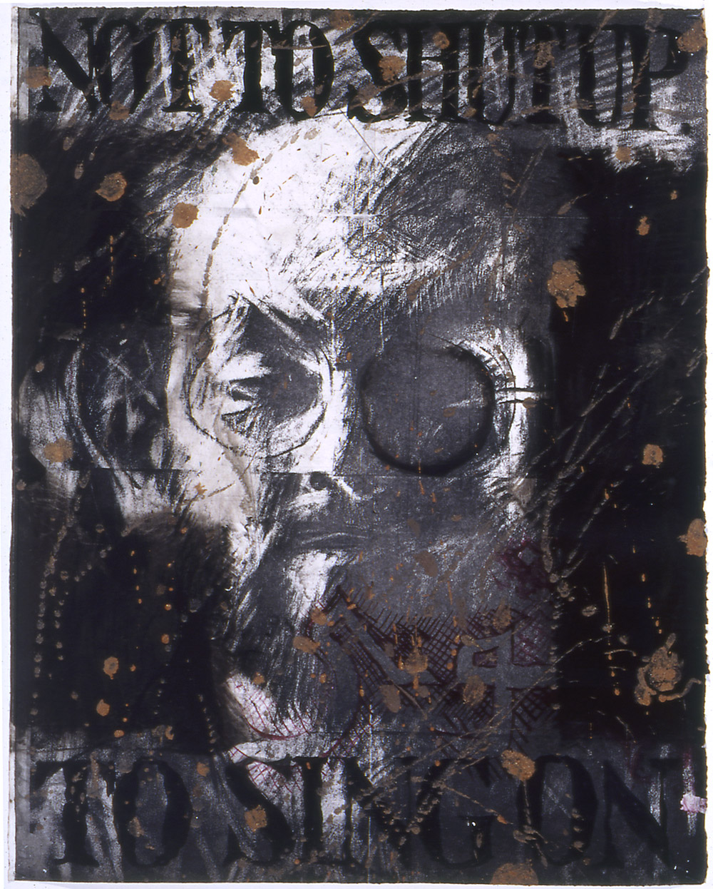
Tom Phillips 'Salman Rushdie' (probably 1993) Charcoal, red and black body colours,
 brown mud bound in liquitex mat medium on white paper.
 
Most exhibitions I visit are intentional, in the sense that I plan to go see them. Visiting ‘Great British Drawings’ was more fortuitous in that I went to see it simply because I had some time to spare!  In that respect it was a pleasant surprise with equally a few seldom-seen gems amongst the collection on display. These include a Tom Phillips charcoal, mud and liquitex drawing of Salman Rushdie, (pictured above) which was uncannily Jim Dine like in its drawing style through heavy use of black and intense mark-making. Elsewhere it was refreshing to see a pen and ink drawing by Edward Coley Burne-Jones (of Pre-Raphaelite fame) that was in its small, more intimate scale more engaging and visually interesting in tone/marks than any of his paintings in my opinion. A few more of the Pre-Raphaelite ‘gang’ had work displayed in this exhibition and whilst I wouldn’t say I’m a fan of work from that period the difference in a perceived sense of warmth between their drawings and their paintings was quite striking. It reaffirmed that the pre-emptive nature of drawing, in the way it was used often before or as a way of composing a painting is so much more revealing of the artists hand and first impression of what they are looking at often than the painting. The painting is more measured in that it has been considered, edited and planned to convey what the artist ‘wants you to see’ whereas a drawing can be as considered but is often more ‘of the moment’ and sort-of as consequence, I feel, slightly more real (‘real’ in the integrity sense of the word rather than necessarily ‘realistic’) Turner is however a good exception to this theory whose drawings are also in this exhibition, he paints very much how he draws and the drawings inform the painting as much as the drawing is informed by the materials he is using.  Again, it was great to see these smaller on paper watercolours which if anything felt slightly fresher and less laboured than some of his paintings.
 
Samuel Palmer 'The valley with a bright cloud' (1825) Pen and dark brown ink with
sepia mixed with gum Arabic, varnished.
 
Edward Lear 'Contstantinople from Eyoub' (1848) Pen and brown ink
with watercolour over graphite on wove paper.
 
Flavour of the month, Eric Ravilious also had a drawing present in this exhibition along with Samuel Palmer (pictured above) who feels vaguely similar in that both were attempting to depict the romanticism of the English landscape, the undulating hills, cloudy skies, ploughed furrows in fields, rows of corn, hidden pathways, stone walls and all the variety in textures of trees, leaves, hedges and fauna. I also admired the draughtsmanship of artists such as Edward Lear whose illustrations I was familiar with but until now had never seen these more technical drawings (pictured above) which although preparatory for something finished are still quite elegantly sensitive and informative in their own right.  There was also work that reminded me of the importance of drawing as capturing an impression of something and the immediacy and observational sketchiness of John Sell Cotman’s ‘A Ruined House’ (pictured below) being one example and also a more unusual contrast to the familiar subject matter predominantly limited to classical architecture or castles (though many of these perhaps also united to this drawing in being ruins but of a slightly different nature).
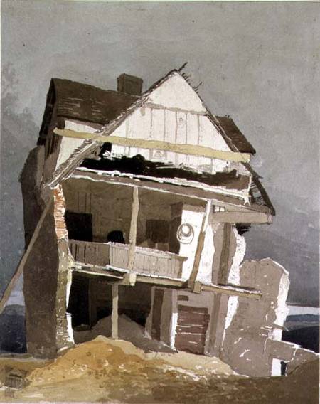
 
John Sell Cotman 'A Runined House' (1807) Watercolour over graphite on paper.
 
This was a quietly contemplative exhibition, with lots of looking and noticing attention to detail of the kind which drawing tends to invite more gently than painting so whilst the Ashmolean probably possess infinitely more work they could have possibly shown in the space it still felt as though there was a lot to see. Certainly a lot to think about.
 
‘Great British Drawings’ is on at the Ashmolean, Oxford until August 31st.
 
*Taken from  CRAIG-MARTIN, M; ‘On being an artist’ (2015) Art Books Publishing: London. p8. 

Monday, 23 September 2013

What are you made of?

'Flesh and Bone' Francis Bacon and Henry Moore at The Ashmolean, Oxford 
“There’s a layer of flesh around the muscle that shimmers with iridescence similar to that of mother of pearl. It’s surprisingly beautiful,” went  another normal conversation from two West Country dwellers on their way in the car to see an exhibition of Francis Bacon and Henry Moore’s work at The Ashmolean in Oxford. Ok, so I was listening to my friend’s account of having to once skin a deer (as you do) but unintentionally it couldn’t have actually been more appropriate way of setting the tone for what was going to be a very fleshy, meaty, bony, but also surprisingly beautiful sort of exhibition.  


Francis Bacon and Henry Moore at The Ashmolean, subtitled ‘Flesh and Bone’ features over sixty works from paintings, drawings and sculptures by the two artists (with the majority of work dating from the 1950’s and 60’s).

“Bacon concentrating on flesh, so mortal, so easily corrupted, and Moore on bone, the human remnant that survives for millennia.”

Until now the only known connection between the two artists was more to do with the fact that they worked during the same time, Bacon growing up within eleven years younger than Moore in the early 1900’s, surviving two world wars and both working simultaneously in London. However, the exhibition at The Ashmolean is the first exhibition to present selected Moore sculptures/drawings alongside Bacon’s paintings drawing attention to the parallels in themes, working practices and formal qualities the artists shared in their work. And let me tell you, the results are rather insightful!

This is a real curator’s type of exhibition, and by that I mean the real success and interest lies with how the show’s been put together in a way that two opposing artists have been reinterpreted as a result of being exhibited alongside each other; different, for example, from a retrospective or show whose aim is to represent a body or breadth of work. You can still expect to find several large scale Bacon paintings depicting distorted, painterly figures/bodies as well as the more solid, smooth, reclining figures of which Moore is renowned for. What is clever, is the curation of presenting the two together, it’s the kind of comparative analysis that art students are taught to put together in their visual culture essays, “what if you look at this artist, then another artist working with a different medium and then see what similarities/comparisons you can make between the two” Efforts often result in a thoughtful new insight into what otherwise has become familiar work. It opens new interpretation and thinking that can make us look at the work differently.

Moore’s Animal Head; and a detail from Bacon’s Portrait of Man with Glasses. Photographs: The Henry Moore Foundation; The Estate of Francis Bacon *

That’s what the curation of Bacon Moore does for the artists’ work at the Ashmolean. I looked for sculptural qualities in Bacon’s figures and admired the painterly quality and gesture in Moore’s drawings.  Perhaps what doesn’t translate as well or so easily for me is Moore’s actual sculptures which appear to be more dated and familiar over the years than Bacon’s paintings which still feel contemporary and stir what I can probably only describe as a more prompt, gut reaction than Moore’s sculptures which still leave me feeling a bit cold. However, Moore’s sculptures have all the more to gain from this exhibition as it’s the way I viewed his work that changed the most. I had always thought Moore’s figures as being in a state of calm, laid back (literally reclining in some cases), soft curving and undulated like the Yorkshire hills that helped inspire their form. But seeing them alongside Bacon has made them all the more sinister. What was once reclining now looks awkward, uncomfortable and even vulnerable. This reading is further developed with the addition of Moore’s shelter drawings; dark, intense images that Moore captured of people huddled, stooped and lying in shelters during World War Two. The figures in these drawings are more distorted, ghostly and malformed like that of Bacon’s figures. Making links between the formal qualities their works is now easier to see. Equally, I was surprised to see sculptural qualities in Bacon’s paintings (aside from the surfaces of his paintings which are in themselves quite sculptural) noticing how he placed his figures on ledges, edges, chairs or pedestals. Like a carcass of meat in a butcher’s window there is something chillingly voyeuristic and something of an awareness of presentation in how Bacon’s figures sit or lie within their constructed window-like frames.  Bodies in Bacon’s paintings appear moulded and shaped as though they were made of unset clay. Moore’s sculptures on the other hand become the solidified version of a Bacon painted from.

However for this joint exhibition of artists to work well, does the connection/the links that the curator is making between the work need to be believable? Or is it important for us, we the audience, to keep in mind that this is a proposed interpretation of the artists’ works and is not necessarily factual proof that the two artists influenced each other. Like the big exhibition, ‘Matisse Picasso’ at the Tate Modern from 2002, the connection is more speculative (however likely) rather than definitive. Not that any of that gets in the way of how one views the work, I don’t think, the distinctions between their work could be purely coincidental. What is clear, is that this is a rewarding exhibition to view, certainly challenging some of my preconceived thoughts of Bacon and Moore. If Picasso’s dictum, ‘Good artists copy, great artists steal.’ is to be believed then whether Bacon and Moore took inspiration or stole ideas from each other or not the fact that that it has taken us this long to notice can only be proof that as artists in their own ways they are both great.

Flesh and Bone is on at The Ashmolean, Oxford until January 19th, for more details visit:
http://www.ashmolean.org/exhibitions/baconmoore/

 *Images from:
http://www.theguardian.com/artanddesign/2013/aug/30/francis-bacon-henry-moore-opposites-attract

Thursday, 22 August 2013

I'm a user

“She found a little bottle…and tied round the neck of the bottle was a paper label with the words ‘DRINK ME’ beautifully printed on it in large letters."
- Lewis Carroll, 'Alice's adventures in Wonderland'

Ah, welcome to sunny Oxford, Wednesday 21st August 2013.

If Baudrillard in, his 'System of Objects' is correct in saying, "...there are two functions of every object, to be put to use or to be possessed" then this shop would surely appreciate both. 'Objects of Use' on Market Street in Oxford sells, you guessed it, things of use and things (like any self-respecting shop that wants to earn a living should) to be possessed if you're willing to cough up the cash that is. And if you're not familiar with this blog, its not my habit to go around applying theory to shops, it just so happens that this shop had something in common with my interest of everyday objects (drawing them mostly -check out the artwork sections of this blog).


After being to visit Pitt Rivers, Oxford earlier that morning and admiring (as I usually do) the collections of tools, netsukes, keys, pigments and such, I realised that what is particularly appealing about Pitt Rivers is the way in which the objects are displayed and the way in which they are labelled with their original handwritten tags (ah see, maybe you were wondering why the Carroll reference at the beginning...and he studied at Oxford too, which is convenient for this post). Later, coming across 'Objects of Use' was a bit like walking in the shop version of Pitt Rivers where things were for sale but presented as though they were on display. The shop was more empty in terms of stock than I was used to, except it was empty in a less-is-more way, where each comb, trowel, pot, pan and pair of scissors was given its own space to hang or lie. The result is an impression that each object is of greater importance and more 'one-of-a-kind'. And why shouldn't it? If we all (as users/makers of objects) took more notice of the things we use and in turn more care in looking after them then maybe that could help us all become a little bit more sustainable...maybe.


On other thoughts, I have often pondered on the difference between an object and an artefact. Is an artefact really just an object with provenance/museum context? Or in general does it really matter what we categorise or label something to be? Is a hammer still the same whether we call it a tool, a thing, an object or an artefact? I don't expect to answer these now, but it is something of an on-going interest. 

So anyway, back to this business of labels, everything in this place has its own label complete with story of where it was made and what its made of. Yes, you too could own a wild boar hair men's hair brush made in Germany! Funnily enough, I didn't buy anything, realising I had probably enough objects of use at home that I could attribute my own provenance and history to. Of course I am a bit cynical here and can kind-of see the shopkeeper psychology at work, trying to get customers to buy premium products that are presented uniquely and given an almost superfluous back-story so that it can be justified at being priced at a higher cost, but none-the-less I think it works and having worked in retail agree that with the increase of online shopping the pressure for high street shops to offer, 'something more', 'added value' or an experience is the new norm. There's actually a lot of creativity that goes into it and I cannot help think of the Andy Warhol quote, "When you think about it, department stores are kind of like museums" I cannot see why this shop couldn't be art? Maybe a lot of shops are? 
 
 
Check it out! -  http://www.objectsofuse.com/