Thursday, 16 March 2017

Of Mutability

Agricultural objects, detritus, artefacts from the consumer-age lay to rust, surfaces weathered, worn and washed with time, light travels across coastal vales, misty veils and illusions of by-gone places, nostalgia, memories, horizons, distances and journeys. Nothing is ever fixed. Nothing stays ever the same. In the words of Percy Shelley's famous poem, ‘Nought may endure but mutability’.
 
Mutability is a good word, I’ve decided. Its official that I also think it is a good word to describe the transformations of the landscape and our place as equally changeable beings within it; and how that process works both ways for both better and sometimes not. This should be nothing of a revelation to many, countless poets, writers and artists have been writing on mutability and the landscape for years before the idea settled into my post-arts degree addled brain. In fact, it was the word,  muted rather than mutability, that first sprang to mind upon seeing the work exhibited in ‘The Transformed Land’ currently on show at The Brewhouse Arts Centre in Taunton.
 
Eleanor Goulding, Linn O'Carroll and Russell Denman's work
exhibited as part of 'The Transformed Land' 
 Muted, in that the colour (or lack-of) and general sense of a feeling of quiet or mute distilment, permeated the works within this exhibition. Featuring the work of 14 artists there are one or two exceptions to this observation, notably David Daniels’s bold, bright, graphic, stylised, Julian Opie-like digital prints of lonely winding rivers, streams and hillsides. Where there is colour in other works it is controlled, reserved, sparing. Jason Miller’s watercolours quietly hum with the delicate quivering, glow of a Rothko and David Smith’s collaged mixed-media pieces also use traces of colour but in a formalistic way. They appear considered and reflective rather than spontaneous. Andrew George’s egg tempera pieces of big, dramatic coastal landscapes are executed with superb scale and technical ability with a colour palette that is both natural but also nostalgic and reminiscent of post-war landscape artists such as Eric Ravillious’s paintings. And they really are BIG paintings with fine detail that do a great job at drawing the viewer in.
 
Andrew George 'Coastal Path Dorset' Egg tempera on gesso panel. 
I have no problems with my perceived lack of colour in this exhibition, it demonstrates that the work within it is on the whole very contemplative; these are artists whose work reflects that they must spend time in the places they depict, go for walks, take photos, make sketches, match colours, collect objects, materials and see how the landscape changes over time. The only perhaps pitfall to this is that perhaps there is too much work in this exhibition that is careful and not enough that appears as a spontaneous or immediate reaction or capturing of the landscape. This reflects perhaps, the interests of the exhibition’s curator, Paul Newman whose own work, graphite drawings of trees and landscapes is very precise and technically masterful as they are sensitively observed. Similarly, the wood engravings of Howard Phipps are competent as they are crowd-pleasing images of countryside it’s just that personally I would like to have seen in addition to these some more work that took less caution, reflection and tranquillity and perhaps demonstrated an immediate reaction or the wildness and sometimes fearful relationship we have with land and landscape.

Howard Phipps 'Malacombe Bottom' Wood engraving.
One artist’s work who does counterbalance this slightly in this exhibition is Andrew Lansley whose drawings show a lot of personality and are taken from views sometimes literally on his doorstep. They have more of that sense of immediacy that I was looking for, the other is Clive Walley whose depictions of trees are amongst the more painterly works in the exhibition. The other, for me personally is Linn O’Carroll. Based on the lived-experience of walking in South Wiltshire where the artist has lived for the last twenty years; found, discarded rusty objects ranging from a shopping basket, hay forks, hooks, pliers and hundreds of nails lay seemingly systematically placed in a circular motif on a weathered (what I presume were former carpet tiles) surface on the gallery floor. It is a calendar, a Tony Cragg meets Goldsworthy and amazing Dutch artist herman de vries all at once; an infinity of lists and one of possibly three pieces in the whole exhibition that refers to the manmade in the environment and that our relationship with land may not always be a harmonious one. These are honest fragments, readymade art in some ways and for me, greater reflect a real sense of time, weather and the relationship some humans have with land than some of the representational or abstract works.   
  
Linn O'Carroll
Elsewhere in the exhibition Russell Denman’s wooden models of huts continue the manmade theme and whilst fascinatingly constructed I am a bit less sure of where they fit into the overall exhibition other than as posing as possible designs for dwellings within the landscape? Eleanor Goulding’s digital HD video ‘Spring Observances’ is beautifully shot depicting a stranded, made derelict  by rust, ship on the coast. I am visually biased being drawn to such images, finding the traces of where humans have interacted with land more fascinating than the idealised, haunting or romantic emptiness of ones without. Is it possible, I wonder to ‘know’ the landscape without the human in it? If not then it seems a relevant decision that so many artists try to detach the human presence from their work.
 
Andrew Lansley 'Leaving Dartmoor' Egg tempera
Where ‘The Transformed Land’ really excels is at having a diverse array of mediums on display, from woodcut, to painting, to drawing, sculpture and conceptual as well as representational based practices. At the more conceptual end of the scale, Deborah Westmancoat’s work combines weather-like processes of evaporation and flooding with materials of handmade oak gall ink and collected water from glaciers. It shares its approach with several other works in this exhibition that imply a response to landscape that is seasonal, site specific or one of measuring, collecting and documenting. It feels museum-like, a form of attempting to preserve it through documentation.
 
It is rewarding to have been introduced to the work of so many new artists in this exhibition, my only small regret is the unfortunate timing that makes this exhibition the third show in a row at The Brewhouse to explore the theme of land, landscape, the sea or the environment and I hope that it doesn't dilute people's interest in seeing this exhibition or thinking it is the same as previous ones, as it is quietly captivating and deserves to be seen with open eyes. 
 
You can visit ‘The Transformed Land’ at The Brewhouse Arts Centre, Taunton until April 29th 2017 www.thebrewhouse.net

Wednesday, 1 March 2017

They came from outer Somerton...

In Jack Finney’s 1950s sci-fi classic ‘Invasion of the body snatchers’ alien seeds invade Earth from outer-space replacing people with perfect physical duplicates grown from plantlike pods. The novel become a metaphor for the paranoia and fears of communist-like conformity present in US society at the time; an examination of our fear of 'the other'. In the year 2017 I explore what can a 1950’s sci-fi novel and an exhibition featuring human-sized, interactive and immersive sculptures have in common and what relevance, if any, that has today.....

The human mind searches for cause and effect, always; and we all prefer the weird and thrilling to the dull and commonplace as an answer.”

Where did they come from? Why are they here?

The podules lie dormant, an almost engulfing presence but one that is so strange that it beckons further investigation from sight and touch of their contours and hairs, intestinal-like villi and skins of varying colours and textures. I pluck up the courage to step-inside one and climb into another -Ooer! Perhaps never to be seen again like a fly lured into a venus flytrap... inside I’m enveloped in a soft-padded walled membrane, an outer-shell covered in veins that seem to pulse and thrum with a subtle glow that suggests the presence of life or an otherworldly-ness. Though there is nothing sinister about these pods if anything they are more bodily, womb-like, relaxing. Far bigger than a man but ergonomically proportioned to fit the cup of a hand or enclose the shape of a seated human-figure. There is an indistinct sound generated from within the pods that I cannot quite place and a smell, not unpleasant, but another sensory distraction in what is already an unusual encounter. 
 
Sometimes fiction is more remarkable than fact.The fact is, the day is Tuesday 28th February and I am visiting Somerton’s Ace Arts Gallery to view an exhibition by Jan Nedojadlo. What I am confronted with are a series of large fabric clad, textured pod-like or utopian structures that are interactive, designed with places within which to sit, rest and explore (the only ingredient missing probably was a mist machine). These pods, like their sci-fi counterpart are designed to inhabit the human form in which the viewer can become miniaturised into a sensorial innerworld of lights, textures and smells. Thankfully with these pods there is no threat of menace or intent on creating body-doubles to take over the world, but they do have the ability to change or alter those who choose to spend time in them offering unique spaces for rest, reflection and relax. In some ways the pods do contend with the notion of ‘fear of the other’ by creating spaces that help people confront fears of disability and/or mental health. I’d like to see some really political pods, out of context in the gallery and for example in campsites in Calais for refugees, made with refugees and other minority groups and the possible outcomes that could produce.
 
Their form,derived from human organs, hands and the liver,
commissioned by a pharmaceutical company, another, a spine built working with patients in mind for the Stoke Mandiville Spinal Unit. That in itself should be enough reason to want to investigate but I was almost disappointed to accept the grown-up reality that these imaginative things had not landed from space and as far as I am aware at least, made by an artist who is human of some sort (I’ve met a few artists who I’d be less sure!). The illusion of organic form being made from common place or recycled materials such as the bristles from brooms, towels and wire was no less fantastical in its inventiveness and transformation, in fact perhaps unintentionally it links well with the environmental themes in ‘Invasion of the body snatchers’ but nonetheless I was left with the overwhelming feeling that this work is better confronted not knowing that this red furry husk-shaped thing I’d taken fascination in exploring from every angle for the last ten minutes is meant to be a liver or that their purpose of creation arose from a utilitarian practicality around its funding as either a health-care tool or science fair exhibit,
both of which for me turn it into a holistic form of glorified interactive furniture. I want to believe the pods are art objects in their own right, my critique more perhaps on the way in which audiences are invited to think about these objects, the amount of information that is presented, is what I am questioning. Sure, one can choose not to read artist statements, but I think why have them there at all if they’re not meant to be read. This exhibition had me thinking a lot about interpretation and the imaginativeness of it, sometimes the overly prescriptive nature of how an art work is rationalised can alienate (if you pardon the pun) an audience rather than present one distinct concept as a point from which many meanings can proliferate. I do not need to know that the piece central to this exhibition titled ‘Hand's of God’ was created from a Christian ‘experience’ in order for me to relate to it in a spiritual way. 
 
When modern men and women lost religious faith, they lost the associated belief that human beings are special, that we were created with purpose to undertake a life with meaning. Science, technology, and politics have not yet filled that void and probably never will be able to do so, especially not if they continue to be powered by the ideologies that have thus far informed them. If we believe that we are just animals, without immortal souls, we are already but one step removed from pod people.” Dean Koontz writing about ‘Invasion of the Body Snatchers’

I’ve tried to use ‘Invasion of the body snatchers’ as a way of framing the themes and ideas I feel has been explored in this work. It is a different approach to how I normally write and viewers visiting the actual exhibition may experience the it very differently. I would just ask that sometimes art is at its most creative for the questions that it raises or the interpretations it ignites rather than knowing its answers. Answers are boring.

Forth into the unknown...
 
Catch the podules before the beam of to another galaxy near you at Ace Arts, Somerton until March 11th. http://www.acearts.co.uk/
 

Saturday, 11 February 2017

Everything You've Come To Expect


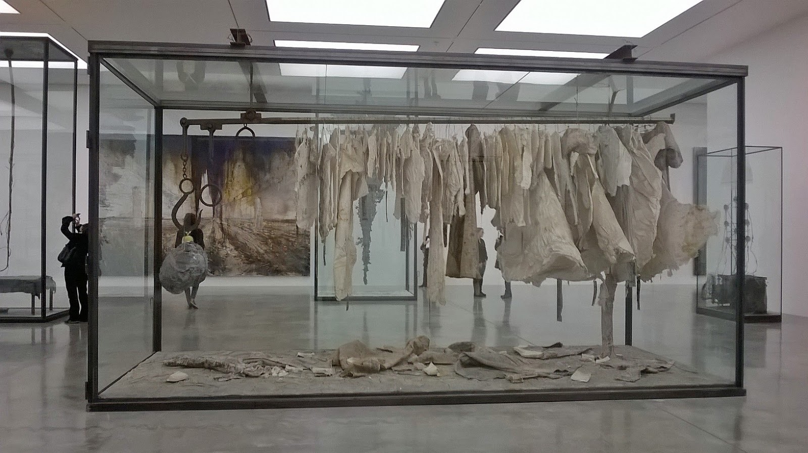
Anselm Kiefer 'Die Walkuren' 2016
Glass, metal, fabric, shellac, plaster, lead, dried plants, ashes. 293 x 560 x 231cm. 

During my Masters there was a lot of talk, generally, but a lot talk specifically about effect and in relation to what effect art works can have on a viewer. Without too much of the philosophy, of which I still struggle to fully grasp, these were phenomenological discussions about how being in the presence of an artwork can physically and/or psychologically effect the viewer; the definition in my mind being like getting goose bumps or hairs going up on the back of one’s neck whilst listening to music. This is a deeper more resonate reaction slightly different from a face-judgement of ‘liking’ something or finding it amusing, sad or happy it is almost a 'being altered' by whatever is experienced. Rather than merely 'viewing' as we are naturally accustomed to with visual art the experience becomes a more holistic one. It is, like most things, of course subjective, but generally I think it has always been easier for me personally, to relate to music, architecture, books and film in this way as ‘causing effect’ rather than visual arts. Yet the later is what I chose to study! It is therefore all the rarer and more precious when it is found and the searching for it is certainly something of a personal motivation come obsession.
 
Therefore I wouldn’t attempt to describe a piece of music that I felt had somehow strongly altered my existence as a human being on this earth to you in writing, I’d just ask you to listen to it. The same could be said of the latest offering from Anselm Kiefer at White Cube Gallery in Bermondsey, London. So monumental, imposing and weighty are some of the latest paintings and sculptures in the exhibition, titled ‘Walhalla’ that describing how it makes one think and feel is no mean feat and even though I have seen a few Kiefer exhibitions now in my now some thirty years, I still feel being in the presence of some of these colossal paintings as awe-inspiring as the first time I’d seen them. In short I hope that in any of my shortcomings to fully describe it, that I may actually inadvertently be describing it better...   
 
Kiefer’s Walhalla begins in a dark, dark, long, lead-walled corridor... Lined with trolley beds covered in hastily dishevelled lead sheets and pillows, its invisible occupants appearing to have fled some unknown atrocity in haste; it is an unnerving space, made more so in being sparsely lit by hanging bare bulbs, it feels institutionalised, regimental, desolate and other worldly. Other worldly or perhaps of-a-world that many of us have been fortunate enough not to have had personally experienced. Reflecting on (amongst other things) Kiefer’s continuous theme with the weight and almost burden of German history from an artist who himself is German. Despite having continuously worked with these ideas throughout his career, they gain new poignancy albeit unintentional, in parallel with the devastating scenes of the crumbling aftermath in the war-torn city of Aleppo.
 
Anselm Kiefer 'Walhalla' 2016 Oil, acrylic, shellac and clay on canvas.
 470 x 760cm.
In these paintings numerous towers and monuments crumble, the citadel has fallen into decay, once fertile lands lay now barren, plundered of their resources or poisoned; rust, dust, ash, molten lead are both surface and destruction at conflict with each other all at once. Is it the end of the world or the beginning of something new; the alchemic, pouring and crashing of elements before the big-bang? So thick are the crusts of some of these are paintings they almost become their own entity; molten lead poured on top has had to be screwed-on in places, there’s so much ‘stuff’ on these surfaces it is as though they have been forged, exposed to the elements and like tectonic plates that continue to shift and crack they corrode and age transforming into new surfaces. In these bleak, almost prophetic dystopias perhaps the latter is an offering of hope that we may not continue to make the mistakes of the past and that perhaps out of this totalitarian destruction change is inevitable and something new may be able to flourish.
 
Anselm Kiefer 'Walhalla' 2016
Oil, acrylic, emulsion, shellac and lead on canvas. 380 x 570 x 42cm.
The corridor with its empty and unwelcoming lead beds offers no rest-bite for reflection on all this, it is a transitional space and the claustrophobic crowding of the beds only forces us to keep moving into one of the six  portals off it, to the left into what are more familiar white-walled gallery rooms, their whiteness all the brighter in contrast to the ash greyness from which we entered. The mere treatment of this exhibition as almost one-whole installation is in itself a powerful thing to experience and takes upon the collective concept of Valhalla at its core. The transition from dark to light being amongst the most simple but effective ways of conveying life and death, conscious and unconscious, the realms of night vs. day. Valhalla in Norse mythology seen as the underworld, “the hall that houses dead distinguished warriors, it is also a place of perpetual fighting” another reminder perhaps alluding to those soldiers and civilians caught-up in wars past and present? These myths seamlessly interwoven amongst conflicted rupturing surfaces in his paintings and in the placement of symbols such as the anvil, the spear, in all of Kiefer’s work for those who seek to look for them.
 
Anselm Kiefer 'Arsenal' 1983-2016 Lead and Mixed media. Dimensions variable.
Kiefer is an artist who has almost enviably gained the luxury of having vast quantities of material and space, technicians at his disposal to which he still does in ambitious abundance, here in Walhalla a historical or library style archive, titled 'Arsenal' is bursting with the debris of the materials he has worked with throughout his career. I suspect more than an element of recycling to be going-on, it is as if now Kiefer may be beginning to address the archive of his own history and career as an artist within his work. Salt, glass, paper, photos printed on reams of lead and seeds spill out of chests of drawers, safes, atop rusty print presses and racks of lead books stacked from floor to ceiling. Am I in a medieval apothecary? A ransacked archive? Or scene from a Harry Potter movie? At this point I am convinced it has become all a bit  theatrical but it is a theatre of which I am happy to have been invited in to explore if nothing for its rarity and glut of surfaces, shapes, nooks and crannies and materials of which remain a visual delight.   
 
Anselm Kiefer 'Walhalla' 2016 Oil, acrylic, emulsion and shellac on canvas. 380 x 570cm.
The preservation and decay of history is explored further in the use of museum vitrines in the exhibition that encase large sculptural works made from stacked bicycles, petrified sunflowers, dead trees and stiffened clothing. Most things in this exhibition appear to be dead or suspended in some way as such is the absence of any figures in the beds, clothing and landscapes albeit except for a lone figure in a photograph at the end of that foreboding corridor, who too offers little solace, as they are depicted walking off into the distance abandoning the viewer in this non-space or purgatory. It is all a perpetual reminder of the fragile mortality of people against the accumulation of what we produce and legacy of history and time itself. Maybe the exhibition is all a little contrite in its contextualisation to ideas of Norse mythology and land of the dead but I think can still be appreciated for its use and breadth of materials alone. It is also in danger of offering much of what we have already come to expect from a Kiefer exhibition, nonetheless I think it important to approach it with fresh eyes and I hope I have already proven why it is still relevant to today. I never fully able to understand what ‘effect’ was during my MA but something in my gut tells me that Kiefer’s work has it in spades.
 
Anselm Kiefer’s Walhalla is on at Bermondsey White Cube until February 12th 2017(one more day, but do catch it if you can) http://whitecube.com/  
 
*These photos are my own. If you're in one and would like me to remove it please contact me.

Monday, 16 January 2017

Fantastic Artists and Where to Find Them

Upstairs Gallery -'Animality' at Marian Goodman Galley
As one steps inside the familiar white-walled terrain of the contemporary art gallery one is greeted by the shrieking caw of ‘GilbertandGeorge!’ 'CyTwombly!' 'CarlAndre!' and names of other artists in a sound piece titled ‘Birdcalls’ by Louise Lawler [1972]. Above me there is a stuffed magpie, to the right a giant photo of an elephant and ahead a portrait of a tiger looks straight at me between an oversized stuffed squirrel, rows of glass vitrines, plinths and free standing sculptures. These are animals but not as we are accustomed to; myths and conventions around how we perceive animals are challenged in fun and unexpected ways across two floors in a menagerie of film, photography, sculpture and illustration.
 
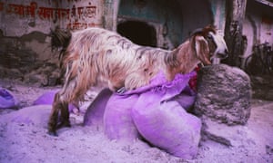
Gabriel Orozco 'Goat in Purple Bag' 1996
"Animality quietly crept up on me and completely took me by surprise. It was without doubt one of the most exciting exhibitions I saw during 2016, on for just over four weeks in November-December at the London Marian Goodman Gallery in Soho."
 
Imagine the best of the science and unusual curiosities of a Wellcome Collection exhibition mixed with works by modern and contemporary artists and you’ll have a good idea of what made this exhibition so special. ‘Animality’ featured the work of over seventy ‘creatures’ comprising of artists, philosophers, writers, scientists and illustrators throughout history (Darwin, Heidegger, Foucault are here and more) seeking to understand the complex relationship humans have with animals; what it means to be human, what it means to be an animal and how the division between the two is sometimes not as distant (if at all) as we thought. What works so well within this exhibition (and other exhibitions I have seen of this type) is this fusion between science, history and philosophy either integrated with art works or presented in context alongside them. This is science and history at its most engaging, its most visual and, I think, is significantly longer lasting in memory for it.
 
Albrecht Durer 'The Rhinoceros' 1515
 From the graphic illustrations of Charley Harper to the observed biological illustrations of Earnst Haeckel and woodcut of an armour plated Rhinoceros by Albrecht Durer (pic), ‘Animality’ covers a breadth of ways in which humans have not only sought to represent animals in art but in doing so were also attempting to understand and educate themselves and others in outcomes that are in some cases playful and in others personal or documentarian. They each offer insight into either our fear or love of beasts, bugs and creatures of all shapes and sizes; those that can eat us, others be eaten. There is a whole Zoo here, tigers, elephants, cats, slugs, horses, magpies, goats and camels including mythical creatures and hybrids throughout history. Despite being a mixed 'museum meets art' exhibition there is no hierarchy of one depiction of ‘animality’ being more significant than any other which is what makes it particularly rewarding, both the scientific and historical are presented alongside the whimsical and fun, grouped together into themes of origins, markings, crossings, variations, trace and extinction.
 
Roni Horn 'Untitled no. 4' 1998
Roni Horn’s photos featuring the backs of bird’s heads (pic) are surprisingly confrontational and unfamiliar, unsurprising  as it is an angle we are not accustomed to seeing birds being taken at. Similarly unsettling is Sarah Jones’s ‘Black Horse’ is striking not only in its scale but in its black on black image of a horse that almost disappears and reappears so we are forced to look at the catches of light on the muscles that define the form of the body. Elsewhere another horse piece by Steve McQueen, ‘Running Thunder’ depicts a horse that at first appears to be asleep in a grassy meadow, the scene a relatively still one until we see a fly pitch around its eyes and we make the startling discovery that this horse is in-fact dead. It is more a comment on our relationship with how we perceive and ‘expect’ to see animals in art; here the expectation of the horse as heroic or symbol of wealth as familiar in paintings by George Stubbs is given a dark twist. A goat stands inside a purple bag (pic) in one of a series of photos by Gabriel Orozco but is more photography than it is fitting in ‘nature photography’ as they do not attempt to present an ideal as much as a reality. Danh Vo reminds us of history in presenting a photo of a pekingese on a throne, the dog once belonging to Queen Victoria plundered from Beijing by British troops during the second opium war.
 
Carsten Holler 'Octopus' 2014 
Amidst this Noah’s Ark-like procession of animals Carsten Holler’s pink octopus (pic) creeps along the gallery floor adding an element of unexpected fun to the proceedings, making us aware of the space in which we inhabit together; like many of the works in this exhibition on its own it doesn’t have a huge amount to say but as part of the whole they form a welcome visual rest bite. Over by the stairs Fischli and Weiss’s projection of a cat lapping up cream plays on continuous loop which is fun if nothing for its almost banal familiarity. There is an almost absurd amount of work to process which only compounds why animals as a subject matter in art is so diverse and why even early George Shira photography first published in National Geographic in 1906 being shown alongside contemporary art works does prove that photography and art are still relevant in aiding education, research and conservation. Seeing Pavia and Gusmao’s slow-motion film of a peacock strutting should be a relatively familiar sight to anyone who’s ever been to a zoo or heritage garden but this film acts as a reminder, as though you were seeing them for the first time, to just how strange, marvellous and remarkable a bird they really are. Or if anything the works in this exhibition only highlight that the real mystery and most complex creature of all is in-fact the artist. Intellectually challenged I proceeded to scramble on two legs out the gallery door and into the jungle outside....
 
Roni Horn and Gabriel Orozco images Sourced from:  http://www.tate.org.uk; https://www.theguardian.com

Thursday, 8 December 2016

If you could say it in words...

What is the collective noun for a group of writers?

What is the collective noun for a group of art writers?

Art Writers Group collective met with interested writers, curators and artists at The Hestercombe Assembly in the afternoon of Wednesday 7th December 2016.

Created by Josephine Lanyon and Peter Stiles The Art Writers Group aims to raise the profile of arts writing in the South West and discuss with other writers, artists, curators and the general public ‘what art writing’ means in 2016, what the future of arts writing could be as well as ideas of; authorship, context and publicity surrounding the area of, you guessed it, arts writing. The Hestercombe Assembly featured six speakers made up of authors, editors and/or curators to discuss, “how texts can be produced, programmed and disseminated to create knowledgeable enjoyment of contemporary art”.

As a non-published, bookselling, artist come blogger what on earth was I doing there?

The answer to that question should be self-evident though highly worth mentioning that to me, this meeting presented an opportunity similar to that of the monthly book group meetings I host at Waterstones, to talk with other people interested in art, writing and reading. What a wonderful discovery to not be alone in this interest and passion of mine that I have embarked on over the last seven years. This was Art Writing in the broadest sense of the word, so included talks from editors, online writers, magazine writers, critical art writing (journalistic and subjective approaches) and art writing that posed itself more as performance art, poetry and in a narrative style more akin to that of fiction. I thought this event was going to involve much ‘clicking of tongues and stroking of beards’ as highly academic people pontificated on the merits of writing as a discourse and its significance to the visual arts themselves. Thankfully it had none of that pretention and became the ultimate fusion of the two worlds I have occupied during my career so far; that of the visual arts and the world of reading and writing learnt in my ten years working in a bookshop.

The following is a list of points I have taken away from listening to the speakers at the event and will consider in my future writing:

·         Art Writing, as a means of ‘capturing presence of the work’ –the function of art writing as a means of describing, explaining what it feels like to see/experience works of art as to a literal description of it.

·         Syntax –where the writing sits in time (past, present, future)

·         Art Writing becomes a way of talking about other subjects –science, environment, archaeology etc. etc. Looking for ways to make art more interesting or accessible to different audiences. As artists we are more familiar in working in ways similar to historians, archivists, scientists and other disciplines but as writers about art we should also consider applying the same. Interestingly not all of the speakers came from art backgrounds but creative writing or curatorial ones raising the position I hold within my own writing, as both an ‘artist who writes about art’ rather than ‘a writer who writes about art’ an interesting one. How can I bring my own experiences into my writing more?   

·         Art writing and subjectivity writing in embodied ways- similar to the first point, but writing about art becomes similar to that of poetry or fiction in that it follows a less academic tone and structure and the voice of the author is more distinctive and present in the work. The writing style has as much to say about the work it is describing as the work itself i.e. fluidity of writing matches fluidity of paint/brush-marks in a painting. The description of artworks becomes less and more about the bodily or lived experience of encountering the work. i.e. scale, weight, texture, sound, smell, context, emotion.

·         What can art writing offer to the reader that the viewing of art work cannot? Does it have to offer clarity or explanation or can it raise new ideas or alternative ways in interpreting work.

·         The lie of art writing? Is art writing a lie/deception of language? ‘art is a lie that reveals the truth’

·         What is the function of the writing? i.e. publicity, critique, opinion, experience and where is there flexibility for these to cross-over...

·         Who is doing the writing? Who is doing the reading? –authorship, readership and how context plays a part in both.

Stephen Smith at Hestercombe Gallery 2016.
After a few hours in to this event spent listening to a myriad of wise words whizzing around the room (somewhat rebelliously at all this talk of writing) I was craving something physically visual, ever thankful that just outside the room we were in at Hestercombe House was the gallery that lay home to Stephen Smith’s paintings –a welcome reminder of the importance of the symbiotic relationship between the actual art and art writing. A few speakers chose not to include images in their talks, opting for the language and our imaginations to conjure up our own images of the art works being captured in words. This was an interesting exercise, but for me only reaffirmed where I stand in being between two camps of being an artist who creates physical images in drawings and print and being a writer who attempts to understand those visual experiences in words. Lizzie Lloyd was one speaker who did this and whose writing on Peter Doig’s ‘Figures in Red Boat’ was as equally creative as the art it spoke of and offered new ways into writing about art that are intelligently observant but personable so that they can be imagined more easily by the reader. Edward Hopper’s “..if you could say it in words there’d be no reason to paint” highlights the  difficulty faced when writing about something whose mere existence is incomprehensible in words but of course that challenge is also part of its appeal. Art writing is like being a translator for visual language though the writer and the artist may not always be trying to say the same thing.
 
Stephen Smith 'Red Forest'
For my love of reading and writing, I still feel as though words alone, read or spoken plainly, are not enough in themselves and offer less of an alternative to experiencing art and more of an addition to enhance the experiencing of art. Reading about art makes me want to experience it and experiencing art makes me want to write about it. What was fascinating and reassuring is that many of the curators and artists I spoke to at the event agreed that there was a place for both within exhibitions and that the relationship between the two was generally a positive and pro-active one at encouraging art appreciation. A possible difficulty to art writing for artists/curators of ‘visual arts’ and one that I feel is evident in the Stephen Smith exhibition at Hestercombe, is that the writing about the art can become more powerful or convey meaning more succinctly than the art itself. This statement warrants more explanation than what I have time to give it here, but essentially I feel Lizzie Lloyd’s writing of the Stephen Smith exhibition attempts to rationalise Smith’s work or compensate for the lack of meaning or substance to the context of Hestercombe that I personally perceived in his paintings. The writing wasn’t so much offering an alternative way into Smith’s work as it was almost justifying it. When it works well the text compliments the art work rather than ‘doing the job’ of the artwork as I felt here which is more a criticism of Smith’s paintings than Lloyd’s writing.

The writers that did chose to show images within their talks such as Mary Patterson created another approach to the context of art writing that became more performative with the rhythm of walking or thinking aloud, the importance of how the piece was spoken evident as well as the potential it had to reach alternative audiences and convey ideas in a framework that was unlike a conventional approach to writing. Here writing becomes an art form in itself.

Much was covered throughout the three hour session that could have had more audience interaction and dialogue than unfortunately what the time would have allowed. Though the biggest missed opportunity, I feel was, whilst Art Writers Group had, what I am sure were many applications from writers of mixed ability and experience, was to do something brave and use it as an opportunity find someone new by picking at least one speaker who, maybe was at the very start of their career and so were less established, unpublished or completely un-paid and independent. The speakers who spoke were all interesting, engaging and relevant in their own ways and I think it important to have people with their experience to bring authority and a certain amount of credibility to such an event HOWEVER, I think representation of an enthusiastic, unpolished, committed to art and arts writing individual with only their own motivation and ambition to support them would have been an inspiring call-to-arms and act as an advocate of the possibility that art writing can and should be accessible to all. It is worth noting here, that I was able to attend this event because I applied for and was awarded a free place to attend so feel grateful but also obligated to stress my thoughts here. There were several other people I met on the day in the same position as me, though I feel instead of piecemeal, Art Writers Group should use its authority to represent or give that experience to someone like myself or those I met in the audience that day. Instead it was disappointing that too frequently those with quantifiable or ‘institutionally recognised experience’ were chosen when there was an opportunity to offer a glimmer of hope amidst the unobtainable and futile nature of progressing into a paid career in writing that only those already practicing or within the industry were represented.

Despite some of my anarchic (but hopefully constructive) views, the day was still, overall very enlightening and I have felt inspired in meeting other people with shared interests in art writing. It has proved that despite its adversities and lack of opportunities, like all aspects of the arts themselves, remains worth doing. I am keen to develop my own writing based on some of the ideas mentioned here, learnt from the speakers on the day, and still have ambition that a legacy from this event, in the form of a peer-led art writing group could form (or gain more awareness, if such a thing exists in the South West please let me know) so that more opportunities to those outside our cities and in our rural areas have access to art appreciation, discussion, writing and reading.

I still do not know the noun for a collective group of arts writers but I sincerely hope it is not a rarity.
 
If you attended the event and/or would like to contact me regarding any of the above then I would very much like to hear from you. Please contact me at: natalieparsley@yahoo.co.uk

Wednesday, 7 December 2016

The Necessity of Art: A Review of 'Art as Therapy'

This weekend I read ‘Art as Therapy’ by Alain de Botton and John Armstrong and it raises some relevant ideas on how we make, buy, study, appreciate and display art, overall seeking to answer the question, ‘what art is for’ rather than the over exhausted and written about ‘what art is’. It does so largely through accessible well written visual analysis of a wide range of artworks making it historically quite interesting. That is where the good points end as it becomes quite infuriating at times in some of the statements and opinions it presents to which I will go into in this review, but conversely it is for those reasons it should and I think will become a must read for anyone studying art or those generally perplexed or curious about the art world as it raises some challenging debates and though this radically conflicts with my own views, if taken lightly covers a breadth of uses of art or how it can help come to terms with ideas to do with nature, politics, censorship, taste, mortality, memory and many more.

The title ‘Art as Therapy’ which implies a more holistic stance associated with the idea of the ‘therapeutic practice of making art’ is a bit misinforming when in fact the tone of the book is far more critical and ideas based so reads more as ‘Art as Philosophy’ in my view than ‘therapy’. Central to its argument is that when engaging with art we should learn to adopt a ‘therapeutic reading’ in addition to technical, political, historical and what the writers describe as ‘shock-value’ readings. I am not against this idea per say but I think there is a danger that if we are viewing art with the gain that it is going to help us or, if we take De Botton’s ‘therapeutic reading’ as a means of art addressing our ‘internal flaws’ then it can become a ‘what’s in it for me’ attitude and art is therefore something that exists to gratify our ego and becomes intrinsically inward looking. I think it would have been more helpful if de Botton had presented an outward looking purpose for art by using examples of collective artist groups such as Assemble or environmental art projects that exist by working outside the gallery, with real people, to improve the therapeutic well-being of place and the people who live there.

‘Therapy’ might be the overriding example the authors use to describe the ‘for’ in their question ‘what is art for?’ but throughout the book it becomes clear that they are describing art as being ‘a tool’ by being both a therapy, political stance, money-maker, educational, social, research and environmental tool in which, “...has the power to extend our capacities beyond those that nature has originally endowed us with.” The faults in De Botton’s writing lie therein as at times he comes across as very condescending as he points out our flaws and need for justifying art by telling what's wrong with us, and how artworks can cure our psychological, mental and spiritual ills when in-fact I feel the expectation should not be so grandiose or met with a pre-conceived self-awareness of its benefits. It would do better for offering ways to engage with art and how to begin to understand it than its implication that art should be created, read or exist to plug some kind of ‘mental or psychological gap’. It raises expectations on art works to deliver something profound or meaningful when more should be done to promote the ‘reading’ of art to be subjective and in the same universal language that people can appreciate or understand music.
The introduction is equally problematic for me, particularly the opening lines, “The modern world thinks of art as very important –something close to the meaning of life. Evidence of this elevated regard can be found in the opening of new museums, the channelling of significant government resources towards the production and display of art...” The latter in particular not something I can think many in the art world in this country would necessarily agree with at the moment, I also think it a huge generalisation to say that ‘the modern world thinks of art as very important’ because surely part of the reason for writing this book is that art isn’t valued enough and by the fact artists and writers are having to constantly convince us otherwise? I feel it is one of the artist’s main concerns (that is a product of our consumerist society whether liked or not) in the modern world to constantly having to justify or quantify the value of their work both in a monetary and moral sense. Even highly ‘successful’ (in a money sense) artists like Koons or Hirst have had to work or have had to rely on the critiques and reviews of writers and art dealers in order to convince others of a perceived sense of ‘value’ to their work. If the idea of 'value' towards art was removed altogether then people could be more open to what the work is rather than what it is worth.   
The book’s final offering that the ‘overall aim of art is to reduce the need for it altogether’ is depressing an end as it is nonsensical because whilst there is humanity, diversity and debate in the world there will always be a need for art. It is a redundant argument, as even if the world was a utopia there would still be a need for art, for the truth-seeking or self-expressive qualities that it offers. Art like science should have no bounds or higher agenda as it is infinitesimal in what can be discovered or explored through them. Many times reading this book I couldn’t help but think that if you want to be inspired by an example of writing about ‘what is art for’ then you should put 'Art as Therapy' to one side and read Ernst Fisher’s ‘The Necessity of Art’ which remains one of the best books ever about the relationship between creative imagination and the individual’s need to engage with society. "Art is necessary in order that man should be able to recognise and change the world. But art is also necessary by virtue of the magic inherent in it."
 One final and redeeming idea from ‘Art as Therapy’ that I think is a good one, is the idea of ‘art as a tool’, a concept I have previously never looked into in any depth. So obsessed with depicting tools as art, tools in art and what tools are that I had never paid much heed to the thought that art itself could be a tool! In my own art this raises a whole paradoxical situation of art about tools being a tool about a tool about a tool....(I feel an epiphany coming!) If you read 'Art as Therapy' in this context of seeing art as a tool and can put aside its faults in some of its statements then it offers some useful ways into understanding art but for best results should be enjoyed as part of a balanced diet in relation to other books that offer a slightly less inward looking perspective.

Saturday, 12 November 2016

Anything but Ordinary

In anticipation of the Robert Rauschenberg [1925-2008] Retrospective exhibition at Tate Modern I thought it would be a good opportunity to familiarise myself with the late American artist’s work.
 
[NOTE: This post isn’t for preaching to the converted but to those who may be in need of reminding  or those yet to discover the work by this brilliant artist.]
 
Compiled here are my top five Rauschenberg’s; a list that is completely biased and my own but will hopefully offer an insight into my own practice and more significantly why I think the forthcoming exhibition is going to be an incredibly exciting and worthwhile event. Whilst I am aware he explored broad number of disciplines throughout his career, from performance, silkscreen printmaking to photography (to name a few) this list features his combine paintings as they are the works of which I feel have had the most influence on my practice. Listed in no particular order!
 
Charlene [1935]
 
Charlene. 1935. Oil, charcoal, printed reproductions, newspaper, wood, plastic mirror, men’s undershirt, umbrella, lace, ribbons and other fabrics and metal on Homasote, mounted on wood with electric light. 226.1 x 284.5 x 8.9cm.  It would be easier to type if Rauschenberg had simply said, ‘mixed media’! But then there was debatably no such thing as ‘mixed media’ when Rauschenberg was making his combination paintings in the 50s-60s. The term would also not have done the significance of the objects in the work justice and by listing them it is emphasising the point that these paintings included street signs, flyers, leaflets, shirts, ties, wheels, clocks, umbrellas and other everyday objects from the street, yet crucially were still ‘paintings’. This was part of a larger movement happening in America at the time reaching from Abstract Expressionism to the beginnings of Pop Art revolving around artists such as, John Cage, Alan Kaprow, Jasper Johns and Claes Oldenburg that sought for the ‘everyday’ in all its forms to be considered as catalysts for creativity and making art.

It is worth listing individually the components that make up ‘Charlene’ and the many ‘combine paintings’ that took their name from the combining of everyday objects, found fragments and things that are collaged onto (initially) flat 2Dimmensional surface(s) covered in paint and/or other substances ranging from mould to toothpaste. This was a relatively new concept, challenging both what ‘painting could be’ and the perceptions and limitations of aesthetics and formalism; preceded by the likes of Duchamp whose urinal opened the debate of whether mundane objects can be considered as art objects and Picasso in 1912 with ‘Still-life with Chair Caning’ believed one of the first uses of real 3D objects integrated or collaged into the picture-plane. Whereas Picasso’s use of an actual chair was illusionary, in the sense it became a surface within the picture that made part of the illusionary sense of an abstract still-life; Rauschenberg’s use of everyday objects is much more formalistic broken-down into shapes, tones, textures within the composition of the painting “An object such as a clock might be used equally for its circular shape, its ticking sound, and its suggestion of the shared framework of time within which our experience of it would necessarily be located.”
 
‘Charlene’ historically is an important landmark in Rauschenberg’s career as it is seen as the first work combining painting, collage and found objects in equal emphasis. The objects within it become formal components in the bigger composition of the work; the umbrella becomes a colour wheel, the plastic mirror a shiny rectangle next to another rectangle with stains and stitching that we recognise to be a folded shirt. It is all deconstructed into shape, texture and colour but as a result creates something that I feel is visually unexpected and often less contrived than human or artistic attempts to recreate these objects or their ‘found surfaces’ that appear worn, eroded or weathered. I find this approach to ‘looking’ timelessly refreshing and that the legacy of these paintings is an open-mindedness to the possibilities of ‘stuff’ that can elevate from its mundane perception into something remarkable or of great potential. In writing it sounds a little corny but probably matched some of the inflated sense of heroism and confidence that came out of American Abstract Expressionism. There is possibly also something appealing in from the idea of the ‘under-dog’ or rebelliousness first felt in using man-made everyday detritus. Jim Dine, as an artist making work at the same time best describes it as a kind of alchemy, “...turning shit into gold,” or “giving life to the lifeless”.

I first saw ‘Charlene’ in the Stedelijk Museum, Amsterdam in 2014, drawn to it as a result of my own dabbles with using umbrellas to make sculptures. I never quite embraced the full formalistic properties of the objects I used in my own practice (with a few exceptions) tending to remain more grounded in the connotations and psychological properties of the objects I was using. My work never became fully abstract, always grounded in some recognisable form or association to their original state. I think I found the boldness of Duchamp’s placing the object unaltered in the gallery too arrogant and lacking in creativity and Rauschenberg’s deconstruction of objects into painted surfaces is sometimes too disguising of that objects natural aesthetic qualities (though in later work this tends to become less).  
 
Bed [1954]
Bed. 1954 Oil, pencil, toothpaste and red fingernail polish on pillow, quilt and bed-sheet mounted on wood supports. 191.1 x 80 x 20.3cm.  Until I saw this piece in the MOMA, New York I did not think it possible to become quite as excited as I was by a paint and toothpaste smeared bed sheet hung vertically on a gallery wall! I still find it difficult to articulate exactly what it is about ‘Bed’ that causes such a reaction. For a painting it is almost sculptural, a landscape with mountains created in its rhythms and folds from the top to the patterned graphics of the bed sheet below. It is successful for its use of variations; busy areas against quiet ones, murky colours against bright contrasting ones; it is this that makes it all the richer for looking at. Rauschenberg was an incredibly visual artist and knew what it meant to have someone look at your work and how to make them want to look at it for longer. ‘Bed’ is unique as it hovers between being a ready-made and a painting to which Duchamp said of Rauschenberg’s paintings, “Since the tubes of paint used by the artist are manufactured and readymade products we must conclude that all the paintings in the world are ‘Readymades Aided’ –and also works of assemblage.” Yet here Rauschenberg, is still operating in the confines of the art gallery by mounting the work vertically on the wall (as opposed to flat on the floor as you would expect to see a bed) as it is more confrontational, more ‘bodily’ and obviously makes the viewer consider it as artwork by its mere being hung on the walls of the gallery like a painting, not a bed. Rauschenberg does however challenge this in later combine paintings which become free-standing in ‘Gold Standard’ and floor, ‘Monogram’.

Winter Pool [1959]
Winter Pool. 1959 Oil, paper, fabric, wood, metal, sandpaper, tape, printed paper, printed reproductions, fragments of a man’s shirt, handkerchief, handheld bellows and found painting on two canvases conjoined by wood ladder. 229.9 x 151.1 10.2cm. To write about Rauschenberg’s paintings is to have a thesaurus of synonyms close to hand as it becomes all too easy to run out of adjectives to describe the range of ways in which paint is applied or actions and gestures made in the creating of his combine paintings; dribbled, poured, smeared, scrapped, brushed, pushed, scratched, layered, spread, sponged, daubed and mixed –to name but a few! ‘Winter Pool’ is another Rauschenberg I have had the pleasure of seeing at the MET, New York and it has made my top five list because it shows a thought process by which elements of the studio have been used to influence the visual outcome of the work. In pure aesthetic terms whether you are an abstract or figurative painter sometimes in the process of making work there are almost instinctive visual elements to any work where you, as the artist, think you need ‘something red’ or a ‘curved shape’ in the bottom left corner for example in order to balance or 'finish' a piece of work. Almost like a chef adding seasoning to a dish, you're not sometimes quite sure why or what a dish [art work] needs but a good chef [artist] can often tell when it is missing something. What I like about ‘Winter Pool’ is that the ladder in the centre is both part of the painting visually but can also be a means of linking two paintings or a space in the middle together. This is what I referred to earlier in saying about the visual awareness of Rauschenberg as a painter and it is something, whether I am successful at it or not, I am at least conscious of in my own work.
 
Reservoir [1961]
Reservoir. 1961 Oil, pencil, fabric, wood, and metal on canvas with two electric clocks, rubber tread wheel, and spoked wheel rim. 217.2 x 158.8 x 39.4 cm. The only Rauschenberg on my list that I haven’t actually seen in person (I think its in Washington) but ironically it is the first image of his work I’d ever seen back in 2005 studying on my art Foundation year spotted in a peers sketchbook. There is nothing particularly more sentimental about it than that, but what ‘Reservoir’ does that is so different to the other paintings on this list is that it adds a performative element in the form of two clocks set at the time the painting was started, the lower when it was finished; that reflects some of the more conceptual/performance based work around the same time it was created. In some ways it is almost an absurd idea that there can even be a start or finish time to a painting that is  relatively abstract and so subjective that it can only really ever be ‘finished’ when the artist and only the artist decides it is. The use of empty space in Reservoir also reminds me of early Richard Hamilton paintings such as ‘Hommage a Chrysler Corp’ done in 1957 and I speculate it could have had an influence.
 
First Landing Jump [1961]
First Landing Jump. 1961 Oil, cloth, metal, leather, electric fixture, and cable on composition board with automobile tire and wood plank. 226.4 x 182.9 x 22.5 cm. The circular form of the tyre in ‘First Landing Jump’ does for this combine painting what the straight vertical and horizontal lines of the ladder did for ‘Winter Pool’ and becomes both a shape and a weight to the overall composition. Interestingly, Rauschenberg wanted others to be able to read into his use of everyday objects so that they could have this duality of being both a formal component in the work and an object with meaning; it was that during the process of creating the work he had to try ignore the connotations of the objects he was using, “So a found object such as a tyre was not simply a material for Raushenberg: it was a social object with possibilities and connotations, even if the connotations he was trying to forget or “unknow”. They [objects in his work] “...retain ghost impressions of context with utilitarian aesthetic...” In other words the tyre is still recognisable as a tyre due to its urban surrounding materials, such as the lights, whilst also being a ‘shape’. The materials in these combine paintings also say something about the appetite for cars in America, the rising emergence of consumerism in the postwar period and how easy they were to find literally discarded in the street. I first saw this piece at MOMA in New York and it is one I have written about in relation to my work more than any other and I think that is largely due to the reasons above in that this piece is more assembled than painted which related to several works I was making at the time.
To be interested in mundane objects is to also be interested in the people/lives those objects inhabit and I think in the Rauschenberg’s of the 60s there was less painting in the ‘combine’ works and more collage, placing of objects/materials so as to retain some of that integrity of the original things but also, I speculate, because of Rauschenberg's exploration into performance art alongside these works, they [the objects] become like actors on a stage, each object responding to another in relationship to where they are placed within the work, "We are all actors, but it's a 'we' that includes the teeming plethora of things with which we share the world's stage."  
 
That’s it for now. To conclude, I hope to visit the exhibition soon when it opens in London on December 1st and to reiterate what I said at the beginning that this is merely one aspect of what was this artist’s overall very diverse career. I think it very inspiring to revisit his work as it continues to remind artists to be inventive and creative within their practice and not grow complacent with ways of depicting and perceiving. Ultimately, for me however it is his testament to the mundane that I find the most encouraging, ‘Asked in 2004 why he liked mundane imagery he replied, “It is overlooked. Most artists try to break your heart or they accidentally break their own hearts. I find the quietness in the ordinary more satisfying.”
 
On that quote it is not necessarily a literal ‘quietness’ of objects that Rauschenberg is referring to but a sort the ‘unassuming’ quietness; there is great expectation for a painting of the Grand Canyon to be as awe inspiring and rapturous as the real thing itself but there is little or no expectation that the coffee percolator or umbrella to do the same so when you see those objects transformed or put in view onto the metaphorical pedestal of ‘art’ it is all the more surprising and wonderful. This is certainly a significant factor of what has led my motivation over the years and whilst the art world and public are more accepting of objects/the mundane in art now than they would have been in Rauschenberg’s era, the shock or surprise factor is considerably less; I still think there is a place for the everyday in art that doesn’t have to fall into recycling or nostalgia but a sort of awareness that these things are still around and they can still be fascinating, pertinent and as unexpected as they ever have been.
 
Robert Rauschenberg is at Tate Modern from December 1st 2016 - April  2nd 2017 http://www.tate.org.uk/whats-on/tate-modern/exhibition/robert-rauschenberg

 
*All images sourced from: http://www.rauschenbergfoundation.org
*Quotes sourced from 'Rauschenberg' [2016]. Tate Publishing. London.