Showing posts with label Venice Biennale. Show all posts

Sunday, 21 July 2019

Art Overload: Venice Biennale 2019

What do clairvoyant spiders, anvils, underground tunnels, washing-machines, a cow on an automated track to nowhere, looming environmental concerns, creation-myths, vanity, surveillance and issues of censorship, gender, race and politics all have in common? Two years have passed and it is time for the Venice Biennale 2019!

Writing about the Biennale as a whole is a feat worth applauding! Now in its 58th cycle and featuring far over fifty countries and hundreds of artists/works in all mediums in what is a huge, complex art Olympics that is, for all its delights also quite exhausting! The central pavilion’s theme, ‘May you live in interesting times’ is a fittingly ambiguous, yet pleasingly all-encompassing, title for what is essentially the world barometer for art, what’s hot and what’s not. Who, which themes and ideas will be appearing in exhibitions near you! Save your applause, however, because instead of trying to cover it all, I have focused instead on the things that were most memorable or had resonance with me. In a vein-attempt to make some sense of it all (in no particular order) is my personal ‘unconventional’ top twenty-one of the ‘must see’ experiences this Biennale.
Arsenale
Ceramic sculptures used to create unusual sound-based installations. Intriguing to watch how these pieces moved as it was to listen.
One of the more controversial exhibits in this year’s Biennale, but also one of the most poignant. Barca Nostra is a shipwreck from a disaster in the Sicilian channel in which between 700-1,100 people seeking refuge from Libya were have believed to have perished. The ship appears ghostly but almost ‘at home’ in its maritime setting of the Arsenale (where many boats are docked) where it could be easily dismissed by those unaware of its history. It is debatable on whether displaying this boat, associated with such tragedy is tasteful or appropriate but I think its greater legacy in being a reminder and political tool ‘for change’ to those whose lives were senselessly lost is something which should not be ignored. In bringing this to the Biennale the reality of what happened becomes more significant in current memory than reading about it in a piece of journalism.  

Unable to use their right arm due to a neurological disease, Darling creates assemblages from ‘small, low-cost, everyday materials’. In ‘March of the Valedictorians’ red school chairs on impossibly long spindly legs teeter precariously whilst supporting one-another as a whole group. Humorous and playful.
Russian Constructivism meets Pop Art in Kadyrova’s ‘Market’ in which fruits, cheeses and meats are ‘for sale’ re-created from tiles and concrete. The idea of ‘art as commodity’ is questioned as each item in this market is sold under the currency of weight. My parents are and have both worked in the fruit-trade all my life and so this piece has a personal association that appealed to me.

‘Robert’ is a neon sculpture representing the skeleton of first African-American astronaut, Robert Henry Lawrence Jr who died in a training accident in 1967. This piece is part of a body of work Strachan has made around the story of Lawrence’s death in working in conjunction with SpaceX. The work raises awareness of Lawrence’s achievements as the first African astronaut as well as the racism encountered around the incident of his death and why, figures such as Lawrence should not have remained invisible in history for this long. Given the 50 years milestone since the moon landings, this collection of work gains added timeliness that leaves a lasting impression.
I have been a fan of Marclay’s work since I first saw the film, ‘The Clock’ in Plymouth’s ‘British Art Show 7’ 2011, in which 24 hours worth of film clips create a real-time clock. If you love movies and like collage then you will appreciate how entertaining it is trying to work out where each clip has come from or guess what the next one will be. For the Biennale Marclay presents, ’48 War Movies’ which are screened (with sound) simultaneously as each film is layered on top of the other to create 48 borders. The sound is perhaps more disorientating than the image, as the cacophony of noise is unsettling and chaotic as war itself. 

Image sourced from: https://news.artnet.com/exhibitions/pics-from-the-biennial-part-1-1540588

 John Akomfrah [Ghana]

In a three-channel film titled, ‘Four Nocturnes’, British director, Akomfrah uses natural history and  archived footage edited alongside shots of characters contemplating, motionlessly. Unmistakably recognisable in its editing and beauty of photography present the concept that humanities destruction of the natural world is ultimately also a destruction of ourselves. 
Hundreds of blank notebooks ‘sculpted’ by the artist’s hands line a slope in the Grand Duchy of Luxemborg pavilion. Each one unique as its page’s have been manipulated and made supple by the sea water in the Mediterranean. ‘Written by Water’ is an exploration of ‘human learning and remembering as a continuous process of writing, erasing and overwriting. As with other works in the Biennale (referred to here) I am personally drawn to work which appears to be simple, but has been created from someone noticing something and then exploring it on a grand scale (in this case, almost obsessively). I like the idea that a book soaked in the sea could become a piece of sculpture as much as there is something mesmerizingly meditative about watching these books being created in the accompanying film to this installation.

Zahrah Al Ghamdi [Saudi Arabia]
50,000 handmade leather ‘pods, line lit fabric walls in Al Ghamdi’s immersive and interactive installation ‘After Illusion’. Viewers are invited to touch and explore the work with their hands to seek out interactive sounds triggered by placing a hand inside a correct pod. Leather being used as the primary material relates to craft within Saudi Arabia and title from an Arabic poem about ‘the struggle to remember home after being away for 20 years’. The other worldliness of this installation does go some-way to achieving just that.
One of the several artists exhibiting in the Indian pavilion for this Biennale, Irana’s piece titled, ‘Naavu (We together)’ consists of worn and altered padukas (wooden footwear) which line the walls. Each one uniquely altered or adorned with objects (possibly from their previous owners) and symbols that are significant of various spiritual connotations within Indian history or culture. I have always liked objects, ephemera that tell a story of its owner and I like the possible connotations and narratives that seeing these shoes conjure.
The piece, ‘Island weather’ by Justiniani is a work that must be experienced to be best understood. Viewers can step on top of a series of clear-topped, island-shaped platforms containing objects housed by mirrors. The effect is one of looking down to what appears to be infinity. Half a ladder, a stack of papers are in fact the reality but when placed in these mirrored containers appear, to the viewer standing above, to continue downwards forever into a black endless nothingness below. It is genuinely quite disconcerting but impressive at the same time.
Image sourced from: https://www.theartnewspaper.com/review/venice-biennale-2019-the-must-see-pavilions-in-the-arsenale

Gardini
Arachnomancy is performed in Saraceno’s ‘Web pavilion 7’ inspired by the Mabila Nggam divination practiced in Western and Central Africa in which spider’s actions and webs are interpreted. The pavilion features spider webs, tarot cards and divination readings. Aiming to use interactive installations and ‘sustainable ways of inhabiting the environment’ to turn audiences awareness to other species and systems. Again the joy for this work, for me personally, is an idea I have already expressed, that this work is great because spider’s webs are fascinating, the artist isn’t trying to compete with that idea, merely notice and present it to a wider audience through the context of art.

For anyone who routinely feels compelled to wipe all the condensation off of steamed-up bathroom mirrors, the plight of Yuan and Yu’s robotic arm that ends with a shovel as it attempts to scrape back an endlessly encroaching red liquid to within a circular area will be highly relatable. Mesmerising in its almost human/animal-like size the giant arm might be one of the most videoed works in this year’s Biennale but it is also one of the most compellingly watchable.
Denmark pavilion’s dystopian sci-fi film offering titled, ‘Heirloom’ ruminates on life, memory and identity after ecological disaster. Shot in black and white its otherworldliness and themes such as nostalgia, explored reminded me of Tarkovsky’s, ‘Stalker’.
An architect, an artist and a composer are the creative disciplines behind the Japanese pavilion installation that tells the story of ‘Cosmo-Eggs’. Essentially the work consists of photos of boulders, sound and an inflatable egg-yolk yellow central seating area connected by a series of sound cables, like umbilical cords. I struggled to see the point of all of this until I had read the allegory on the wall (see below) which helped contextualise the work and was a refreshing insight as an alternative creation-myth for the Japanese islands. For me personally it reaffirmed that the Biennale doesn’t have to always be a looking-forward or comment on current life but can be an exploration of traditions and storytelling, re-imagined for new audiences.   
“A long time ago, sun and moon descended to earth and laid a single egg. A snake came and swallowed the egg, and so sun and moon visited earth once more to leave behind three eggs that they hid: one inside earth, one inside stone, and one inside bamboo. The eggs soon hatched, and born were the ancestors of three islands. Once grown up, they each built a small boat and travelled to different islands: one in the East, one in the West, and one in the North. The tribes of these islands visited each other by boat, and despite occasional fights, they overcame pestilence and poor harvests to live in peace for a long time. Each island passed down its own language, its own music, its own traditions, its own festivals. They each possessed the power to speak with the animals: the earth tribe spoke with the worms and the insects, the stone tribe with the snakes, and the bamboo tribe with the birds.”
An inside-out luxury aircraft is the central piece to this year’s Polish pavilion. In reversing the aircraft the artist is attempting to criticise the ‘rich elite’ and inequalities of capitalism. Somewhat ironically, if this piece, as ‘art’ (and sold as art) then feeds back into the rich elite it is trying to challenge. All of that aside it is a fascinating piece to explore visually and out of curiosity.  
Venice Pavilion
A mysterious but compelling queue of people beckons closer inspection of the Venice pavilion, revealing an embodied experience experienced by no more than 8 people at a time. Stepping from the heat of the Gardini into what is a life-size, inflatable tube with water underneath is a remarkably welcome and cooling experience (not to mention slightly hap-hazard) as it is basically like walking on the world’s longest and biggest waterbed (or imagining of intestinal tract)! It is an unashamed spectacle in which the viewer becomes participant in its existence as a piece of art.
Historically speaking, the Israeli pavilion has always been one of my favourites out of the four Biennale’s I have attended. This year’s offering may not be up there with my favourites but it definitely made me think. ‘Field Hospital’ is an interactive art ‘institution’ established by the artist, Aya Ben Ron, with the aims to ‘provide a space in which silenced voices can be heard and social injustices can be seen’. Looking and acting like a ‘real’ hospital the pavilion is transformed into a waiting room where viewers wait to be called to experience ‘care-kits’ upstairs which include special video/seating chairs showing recorded testimonies of social injustices and Safe-Unit areas in which participants can scream in sound proof booths.

Offsite
If you see one offsite exhibition during this year’s Biennale, Dysfunctional should be it. Featuring 21 artists from the Carpenter’s Workshop Gallery who have made work in response to the architecture of the Ca’d’Oro and its collection of Renaissance art. It is refreshing in its lack of pretentiousness as it seems to celebrate really well-made, visual but still thought-provoking pieces as a much welcomed break from the depth of intensity needed in digesting many of the other Biennale shows. Shown here: Maarten Bass 'Real Time XL' (2019) a recorded twelve hour performance involving painting, removing and repainting hands on a clock-face. And the Vernoeven Twins 'Moments of Happiness' (2019) glass giant bubbles. 
Self-portraits of the artist and 70 gloss painted-used tyres make the components of Mexican artist, Morales’ exhibition at the Ca Ressonico Gallery. This assembled collage of stuff which includes dinosaurs (why not) aims to, “challenge our perceptions of texture, touch, beauty, solace and violence”. I struggled to engage with how all of these elements came together, personally,  but from a purely aesthetic and debatably shallow perspective enjoyed seeing so many coloured tyres as an installation.
Eila Yenlysarja –Various locations
The Biennale’s best kept secret (one you won’t find in any of the guidebooks)! Yenlysarja’s weathered, textured surfaces and palimpsests materialise themselves around the city in various locations. A celebration of beauty and purity in surface and form. I could look at these all day long!
The Biennale can be seen across locations in Venice until November 24th
 
Previous Posts about the Venice Biennale can be read here:
2017 - http://spannerintheworkz.blogspot.com/2017/07/viva-venezia.html
2015 - http://spannerintheworkz.blogspot.com/2015/06/i-always-believed-in-futures.html
2013 - http://spannerintheworkz.blogspot.com/2013/11/venice-biennale-2013.html

Images (except where specified) and text copyright of Natalie Parsley ©

Friday, 7 July 2017

Viva Venezia!

This post is not intended to be read from start to finish [though by all means please do so if you feel inclined] but is a visual snapshot of my own personal highlights from this year’s Venice Biennale 2017. In its 57th year and featuring artists from all over the world, this year’s central exhibition ‘Viva Arte Viva’ goes some way in proving that art is indeed ‘not dead’. The sublime, the ridiculous, the poetic and the political, there really is MUCH to be inspired by. Presented here are 16 of those artworks/pavilions some of which can be seen across the city for free and others within the ticketed Giardini and Arsenale Biennale sites themselves. Enjoy!

The Venice Biennale is on until 26th November 2017, for further info visit: http://www.labiennale.org/en/Home.html    


Britain – Phyllida Barlow ‘Folly’
It is difficult not to smile when first encountering Barlow’s work; colourful, larger than life, every piece installed within each space in a different way. I first saw Barlow’s work on a scale such as this at Hauser and Wirth in Bruton when it first opened in 2014. Her treatment of the British pavilion does not disappoint, columns in the central disrupt how viewers negotiate the room, followed by wracks of stained cloth, more tubes, blobs infiltrate the space outside and stacked boulder-like fabrications make up this ambitious and playful offering from the British artist now in her 70s. That play soon becomes more threatening however, as viewers have to squeeze past and lean around the gallery rooms, forced to alter their route by the sheer scale of some of these pieces and that they often occupy the walls, leaning outwards, other times suspended or simply plonked as a giant mod-rock clad obstruction. There is a lot of recycling and use of cheap readily available materials in her work that makes it feel exciting and accessible in the way she sees potential and use in such everyday things. If shape, form, colour, texture, volume are some of the ways we aesthetically perceive sculpture then Folly is an excellent example of what sculpture can offer.

 
Romania – Geta Brătescu ‘Apparitions’*

In what looks like a retrospective of the Romanian artist’s work since the 1960s, Geta Brătescu’s drawings, collages, engravings, tapestries, objects, photographs and experimental film are displayed in the Romanian Pavillion at the Giardini. Spanning themes of ‘the studio’ and ‘space within-it’ along with reflections on female subjectivity; there is rather a lot to see. She studied both art and literature, evident in references of both in her work, one example being a series of drawings based on Faust. “In Brătescu’s practice the real, physical space meshes with the inner, intimate space and becomes part of the sphere of art....exploring phenomenology –her own hands...tension between the representational and non representational.” It made me think of outsider art in the way that it felt so personal, its quantity the product of obsession –this is a person finding things out about themselves and their context through making and doing on a prolific scale. I thought the hand drawings were exquisite and admired their difference to the loser, more expressive drawings. That duality interests me as it is something I am often at conflict with in my own work.

 
Israel   – Gal Weinstein ‘Sun Stand Still’
“Weinstein critically explores the mythological and Romantic images of Zionism embedded in Israel’s collective memory. The project reflects his fascination with the desire to stop time, with potential forms of construction, destruction, progress and devastation.” Mould and coffee are used to suggest the passing of time, allegory or a post-apocalyptic vision of Israel. ‘Jezreel Valley in the dark’ [pictured] consists of puzzle-shaped agricultural plots filled with coffee dregs that gradually grow mould at different rates. The smell that greats you isn’t very pleasant, nor probably is the realisation that it is mould all over the walls and floor, but for me I love the idea of having a changing installation at different stages of decay and where else can you view it and critique it in the context of being ‘art’. Here the natural process of the mould decaying is used to represent political or urban decay, the sprawl of time and how mould, like urban generation/degeneration can spread.


John Waters – Study Art [For Breeding or Bounty]
You’ve got to love a super kitsch; pop art style sign about studying art if you’re an artist don’t you? I certainly do and Waters’s series of ‘Study Art’ signs take his own intentions and turns language into a double meaning of a consumerist nature. Known for his film directing, (‘Pink Flamingos’) Waters, I learn, was once described by William S Burroughs as, ‘the Pope of bad Taste’. I like him even more! Deconstructing the clichés of the politically correct he is as debatably offensive as he is Duchampian-ly witty. If anything the humour of these pieces reminded me that it is important to not always [if at all] take art too seriously. Especially those who study art, these signs should be made available within every art department!


Republic of Korea – Lee Wan ‘Proper Time’
“Over 600 clocks engraved with the names, birthdates, nationalities and occupations of individuals interviewed from around the world. Each clock moves at a different rate that is determined by the amount of time the individual must work in order to afford a meal.” A lot of the Biennale feels like spectacle; which piece will be the biggest, most outrageous, most ambitious, most photogenic, most political or get its participants to do the strangest things? It is hugely competitive, with every work, every pavilion asking for everyone’s time to engage, therefore it is quite hard to determine whether one is interested in a work for genuine reasons or whether it all becomes a bit throw-away or commercialised.  Lee Wan’s ‘Proper Time’ is one piece in a two-man exhibition in the Republic of Korea pavilion. The way in which you approach this work is by having to duck under and through a very low doorway into a white-walled room filled with the sound of ticking clocks. It is intentionally humbling, having to almost bow in order to enter this space; a sign of respect perhaps to the people whose time is being exhibited. The speed of the care-worker’s clock from Britain significantly slower than that of the hotelier in Abu Dhabi, though quicker than that of the cobbler from Budapest; these kinds of comparisons intentional in what becomes a vast visual representation displaying the scale of global inequality. It is fitting too that it is a part of an exhibition as a whole that explores themes of cultural identity.


Argentina – Claudia Fontes ‘The Horse Problem’
There is no problem in ‘The Horse Problem, well at least not one I can see, unless of course the problem is that this horse sculpture is inexplicably huge! The idea behind the creation of the work was to present “...the relationship between man and his horse which is the basis for the nation’s founding myth....the animal kept captive in a prison [the Arsenale] built by its own motive power.” The artist Claudia Fontes speaks of the use of horses to forge, plough and build. That relationship she explains led to the building of borders and territories that we now challenge and cause many self-inflicted problems in how people and the land live together. It is a timely concept and one that current writer’s such as Ulrich Raluff are exploring in his book, ‘Farewell to the Horse’ though I am unsure if I would get much of that impression from the work itself it has certainly ignited my interest in finding out more.


Andora – Eve Ariza ‘Murmuri’ (Murmur)
Are they bowls? Are they mouths? Are they something other? However you see it, there are an awful lot of them in the Andora pavilion. Each one made in clay corresponding to different human skin tones, formed into the shape of a bowl as a symbol of, ‘the first container of truth’ they are meant as an offering of unity between languages. Each bowl becoming a listening vessel from which to hear the vibrations and subtle murmurings amidst the hustle and bustle of the Biennale. It is beautifully simple, the moulded bowls also form mouths and the ease in which meaning can be gleaned from this work was refreshing.


Republic of Azerbaijan – Elvin Nabizade
As part of the exhibition, ‘Under One Sun’ Azerbaijan hopes to present, the polychromi of culture in their country, “from its origins and traditional forms up to its different present manifestations”. There were several well executed immersive video installations within this exhibition but for me personally I could not resist the visual joy of seeing beautiful instruments suspended in sphere and arching forms from the ceiling.  


Japan – Takahiro Iwasaki ‘Turned Upside Down, It’s a Forest’
Stacks of arranged books on a table become a representation of a mountain and skyscrapers. A citadel from which delicate threads of cotton from towels become steel towers, cranes and oilrigs. These are the fine crafting of Takahiro Iwasaki who uses everyday objects to make small interventions that signify both traditional and new landscapes in Japanese culture; from large mountains to chemical plants that stand along Hiroshima’s coast to a shrine built above the sea. They are playful yet superbly handcrafted, quietly commanding attention not for their scale but for their subtlety.   


Italy – Giorgio Andreotta Calo ‘Untitled (The End of the World)’*
Andreotta Calo goes where Richard Wilson has previously gone with what, for the sake of argument is much larger, but visually very similar version of 20:50 that uses water as its reflective surface rather than oil. Despite the enormous space it occupies in the Italian pavilion it is just one artwork in the overall exhibition ‘The Magical World’ featuring three artists whose work we are told, shares, “...transformative power of the imagination and an interest in magic...” The surprise with this particular piece comes from first experiencing it from underneath; the viewer enters the installation to what appears to be a low dark ceiling suspended in place by a forest of metal scaffolding poles. As you traverse through this space you eventually come to a set of steep metal stairs leading upwards. The view at the top is initially disappointing as it is confusing; the stairs hit a brick wall. Nothing special about it; it isn’t until you turn-around that the trick is revealed. What was a ceiling held up by scaffolding was in fact a floor for a very, very large pool of water. This water reflects the architectural beams of the Arsenale pavilion playing with our sense of balance and creating another illusion. All three artists in this exhibition made intriguing work, the premise that, “...magic is not an escape into the depths of irrationality, but rather a new way of experiencing reality.” Of all the concepts in this year’s Biennale this was one that I thought was a refreshing change from the otherwise largely political agenda and I think it is important to remember in times as politically fraught as these of other forms of experiencing the world, a little magic maybe can go a long way.


New Zealand – Lisa Reihana ‘Emissaries’
In a panoramic, partly filmed, partly animated video projection ‘in Pursuit of Venus’ Māori and Pacific perspectives are shown in a re-imagining of the wallpaper, ‘Les Sauvages de la Mer Pacifique’ that, in 1769 referenced Pacific voyages of James Cook. It depicts real and invented narratives of cartographic and scientific exploration which happen simultaneously and on a scrolling loop from right to left so as to appear as life-size, moving wallpaper. For its use of animation mixed with filming it was distinctly memorable and along with its wit in showing a different perspective in a visually creative way.


Mexico – Carlos Amorales ‘Life in the Folds’*
“From abstract paper cut-outs [Carlos Amorales] created an illegible alphabet, which evolved into a series of ceramic wind instruments –ocarinas- producing a particular sound for each letter.”  Viewing the Mexican pavilion felt like an experience in trying to decipher and understand something. Upon entering the first thing one sees is a dozen flat white, table-like surfaces with hundreds of black ocarinas laid out systematically. Without having read anything it was a real mystery to solve. How we understand language and how it is constructed is exactly the point of Amorales’s work and a visual language is perhaps no different in the way in which we attempt to interpret and ‘make sense’ of things. The ocarinas here represent an abstract language, visually they looked like shapes, symbols or birds to me, but further into the exhibition a film depicting them being played turns the typographical into the phonetic. I thought how the work in this exhibition was displayed was successful to interpreting its meaning, it felt museum-like and I enjoyed the challenge of it.


Tunisia – ‘The Absence of Paths’*
Set across three one-man sized booths in the Arsenale and across Venice visitors are invited to participate in registering for their very own Freesa; a protest travel document whose recipients ‘effectively endorse a philosophy of universal freedom of movement’. Part performance, part protest the work ‘The Absence of Paths’ creatively engages with the debate around migration. The passport sized pamphlet visitors are given articulates the idea behind the work very succinctly, “The world over, human migration –once a symbol for our continued social evolution –is facing headwinds from populist nationalistic movements. Diverse rhetoric centred on the building of walls and policing of borders is worryingly translating into action and is considered normal.” I thought this was a really effective idea and powerful way to engage people’s interest. Everyone who participates in the performance at the Biennale leaves their name and email address, making it a great case for unity and understanding given much of current world events.


Taus Makhacheva ‘Tightrope’ 2015
In what was possibly one of my favourite video works from this year’s Biennale, Russian-Dagestani artist, Taus Makhacheva films a performance by Rasul Abakarov (descendant of a famous tightrope dynasty) “carry sixty-one art works copied from the museum of Dagestan between two mountains, from open air to a black structure reminiscent of museum storage.” At whatever point you encounter this film during its play, there is something very mesmerising about the task of which is unfurling before your eyes. Maybe it is the sense of danger and suspense from traversing the tightrope whilst carrying often large precariously balanced paintings or maybe it is the repetition of watching this activity play-out a dozen or so times that makes it so watchable. Will he drop one of the paintings [I hope not]? The viewer is compelled to watch and see. The film is also a curious way of viewing art works, the paintings suspended or carried move from one side of the mountain to the other giving us a panning view of each one as it travels by set against the stunning backdrop of the mountain range. It is as pleasing as it is unusual and subtly suggests how context is significant in how we view artworks. Once across they are safely and carefully stored, the pieces contained a comment on how museums deal with their storage and never exhibited art works. Politically Makhacheva’s dual heritage of being both Russian and Dagestani prohibits her to explore themes of how the West challenges invisible heritage, using elements in her work from both tradition and the present.


 Michal Cole ‘Neverland’ 2017
I don’t think I have ever seen a projection displayed in a bathroom before...? All the work in the Pavilion of Humanity is presented inside rooms of a house. There are faces and mouths projected inside saucepans in the kitchen, the ‘gentleman’s’ living room is floor to ceiling with every item of furniture clad in 27,000 neckties! In ‘Neverland’ a woman on a gondola in 1950s dress attempts the futile task of mopping-up the water of Venice’s canals. She is the artist’s interpretation of the Greek mythological figure of Sisyphus, her plight a visual representation of ‘the never ending task’. Subsequently the work is also a comment on, “the struggle of women to navigate the minefield of identity in an increasingly impossible and sometimes hostile society.” All the work in this exhibition created by the Israeli born and British-based artist alongside Turkish artist, Ekin Onat is a protest against global patriarchy.

The backdrop of global protest against the oppression of women, which saw millions around the world take to the streets earlier this year, “has made this work feel more powerful, definitely”, said Cole...But as well as commenting on the wider issues faced by women around the world today, the piece also comes from a deeply personal place for Cole. Her grandmother was a child bride, married off at 11 and gave birth at age 12. Cole also grew up in Israel and served her mandatory time in the military, where sexual assault has long been an issue swept under the carpet...”

I thought the context of the house or home was a meaningfully loaded place in which to show these works, the everyday domesticity of it and its familiarity took the understanding of the work outside of the gallery, which often feels very detached and put it into our real life.


Ibrahim Mahama –Ghana 1901-2030, 2016
A wall of worn shoemaker boxes obstructs the largest room of the Palazzo Contarini Polignac as part of the Future Generation Art Prize. It isn’t obvious at first quite what they are and until you get close do you notice polishing brushes and buckles in amongst the boxes that begin to give away what their purpose once was. It is revealed that these are exchanged shoemaker boxes, exchanged for new ones by the artist whose other well known work includes cladding buildings in used jute sacks from Ghana to transport coffee, rice and charcoal. Mahama uses these everyday items of work as raw material with which it is, “…possible to disrupt and subvert the politics of spaces by granting them new forms, imposing new meanings upon them, or divesting them of their intended significance.” These low-grade materials of everyday use displayed here on mass create a visual awareness of the scale and plight of our reliance on the work of the many individuals within these industries. On one level it seems wrong that these objects of use should be displayed so as to be viewed on their visual aesthetic and beauty, but the significance that each one has been collected by exchanging it for something new makes the work far more socially engaged than it does purely on aesthetics.

Whilst most of the pictures here are my own, the ones marked with a * have been sourced online via the following sites: http://moussemagazine.it; http://www.cultweek.com; http://www.e-flux.com; http://www.kurimanzutto.com/index.php/artists/carlos-amorales  
 

Thursday, 25 June 2015

Tongue tied or speaking in tongues?

If you are lucky enough to visit ‘Slip of the Tongue’ at Punta Della Dogana in Venice this year there will be some points during your viewing where you will look possibly at a stone axe head sticking out the top of a block of clay and question ‘what does this all mean?!’ ‘uh....’
 
That’s right! This post marks the glorious return of ‘the bit pretentious one’ art gallery, Punta Della Dogana, Venice. Hard to believe it was almost two years since my last visit during the 2013 Biennale when I initially dubbed the contemporary art gallery as the ‘more pretentious’ of its Venetian counterparts [see http://spannerintheworkz.blogspot.co.uk/2013/12/the-bit-pretentious-one.html]. June 2015 and I am not deterred, as before, first opinions can be misleading and I was excited to see what was in store second time around. In fact my visits to PDD are becoming some of the most insightful experiences into art I have ever had at an exhibition. This post reflects on some of those thoughts.
 
People should not be afraid to not understand art. I think the image of authority projected by the galleries we place art in can often dictate otherwise and there is a pressure or intimidation found in their reverend silence and cathedral-like viewing spaces that fills people with a sense of the unknown. I don’t think this is the fault of gallery spaces who go to great lengths to ensure their buildings are as welcoming, user-friendly and accessible as possible and it is a double-edged sword, galleries need to be authoritative to give the work a kind-of cultural backing or approval that gives conviction that, for example, this sheet of gold leaf on the floor is ‘art’. However I do not see any of this as a bad thing and think it is as important to not know, expect the unexpected as much as it is to-know something. With art particularly the complexity of each individual piece and ways in which meaning is constantly shifting over time can mean that no one could ever claim to understand it all, often not even the artist. On that note the introduction to the exhibition at PDD states, “Each of the objects and works of art (around 120) presented in the exhibition “Slip of the Tongue” seem to partake in this idea that the activity of the artist is aimed at the preservation and afterlife of objects rather than of their interpretation.”

Hubert Duprat 'Volos' (2013)
Equally it would be wrong to assume that our soul engagement or pleasure from art should be in attempting to understand/interpret it. Asking what a stone axe head in a lump of clay is all about is a perfectly reasonable question, but may actually have nothing to do with arts knowledge or experience brought to the work by the viewer, but highlights that there must be something intriguing or something possibly worth knowing about the art work. Conversely, when I find myself in an exhibition asking myself what various works are about, I then ask ‘why/what is it about the work I’m looking at that makes me interested in it?’ In the case of our axe head I was initially attracted, of course, because it featured a tool and there was something totemic-like or primal about the way in which it was quite ‘simply’ stuck in the top of the clay block that aroused suspicion. I wanted to know why the clay had been kept in its clear shrink wrap casing as to being left to dry and whether this made it, due to the condensation formed under the wrap a bit like a ‘breathing sculpture’. It raised connections in the art history part of my knowledge of Arte Povera, the ready-made as well as something more tribal or ancient. Even without this assumed knowledge I think people would pick up on the clues in the work but admittedly it requires more effort than some work. The work is part of a series in this exhibition by French artist, Hubert Duprat. Titled ‘Volos’ it is in fact named after the Greek island where in an archaeology museum a  pre-Cycladic polished axe head replaces a human head in a  terracotta sculpture of a human chest. The specifics of this may have taken some deducing or would require knowledge of pre-Cyladic sculpture, but the essential ideas of something ancient, and a breathing or flesh-like form could be read by most.

Nairy Baghramian 'Retainer' (2013) Cast aluminium, silicon, polycarbonate, chromed metal, rubber.
 
Despite its more demanding nature ‘Slip of the Tongue’ is one of the more digestible exhibitions in this year’s Biennale in which Danish artist, Danh Vo curates. Featuring some 39 artists from throughout art history; mediæval miniaturists, Rodin, Picasso, Francesco Lo Savio, Carol Rama, Paul Thek, Nancy Spero and Lee Lozano, Marcel Broodthaers, Hubert Duprat, Elmgreen and Dragset to Fischli and Weiss it is still pretty sizable but in true Punta Della Dogana style the works featured are at times difficult to spot given, at times vast quantities of space to single works of art. Art Tourists expecting a similar Biennale style art binge will relate to its ‘bit pretentious’ reputation as was my similar false judgement from two years ago. However in contrast to the relentlessness and scale of the Biennale central exhibition itself, PDD stands out for demonstrating that by giving artwork more space (irrespective of its scale) it forces us to consider/notice it more. This is an exhibition that rewards thoughtful interpretation for those who take the time to look for it.
 
 Elsewhere a row of yellow, cheese-like melting plastic squares are supported into a row by a wire structure which arguably regiments them as much as it supports. Therein lies our beginnings to interpreting this work, a dynamic visual puzzle in the language of materials, shape, form and meaning. The wire denotes some kind of forcible correction and reminded me of braces or an abstract wall. The plastic yellow sheets then become teeth-like or the object which is being manipulated by the wire, their shiny surface mimicking a feeling of wetness associated with the teeth/mouth idea. The work, titled ‘Retainer’ is by Nairy Baghramian and in directly avoiding a representation of a set of braces/retainer it is meant to conjure ideas of the mouth as a space that changes when it is open or closed.  The whole thing does look fairly awkward and not exactly aesthetically pleasing but to quote the catalogue rather, ‘reveals the ugliness that proceeds correction’.
 
Baghramian also has two other works in the show, one of which the title piece for the exhibition, ‘Slip of the tongue’ (continuing the mouth theme). The work itself a combination of epoxy, resin, polystyrene and concrete series of phallus looking sculptures which are meant to be more tongue-like but in their uncertainty convey the idea of Freudian-slips and stumbles of language and how it shapes our identity.
 
Danh Vo 'We the People'  Detail (2011-2013) Copper.
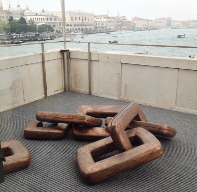
In relation to the curator Danh Vo’s work the theme of the broken and the mended, the beautiful and the delicate is referred to not only in the artists he has selected but also his own practice which in some cases combines fragments of classical sculpture with modern-abstract concrete or wooden forms that both appear to hold-together and prop-up the original sculpture and interfere with it at the same time. In Vo’s sculpture, ‘We the People’ a set of giant broken and joined chain-links, is derived from a painting showing a cross-section inside the Statue of Liberty by Martin Wong (also in the exhibition). The links also refer to a piece Vo did about the Statue of Liberty in New York five years earlier. The idea of making links and literally depicting them is woven throughout the exhibition so that the work can be read both individually and then a second time in relation to the work surrounding it.  
 
Danh Vo 'Untitled' (2015) Gold, cardboard, various iron and farm tools.
 
Where this particular exhibition also challenges expectations is in that it has been curated by an artist. Whether it is perhaps because ‘artist as curator’ is more intuitively visually aware than a curator is, I don’t know but there could be argument in saying that this exhibition overall feels far more cohesive and more reflective of Vo’s practcice in its selection of works than that of the theme-based grouping of the Biennale ‘All the World’s Futures’ curated by Okwui Enwezor. Even down to the presenting of work aesthetically together is well thought-out with similar neutral tones, sepia hues and scales and sizes that vary from the elegantly small to the ambitiously large. From the late 19th century chandelier from the ballroom of the former Hotel Majestic in Paris which functioned as the headquarters for the German military in WWII to Sigmar Polke’s potato house and Andres Serrano’s ‘Piss Christ’ there is a LOT of art in this exhibition that begs to be thought about and how it talks to the other pieces that surround it paints a complex set of ideas around identity and biographical links to Vo’s mixed heritage of being a Vietnamese-born Danish artist that I’m still left unravelling weeks after having seen it!

Assisted in this plight visitors are burdened with what is an almost alarmingly comprehensive accompanying twenty-three page document which I think reads better as more of a catalogue to read after the exhibition rather than during. Tip; never find yourself reading the text in the gallery longer than you are ‘reading’ the work itself.

 
Lee Lozano 'No Title' (1964) Graphite on paper. 36.5 x 46.5 x 2.5cm.
The juxtaposition of works throughout history, such as a Picasso next to a Lee Lozano is another example of two artists whose work may have never been seen together; Picasso amassed his wealth as an artist during his lifetime, Lozano famously rejecting the idea of being an artist forcibly removing herself from the art world in ‘dropout piece’ in the late 60’s. Politically and historically they are two completely different artists, so in one way it is joyously rebellious to put them side-by-side but visually it also allows us to compare their work as paintings and celebrate the differences/similarities within the work. This exhibition does feel a little like a Lozano retrospective and for me personally, the real gem was seeing several of her ‘tool’ inspired drawings from the 60’s. Compared to the similarly sexualised, intense drawings/prints of Jim Dine (who was also working at same time as Lozano in America) very few people have heard of her. This is in part due to her self-inflicted infamy of wanting to disappear from the art world, but I think her drawings have so much to offer as being the female reaction to what are traditionally very masculine and at times phallic-looking objects. As drawings they aren’t very detailed or refined, but they are very aggressive, dark, imposing and direct responses to these objects that are openly sexualised and confrontational. In their expressiveness and exaggeration they also remind me of Philip Guston’s drawings and although I did not spot it they have also been likened to Claes Oldenburg's sculpture drawings of enlarged or distorted common-place objects . Watch this space as a more detailed post on Lozano is worthy an imminently due on this blog!

Lee Lozano 'No Title' (1964) Graphite on paper. x4

Overall this exhibition does draw attention to some of the treachery and misleading nature of language as well as challenging the purpose of art objects once they have finished being created. Art undergoing an existential crisis, 'what does art 'do' once it has been created?' It is one of the most concept riddled shows I have ever seen and I think the fact that I have struggled to summarize it succinctly only proves just how it defies simple explanation, but in doing so is also incredibly rich and rewarding. You’ll leave perhaps more confused than when you came in and that is a good place to start. What a difference two years can make!
 
 ‘Slip of the Tongue’ is on at Punta Della Dogana, Venice until December 31st 2015.