Showing posts with label Punta Della Dogana. Show all posts

Thursday, 22 June 2017

You better believe it!

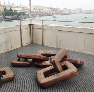
In Damien Hirst’s latest exhibition, ‘Treasures from the Wreck of the Unbelievable’ visitors are invited to experience two museums worth of coral-clad sculpture, objects, photography and video that aims to push our understanding of how history and myths are formed, questioning the mortality of materials and their makers. We are told that the beasts, idols, artefacts and objects on show were once lost in a legendary shipwreck and have been raised from the Indian Ocean to be presented here at the Francois Pinault Foundation’s Punta Della Dogana and Palazzo Grassi galleries in Venice. Relics of a bygone civilisation they are presented as such, in vast glass vitrines or vast spaces; many still encrusted in the limpets, barnacles and coral accumulated from their time underwater.

‘Demon with a bowl’ (Exhibition Enlargement) Painted resin. 1822 x 789 x 1144 cm
On Monday 12th June 2017 armed with nothing but a camera and a pen I chose to wade into the depths and shallows of these art-infested waters...
 
‘Calendar Stone’ Bronze. 422.5 x 475.8 x 172.3 cm
Opening in the heart of the Biennale contemporary art calendar, the venue set over two museums along the Grand Canal has the makings for the perfect rock n’ roll style location for an artist whose calf slicing, diamond skull encrusting, butterfly pinning works about mortality have become amongst the most iconic, satirised, notorious, discussed and the most highly selling of any living artist in the contemporary art world. This new exhibition of work from the Bristol born artist, now in his 50s is his most ambitious to date and sees a sum 190 pieces in marble, gold and bronze, crystal, jade and malachite, at over a decade in the making and at a whopping cost reportedly of 50 million to make it is as an extravaganza to behold as it is ambitiously risky. But what else would one expect from the artist made famous as one of the YBAs for pickling a shark and calling it art!
‘Huehueteotl and Olmec Dragon’ Silver, Paint. 29.7 x 28 x 21 cm
In the Punta Della Dogana a replica of a Mayan Calendar welcomes visitors to the exhibition, its surface completely clad in the coral and underwater fauna of its supposed 2,000 years lost at sea. Behind it, a larger-than-life statue of a warrior atop a snarling bear on its hind legs, its surface also at first glance appearing to be covered in a living surface.  Smaller relics such as coins and assorted precious stones alongside photographs placed throughout the exhibition create a museum-like narrative that depicts the breadth of what was ‘discovered’ as well as the salvaging process of divers excavating these treasures. If you believe that any of it is real, from the impressive looking albeit actually fake coral, to the whole fabricated tale itself then you’ll believe anything! It soon becomes apparent that this is all a little too farfetched; the comic nature completely exposed when pop culture figures such as Mickey Mouse, Goofy, a transformer, Kate Moss as a sphinx appear and later a depiction of the artist himself. They are modern cultural references that begin to make the whole thing begin to feel like the satire of Banksy’s Dismaland. It does however raise the interesting question of whether these are remnants from a fabricated past or visions of a dystopian future?
‘The Warrior and the Bear’ Bronze. 713 x 260 x 203 cm
This is merely the tip of the iceberg in an exhibition that in its vast yarn-spinning complexity becomes more a lesson in 21st Century marketing and publicity. This isn’t a criticism; Hirst manipulates the power of the institution of the gallery as a place for authority and truth and turns it on its head. The result is that the ‘joke’ ends up more often than not to appear rather kitsch, befitting of the attention they receive in their crowd-pleasing photographable appeal alone. For these reasons early reviews for this exhibition were almost ravenous in criticising it but I feel that they were searching too hard for a depth that they sought when in fact what makes this show so appealing and so extraordinary is in its shallowness. Unabashed conviction in its commitment to the lie it is trying to tell is commendable as at times its relentlessness of puns and popular icons grows tedious. It is popular, maybe for the wrong reasons; though it is also fun and regardless of the jokes or whether it’s real or not it is still a spectacle to behold.
Artists have long been blurring the distinctions between truth and lies, fact and fiction, history and its documentation versus myth and its own immortality in their art. Whilst these are ideas that have been explored before, particularly in Hirst’s work, they have not been explored as lavishly previously by the artist as they have here. There is something Hollywood blockbuster-like or theme park sized extravagance to the ambition of the ‘lie’ that is being presented that sort of allows us to forgive it and immerse ourselves into the experience. Are we part of the joke or in on the joke I am still unsure? For me, the best work in the exhibition is the video documentation, regardless of the ‘lie’, the reality is that all of these monstrously-sized objects had actually been put out at sea and salvaged (albeit in a staged manner) but the filming of this process is mysteriously compelling, well shot and edited as a piece of film-making and becomes visually far more believable! As for the sculptures themselves, I think it would be good if much of this work was buried back at sea; not because I believe they are awful (some though truly are) but because I would like to have seen them with real algae and age to them rather than being fabricated. In 2,000 years or more they could become something that really could be discovered? I would love to know either way what the legacy of this work will be. 
‘Hydra and Kali’ Bronze. 539 x 612 x 244 cm
In this era of fake news this exhibition feels timelier than what critics give it credit for and the lasting impression it has had for me is that there is still much creativity involved in creating a story, those stories then sometimes becoming myths of the future. This exhibition is certainly very memorable! It is therefore highly appropriate that I end this tale with one of my own. Make of it what you will. Upon finishing seeing the show at the Palazzo Grassi, I descended the stairs and spotted at the feet of the gargantuan 18 metre resin statue ‘Demon with a Bowl’, the artist, Damien Hirst, himself! It was the ultimate irony and much to my surprise that no one else in the relatively busy exhibition had noticed that its creator was just walking amongst them as they so enthusiastically photographed and viewed his work, perhaps it was humbling? Myself, I could not resist the opportunity to say ‘hi’ and shake his hand. “I suppose you’re to blame for all this then?” I asked him. “I suppose I am,” he said.
That really is unbelievable!
 
Damien Hirst’s ‘Treasures from the Wreck of the Unbelievable’ is on at Palazzo Grassi and Punta Della Dogana until 3rd December 2017. http://www.palazzograssi.it/en/exhibitions/current/

Thursday, 25 June 2015

Tongue tied or speaking in tongues?

If you are lucky enough to visit ‘Slip of the Tongue’ at Punta Della Dogana in Venice this year there will be some points during your viewing where you will look possibly at a stone axe head sticking out the top of a block of clay and question ‘what does this all mean?!’ ‘uh....’
 
That’s right! This post marks the glorious return of ‘the bit pretentious one’ art gallery, Punta Della Dogana, Venice. Hard to believe it was almost two years since my last visit during the 2013 Biennale when I initially dubbed the contemporary art gallery as the ‘more pretentious’ of its Venetian counterparts [see http://spannerintheworkz.blogspot.co.uk/2013/12/the-bit-pretentious-one.html]. June 2015 and I am not deterred, as before, first opinions can be misleading and I was excited to see what was in store second time around. In fact my visits to PDD are becoming some of the most insightful experiences into art I have ever had at an exhibition. This post reflects on some of those thoughts.
 
People should not be afraid to not understand art. I think the image of authority projected by the galleries we place art in can often dictate otherwise and there is a pressure or intimidation found in their reverend silence and cathedral-like viewing spaces that fills people with a sense of the unknown. I don’t think this is the fault of gallery spaces who go to great lengths to ensure their buildings are as welcoming, user-friendly and accessible as possible and it is a double-edged sword, galleries need to be authoritative to give the work a kind-of cultural backing or approval that gives conviction that, for example, this sheet of gold leaf on the floor is ‘art’. However I do not see any of this as a bad thing and think it is as important to not know, expect the unexpected as much as it is to-know something. With art particularly the complexity of each individual piece and ways in which meaning is constantly shifting over time can mean that no one could ever claim to understand it all, often not even the artist. On that note the introduction to the exhibition at PDD states, “Each of the objects and works of art (around 120) presented in the exhibition “Slip of the Tongue” seem to partake in this idea that the activity of the artist is aimed at the preservation and afterlife of objects rather than of their interpretation.”

Hubert Duprat 'Volos' (2013)
Equally it would be wrong to assume that our soul engagement or pleasure from art should be in attempting to understand/interpret it. Asking what a stone axe head in a lump of clay is all about is a perfectly reasonable question, but may actually have nothing to do with arts knowledge or experience brought to the work by the viewer, but highlights that there must be something intriguing or something possibly worth knowing about the art work. Conversely, when I find myself in an exhibition asking myself what various works are about, I then ask ‘why/what is it about the work I’m looking at that makes me interested in it?’ In the case of our axe head I was initially attracted, of course, because it featured a tool and there was something totemic-like or primal about the way in which it was quite ‘simply’ stuck in the top of the clay block that aroused suspicion. I wanted to know why the clay had been kept in its clear shrink wrap casing as to being left to dry and whether this made it, due to the condensation formed under the wrap a bit like a ‘breathing sculpture’. It raised connections in the art history part of my knowledge of Arte Povera, the ready-made as well as something more tribal or ancient. Even without this assumed knowledge I think people would pick up on the clues in the work but admittedly it requires more effort than some work. The work is part of a series in this exhibition by French artist, Hubert Duprat. Titled ‘Volos’ it is in fact named after the Greek island where in an archaeology museum a  pre-Cycladic polished axe head replaces a human head in a  terracotta sculpture of a human chest. The specifics of this may have taken some deducing or would require knowledge of pre-Cyladic sculpture, but the essential ideas of something ancient, and a breathing or flesh-like form could be read by most.

Nairy Baghramian 'Retainer' (2013) Cast aluminium, silicon, polycarbonate, chromed metal, rubber.
 
Despite its more demanding nature ‘Slip of the Tongue’ is one of the more digestible exhibitions in this year’s Biennale in which Danish artist, Danh Vo curates. Featuring some 39 artists from throughout art history; mediæval miniaturists, Rodin, Picasso, Francesco Lo Savio, Carol Rama, Paul Thek, Nancy Spero and Lee Lozano, Marcel Broodthaers, Hubert Duprat, Elmgreen and Dragset to Fischli and Weiss it is still pretty sizable but in true Punta Della Dogana style the works featured are at times difficult to spot given, at times vast quantities of space to single works of art. Art Tourists expecting a similar Biennale style art binge will relate to its ‘bit pretentious’ reputation as was my similar false judgement from two years ago. However in contrast to the relentlessness and scale of the Biennale central exhibition itself, PDD stands out for demonstrating that by giving artwork more space (irrespective of its scale) it forces us to consider/notice it more. This is an exhibition that rewards thoughtful interpretation for those who take the time to look for it.
 
 Elsewhere a row of yellow, cheese-like melting plastic squares are supported into a row by a wire structure which arguably regiments them as much as it supports. Therein lies our beginnings to interpreting this work, a dynamic visual puzzle in the language of materials, shape, form and meaning. The wire denotes some kind of forcible correction and reminded me of braces or an abstract wall. The plastic yellow sheets then become teeth-like or the object which is being manipulated by the wire, their shiny surface mimicking a feeling of wetness associated with the teeth/mouth idea. The work, titled ‘Retainer’ is by Nairy Baghramian and in directly avoiding a representation of a set of braces/retainer it is meant to conjure ideas of the mouth as a space that changes when it is open or closed.  The whole thing does look fairly awkward and not exactly aesthetically pleasing but to quote the catalogue rather, ‘reveals the ugliness that proceeds correction’.
 
Baghramian also has two other works in the show, one of which the title piece for the exhibition, ‘Slip of the tongue’ (continuing the mouth theme). The work itself a combination of epoxy, resin, polystyrene and concrete series of phallus looking sculptures which are meant to be more tongue-like but in their uncertainty convey the idea of Freudian-slips and stumbles of language and how it shapes our identity.
 
Danh Vo 'We the People'  Detail (2011-2013) Copper.
In relation to the curator Danh Vo’s work the theme of the broken and the mended, the beautiful and the delicate is referred to not only in the artists he has selected but also his own practice which in some cases combines fragments of classical sculpture with modern-abstract concrete or wooden forms that both appear to hold-together and prop-up the original sculpture and interfere with it at the same time. In Vo’s sculpture, ‘We the People’ a set of giant broken and joined chain-links, is derived from a painting showing a cross-section inside the Statue of Liberty by Martin Wong (also in the exhibition). The links also refer to a piece Vo did about the Statue of Liberty in New York five years earlier. The idea of making links and literally depicting them is woven throughout the exhibition so that the work can be read both individually and then a second time in relation to the work surrounding it.  
 
Danh Vo 'Untitled' (2015) Gold, cardboard, various iron and farm tools.
 
Where this particular exhibition also challenges expectations is in that it has been curated by an artist. Whether it is perhaps because ‘artist as curator’ is more intuitively visually aware than a curator is, I don’t know but there could be argument in saying that this exhibition overall feels far more cohesive and more reflective of Vo’s practcice in its selection of works than that of the theme-based grouping of the Biennale ‘All the World’s Futures’ curated by Okwui Enwezor. Even down to the presenting of work aesthetically together is well thought-out with similar neutral tones, sepia hues and scales and sizes that vary from the elegantly small to the ambitiously large. From the late 19th century chandelier from the ballroom of the former Hotel Majestic in Paris which functioned as the headquarters for the German military in WWII to Sigmar Polke’s potato house and Andres Serrano’s ‘Piss Christ’ there is a LOT of art in this exhibition that begs to be thought about and how it talks to the other pieces that surround it paints a complex set of ideas around identity and biographical links to Vo’s mixed heritage of being a Vietnamese-born Danish artist that I’m still left unravelling weeks after having seen it!

Assisted in this plight visitors are burdened with what is an almost alarmingly comprehensive accompanying twenty-three page document which I think reads better as more of a catalogue to read after the exhibition rather than during. Tip; never find yourself reading the text in the gallery longer than you are ‘reading’ the work itself.

 
Lee Lozano 'No Title' (1964) Graphite on paper. 36.5 x 46.5 x 2.5cm.
The juxtaposition of works throughout history, such as a Picasso next to a Lee Lozano is another example of two artists whose work may have never been seen together; Picasso amassed his wealth as an artist during his lifetime, Lozano famously rejecting the idea of being an artist forcibly removing herself from the art world in ‘dropout piece’ in the late 60’s. Politically and historically they are two completely different artists, so in one way it is joyously rebellious to put them side-by-side but visually it also allows us to compare their work as paintings and celebrate the differences/similarities within the work. This exhibition does feel a little like a Lozano retrospective and for me personally, the real gem was seeing several of her ‘tool’ inspired drawings from the 60’s. Compared to the similarly sexualised, intense drawings/prints of Jim Dine (who was also working at same time as Lozano in America) very few people have heard of her. This is in part due to her self-inflicted infamy of wanting to disappear from the art world, but I think her drawings have so much to offer as being the female reaction to what are traditionally very masculine and at times phallic-looking objects. As drawings they aren’t very detailed or refined, but they are very aggressive, dark, imposing and direct responses to these objects that are openly sexualised and confrontational. In their expressiveness and exaggeration they also remind me of Philip Guston’s drawings and although I did not spot it they have also been likened to Claes Oldenburg's sculpture drawings of enlarged or distorted common-place objects . Watch this space as a more detailed post on Lozano is worthy an imminently due on this blog!

Lee Lozano 'No Title' (1964) Graphite on paper. x4

Overall this exhibition does draw attention to some of the treachery and misleading nature of language as well as challenging the purpose of art objects once they have finished being created. Art undergoing an existential crisis, 'what does art 'do' once it has been created?' It is one of the most concept riddled shows I have ever seen and I think the fact that I have struggled to summarize it succinctly only proves just how it defies simple explanation, but in doing so is also incredibly rich and rewarding. You’ll leave perhaps more confused than when you came in and that is a good place to start. What a difference two years can make!
 
 ‘Slip of the Tongue’ is on at Punta Della Dogana, Venice until December 31st 2015.  

Tuesday, 3 December 2013

The 'bit pretentious' one

Alright, alright I’ll admit it. Takes one to know one, and when it comes to pretention I’m almost certain I’ll have sometimes been guilty of it, albeit most of the time unknowingly. In fact I can think of an artist who uses the negative quotes about his work from the public, such as ‘pretentious drivel’ as the titles for his next paintings. Ha, ha! Brilliant! And when it comes to being ‘a bit’ pretentious then nothing I saw during my time in Venice fitted as aptly as ‘Prima Materia’ at the Punta Della Dogana. This is by no means necessarily a derogatory opinion, as I aim to prove in this blog post, for whilst, yes, the work was inflated in its importance by its minimalist aesthetic and slick contemporary art gallery surroundings, it was those qualities that also made it a much more meaningful and subdued experience than that of the relentlessness of the Biennale.

Firstly, the gallery, Punta Della Dogana, itself is spectacular (hopefully some of my photos below will give you a sense of the scale/openness of the building). There are relatively few ‘new’ buildings in Venice (part of its appeal) which means architects have had to come up with creative solutions to restore and redesign the interiors of many buildings so they can continue to have new purpose/function. Punta Della Dogana was the city’s former customs house in the 15th Century, now the two floored, triangular building is a brick walled, concrete floored and oak beamed ‘temple’ to contemporary arts, transformed by architect, Tadao Ando from the François Pinault Foundation in 2006. Stylistically, it all reminded me a bit of the Saatchi Gallery back in London, housing one extremely wealthy man's art collection of large and ambitious contemporary art works by some ‘big’ art names such as Bridget Riley, Bruce Nauman and Piero Manzoni as well as plenty of new and emerging ones.

Visiting the Biennale for two days straight before visiting the Punta Della Dogana had left me with a major art hangover. I’d binged on non-stop art in the day and the cheap local prosecco by night, now at day three my tolerance and susceptibility to the prospect of viewing yet more art were slowly beginning to wane. A deep sense of art fatigue was setting-in and who could blame me? The only plausible cure was also the one that came most naturally and that was to just keep going.

The problem with this of course was that the sudden change in ‘art viewing pace’ I was met with at the sparser Punta Della Dogana which came as a shock to the system but also as a welcoming one as I was forced to return to the discipline of having to make an effort to read/understand when viewing the works in the exhibition.


A brief digression: In the catalogue of the ‘Bloomberg New Contemporaries’ 2013 exhibition Ryan Gander writes of the work selected in this year’s exhibition, ‘there are things that mean things and things that look like they mean things’. How true a statement of most contemporary art today, I found myself thinking and I particularly like that statement because it also summaries how I feel about the work in ‘Prima Materia’. The theme, ‘Prima Materia’ is broad in its possibilities and attempts to cover,

‘...the prima materia—essence, everything and nothing, everywhere and nowhere—takes many forms... separate from, or encompassing, earth, air, fire, and water; or the formless base of all matter; containing the soul and the body, the sun and the moon; love and light, imagination and consciousness; or urine, blood, or dirt. It was searched for in the darkest soil of the forest, and inside the body. It is the primal chaos that exists before time and all possibilities of the future...in science, perhaps the dark matter that makes up most of our universe. The definitions of this medium that carries all of the elements are diverse by cultural perspective or personal identity.’

I often think though that anything that tries to be ‘everything’ ultimately ends up in being about nothing. Is that a fair statement to make, so is this an exhibition about everything and yet nothing? No wonder I found it a bit pretentious. Such is the paradox of art with similar examples of art having to render itself useless in order for it to be seen as useful. It’s damned confusing if you think about it too much in the same way that over analysis of the bible ends up highlighting all the ways in which it contradicts itself. Then again maybe there is no other way to curate contemporary art as there are so many plausible meanings/interpretations to a piece of work, making the art of curating an art of editing and providing an overall framework  that influences how we view a given piece of work in the context of a particular themed exhibition or space. Thus one piece of work can be shown in many different themed exhibitions taking on different interpretation each time it is shown.

 The work in ‘Prima Materia’ has the feeling of being familiar, as though I’ve seen some of the work before but in different exhibitions. One of the opening rooms (pictured above) features several works by artists from the Japanese, Mona-ha (never heard of it until now) and Italian, Arte Povera movements. A fairly minimalist looking array of sculptures whereby often philosophically large concepts to do with phenomena, the environment and/or existentialism are re-imagined into their most simplistic/essential visual form. The important distinction that I have always struggled to achieve in my own work is that it is not necessarily the aim of art to illustrate these concepts as it is to re-present, explore or communicate them. There's a difference, that has something to do with intention and possibly integrity, that illustrating is  more of a 'presenting' and art is more of a 'figuring out'....I'm intrigued, so I speculate, answers on a postcard please! 

 Rocks are placed on pre-smashed sheets of glass (Lee Ufan’s ‘Relatum’) to symbolise the constant search for equilibrium in the physical world. Or in Susumu Koshimizu’s ‘Paper’ we see a paper cube with a stone placed inside which plays with the perception of heaviness and lightness. I’m nervous that I’m finding it difficult to write about this without sounding too sardonic, when I really don’t want to be because when I actually think about it, if someone were to ask you to represent the concept of ‘the light of human intelligence’, ‘infinite space’ or ‘equilibrium of the physical world’ with any materials/forms of your choosing how would you do it? It’s incredibly difficult but also as equally important to have these ideas presented visually as they are a much more accessible way into some of the ‘weighty’ concepts they deal with.


I counted over 28 artists exhibiting in this exhibition demonstrating, as you would expect, a wide range of mediums including painting, installation, sculpture, film and light. It was fantastic to see the work in this gallery quietly, away from the busy crowds that plagued the Biennale and whilst I don’t feel the work was as good as some of the stuff I’d seen there, I did have more time to experience it. For example, the large painting pictured above, ‘The Land so rich in beauty’ by Zeng Fanzhi doesn’t do a lot for me, but it’s gutsy, ambitious and dynamic so despite not personally having ‘a liking’ for the colour palette or way it was painted I was still impressed at seeing it in the context of the gallery because it couldn’t fail but to generate a sense of awe for its sheer scale and sense of expression/conviction. James Lee Byars’ installation, ‘Byars is Elephant’ (pictured below) is another similar example, the ball of rope in the centre is actually made from hand-woven camel hair with golden lamé (fabric with woven threads of metal in, I later learnt) draped floor to ceiling. You’re guess is as good as mine as to what this is all about, I got as far as the knotted rope being a metaphor for the insoluble questions and riddles of human existence and maybe something about ritual a la the camel hair and ‘story of the weeping camel’ (maybe not related). The accompanying blurb mentions Byars’, ‘luxurious sculptures, works on paper and performances question the boundaries between art and life, and the importance of living intensely.’ Most people'd probably tell you that I live pretty intensely enough as it is without having had to experience a gold lined room with a ball of camel hair in it and I've never seen this as a particularly important condition of living either until now so maybe there's some wisdom to be had in this semi-poetic, theatrical-looking installation after all.


At the opposite end of the interpretation scale of art reading would be Adel Abdessemed’s ‘Décor’ where four life-sized sculptures of Christ after the Crucifixion hang in a row on the gallery wall. They are made of razor wire which straight away transforms the meaning of Christ as, traditionally a symbol of faith/love into one of danger. Similarly the plurality of having four depictions of ‘one’ God is turning preconceptions of representations of Christ. It is brilliantly made, but too obvious for my liking.


When it came to the painting in this exhibition there was quite a variety, from the painterly, almost Futurist style abstraction of Mark Grotjahn, to the more controlled Op Art of Bridget Riley and satirical/political imagery of Lynn Foulkes, but for me however, the two painters that stood out were Marlene Dumas (pictured above) and Roman Opalka (pictured two images below). It’s debatable whether Opalka is a painter or more of a conceptual artist and is probably somewhere in-between, but more of that later. I had heard of Marlene Dumas and seen images of her work on many occasions but until now had never before seen any of her work in person. Pictured above, is ‘Peter O’Toole as Lawrence of Arabia’, not the best painting out of the series of five/six displayed but it’s the only one I photographed for some reason. I’d describe Dumas as a real painters’ painter, like Bacon or Saville you can see, almost feel, the brushstrokes, the layers, the wash upon wash which creates a ghostly-like transparency, window or veil over the image. This 'veil' beckons you to look closely and ponder on the vacant, often expressionless faces of the figures depicted in her paintings, the figures and their stories often disguised by this quiet sense of mystery.

 The mystery apparent in Opalka’s paintings reveals itself more simplistically and upon first glancing upon his canvases you’d easily be forgiven for thinking they were left blank or painted white. It is only on closer inspection that one sees thousands upon thousands of numbers painted systematically upon the canvas’ surface. It is quite stunning and a real testament to human endurance and patience, or at least this one artist’s endurance, which he started in 1965 in an attempt to paint 1 to infinity which he carried on everyday for the rest of his life until 2011. He also began to take photos of himself at the end of each day’s painting each image taking an increasingly lighter tone so eventually his image began to fade away into nothingness. This work feels beautiful and quite sad at the same time, as it is an act of obsession/meditation performed everyday but also quite futile as in no human lifetime could one ever actually paint every number up to infinity. Its pointlessness is admirable which sort of gives it ‘a point’ after all.


Another work that felt similarly ‘zen-like’ was Roni Horn’s ‘Well and Truly’ (pictured above) where ‘water is depicted as solid in the form of ten cast-glass blocks in different shades of blue, blue-green, grey and white’. It was the perfect morning to come across this work, the gallery was quiet and the sun was shining right on top of each of the glass blocks creating a shimmer and sheen on the glass so that it really did appear as though it was liquid. The colour of each block glowed and radiated subtly on the grey concrete floor of the gallery and I wouldn’t have thought much more of it unless I hadn’t read it was by Roni Horn and the title of the work, ‘Well and Truly’. The phrase’s primary meaning is contradicted by the connotation of well (as in a water well) being associated with water which acts as a symbol of changeability, flow and uncertainty. “Watching the water,” says the artist, “I am stricken with vertigo of meaning. Water is the final conjugation: an infinity of forms, relations and contents.” Once again it strikes me that this is another work sort-of about ‘nothing’ in what has been a morning of serene minimalism and profound, metaphysical anomalies.


Phew! And this was just the start of my day! I'd still stand by my comment of it all being a bit pretentious. The act of viewing art, I think, should be an internal conversation between the viewer and the art work, effort is required on both sides in order for work to convey meaning and in turn the viewer (who already brings their own history, experiences, 'baggage' to the conversation) responding/taking time to experience the work. In other words, it would be impossible to have to think about all the work in this exhibition in the amount of depth each individual piece of work demanded. I'm as fickle as anyone else and sometimes there are just some pieces of work you don't feel like 'talking to' or even worse that you feel intimidated by because you 'can't speak the language' but confusing metaphors aside, you are more often than not rewarded for making the effort of trying to understand a work art than not bothering at all (as I hope some of my observations in this post showed...). On the whole I'm often more surprised and learn more from the art I 'don't like' or find difficult than the stuff I enjoy. Who ever knew that conceptualism could generate so much conundrum?

If this hasn't been quite enough pretention for you and you happen to be in Venice then why not check out 'Prima Materia' at Punta Della Dogana until the 31st December!