Sunday, 12 July 2015

Post Lozano

  If she were alive today would Lee Lozano be a blogger? I’d like to think so, as at the very least I think the medium would have been deeply interesting to her, its occupation with the ‘global audience’, exposure for the written word and debates on censorship and what constitutes public/private in an age when almost every aspect of people’s lives is documented online.  
 
But where are my manners?! Few people I know have ever even heard of the artist, Lee Lozano and to some extent that is exactly  what she wanted, self-creating her own infamy with a body of work titled ‘Dropout piece’ whose primary aim was to reject and create self-anonymity from the art world.
 
“She became competitively uncompetitive, ‘I will not seek fame, publicity or suckcess.’ That single declaration remains the cleanest summation of what Dropout Piece is actually amounted to: a total disengagement from all professional art world ambition.”1
 
In succeeding to do so, but still continuing to work privately and continue her practice (in the form of copious notebooks of thoughts and experimental performance pieces) she inadvertently created a legacy in the art of self-oblivion. Born 1930 in New Jersey she graduated philosophy and natural sciences before marrying and in four years divorcing, architect Adrian Lozano whilst studying towards her Bachelors in Fine Art. In the 60s she moved to New York befriending artists such as Stephen Kaltenbach and Carl Andre in which increasingly, due to the likes of artists such as Michael Heizer and Robert Smithson, the art was beginning to emerge outside the institution of the gallery/exhibition space. This was to be influential in the development of Lozano’s later performance and conceptual pieces.

IMAGE 1. Lee Lozano Installation view of the ‘Wave Series’ (1969) oil on canvas.

  It is a compelling mystery that she is so unheard of given the prolific nature of work she actually produced. Her decision to disappear from the art world was not made out of apathy or an act of attention-seeking but a rebellion, a protest piece against the disillusionment and superficiality of the art world. Additionally it was met with shared adversity amongst many of the artists Lozano associated herself with along with the anti-war protest and feminist movements in America at the time. Prior to ‘Dropout Piece’ Lozano was gaining recognition for her series of large ‘Wave’ paintings that share a similar flat, minimalist sense of abstraction and use of colour to Barnett Newman (IMAGE 1) but becoming increasingly frustrated at the schmooze-filled pomposity of the art scene and after undergoing an extensive period of psychoanalysis she revolted against ‘expectation’ and resorted back to her earlier ‘word’ works; conceptual pieces handwritten in copious notebooks. This almost cataclysmic shift to something different in her practice, I feel has so much in common (but so little written about it) in relation to Philip Guston’s own choosing to retract from his success in the art world as a abstract expressionist painter to pursue his own path, his own re-invention as an artist. A bold thing to do and one that is not without risk nor always successful. Lozano herself very aware of the pressures and expectations put upon artists by both themselves and, more significantly for the motivation for ‘Dropout piece’; the expectation that the art world places upon the artists it is so reliant on. Lozano expresses this quite honestly and refreshingly defiantly at a lecture she gave on creative production,
 
“For example, what is expected of any artist or any creative person, as opposed to what really happens? Everyone knows that an artist’s best work often covers a very short period of time, yet the artist is expected to function on a high, high level of performance at all times. And, if an artist does very good work at one period in life, he or she is always, actually competing with their own great period of work. It’s almost very rare that an artist does high quality work and maintains this great period throughout their career. Yet it’s expected of him.”2
 
Prior to any of this however she had been making drawings, gestural paintings and caricatures of tools, screws, nails, flexi-pipes, sharpeners and mechanical objects which she collected off the streets and her ‘former’ studio floor (IMAGE 2). And for me, personally, it is her tool work made between 1964-67 that is particularly interesting...
 
IMAGE 2. Lee Lozano ‘Untitled’ (1964) Graphite and crayon on paper. 23 x 16”
 
IMAGE 5. Lee Lozano ‘No Title’ (1963-64) graphite and crayon on paper. Dimensions unknown.
 
In her series of tool drawings and large paintings tools are depicted with great intensity, often in extreme close-up with a very physical use of mark-making.
 
“In Lozano’s hands, screws are no longer a neutral means to hang a painting or set a bookshelf but rather explicit euphemisms of sexist logic: anthropomorphized machines aggressively screwing in and out of each other in acts of overdetermined functionality, regardless of pain or pleasure.”3
 
The concept of anthropomorphising tools being one reason I am interested in Lozano’s work,
 
"Given life they automatically become frenzied beings – clamps, pliers, screwdrivers and hammers fondling and struggling with each other in a kind of dangerous courtship."4 (IMAGE 3)
 
IMAGE 3. Lee Lozano ‘No Title’ (1963-64) graphite and crayon on paper. Dimensions unknown.
 
In my own work (IMAGE 4) the tools I depicted were nearly always unconsciously in groups or sets. I like to think this was a compositional decision; that the positive and negative shapes created by layering/overlapping the tools more interesting visually than drawing them statically or in rows. However, the large scale and intensity with which I drew them dictated otherwise, making them often more intimidating or, similarly to Lozano personified in some way. Tools are objects of character, their patina giving them unique surfaces and whilst I did not directly respond to imbuing them with the courtship and coupling in Lozano’s drawings I accept that other people could read into them in this way. If anything it makes me want to make new work that specifically explores these ideas. 'Tools and their relationships'! Ha!

IMAGE 4. Natalie Parsley. Tools 2. 2008. Oil and gloss mono print on paper. 250 x 220cm.

 Lozano’s tool works aren’t exactly comfortable viewing aside from the fact they aren’t always particularly accurately drawn, their composition of being squashed and almost perverse intimate close-ups of these familiar objects that creates feeling of claustrophobia or threat; met with the large scale of some of the paintings,
 
“The huge formats of many of the Tool Paintings give these dynamic images an overpowering forcefulness.”5
 
These are paintings that intend to intimidate and are as aggressive as they are sexually direct and full of double entendre and masculinity (IMAGE 5). In their exaggerated extremity they also have many parallels with comic books that both influenced Lozano and whose word-play inspired her written pieces. But the fact Lozano is a woman depicting these heavily masculinised objects with equally masculine connotations gives them a sort of anarchic sense of taking claim or ownership of them.
 
"Lozano’s early work was irreverent and unabashed, propelled by an overt and oversexed drive to misbehave as much as possible for a woman in the early 60s."6
 
As a woman myself, conveniently, who has depicted tools in her art for many years now it is incredibly liberating to discover Lozano’s tool work as it openly challenges stereotypes and throws an interesting perspective on my own relationship with tools that had previously, relatively gone unconsidered.  Perhaps being in a more liberal age of equality than America in the 60s I don’t see gender-equality as much of an issue regarding my own work in the sense it isn’t driven out of a desire to protest or misbehave but none-the-less after spending the majority of my tool-based art career looking at the prints of Jim Dine it is refreshing to counterbalance this perspective with a female artist. Dine and Lozano’s drawings have a similarity in their intensity of looking and use of drawing as a means of expression and almost cathartic ‘drawing-out’ which I too have frequently referred to in my own practice. This and the fact that each of them underwent bouts of psychoanalysis is evidence that there is more that unites the likes of Lozano and Dine other than just in their representation of tools.

Lee Lozano ‘No Title’ (1964) oil on canvas (two parts) 275.2 x 168.5 x 5.2cm.

  Where Lozano differs, is that Dine’s tools are relatively more static but ‘sexually’ charged by the mark-making that surround them (IMAGE 6); Lozano’s tools are cropped so that the moving-parts of the tool, the parts with teeth, which cut, which flatten and squeeze are amplified so have this feeling of being  more menacing, at times perverse and certainly more physical. In a precursor to Sol Lewitt, Lozano wrote her own list of verbs and used these ‘doing’ words as titles for her tool paintings, further underpinning associations with action/use.  
 
In my own practice an ongoing thread has been the idea that the function of objects is to be ‘put to use or be possessed’ and my MA explored someway into unravelling what it means to ‘use’ a tool and/or ‘possess’ one. Specifically I was interested if drawing could be a form of use and possession largely fuelled by a quote by Jim Dine who of his tool prints stated, "I wanted to possess them and what better way to possess them than to draw them"7. Whether Lozano was trying to possess them or not she was encapsulated in a form of ’Tool Mania’ and possessive lifestyle mixed with periods of casual and heavy drug-taking. It was as though she was seeking of ways in which to escape reality and thinking through frantically making work,
 
"...concerns shaping her practice, involving intimacy and exposure, the incommunicatability of living in your head and the psychological state of possession, whether taking possession or being possessed."8
 
IMAGE 6. Jim Dine ‘Untitled (C Clamp)’ from Untitled Tool Series (1973).
 
The idea of ‘incommunicatability of living in your head’ struck me as yet another example of the similarities that Lozano’s tool drawings have to Guston’s later works (IMAGE 7). They share the similarity of being inwardly bodily; ‘living in your head’ which Lozano conveyed with her treatment to thickly apply paint like a skin and make marks with a frenzied intensity, expression and physicality that are comparable to Guston’s fleshy, skin-crawlingly pink, eyeball filled figures. A depiction of what it feels like on a very sensorial level, to be inside a head. As cartoonist, Chris Ware writes of Guston’s work so succinctly,
 
"...these paintings are not what it looks like to see a human being, but what it feels like to inhabit one. Philip Guston is the first painter, ever, to truly paint a portrait from the inside out."9
 
There is, I feel without doubt a rawness of emotion in both Lozano's and Guston's drawings aside from their subject matter that warrants further research than I have gone into here. I see this post as the beginning of an on-going enquiry into Lozano's work.

IMAGE 7. Philip Guston ‘Rug’ (1980) Lithograph on paper, 495 x 736 mm.

Lee Lozano ‘Untitled (Be this occasionally)’ (1964) Graphite and crayon on paper. 13 x 18.5”
 
Lozano’s tool drawings and paintings only made for a short span of her artistic career which evolved from the early tool works to minimalist paintings and later written conceptual pieces performed often in private. Despite the diversity and shifts within her practice her reasoning and resistance to any sense of categorisation within the art system and nonconformity prevailed seeking recognition and appraisal amongst her peers rather than public.
 
Her work highlighted the dangers of expectation and assumption and demonstrated that artists are able to reinvent themselves and take on many evolutions within their practice, but most of all being admirable for not being afraid to stick two fingers up at the symbiotic, superficial relationship between artist and the art world, in fact making it into the catalyst for creating work. This path consequently led her down an incredibly self-destructive path and at times reliant on the support of friends and family which she continued to rely on up until her being diagnosed for cervical cancer which she died from in 1999 (she was 69).  Yet despite her elusiveness and relatively premature death her work went on to influence a generation of conceptual and performance artists working in America and thanks to the preservation of many of her works, countless since. I have known of her work since 2011, first discovering her in a book on drawing –since then I have felt obliged to unveil some of the mystery and have continued to seek her work out in exhibitions and in books. I still want to find out more, captivated by both the shifts within her practice, her mystery and determination met with anarchy against the establishment.
 
 That and the tools, of course!  
 

1 LEHRER-GRAIWER, S (2014) Lee Lozano ‘Dropout Piece’ Afterall Books: London p57
2 IBID p59/60
3 FOLIE, S (2011) ‘Lozano Tools’, An Art Service Publications; Minneapolis
4 IBID
5 IBID
6 LEHRER-GRAIWER, S (2014) Lee Lozano ‘Dropout Piece’ Afterall Books: London p28
7 DINE, J (2005) Jim Dine: Tools and Plants Alan Cristea Gallery: London p5.
8 OpCit p18


Thursday, 25 June 2015

Tongue tied or speaking in tongues?

If you are lucky enough to visit ‘Slip of the Tongue’ at Punta Della Dogana in Venice this year there will be some points during your viewing where you will look possibly at a stone axe head sticking out the top of a block of clay and question ‘what does this all mean?!’ ‘uh....’
 
That’s right! This post marks the glorious return of ‘the bit pretentious one’ art gallery, Punta Della Dogana, Venice. Hard to believe it was almost two years since my last visit during the 2013 Biennale when I initially dubbed the contemporary art gallery as the ‘more pretentious’ of its Venetian counterparts [see http://spannerintheworkz.blogspot.co.uk/2013/12/the-bit-pretentious-one.html]. June 2015 and I am not deterred, as before, first opinions can be misleading and I was excited to see what was in store second time around. In fact my visits to PDD are becoming some of the most insightful experiences into art I have ever had at an exhibition. This post reflects on some of those thoughts.
 
People should not be afraid to not understand art. I think the image of authority projected by the galleries we place art in can often dictate otherwise and there is a pressure or intimidation found in their reverend silence and cathedral-like viewing spaces that fills people with a sense of the unknown. I don’t think this is the fault of gallery spaces who go to great lengths to ensure their buildings are as welcoming, user-friendly and accessible as possible and it is a double-edged sword, galleries need to be authoritative to give the work a kind-of cultural backing or approval that gives conviction that, for example, this sheet of gold leaf on the floor is ‘art’. However I do not see any of this as a bad thing and think it is as important to not know, expect the unexpected as much as it is to-know something. With art particularly the complexity of each individual piece and ways in which meaning is constantly shifting over time can mean that no one could ever claim to understand it all, often not even the artist. On that note the introduction to the exhibition at PDD states, “Each of the objects and works of art (around 120) presented in the exhibition “Slip of the Tongue” seem to partake in this idea that the activity of the artist is aimed at the preservation and afterlife of objects rather than of their interpretation.”

Hubert Duprat 'Volos' (2013)
Equally it would be wrong to assume that our soul engagement or pleasure from art should be in attempting to understand/interpret it. Asking what a stone axe head in a lump of clay is all about is a perfectly reasonable question, but may actually have nothing to do with arts knowledge or experience brought to the work by the viewer, but highlights that there must be something intriguing or something possibly worth knowing about the art work. Conversely, when I find myself in an exhibition asking myself what various works are about, I then ask ‘why/what is it about the work I’m looking at that makes me interested in it?’ In the case of our axe head I was initially attracted, of course, because it featured a tool and there was something totemic-like or primal about the way in which it was quite ‘simply’ stuck in the top of the clay block that aroused suspicion. I wanted to know why the clay had been kept in its clear shrink wrap casing as to being left to dry and whether this made it, due to the condensation formed under the wrap a bit like a ‘breathing sculpture’. It raised connections in the art history part of my knowledge of Arte Povera, the ready-made as well as something more tribal or ancient. Even without this assumed knowledge I think people would pick up on the clues in the work but admittedly it requires more effort than some work. The work is part of a series in this exhibition by French artist, Hubert Duprat. Titled ‘Volos’ it is in fact named after the Greek island where in an archaeology museum a  pre-Cycladic polished axe head replaces a human head in a  terracotta sculpture of a human chest. The specifics of this may have taken some deducing or would require knowledge of pre-Cyladic sculpture, but the essential ideas of something ancient, and a breathing or flesh-like form could be read by most.

Nairy Baghramian 'Retainer' (2013) Cast aluminium, silicon, polycarbonate, chromed metal, rubber.
 
Despite its more demanding nature ‘Slip of the Tongue’ is one of the more digestible exhibitions in this year’s Biennale in which Danish artist, Danh Vo curates. Featuring some 39 artists from throughout art history; mediæval miniaturists, Rodin, Picasso, Francesco Lo Savio, Carol Rama, Paul Thek, Nancy Spero and Lee Lozano, Marcel Broodthaers, Hubert Duprat, Elmgreen and Dragset to Fischli and Weiss it is still pretty sizable but in true Punta Della Dogana style the works featured are at times difficult to spot given, at times vast quantities of space to single works of art. Art Tourists expecting a similar Biennale style art binge will relate to its ‘bit pretentious’ reputation as was my similar false judgement from two years ago. However in contrast to the relentlessness and scale of the Biennale central exhibition itself, PDD stands out for demonstrating that by giving artwork more space (irrespective of its scale) it forces us to consider/notice it more. This is an exhibition that rewards thoughtful interpretation for those who take the time to look for it.
 
 Elsewhere a row of yellow, cheese-like melting plastic squares are supported into a row by a wire structure which arguably regiments them as much as it supports. Therein lies our beginnings to interpreting this work, a dynamic visual puzzle in the language of materials, shape, form and meaning. The wire denotes some kind of forcible correction and reminded me of braces or an abstract wall. The plastic yellow sheets then become teeth-like or the object which is being manipulated by the wire, their shiny surface mimicking a feeling of wetness associated with the teeth/mouth idea. The work, titled ‘Retainer’ is by Nairy Baghramian and in directly avoiding a representation of a set of braces/retainer it is meant to conjure ideas of the mouth as a space that changes when it is open or closed.  The whole thing does look fairly awkward and not exactly aesthetically pleasing but to quote the catalogue rather, ‘reveals the ugliness that proceeds correction’.
 
Baghramian also has two other works in the show, one of which the title piece for the exhibition, ‘Slip of the tongue’ (continuing the mouth theme). The work itself a combination of epoxy, resin, polystyrene and concrete series of phallus looking sculptures which are meant to be more tongue-like but in their uncertainty convey the idea of Freudian-slips and stumbles of language and how it shapes our identity.
 
Danh Vo 'We the People'  Detail (2011-2013) Copper.
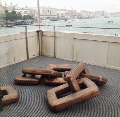
In relation to the curator Danh Vo’s work the theme of the broken and the mended, the beautiful and the delicate is referred to not only in the artists he has selected but also his own practice which in some cases combines fragments of classical sculpture with modern-abstract concrete or wooden forms that both appear to hold-together and prop-up the original sculpture and interfere with it at the same time. In Vo’s sculpture, ‘We the People’ a set of giant broken and joined chain-links, is derived from a painting showing a cross-section inside the Statue of Liberty by Martin Wong (also in the exhibition). The links also refer to a piece Vo did about the Statue of Liberty in New York five years earlier. The idea of making links and literally depicting them is woven throughout the exhibition so that the work can be read both individually and then a second time in relation to the work surrounding it.  
 
Danh Vo 'Untitled' (2015) Gold, cardboard, various iron and farm tools.
 
Where this particular exhibition also challenges expectations is in that it has been curated by an artist. Whether it is perhaps because ‘artist as curator’ is more intuitively visually aware than a curator is, I don’t know but there could be argument in saying that this exhibition overall feels far more cohesive and more reflective of Vo’s practcice in its selection of works than that of the theme-based grouping of the Biennale ‘All the World’s Futures’ curated by Okwui Enwezor. Even down to the presenting of work aesthetically together is well thought-out with similar neutral tones, sepia hues and scales and sizes that vary from the elegantly small to the ambitiously large. From the late 19th century chandelier from the ballroom of the former Hotel Majestic in Paris which functioned as the headquarters for the German military in WWII to Sigmar Polke’s potato house and Andres Serrano’s ‘Piss Christ’ there is a LOT of art in this exhibition that begs to be thought about and how it talks to the other pieces that surround it paints a complex set of ideas around identity and biographical links to Vo’s mixed heritage of being a Vietnamese-born Danish artist that I’m still left unravelling weeks after having seen it!

Assisted in this plight visitors are burdened with what is an almost alarmingly comprehensive accompanying twenty-three page document which I think reads better as more of a catalogue to read after the exhibition rather than during. Tip; never find yourself reading the text in the gallery longer than you are ‘reading’ the work itself.

 
Lee Lozano 'No Title' (1964) Graphite on paper. 36.5 x 46.5 x 2.5cm.
The juxtaposition of works throughout history, such as a Picasso next to a Lee Lozano is another example of two artists whose work may have never been seen together; Picasso amassed his wealth as an artist during his lifetime, Lozano famously rejecting the idea of being an artist forcibly removing herself from the art world in ‘dropout piece’ in the late 60’s. Politically and historically they are two completely different artists, so in one way it is joyously rebellious to put them side-by-side but visually it also allows us to compare their work as paintings and celebrate the differences/similarities within the work. This exhibition does feel a little like a Lozano retrospective and for me personally, the real gem was seeing several of her ‘tool’ inspired drawings from the 60’s. Compared to the similarly sexualised, intense drawings/prints of Jim Dine (who was also working at same time as Lozano in America) very few people have heard of her. This is in part due to her self-inflicted infamy of wanting to disappear from the art world, but I think her drawings have so much to offer as being the female reaction to what are traditionally very masculine and at times phallic-looking objects. As drawings they aren’t very detailed or refined, but they are very aggressive, dark, imposing and direct responses to these objects that are openly sexualised and confrontational. In their expressiveness and exaggeration they also remind me of Philip Guston’s drawings and although I did not spot it they have also been likened to Claes Oldenburg's sculpture drawings of enlarged or distorted common-place objects . Watch this space as a more detailed post on Lozano is worthy an imminently due on this blog!

Lee Lozano 'No Title' (1964) Graphite on paper. x4

Overall this exhibition does draw attention to some of the treachery and misleading nature of language as well as challenging the purpose of art objects once they have finished being created. Art undergoing an existential crisis, 'what does art 'do' once it has been created?' It is one of the most concept riddled shows I have ever seen and I think the fact that I have struggled to summarize it succinctly only proves just how it defies simple explanation, but in doing so is also incredibly rich and rewarding. You’ll leave perhaps more confused than when you came in and that is a good place to start. What a difference two years can make!
 
 ‘Slip of the Tongue’ is on at Punta Della Dogana, Venice until December 31st 2015.  

Tuesday, 9 June 2015

I always believed in futures

The stage is set as eighty-nine countries across the world present their pavilions from the 9th May until 22nd November in the 56th Venice Biennale. This year’s central exhibition has been curated by Okwui Enwezor, titled ‘All the World’s Futures’ and  at its core features live performances and underpinning ideas expressed in Karl Marx’s ‘Das Kapital’. The future doesn’t come across too brightly in this Biennale and as consequence has already drawn criticism for being highly political, sombre and ‘more depressing’ than in previous years. ‘All the World’s Futures’ is however, ambitious and enables for a broad capacity of works like its preceding Biennale theme, ‘The Encyclopaedic Palace’ whose title covered pretty much anything! I am reminded of when I was a child and creating an imaginary ‘everything in the world backpack’ which travelled with me on all my childhood adventures as well as frequently appearing in my written stories. It was a way of encompassing everything one could ever need as well as a sort-of lazy alternative to having to imagine something specific- rather a means of imagination subject to necessity, if I needed a ladder, saucepan, compass or rowing boat in the course of play, anything one could possibly ever need would undoubtedly be covered by the ‘everything in the world backpack’. The 56th Venice Biennale feels a little the same, in its efforts to cover the all encompassing breadth of existence from human endeavour to the social, political, environmental, symbolic and aesthetic. So much so that if you were to wonder, ‘is there any work here featuring string?’ you’ll undoubtedly find it –everything from bones, tyres, shops, keys, bread, earth, trees, glass, flags, fabric, instruments, boats, video games, immersive installation, sound, chalkboards, ready-mades, recycling, text, neon, driftwood, conflict, film, opera, war, eating, sexuality, identity, the sea, archiving, minimalism, technology, stone, metal, newspapers, fans, walls, doors, suitcases , history, people, paint, place is represented making it an almost impossible task to surmise just what isn’t included either conceptually or in material! Does it fall flat of being too disorganised, too crowded? Or is it too specific in being overtly political or depressing as the reviews seem to claim? I am less sure of the latter as it moderately depends on what glasses you are wearing when viewing the work as I certainly found there to be enough variety, curiosity and uplifiting/depressing/confusing wonderment to fill a lifetimes worth of futures.

Over the course of three sizzling Venetian days I attempted to visually munch my way through as much of the Biennale as possible across its two main venues (the Giardini and Arsenale) and around the city so I can present what is hopefully a digested view of some of the highlights of this year’s Venice Biennale 2015! Burp!

Top Five Biennale Pavilions (in no particular order)

Netherlands – herman de vries ‘to be always to be’ How could you make reference to ‘Das Kaptial’ without having plenty of tools scattered throughout? This year’s Biennale certainly had more than I recall seeing last year which is never a bad thing! The Netherlands pavilion was no exception and as one of the first I visited, was a delight to see dozens of sickles laid out on the floor so that each of their shapes is emphasised highlighting their similarities yet their differences at the same time. This was one piece in the body of work by herman de vries whose contribution to the Netherlands pavilion took the form of a series of natural/earth-based works that are experienced by the eye, ear, body and nose. Leaves, shells, plants, soil, stones, flowers are collected, isolated and displayed drawing attention to the oneness and diversity of the world surrounding us. The sickles create an association between the tool as an extension of the body and mediator to the crops and land in which it comes into contact with. Aside from my obvious bias in this pavilion featuring tools, I found the compartmentalisation of each of the elements, soil, stone, plant, tool etc. to be immensely satisfying which may stem from my interest in typology of tools and tool catalogues. Aesthetically there is something pleasing about the order of grids/isolating objects in this way as well as the psychological implications of grouping/collecting things to form a bigger sense of control or unity even more interesting when done so with natural objects like plants/leaves which by their very nature defy the man-made perception of order and control. It was a very gentle exhibition and not fascinating because it was necessarily anything new, but was more reassuring as it confirmed what I’ve seen so many people do (both artists and non alike) using natural materials and a connection with documenting, noticing, looking at natural world. It also underlines a very basic belief that an appreciation of understanding, engaging in the world around us begins with noticing it.


Israel –Tsibi Geva ‘Archaeology of the Present’
Hundreds of disused car tyres encase the outside of the Israeli pavilion whilst inside window panels and shutters line the walls. Perceptions of inside, outside the functional and the representational are manipulated creating new assemblages, installations and sculptures that in some cases block or create a sense of sometimes confrontational discomfort for the viewer. In complete contrast to the natural tone of the Netherlands, Israel presents an altogether urban, industrialised pavilion of bicycles, ladders, weapons, metal girders, wire, and wood.  Not so much an environmental or recycling statement as a formal, aesthetic one where wheels become circles, ladders –lines, fencing –grids and street signs –squares. Together their formal qualities and crudeness create interesting compositions, tones, surfaces, imagery and spatial ambiguity. Echoes of the Bauhaus, Rauschenberg and Johns alongside what could only be described as Israel’s version of a Tapies would suggest that whilst Israel isn’t bringing much originality to proceedings but non-the-less it is an aesthetic I am glad is still being explored and utilised as made manifest in this pavilion.


 Canada –BGL ‘Canadassimo’  
The BGL artists collective comprising of three Canadian artists present the visually glorious and great fun, ‘Canadassimo’ installation raising issues related to economics and the art system centred around the notion of ‘unproductivity’. Humorously, they attempt to do so with a three part installation set as a shop, living space and studio the latter of which couldn’t be any more extravagant and in its sheer abundance of paint cans, shoes, tools, palettes and other artistic paraphernalia appears in some ways the complete opposite of unproductivity. However the point being that out of all this paint, all these brushes and all of this mess no actual ‘art work’ has been produced. There is a huge sense of artificiality in this work from the kitsch colours to the fact that it has been staged to look as though work has taken place when in a way it hasn’t. We do not see the product of all these half empty paint cans, merely the mass of their existence. It is taking the idea of the consumerist, product-based Westernised nature of being an artist and exaggerating it to make a point that we are conditioned to buy all of these things in order to ‘make art’ when these objects often sit taking up space inadvertently becoming the art themselves. The whole thing is very visually pleasing so much so I am sceptical that I really whole-heartedly ‘believe’ in it as a piece of work that will resonate with me for years to come. Is it a bit of a one-liner and does it really offer anything new in how I think about the system of ‘what it means to make art’? Certainly in the short-term it is a joyous thing that will quietly rekindle that simple pleasure of painting without a cause and that’s never a bad thing.  


Poland –C.T Jasper and Joanna Malinowska ‘Halka/Haiti 18°48’05”N 72°23’01”W’
What do you get if you take the principle idea behind Werner Herzog’s Fitzcarraldo, a Polish Opera and Saint-Domingue in Haiti? Answer the Polish Pavilion video installation which takes Herzog’s Fitzcarraldo, a mad/romantic anti-hero who attempts through all manner of frustrating human endurance build an opera house in the Amazon. Sharing a motivation in the faith of the universal power of opera C.T Jasper and Malinowska attempt to similarly bring opera to the island whilst remaining ‘not uncritical to the aspect of cultural colonization’. The result is a large ‘in the round’ video projection of a performance of the Polish opera ‘Halka’ in Saint-Domingue uniting a Polish opera with the land in which Polish soldiers fought to defend its independence during 1802. I have to admit part of my enjoyment of this piece comes from having seen Fitzcarraldo and similarly, like many artists I expect, relating to the idea of perseverance in the face of adversity for the motivation of a love of the arts. In the film the impossible struggle to make this dream a reality doesn’t bare fruition so taking that idea and enabling it to happen, in the very modern way of not being restricted by having a theatre in which to perform in, Fitzcarraldo’s dream is made into reality. It is not done with an arrogance that the Westernised version of opera is necessarily better or what is needed for a place like Haiti but speaks more of the universal language of music and storytelling across two different cultures in which we as the viewer are watching both the performance and audience at the same time. I actually found myself watching the reactions of the audience and movements of the children, animals and passersby more than the performance itself.


Romania –Adrian Ghenie ‘Darwin’s Room’ First spotted in the 2008 Liverpool Biennial, I would cautiously go as far to say that Adrian Ghenie is one of the best painters in this year’s Biennale even though, sadly there aren’t many to choose from (Marlene Dumas coming in at a close second). Titled ‘Drawin’s Room’ the Romanian pavilion features three rooms of Ghenie’s paintings and a few of his drawings, the majority of which are portraits of Charles Darwin throughout various ages of his life. Purely from a painterly view, these are really voluptuously painted portraits which share a darkly, distorted layering and manipulation of paint on canvas as though it were a fleshy surface. They remind me of more thickly painted and colourful Francis Bacon’s but sharing some of their flatness so as not to become as thick as an Auerbach. What they offer in terms of a perspective into Charles Darwin, his work and or ideas feels significantly less.  I often think portraits of figures such as Darwin, Einstein, Freud etc. don’t really work as portraits as such, as the people they depict, apart from being dead are so iconic and recognisable we don’t really see them as people anymore, but more as a symbol of their ideas/discoveries. Hence, when I look at Ghenie’s paintings of Darwin, I either think; in their distortion they are so unrecognisable that it could be any face, any person; or, I recognise it as being Darwin and so begin to look for things in the painting which allude to ideas of evolution. If anything in distorting historical figures in Ghenie’s paintings is perhaps an attempt to convey the true nature of these people and not the myth. In the Darwin portraits I think they speak more of the subconscious than the scientific and it is perhaps that juxtaposition what makes it interesting.

Other highlights:

Fiona Hall –Australian Pavilion*  
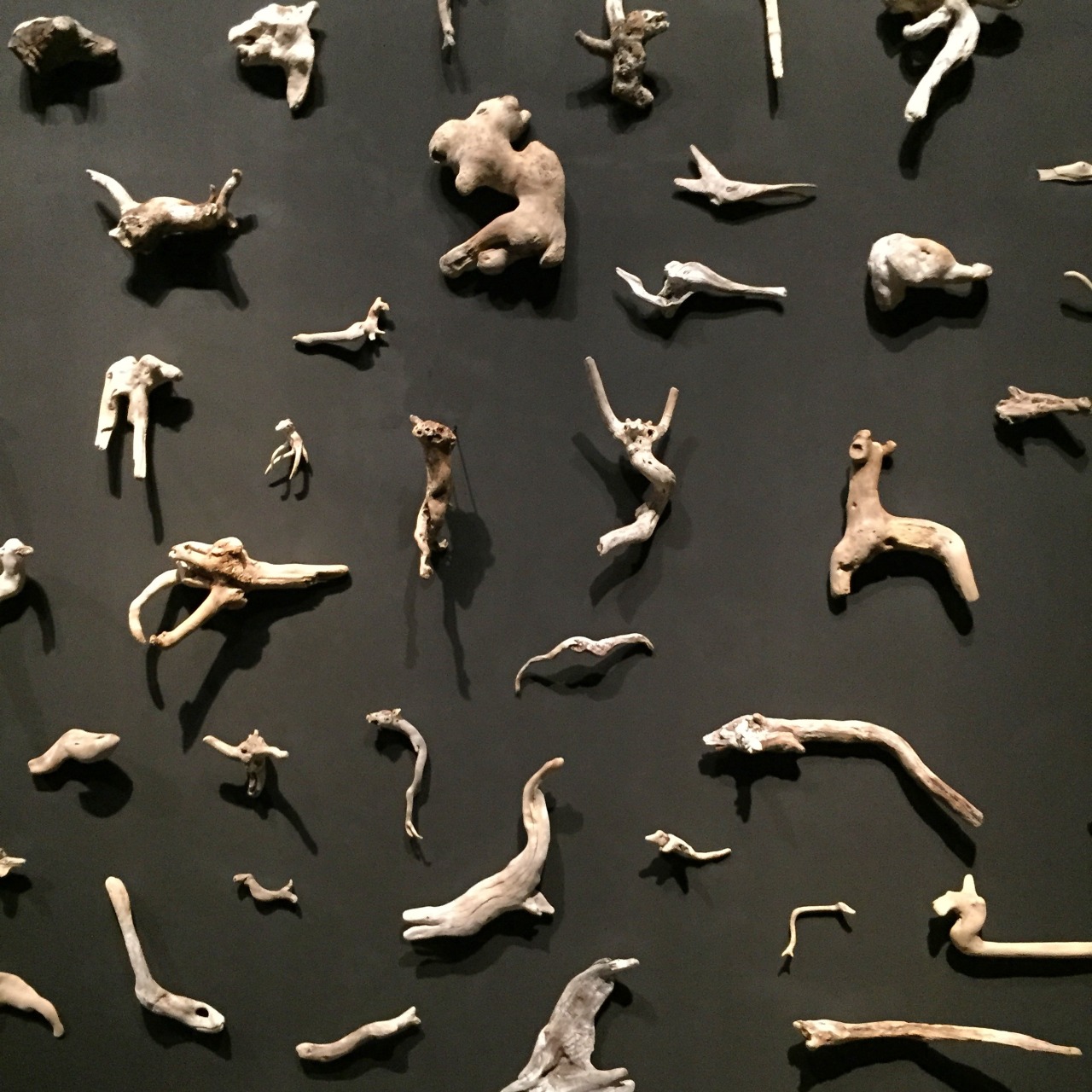
In a cabinet of curiosities meets Pitt Rivers style installation, Hall marks the opening of the brand new Australian pavilion with an installation of hand sculpted objects made from sardine cans, drift wood, cuckoo clocks and wound-string. Her presence in the Biennale brings a celebrated sense of optimism to proceedings, in the artists words, "Our contemporary mindset has resulted in widespread paranoia over this perilous state. But it's a world that's also resilient and wondrous. The body of work I'm presenting is a personal attempt to reconcile a state of gloom and chaos with a curiosity and affection for the place where we all live."

Steve McQueen –‘Ashes’ 2012-2013*
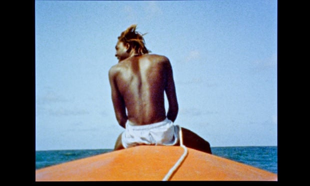
The Turner Prize/Oscar winning artist/director makes a moving Biennale appearance with a very simple but very direct film about a boy on a boat and the story of his murder.


John Akomfrah –‘Vertigo Sea’ 2015 *
Increasingly becoming one of my favourite film makers, Akomfrah first came to my attention with the ‘Unfinished Conversation’ at the Liverpool Biennial in 2012. His work defies categorisation being part documentary, part installation, part cinematography: using three screens and edited using sound, stock and recorded footage, ‘Vertigo Sea’ presents a meditative experience on the environment, whaling and our relationship with the sea drawing on Moby Dick as one of its many cultural references.
Nicola Samori –Italian Pavilion ‘Lienzo’ 2014 Oil on table
Renaissance style images of saints and Christ are depicted traditionally as oil on canvas/board whose top halves are then peeled back or pierced as though the painted surface becomes flayed skin. I have always been drawn to art works that are very self-aware, in the sense a painting which knows its a painting, in example when the painter has manipulated the painted surface so that it ceases to act as a representational image or illusion and becomes an object in its own right. In Samori's paintings this peeling back adds extra meaning and deformation to the icons depicted. 
Ricardo Brey*
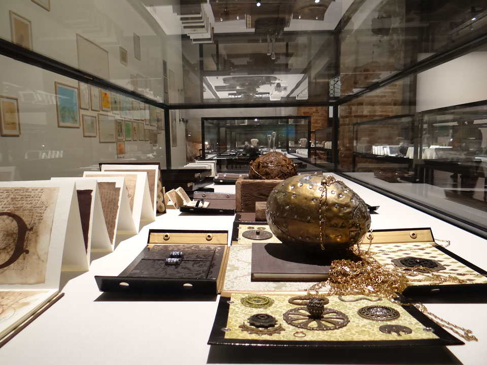
Nested boxes are presented in anthropological glass cases containing parchments, drawings, materials, items and totemic-looking, shamanistic objects made and in some cases found by the artist.  A library of curiosity that begs closer inspection.

Melvin Edwards
Wonderfully intricate, complex sculptures to draw comprising of welded together scraps and parts (yes, including tools!).
Chiharv Shiota –Japanese Pavilion ‘The Key in the Hand’ 2015
For the amount of threads (some 50,000) literally involved in making this piece it is ironically also ending up becoming a bit of a one-liner in that ideas of association of keys, to memory and threads is a little bit too easy and for my liking a bit chocolate-boxy. However it is still a triumphant spectacle to behold and is worth seeing for being one of this year's most crowd pleasing works.

 Was this year’s Biennale original or innovative enough overall? I think so. I think there is far greater emphasis on film and digital technologies this time around, with even less painting which led me to feeling as though the previous years left more to the imagination. At times in this year’s Biennale there were so many films it would be in fact impossible over the time limit of two days to watch each one in their entirety which is where the distinction between good and outstanding film makers really becomes important, with artists like John Akomfrah, Steve McQueen, Chantal Akerman, Mika Rottenberg (reminiscent of Matthew Barney/David Lynch) and Peter Greenaway (who has a massive video installation in the Italian Pavilion) standing out amongst the bunch. In the central exhibition it is true that there were more swords, weapons, flags and skulls than perhaps ever before which is understandable reasoning for the Biennale being more political, war torn, morbid and sombre this year, but then this was always counter balanced by the media-friendly and perfectly pleasing works of the likes of the red threaded keys of Japan and the mechanised moving trees of the French pavilion so the whole thing is too complex to make a fair overall assessment. In Enwezor’s view the aim of this year’s Biennale was to ‘Bring together publics in acts of looking listening, responding, engaging and speaking in order to make sense of the current upheaval’. The world may have become a little darker in recent years, but whether the presence of swords, canons and broken window panes really reflects a bleak world view of future dystopias is more a matter of perspective than prophecy. The Biennale’s greatest asset is also its biggest burden that in being so big and diverse it suffers from the loss of an overall sense of coherence, message or understanding though it remains a terrible, bordering on gluttonous, binge of the best and worst of the art world and for that alone makes it worth celebrating. For a breath of fresh air the Punta Della Dogana exhibition ‘Slip of the Tongue’ curated and featuring work from Denmark’s Danh Vo offers a welcome rest bite to the cramming of work and space of the Venice Biennale, but more on that next time...

Yum, yum, yum! Please art binge responsibly.


The 56th Venice Biennale, ‘All the World’s Futures’ runs until November 22nd 2015. More details found at:


Friday, 29 May 2015

Jurassic World!

Old fossils spotted down on Watchet’s quayside!

‘Jurassic: Triassic: a Geological Journey’ currently on at ‘Contains Art’ in Watchet is an exhibition of drawings, paintings, felt and mixed media work ‘inspired by the strata, rock formations and landscapes of the coastline from Doniford to Blue Anchor’. Featuring work by six local artists (four of whom also have container-based studios on site alongside this exhibition) Mel Degan, Lucy Lean, Angie Wood, Leo Davey, Sue Lowe and Alison Jacobs.

Speaking of ancient history, it has been almost two years since I last visited Watchet when I attended the ‘Contains Art’ grand opening on the sixth of July 2013*! What kept me away for so long?! For those not in the know, ‘Contains Art’ is located on Watchet’s quayside in the form of three large beautiful blue shipping containers that have been transformed into studio spaces and an exhibition space for artists. A visit to these unique and imaginative studios and exhibition space was clearly long overdue and so on May’s last bank holiday Monday I paid them a visit.

Leo Davey

The practicalities of an artist working and exhibiting in a shipping container is no mean feat, the spaces are long and relatively narrow (and probably quite cold in the winter months), but as ‘Contains Art’ continues to prove the resilience of artists is such that we are prepared to make it just about anywhere. Printmaking, sculpture and painting all happen on site in these seemingly impractical containers in a real working example of the innovativeness of creative practitioners. It is quite inspiring and has already become a successful addition to the contemporary arts landscape in Somerset with ambitions for future expansion in the pipeline.

Sue Lowe 'Helwell Layers I'
 The small but geologically formed exhibition currently on until Sunday 31st May is an example of some of the local talent on offer and brings together some varied and imaginative approaches to the theme of the local Jurassic/Triassic coastline. As you may expect to find in an exhibition about geology there is a lot of layering going on in the work! Printmaker, Sue Lowe produces collagraphs layered with chine collé in totem-like columns. The colours and layering Lowe uses create a sense of the maritime, salt/minerals through their depth, texture and wear. Minehead based artist, Leo Davey provides a series of watercolour/ink based drawings depicting the strata and layering of the coastal rock formations. The longer you spend looking at stone the more you notice the amount of colours and tones that seem to change in different light and weather conditions. Davey’s drawings seem to pick up on this being extremely colourful becoming stylised and almost pattern-like in their appearance. Elsewhere Lucy Lean felts undyed natural fleece into tightly packed, dense forms mimicking the shapes and layering of fossils or rock. It is an interesting choice of material [fleece] as it’s soft, more malleable properties have parallels to geological processes of squashing and compressing of layers of rock and sediment.


Lucy Lean
Angie Wood and Alison Jacobs both create their own interpretations in paint inspired by the cliffs and coastal landscape; Wood through stained/layered acrylic paintings which seem to celebrate the roughness and texture of the canvas surface they’re painted on creating earthy, moody and contemplative scenes inspired by the local cliffs but could also connect to a broader reaching sense of our relationship to space, the ground and terra firma. Jacobs, another accomplished painter depicts coastal landscapes with vivid, expressive colours and energy, some of which have been created on an iPad in a sort of David Hockney style experimental playfulness. They are slightly detracted from, however, in my opinion by another of her works (coincidently my favourite overall in this exhibition) made entirely from used artist’s paint brushes. Titled ‘Fossil’ (pictured) as the name would suggest, the brushes are arranged together in rows taking the curved form of an ammonite fossil, or as I saw it mimicking stratum layers. It is possibly the most conceptual piece in the show, but is very cleverly affective and brilliantly observed at communicating the same subject matter in the paintings but in an altogether wittier way.   

Angie Wood

Alison Jacobs 'Fossil'

In true cabinet of curiosities style ‘Contains Art’ is full of many wonders and diehard fossil hunters fear not, for there are also a few actual fossils in this exhibition as well as alabaster and various stones!   ‘Jurassic: Triassic: a Geological Journey’ is a vibrant exhibition that is only limited by its deserving to expand into a bigger container!

 ‘Jurassic: Triassic: a Geological Journey’ is on at Contains Art, Watchet until the 31st May! Get a move on!


Tuesday, 19 May 2015

Drawn together

 ‘Writing is like drawing in that it focuses the mind wonderfully’.  –Michael Craig-Martin*
 
I write these posts in order to understand what I’ve seen or experienced, better. It is a way of processing, analysing those thoughts for as much my own record as it may (hopefully) be as of interest to anyone else that chooses to read it. The same can be said of drawing and my relationship with it as a means of focusing the mind allowing the opportunity for new thoughts, or indeed the almost meditative expulsion of having no thoughts at all (both as equally valuable).  Having a passion for both, with that in mind, I began writing this post about ‘Great British Drawings’ exhibition of over 100 drawings by artists such as, Gainsborough, Turner, Rossetti, Millais, Holman Hunt, David Hockney, Gwen John, Walter Sickert, Ravilious, Edward Lear, William Blake, Samuel Palmer and Tom Phillips at the Ashmolean in Oxford.
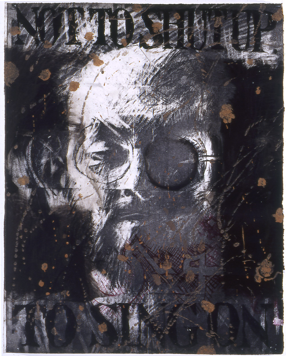
Tom Phillips 'Salman Rushdie' (probably 1993) Charcoal, red and black body colours,
 brown mud bound in liquitex mat medium on white paper.
 
Most exhibitions I visit are intentional, in the sense that I plan to go see them. Visiting ‘Great British Drawings’ was more fortuitous in that I went to see it simply because I had some time to spare!  In that respect it was a pleasant surprise with equally a few seldom-seen gems amongst the collection on display. These include a Tom Phillips charcoal, mud and liquitex drawing of Salman Rushdie, (pictured above) which was uncannily Jim Dine like in its drawing style through heavy use of black and intense mark-making. Elsewhere it was refreshing to see a pen and ink drawing by Edward Coley Burne-Jones (of Pre-Raphaelite fame) that was in its small, more intimate scale more engaging and visually interesting in tone/marks than any of his paintings in my opinion. A few more of the Pre-Raphaelite ‘gang’ had work displayed in this exhibition and whilst I wouldn’t say I’m a fan of work from that period the difference in a perceived sense of warmth between their drawings and their paintings was quite striking. It reaffirmed that the pre-emptive nature of drawing, in the way it was used often before or as a way of composing a painting is so much more revealing of the artists hand and first impression of what they are looking at often than the painting. The painting is more measured in that it has been considered, edited and planned to convey what the artist ‘wants you to see’ whereas a drawing can be as considered but is often more ‘of the moment’ and sort-of as consequence, I feel, slightly more real (‘real’ in the integrity sense of the word rather than necessarily ‘realistic’) Turner is however a good exception to this theory whose drawings are also in this exhibition, he paints very much how he draws and the drawings inform the painting as much as the drawing is informed by the materials he is using.  Again, it was great to see these smaller on paper watercolours which if anything felt slightly fresher and less laboured than some of his paintings.
 
Samuel Palmer 'The valley with a bright cloud' (1825) Pen and dark brown ink with
sepia mixed with gum Arabic, varnished.
 
Edward Lear 'Contstantinople from Eyoub' (1848) Pen and brown ink
with watercolour over graphite on wove paper.
 
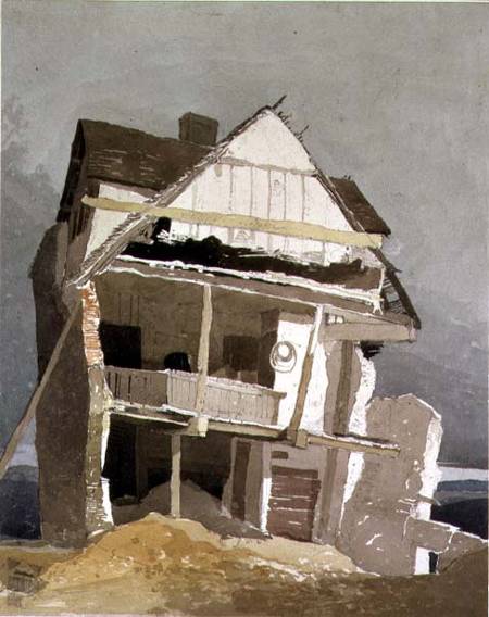
Flavour of the month, Eric Ravilious also had a drawing present in this exhibition along with Samuel Palmer (pictured above) who feels vaguely similar in that both were attempting to depict the romanticism of the English landscape, the undulating hills, cloudy skies, ploughed furrows in fields, rows of corn, hidden pathways, stone walls and all the variety in textures of trees, leaves, hedges and fauna. I also admired the draughtsmanship of artists such as Edward Lear whose illustrations I was familiar with but until now had never seen these more technical drawings (pictured above) which although preparatory for something finished are still quite elegantly sensitive and informative in their own right.  There was also work that reminded me of the importance of drawing as capturing an impression of something and the immediacy and observational sketchiness of John Sell Cotman’s ‘A Ruined House’ (pictured below) being one example and also a more unusual contrast to the familiar subject matter predominantly limited to classical architecture or castles (though many of these perhaps also united to this drawing in being ruins but of a slightly different nature).
 
John Sell Cotman 'A Runined House' (1807) Watercolour over graphite on paper.
 
This was a quietly contemplative exhibition, with lots of looking and noticing attention to detail of the kind which drawing tends to invite more gently than painting so whilst the Ashmolean probably possess infinitely more work they could have possibly shown in the space it still felt as though there was a lot to see. Certainly a lot to think about.
 
‘Great British Drawings’ is on at the Ashmolean, Oxford until August 31st.
 
*Taken from  CRAIG-MARTIN, M; ‘On being an artist’ (2015) Art Books Publishing: London. p8.